Chart Vizzard
Vizzlo's AI-based chart generatorCOVID-19: Excess Mortality in Germany

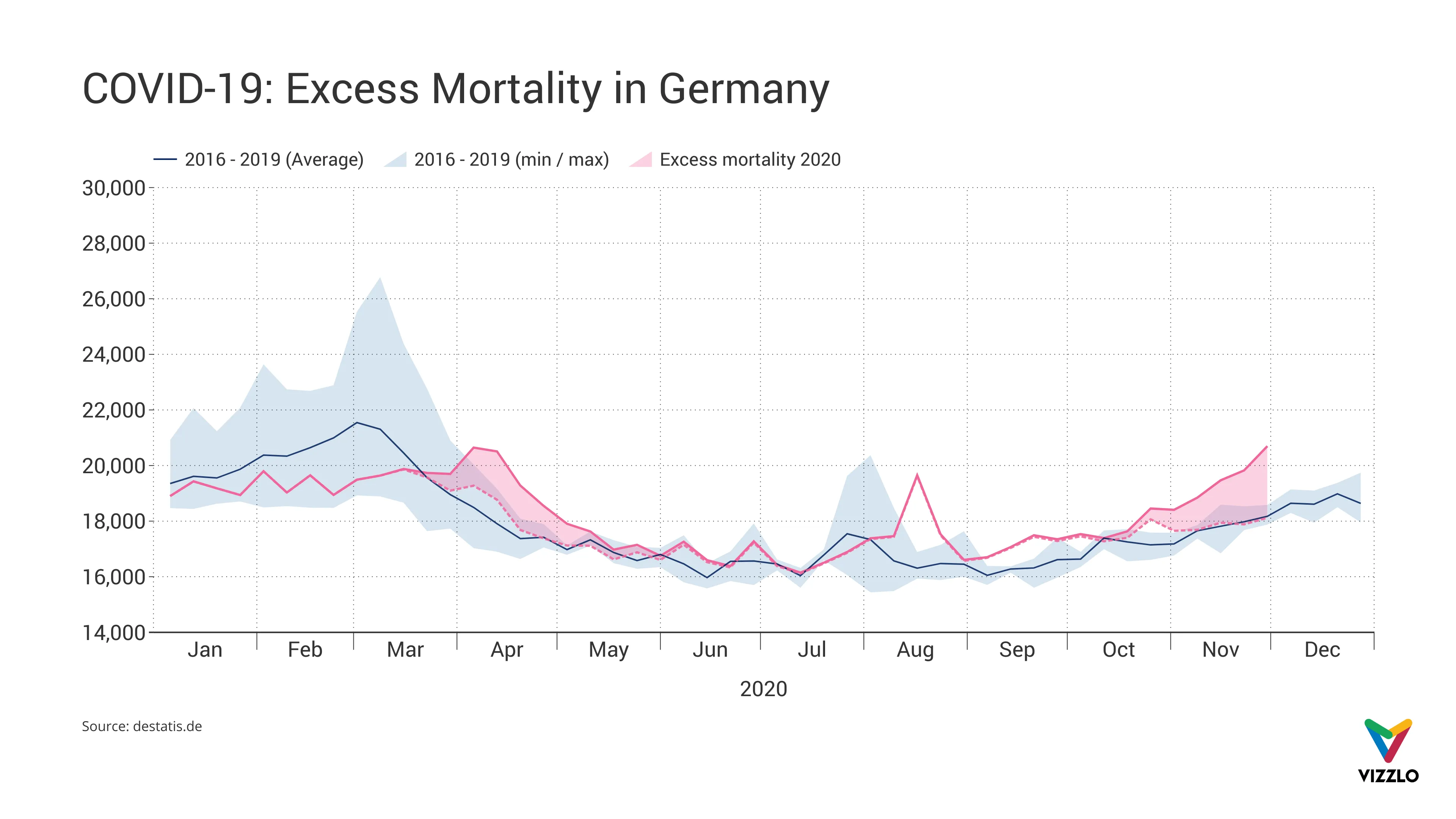
Does COVID-19 lead to excess mortality? To answer that question, the German statistical bureau evaluated death figures for Germany since January 1, 2016.
In April 2020, mortality figures were markedly higher than the average across previous years, highlighted by the pink ribbon in the chart. Meanwhile, an increase in COVID-19 related deaths was recorded (source: Robert Koch Institute). When they decreased, death figures, too, were around the average again as from early May.
In August, however, deaths were up again. This is assumed to be caused by a heatwave, as the COVID-19 cases were generally low in Germany in summer.
After average mortality figures had been recorded in the first half of October, death figures were above average again in the second half of October.
Source: destatis.de

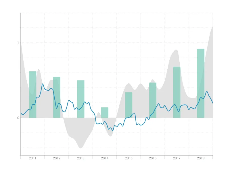
This is an example of Vizzlo's “Time Series Graph”
Complex time series graph to visualize detailed financial data.
Finance & Economics Bar & Column charts Line & Area charts Time-based charts