Chart Vizzard
Vizzlo's AI-based chart generatorArea Chart
A super versatile area chart maker for colorful, bold visualizations
What is an area chart?
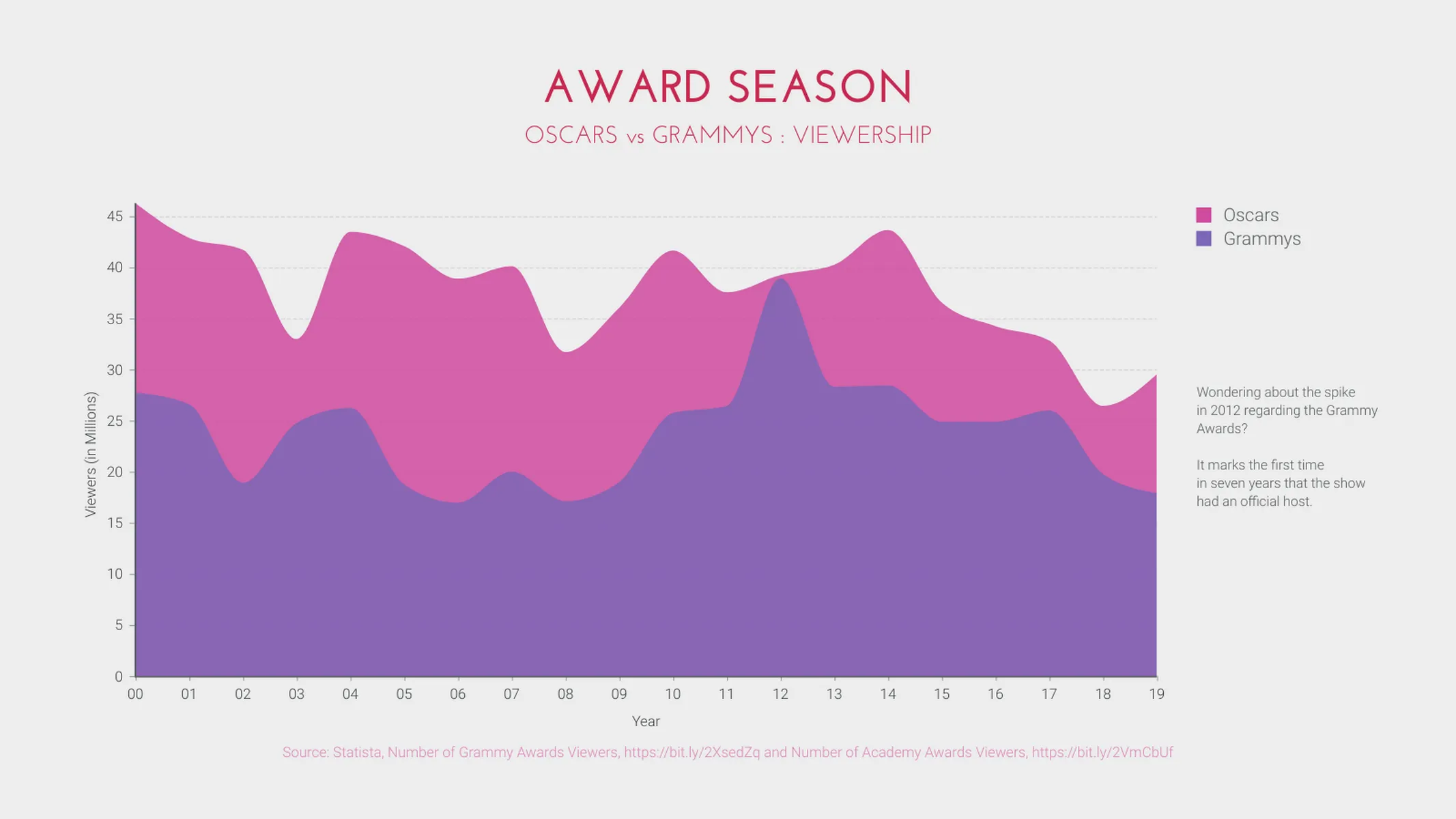
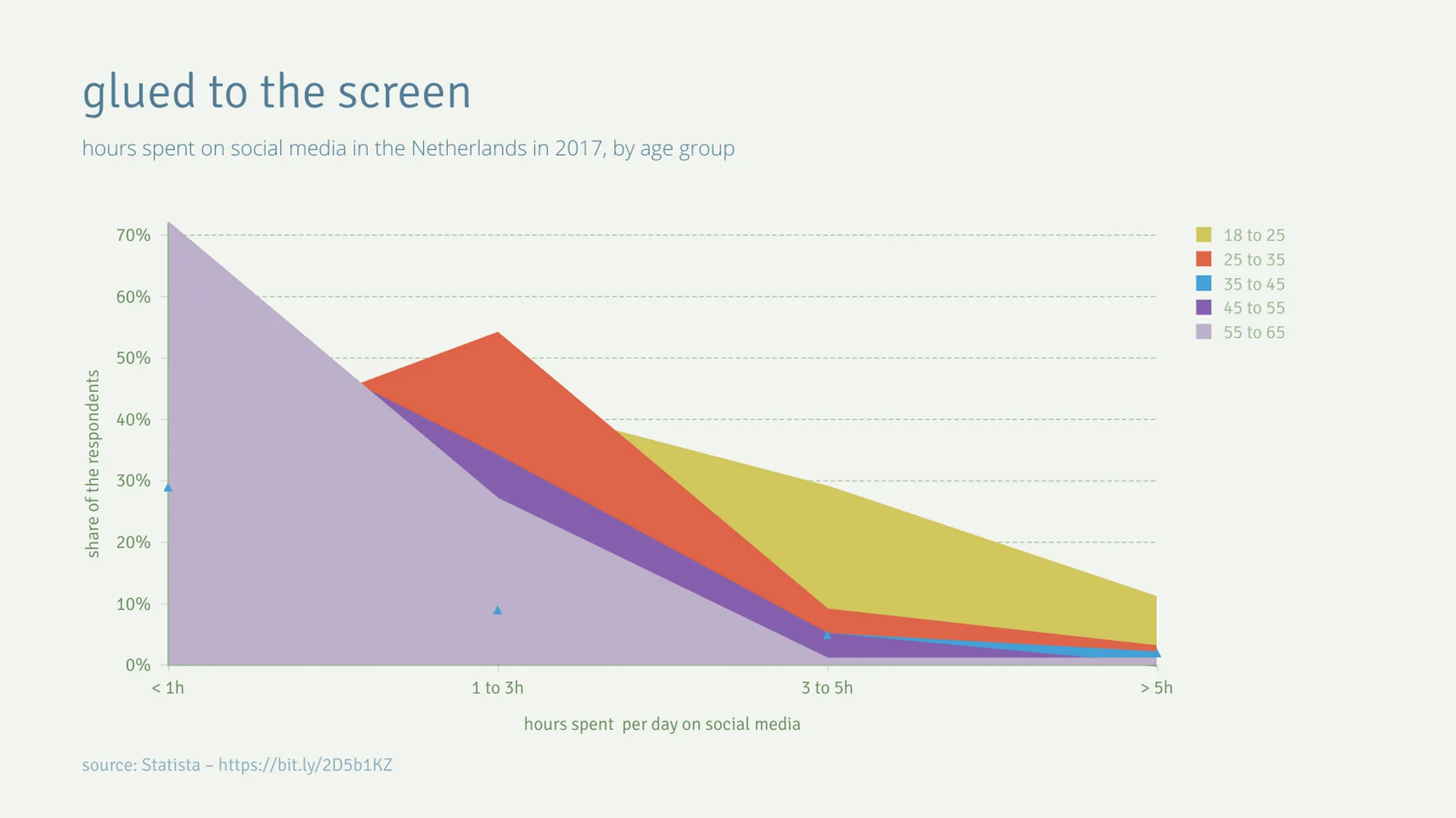
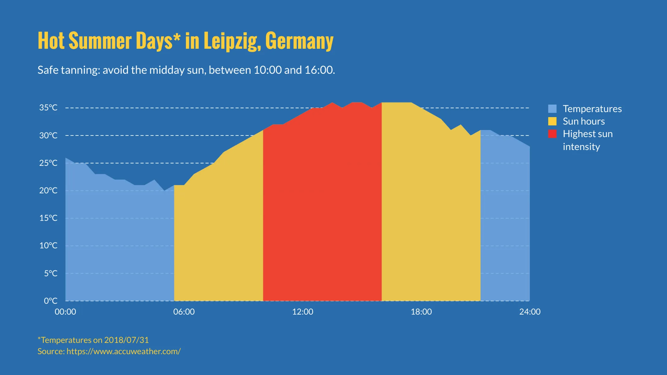
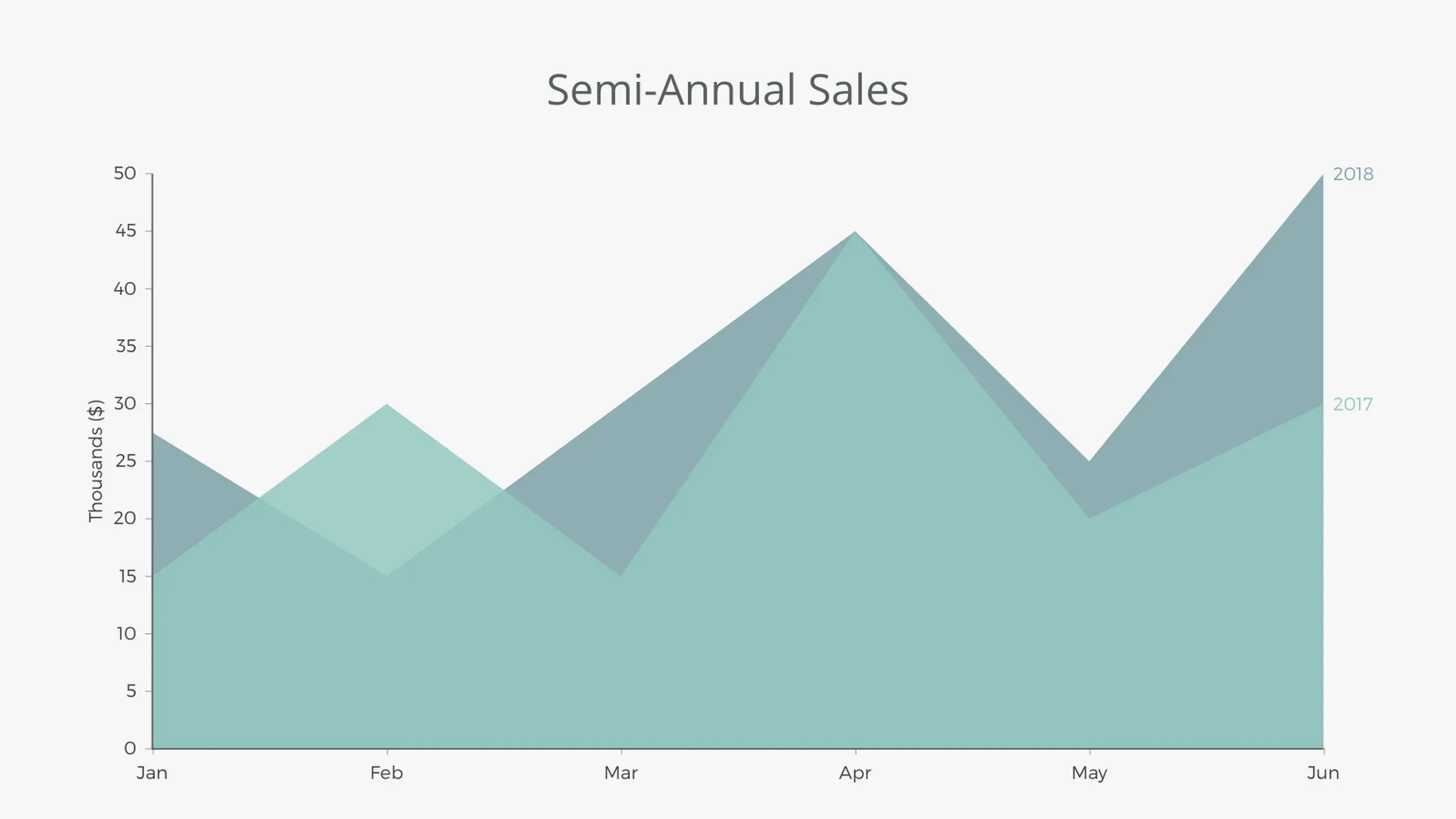
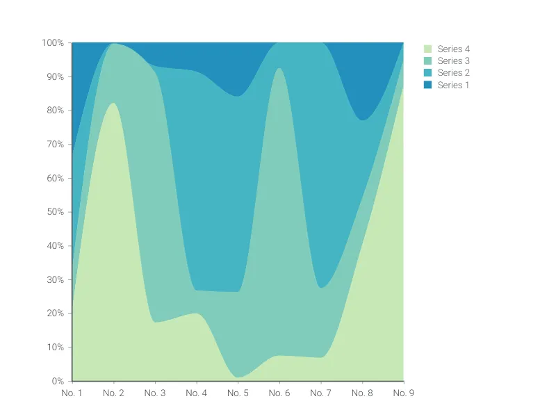
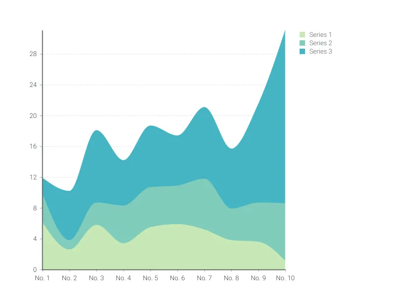
An area chart is a great way to visualize the changes in quantitative data (especially those based on volume) over an ordinal or categorical scale. A variant of the line chart, the series of the area chart are filled beneath the slope, allowing for a different visual emphasis.
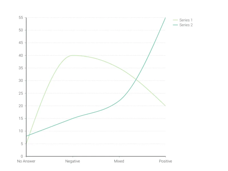
Technically, area charts with curved lines (smooth waves) rather than straight lines (forming triangular peaks) and referred to as ‘spline-area charts’; in addition, charts with data points connected horizontally are named ‘step-area charts’ - however, the Area Chart Vizzard gives you the option to choose between any of these!
Did you know that the first area chart was created by William Playfair in 1786?!
Best uses for the area chart
- Emphasising volume
- Data sets with fewer series, as the filled areas can compete with each other visually
- Putting focus on one or two categories of data
- Data that is not time-based
How to make an area chart with Vizzlo?
Ready to create your own area chart? Follow these simple steps:
- Click on any point in the chart (indicated by red dots) to view and adjust the values for each record
- Alternatively, use the active cards or Vizzlo’s spreadsheet to enter your data
- On the “APPEARANCE” tab, adjust the layout of your chart
- You can further customize the colors and fonts under the theme’s setting
Area chart: pro tips
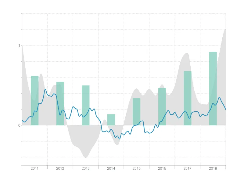
- If your data is time-based, use the time series graph to easily visualize your series over time
- To toggle between a traditional area chart (linear), a spline-area chart (curve) or a step-area chart (steps): click on the series you want to customize (or select it in “EDIT SERIES” under the “DATA” tab), then choose from the drop-down menu under “Mode”
- Realised your area chart would look better as a line graph after all? No problem, and no need to start again - just check the option “Line” under series style (you can even customize this for each series and have a mixed area and line chart)
Area chart maker: key features
- Custom lines, grid, and colors
- Option to add a second y-axis
- Select from different area styles: linear, curve, and steps
- Easily convert areas to lines, or use a combination of both
- Add separator grid lines for easy reference
Resources
Can’t decide between the line chart, area chart, or time series graph? Check out our blog post to learn how to make the right decision.
Area Chart: What's new?
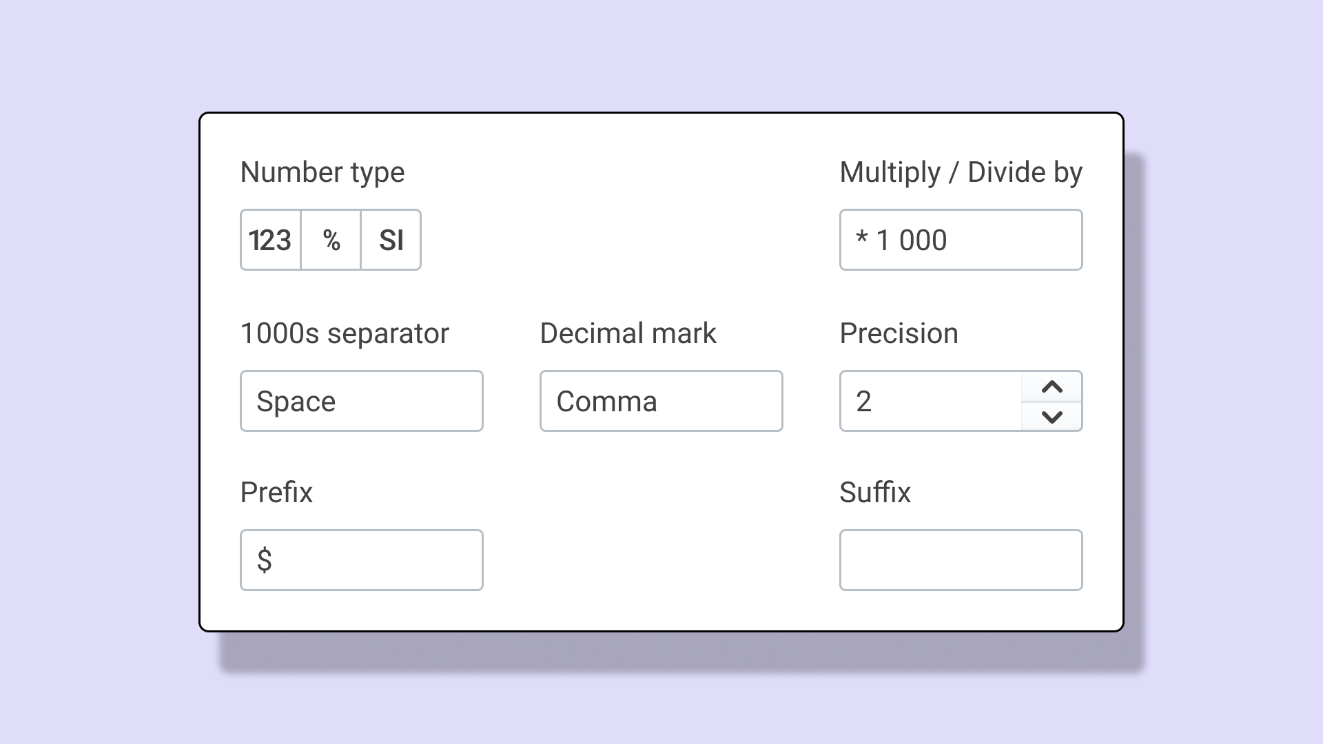
Most of our data visualisations now support SI prefixes, advanced number format options for axes and shown data labels.
Area Chart Alternatives
Use Cases
Line & Area chartsEnhance your productivity
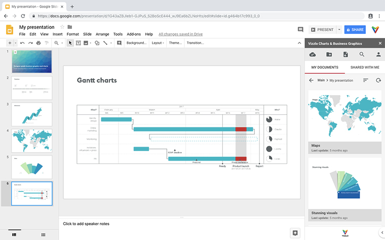
Create a Area Chart directly in the tools you love
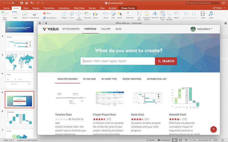
Create a Area Chart in PowerPoint with
Vizzlo's add-in
Loved by professionals around the world


Visualizations your audience won’t forget
Convey abstract concepts and data with professionally designed
charts and graphics you can easily edit and customize.
