Chart Vizzard
Vizzlo's AI-based chart generatorLine Graph
An easy, quick, and super versatile line graph maker.
What is a line graph?
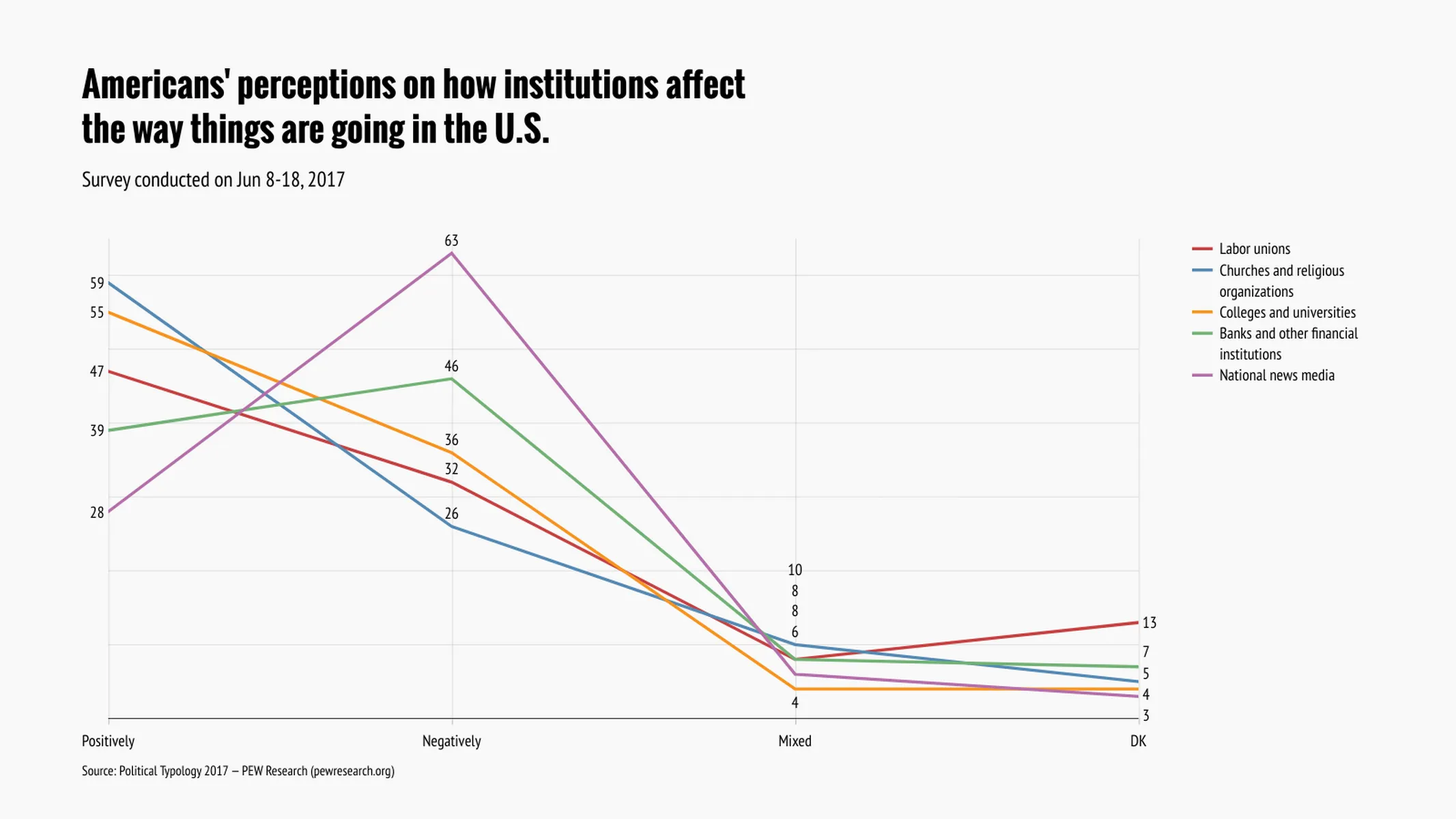
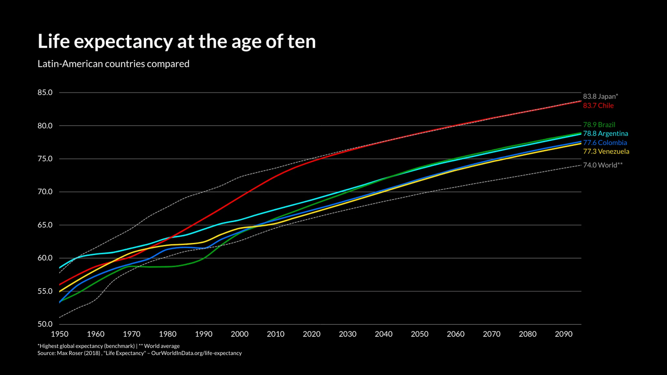
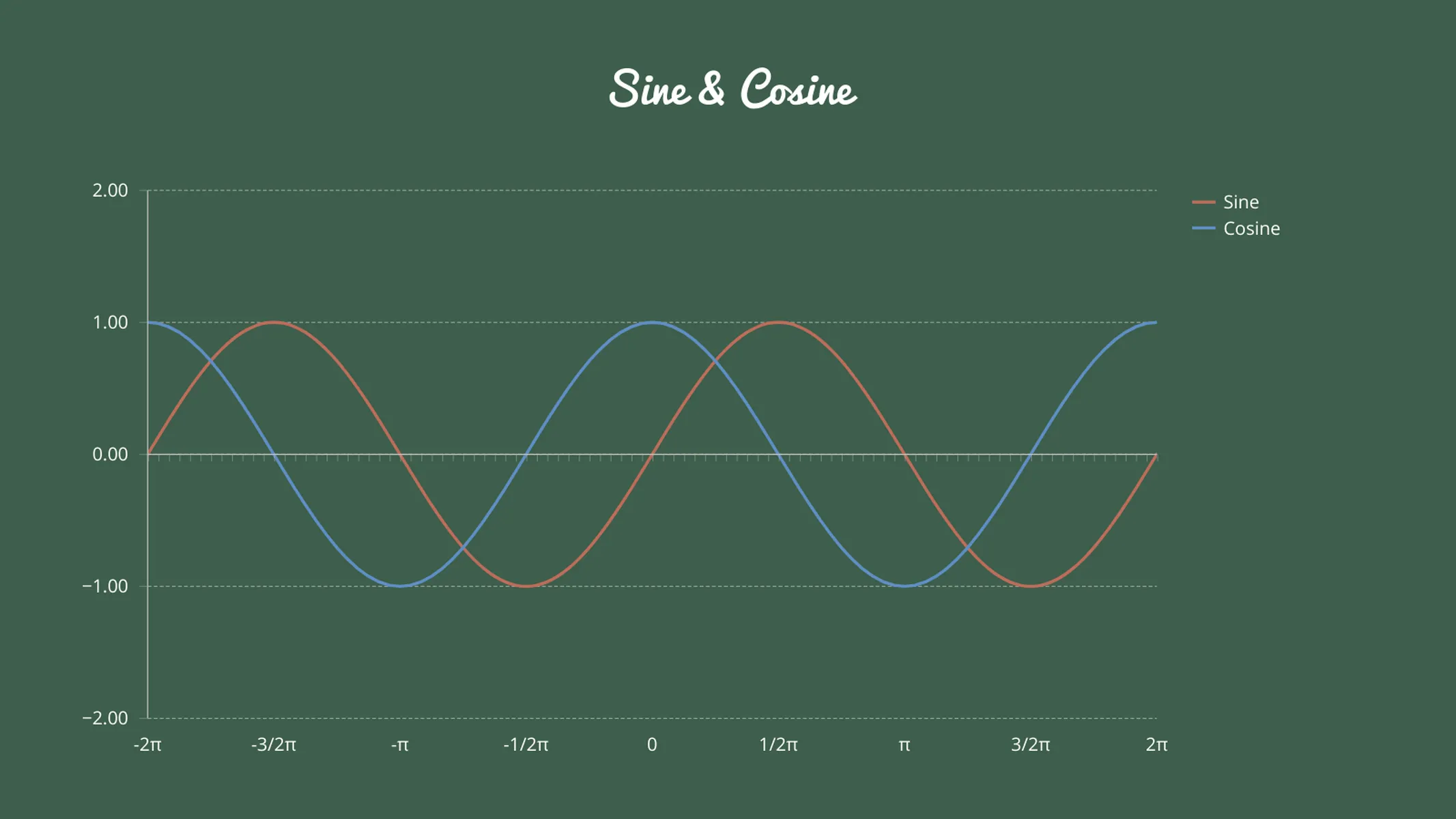
In a line graph (also called line chart or line plot) the data points of a series are plotted in sequential order and connected by a continuous line which reveals trends over the x-axis. You can use this plugin also to represent ordinal data since its x-axis can be used as a category axis (ordinal scale).
Pro tip: Want to compare data over time? Try Vizzlo’s Time Series Graph.
What is the difference between a line graph and an area chart?
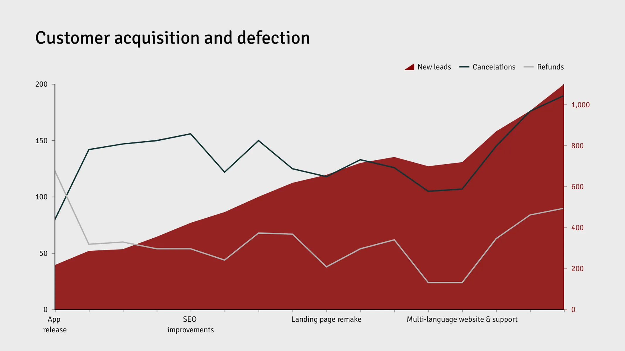
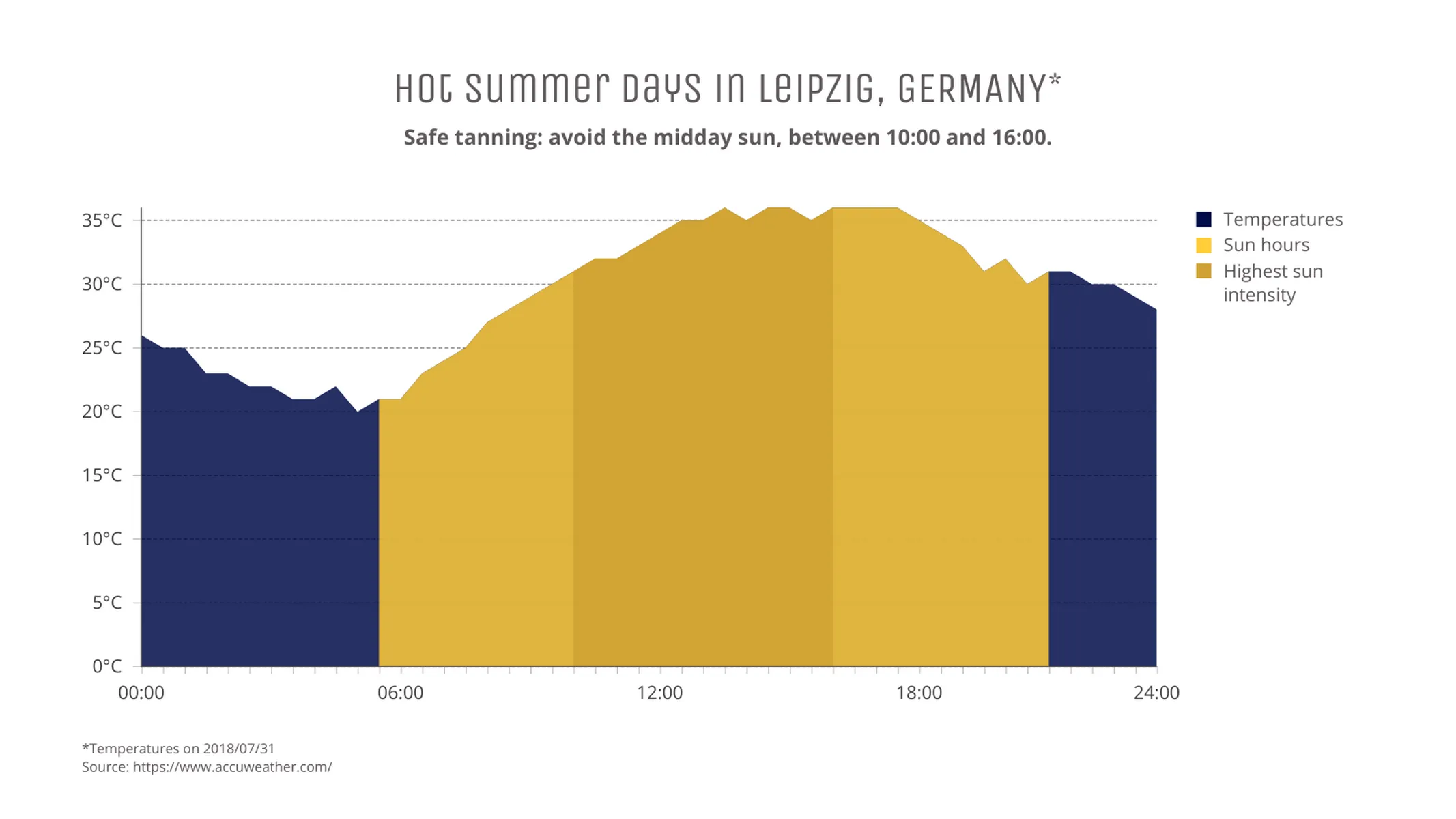
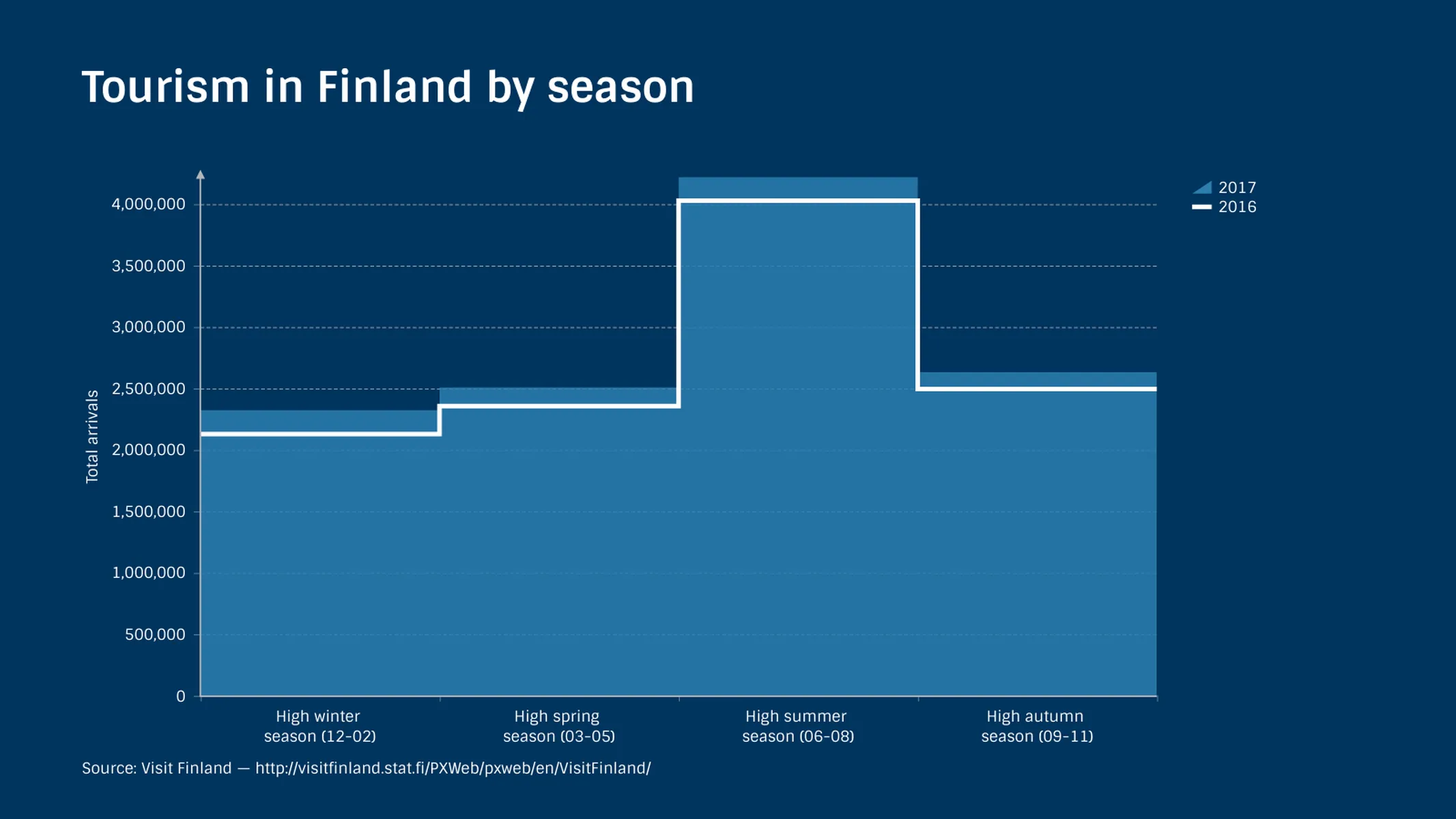
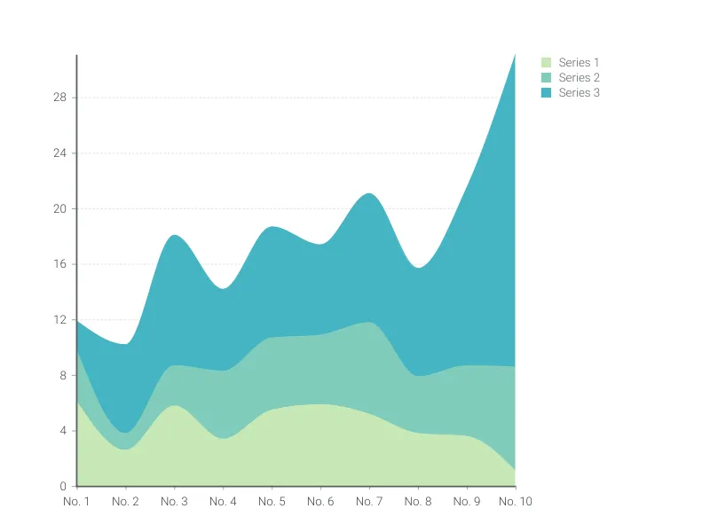
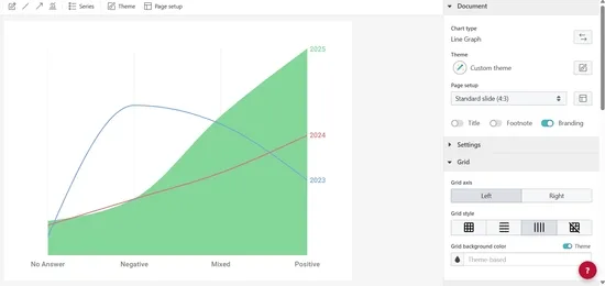
In an area chart, the areas between the horizontal axis and the series’ lines are filled with colors.
Both charts can be used to visualize one single series or to compare multiple series over a category or value scale. This graph maker enables you to choose between them or even combine lines and areas.
Because areas often overlap with each other, they can be more difficult to understand than lines. To minimize this risk and facilitate comprehension, the areas in this plugin are light transparent.
How to make a line or an area chart with Vizzlo?
Making a great-looking line or area graph with Vizzlo is easy:
- On the tab “DATA” of the sidebar, click on the button “SERIES” to name your series. If necessary, add new ones.
- Use the spreadsheet to enter or import your data quickly.
- Before pasting or importing your data into Vizzlo’s spreadsheet, choose the x-axis type (value or category) and make sure the number formats are matching your data source. Click on the “wheel” icons of the columns to match your settings.
- Click on the lines to define their styles.
- Explore the customization options of the tab “APPEARANCE” to choose your display preferences and refine the look of the chart.
Resources
Features
- Multiple series
- Lines or filled areas
- Straight line segments, smoothly interpolated curves or steps
- Optional right y-axis
- Custom x-axis: values (number) or categories (text)
- Adjustable axes and ranges
- Custom number formats
- Optional labeling of individual values
- Optional labeling of closing/end values
- Custom colors and fonts
- Custom gridlines
Line Graph: What's new?
Fixed the symbol size slider glitching.
Fixed an issue where top arrows would clash with value labels in some cases.
You can now configure the handling of gaps in the data. The default is to show a break in the line, but you can also choose to fill the gap with a solid color or a shaded color.
Value labels in the line graph can now be repositioned via drag & drop. They can be brought back to their original position via the right-click context menu.
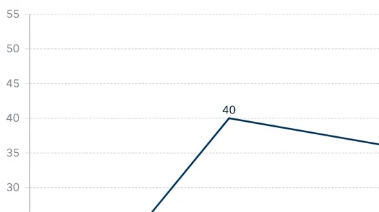
It is now possible to easily mix and match between line, area, stacked area and 100% stacked area series.
Line Graph Alternatives
Enhance your productivity
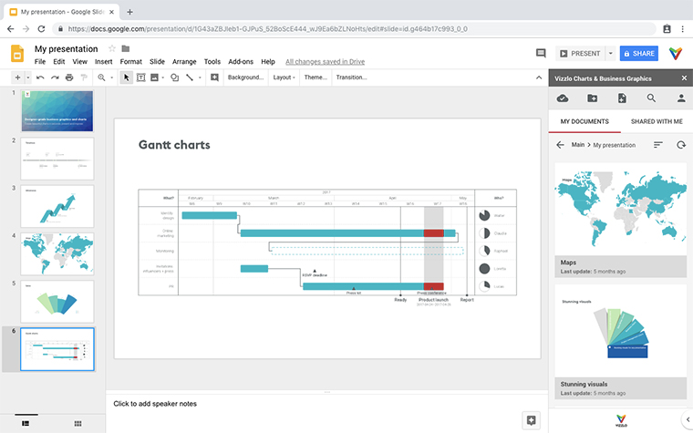
Create a Line Graph directly in the tools you love
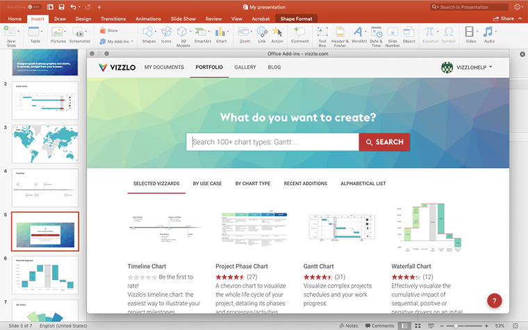
Create a Line Graph in PowerPoint with
Vizzlo's add-in
Loved by professionals around the world


Visualizations your audience won’t forget
Convey abstract concepts and data with professionally designed
charts and graphics you can easily edit and customize.
