Chart Vizzard
Vizzlo's AI-based chart generatorBump Chart
Visualize how items change rank across a series of categories with smooth, connected lines.
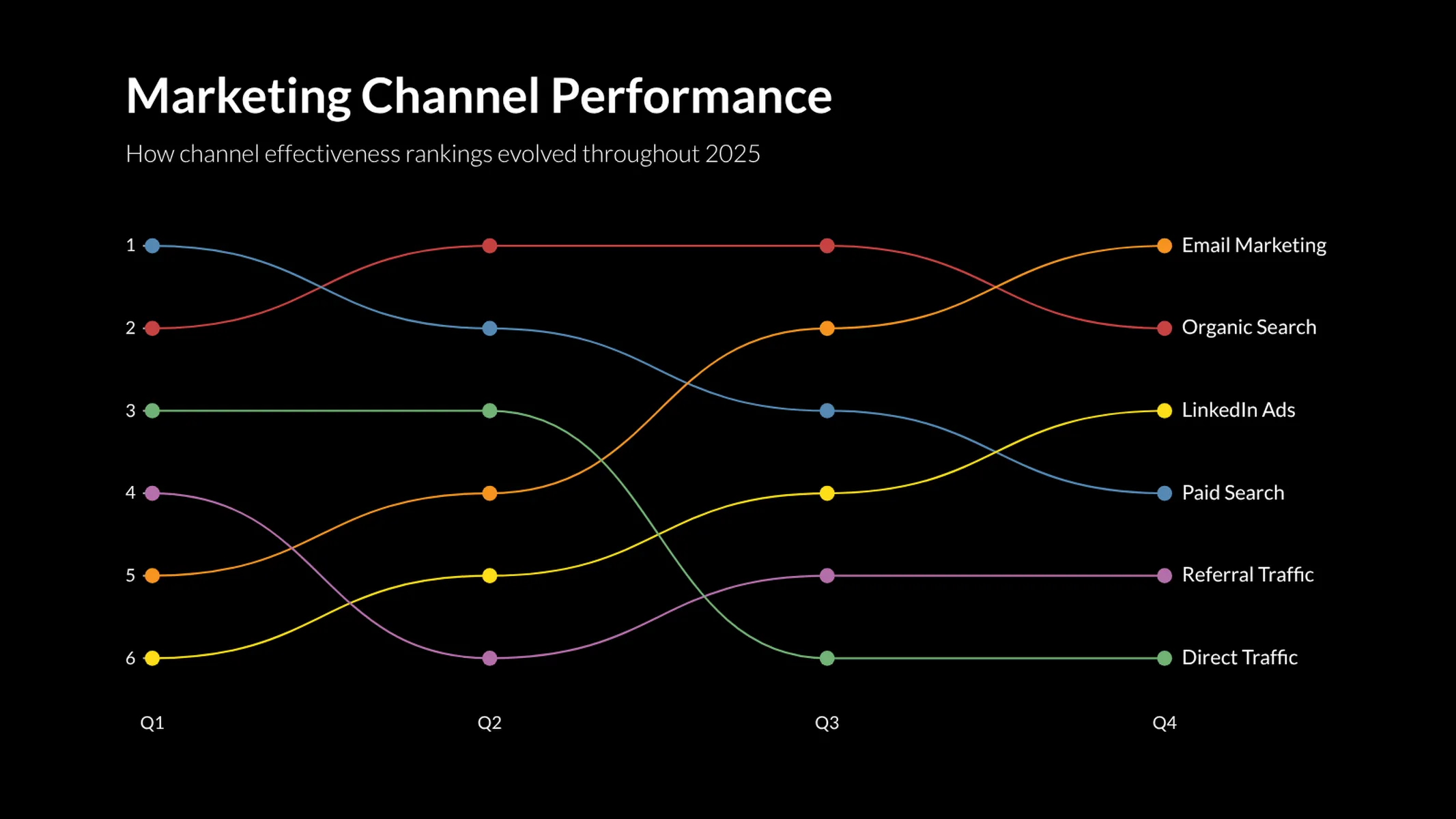

What is a bump chart?
A bump chart visualizes how a set of items moves through a ranking — or any other ordered position — over a series of categories or time periods. Each item is drawn as a smooth, connected line that travels up or down between the category positions, making leaps and falls in the standings instantly recognizable.
Bump charts are particularly effective when the order of items matters more than the absolute values: a sports league table over a season, the world’s largest companies year by year, the relative popularity of products across a product launch cycle, and so on.
Best uses for the bump chart
- Comparing how rankings evolve over time
- Tracking the relative position of competitors
- Showing race-style progressions (“who’s leading?”)
- Highlighting items that rise or fall dramatically
- Visualizing leaderboards with a clear narrative
How to make a bump chart with Vizzlo?
- Use the Categories sidebar control to define the columns of your chart (e.g. years, rounds, weeks).
- Use the spreadsheet to add one row per series. Each row contains the rank — or value — of that series at every category.
- Toggle “Rank 1 at top” if your data uses 1 to mean the best position.
- Pick Smooth lines for the classic curved bump-chart look or switch it off for clean, straight segments.
Bump chart: pro tips
- Bump charts shine with 5 to 12 items. With too many lines they get cluttered — consider grouping or filtering instead.
- Activate the end labels to make every line easy to identify without a separate legend.
- Use distinct colors for the items you want to follow most closely; a neutral gray works well for the others.
Bump chart maker: key features
- Smooth or straight lines between rank positions
- Symbols at every data point for clear emphasis
- Optional labels at the start and end of each line
- Inverted rank axis (rank 1 at top) — toggleable
- Custom colors per series
- Vertical and horizontal layouts
Bump Chart: What's new?
Bump Chart Alternatives
Enhance your productivity
Create a Bump Chart directly in the tools you love

Create a Bump Chart in PowerPoint with
Vizzlo's add-in

Loved by professionals around the world


Visualizations your audience won’t forget
Convey abstract concepts and data with professionally designed
charts and graphics you can easily edit and customize.