Chart Vizzard
Vizzlo's AI-based chart generatorGE-McKinsey Matrix
Visualize a portfolio analysis effectively to help you allocate resources efficiently for a successful business strategy.
What is a GE-McKinsey Matrix?
A GE-McKinsey Matrix is a strategic planning tool used to help an organization for portfolio planning. Use Vizzlo’s GE-McKinsey Matrix to visualize the allocation of resources effectively. Either as an analytical tool in portfolio analysis, brand marketing, product management, or strategic management.
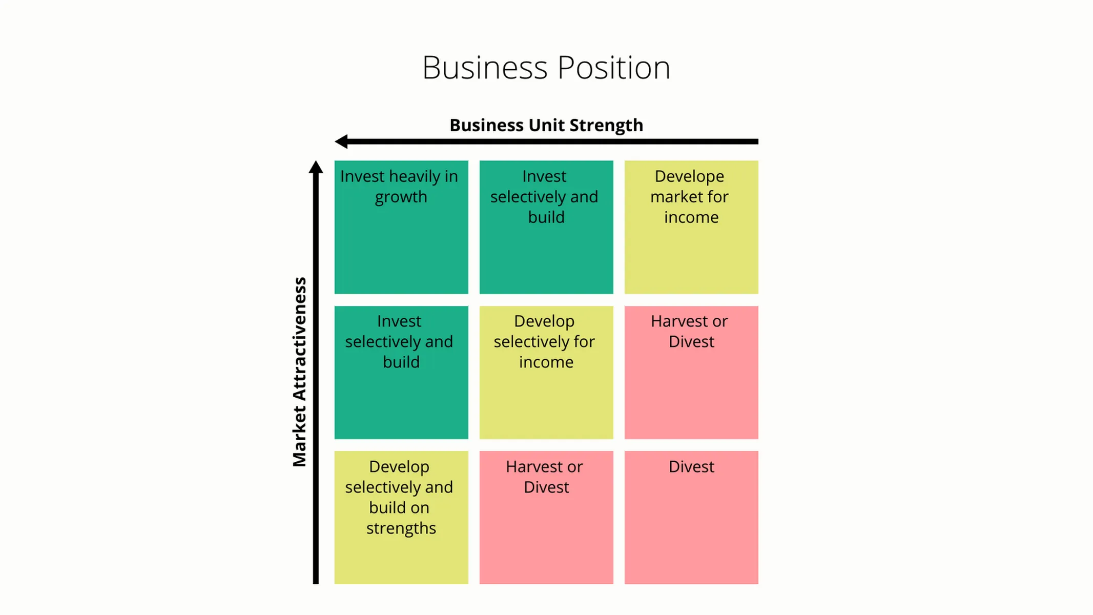
A group of businesses that together make up a company is called a portfolio. These individual businesses are often referred to as Strategic Business Units, or SBUs for short. The aim of a company having a portfolio of products is a balance between cash flows from different product lines. The GE-McKinsey matrix provides a structured means to help you understand where to invest the limited resources of an organization. That is, a GE-McKinsey Matrix serves as a tool to communicate as to which SBUs should receive more or less investment, which SBUs should be added to the portfolio, and which should be divested.
The building blocks of a GE-McKinsey are
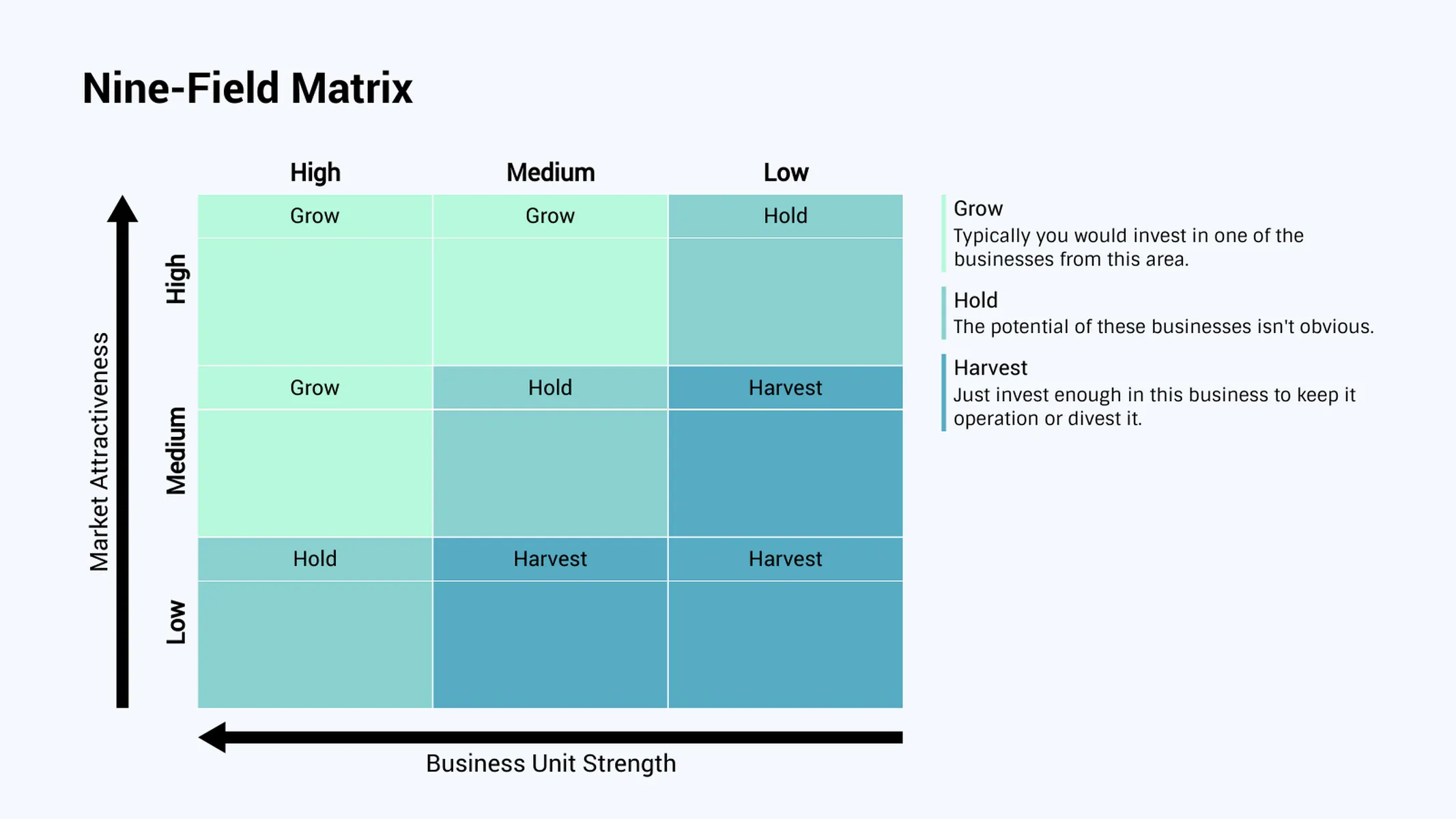
- the strengths of a business unit plotted on the horizontal axis,
- the market attractiveness plotted on the vertical axis, and
- once the SBUs have been plotted on the matrix, use different colors to indicate the three investment options grow, hold, and harvest.
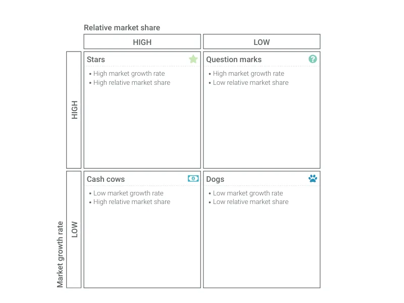
Competitive strengths factors are: total market share, customer loyalty, brand awareness. Factors that influence the market on the other hand are total market size, market share, expectations about the growth rate of a market, etc. Conceptually, a GE-McKinsey Matrix is similar to a BCG matrix, but somewhat more complicated.
A brief history of the GE-McKinsey Matrix
In the 1970s, General Electric hired McKinsey to develop a business analysis tool to analyze their portfolio to make better investment decisions. Hence the name, GE-McKinsey Matrix.
How to make a GE McKinsey Matrix chart with Vizzlo?
- Adjust the layout of the matrix from rectangular to square.
- Show additional information in a legend or column headers.
- Use different styles to highlight the cells of the matrix.
- Change the axes positions from left to right and top to bottom. Or hide the axes completely.
- Add padding between the cells.
- Change colors and adjust fonts.
- Export your work as PDF or PNG.
- Embed the chart into PowerPoint or Google Slides.
GE-McKinsey Matrix maker: key features
- Switch between a square matrix layout and a rectangular layout.
- Add inner padding between the cells.
- Show or hide a legend, row, column, or cell headers.
- Move axes lines from top to bottom or left to right.
GE-McKinsey Matrix: What's new?
Please welcome the GE-McKinsey Matrix in our portfolio 🎉

Features include:
- Switch between a square matrix layout and a rectangular layout.
- Add inner padding between the cells.
- Show or hide a legend, row, column, or cell headers.
- Move axes lines from top to bottom or left to right.
GE-McKinsey Matrix Alternatives
Enhance your productivity
Create a GE-McKinsey Matrix directly in the tools you love
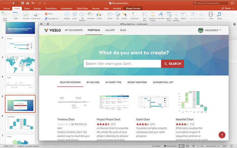
Create a GE-McKinsey Matrix in PowerPoint with
Vizzlo's add-in
Loved by professionals around the world






Visualizations your audience won’t forget
Convey abstract concepts and data with professionally designed
charts and graphics you can easily edit and customize.
