Chart Vizzard
Vizzlo's AI-based chart generatorCreate your Hourglass Chart in seconds
How much time is still left for your project? Visualize it like in the old days.
Create your chart in 3 simple steps
- Create new Hourglass Chart
- Add your data
- Export or share
Why Vizzlo?
- Create professional charts in seconds
- Fully customizable, no design skills needed
- Create directly in PowerPoint & Google Slides
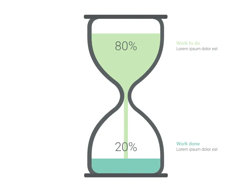
What is an hourglass chart?
The Hourglass Chart provides a compelling visual metaphor for time-based progress, project completion, or any scenario where you need to show the relationship between completed and remaining work. This timeless visualization uses the familiar hourglass symbol to create an immediate understanding of progress and remaining effort.
Key Features
- Time metaphor: Classic hourglass design instantly communicates temporal concepts
- Progress visualization: Adjustable ratio shows completed vs. remaining work
- Dual labeling: Separate titles and descriptions for both completed and remaining portions
- Interactive adjustment: Slide to modify the completion ratio dynamically
- Value formatting: Comprehensive number formatting options with customizable display
Best Use Cases
- Project management: Show how much work is completed vs. remaining
- Time tracking: Visualize elapsed time against total project duration
- Resource utilization: Display consumed vs. available resources
- Budget tracking: Show spent vs. remaining budget allocation
- Goal progress: Track advancement toward objectives or targets
- Process completion: Monitor manufacturing, development, or operational progress
Configuration Options
Customize your hourglass visualization with detailed controls:
- Completion ratio: Slider control to set the percentage of work completed (0-100%)
- Top section: Title and description for the remaining/incomplete portion
- Bottom section: Title and description for the completed/finished portion
- Value formatting: Precision, decimal marks, separators, prefix/suffix options
- Font scaling: Option to scale value text for better visual hierarchy
Visual Design Philosophy
The hourglass metaphor effectively communicates several important concepts:
- Time passage: Sand flowing from top to bottom represents natural progression
- Finite resources: Fixed total amount emphasizes resource constraints
- Urgency: Visual reminder that time or resources are limited
- Progress: Clear visual indicator of how much has been accomplished
- Momentum: Flowing sand suggests ongoing activity and progress
Data Representation
The hourglass uses a simple but powerful ratio system:
- Top portion: Represents remaining work, time, or resources
- Bottom portion: Shows completed work or consumed resources
- Ratio control: Percentage slider for precise progress indication
This visualization is particularly effective in presentations where you need to create urgency around deadlines or emphasize the finite nature of resources while clearly showing current progress levels.
Hourglass Chart: What's new?
Hourglass Chart Alternatives
Enhance your productivity
Create a Hourglass Chart directly in the tools you love

Create a Hourglass Chart in PowerPoint with
Vizzlo's add-in

Loved by professionals around the world


Visualizations your audience won’t forget
Convey abstract concepts and data with professionally designed
charts and graphics you can easily edit and customize.