Chart Vizzard
Vizzlo's AI-based chart generatorMake beautiful pie charts
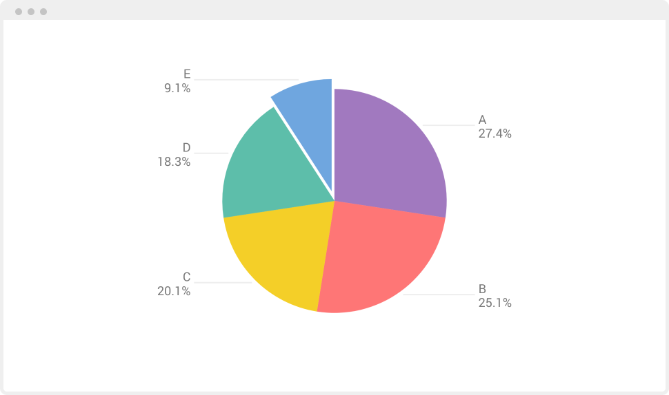


How to make a pie chart?
Create a pie chart in minutes with Vizzlo's free pie chart maker.
- Browse Vizzlo’s portfolio and search for ‘pie’
- To use the pie chart maker, create a new pie chart
- Add your data, either by copy’n’paste or by importing an Excel, CSV or Google sheet
- Customize colors, fonts, backgrounds and more
- Export as PDF and PNG, or embed in PowerPoint and Google Slides
Pie chart maker key features
Color your pie chart slice by slice, add a legend, label your pie chart, and more with Vizzlo’s pie chart generator.
Add your data easily
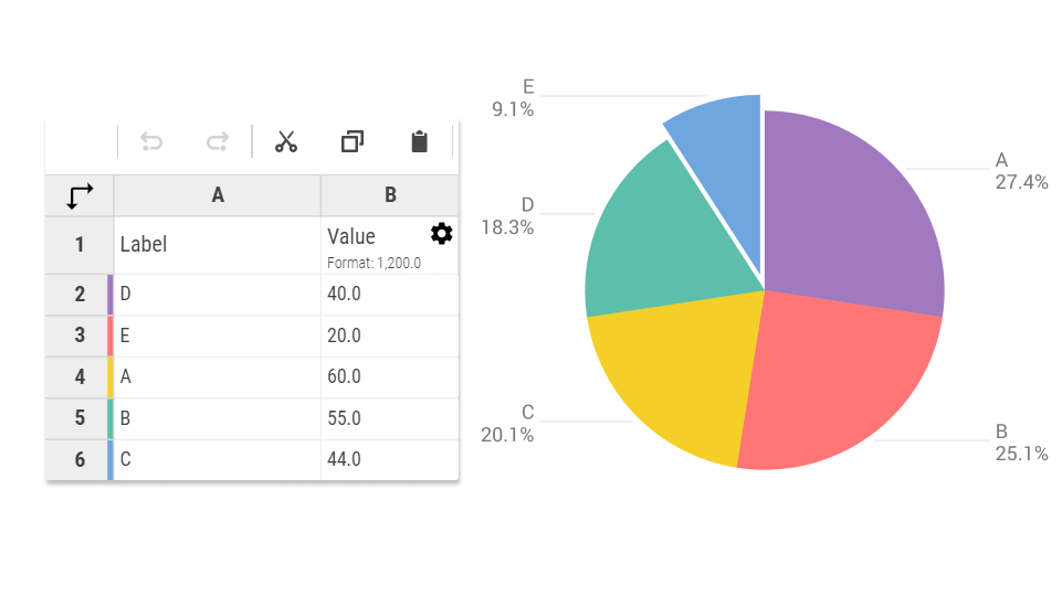
Change colors with a few clicks
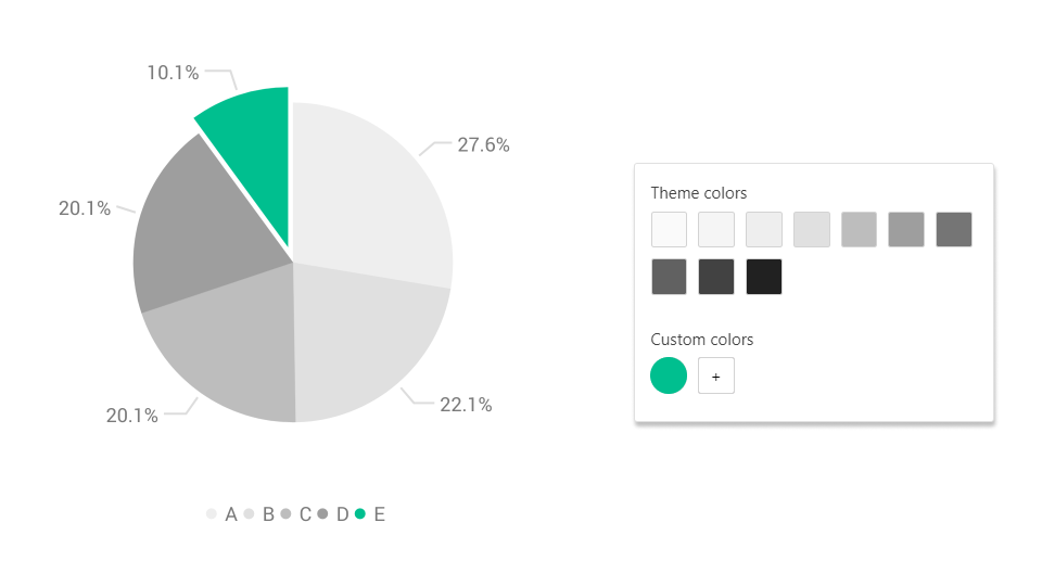
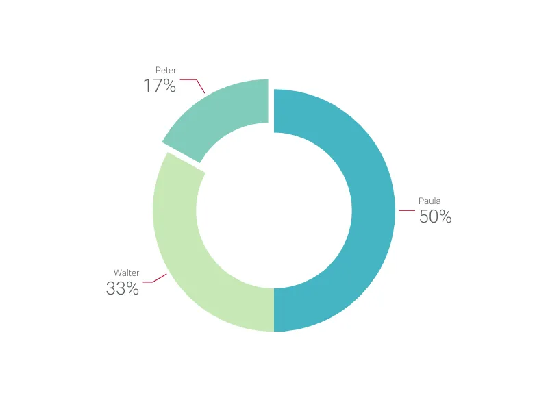
Turn your pie into a donut
What is a pie chart?
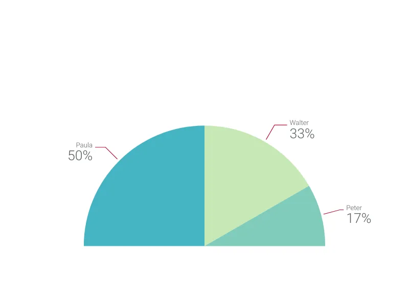
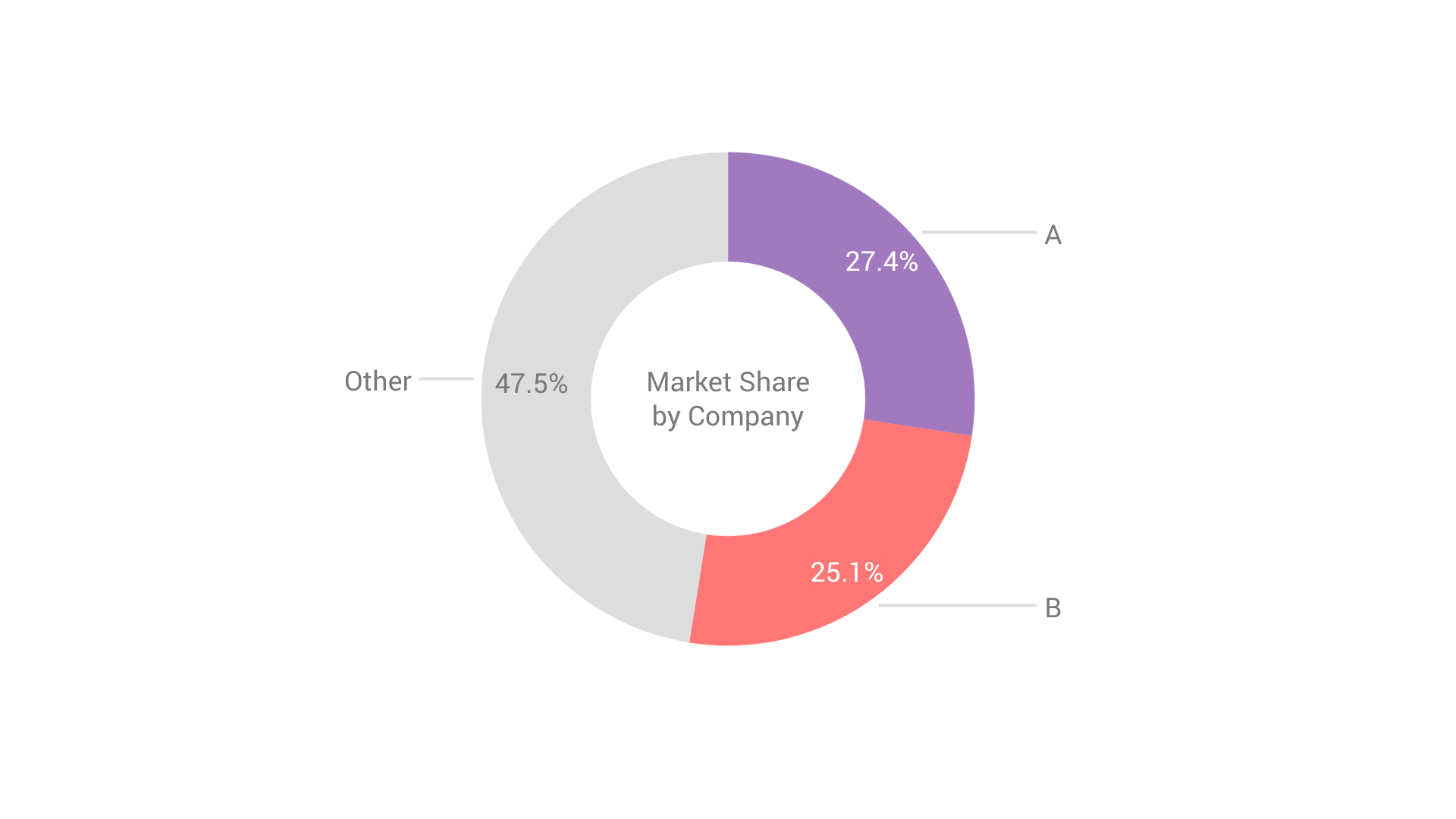
A pie chart is a circular chart that resembles a pie. It is divided into slices to illustrate numerical proportions. The size of each slice is relative to its portion of the whole. A pie chart always represents 100%. Pie charts work best for 6 slices or fewer otherwise, they become hard to read and understand. Like any data visualization, a pie chart should give information at a glance.
A donut chart, or doughnut chart, is an alternative of the pie chart, with a blank circle in the center, allowing for an additional label to be included. Just like a pie chart, a donut chart shows proportions. You can use both interchangeably. Pie charts and donut charts are widely used in business presentations and reports.
Try the only pie chart maker that works in PowerPoint and Google Slides
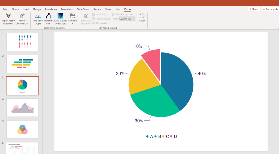
in PowerPoint with the Vizzlo add-in

Learn more about our PowerPoint pie chart maker
Insert and update your charts quickly
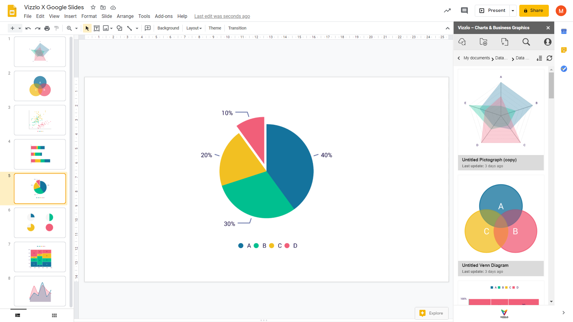
from within Google Slides
Learn more about our Google Slides pie chart maker
