Chart Vizzard
Vizzlo's AI-based chart generatorGrouped Bar Chart
Use a grouped bar chart to compare the same categories within different groups.
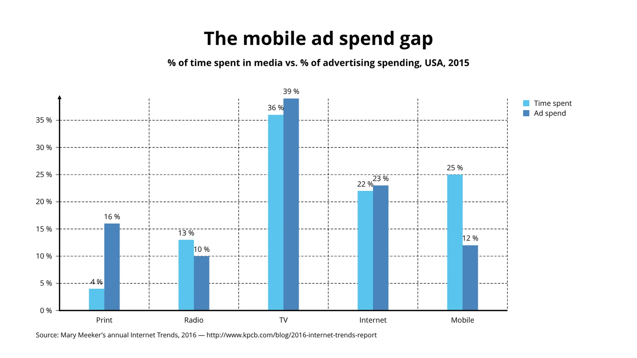
What is a grouped bar chart?
A grouped bar chart, also known as clustered bar graph, multi-set bar chart, or grouped column chart, is a type of bar graph that is used to represent and compare different categories of two or more groups.
Because the categories are grouped and arranged side-by-side, the bar clusters make easy to interpret the differences inside a group, and even between the same category across groups.
Best uses for the grouped bar chart
- Showing the changes in set categories over time, location or sector
- Comparing financial data–for example sales, costs and revenue–across different groups
- Evaluating the performance of a series of marketing projects in contrast to one another
How to make a grouped bar chart with Vizzlo?
Make a grouped bar chart following these easy steps:
- On the tab “DATA” of the sidebar, click on the button “CATEGORIES” to name them
- Then select a group on the chart to edit it using the active cards on the sidebar
- You can also use Vizzlo’s spreadsheet to enter your data more efficiently. Just copy and paste it from your source
- Finally, try the customization options of the tab “APPEARANCE” to choose your preferences regarding the axes, grid, and colors
Grouped bar chart: pro tips
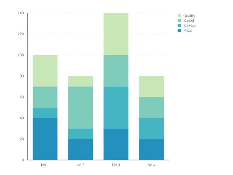
- If there is a part-to-the whole relationship or if you want to emphasize the comparison among the total sum of the groups, consider creating a stacked bar chart.
- Color coding is essential with this chart, so make sure the shades you use are easily distinct from one another and clearly labelled in the legend
- Long category names often work better with a horizontal bar chart, alternatively, you can click the layout–switch easily with the check box on the “APPEARANCE” tab
- One huge value number can dwarf the rest of the bars, so try using the “Scale break” function to re-balance the visuals (but only use this if absolutely necessary, as it can make your chart appear misleading)
- On the “APPEARANCE” tab, you can select the “Custom group width” checkbox to edit the design of your chart further
Grouped bar chart maker: key features
- Multiple series
- Vertical and horizontal views
- Custom number formats and colors
- Custom group width
- Custom axes and grid
- Optional labeling of individual values
- Adjustable min/max values for y-axis
- Scale break
Resources
- Data Viz Guide: What is a bar chart?
Grouped Bar Chart: What's new?
It is now possible to seamlessly switch between grouped and stacked series—no need to convert into a different chart type anymore.
Showing or hiding values for individual series now works properly again.
Connecting a chart with top arrows to an external spreadsheet now works properly again.
Value labels are now drawn above other elements.
Value labels now appear with the correct font size.
Grouped Bar Chart Alternatives
Enhance your productivity
Create a Grouped Bar Chart directly in the tools you love

Create a Grouped Bar Chart in PowerPoint with
Vizzlo's add-in

Loved by professionals around the world


Visualizations your audience won’t forget
Convey abstract concepts and data with professionally designed
charts and graphics you can easily edit and customize.