Chart Vizzard
Vizzlo's AI-based chart generatorRadial Bar Chart
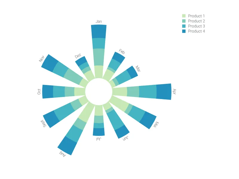
This modified bar chart with its circular shape is as stylish as possible for your next presentation.
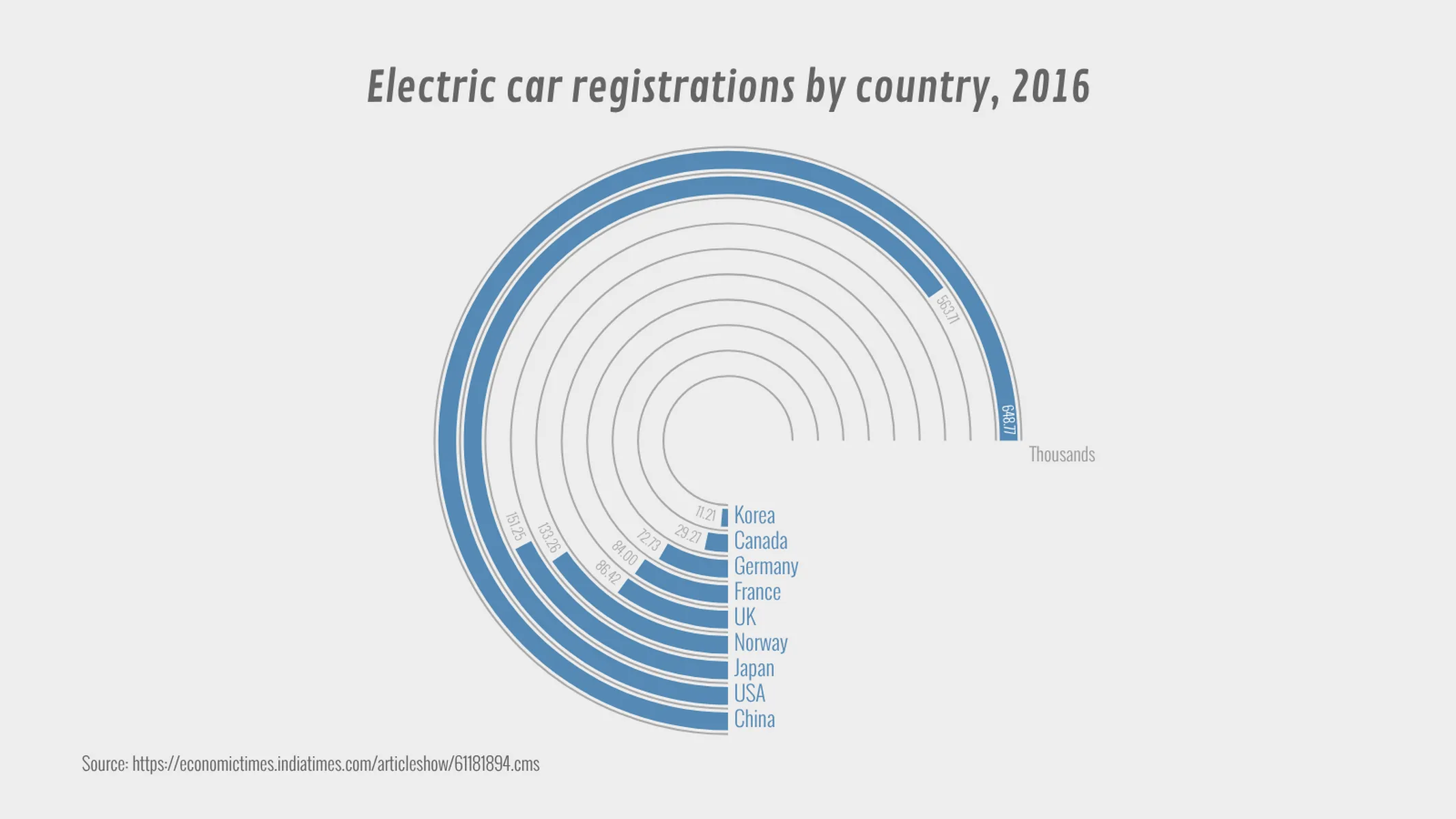
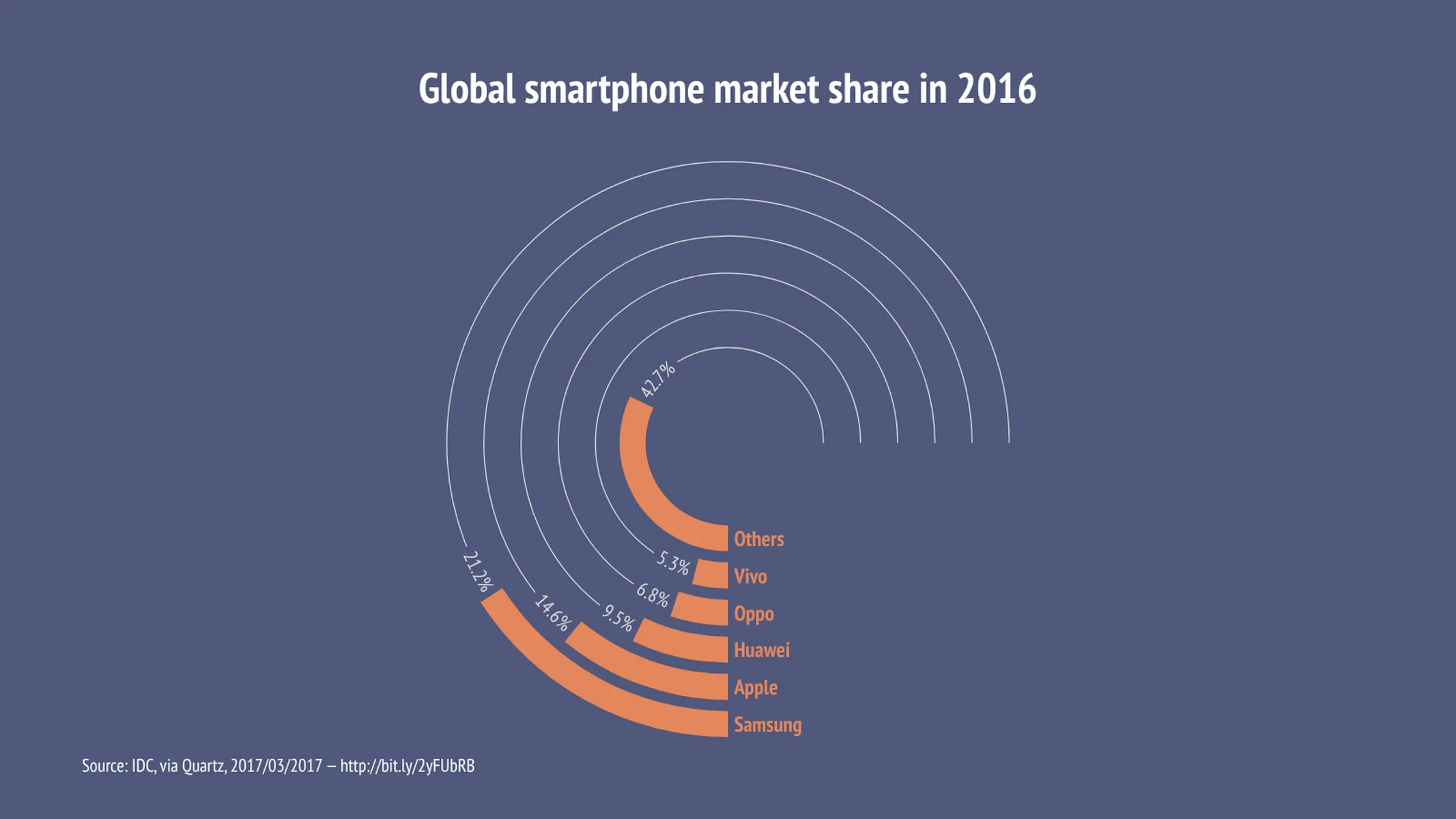
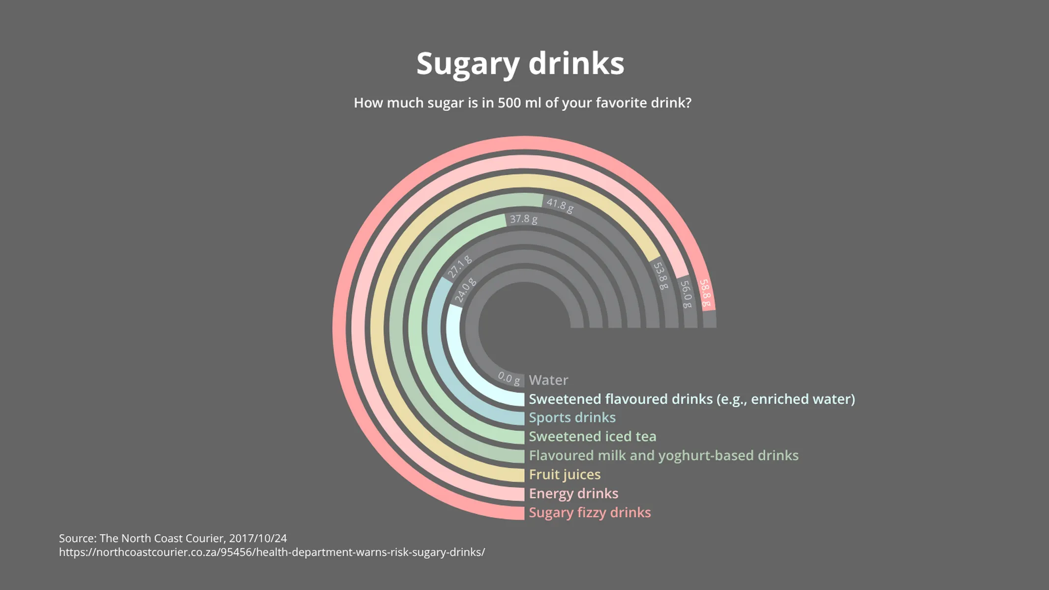
What is a radial bar chart?
A radial bar chart, also called circular bar chart, is a bar chart plotted in polar coordinates (instead of a Cartesian plane).
Because of its circular shape, this type of bar chart is eye-catching but is often not as easy to interpret as a regular bar chart. Because the bars are plotted on different radial points of the polar axis, they have different perimeters and cannot be compared by their lengths.
In this plugin, we’ve included many features to help you create a compelling and easy-to-read radial bar chart. Opt to show or hide values, axes, and grids and organize the bars by their values.
How to make a radial bar chart with Vizzlo?
Create a dazzling radial bar chart online, in seconds! Follow these easy steps:
- Click on the bars to start editing them.
- Use their respective cards in the sidebar as a support to change values, labels, and colors.
- Alternatively, click on the button “EDIT DATA IN SPREADSHEET” to copy and paste your data with ease.
- Adjust the number format clicking on the “wheel icons” in the active cards or the spreadsheet. Or, in the “APPEARANCE” tab, click on the drop-down menu “Value” to set your preferences.
- Explore all the customization possibilities in the “APPEARANCE” tab to choose your layout settings and customize themes.
Radial bar chart: key features
- Custom number formats and colors
- Custom axes and grid
- Custom ring styles
- Optional labeling of individual values
- Optional sorting by value
Radial Bar Chart: What's new?
Easier number formatting through some changes in the user interface. Showing and hiding values is possible in the same place as you format them.
Radial Bar Chart Alternatives
Enhance your productivity
Create a Radial Bar Chart directly in the tools you love

Create a Radial Bar Chart in PowerPoint with
Vizzlo's add-in

Loved by professionals around the world


Visualizations your audience won’t forget
Convey abstract concepts and data with professionally designed
charts and graphics you can easily edit and customize.