Chart Vizzard
Vizzlo's AI-based chart generatorScatter Plot
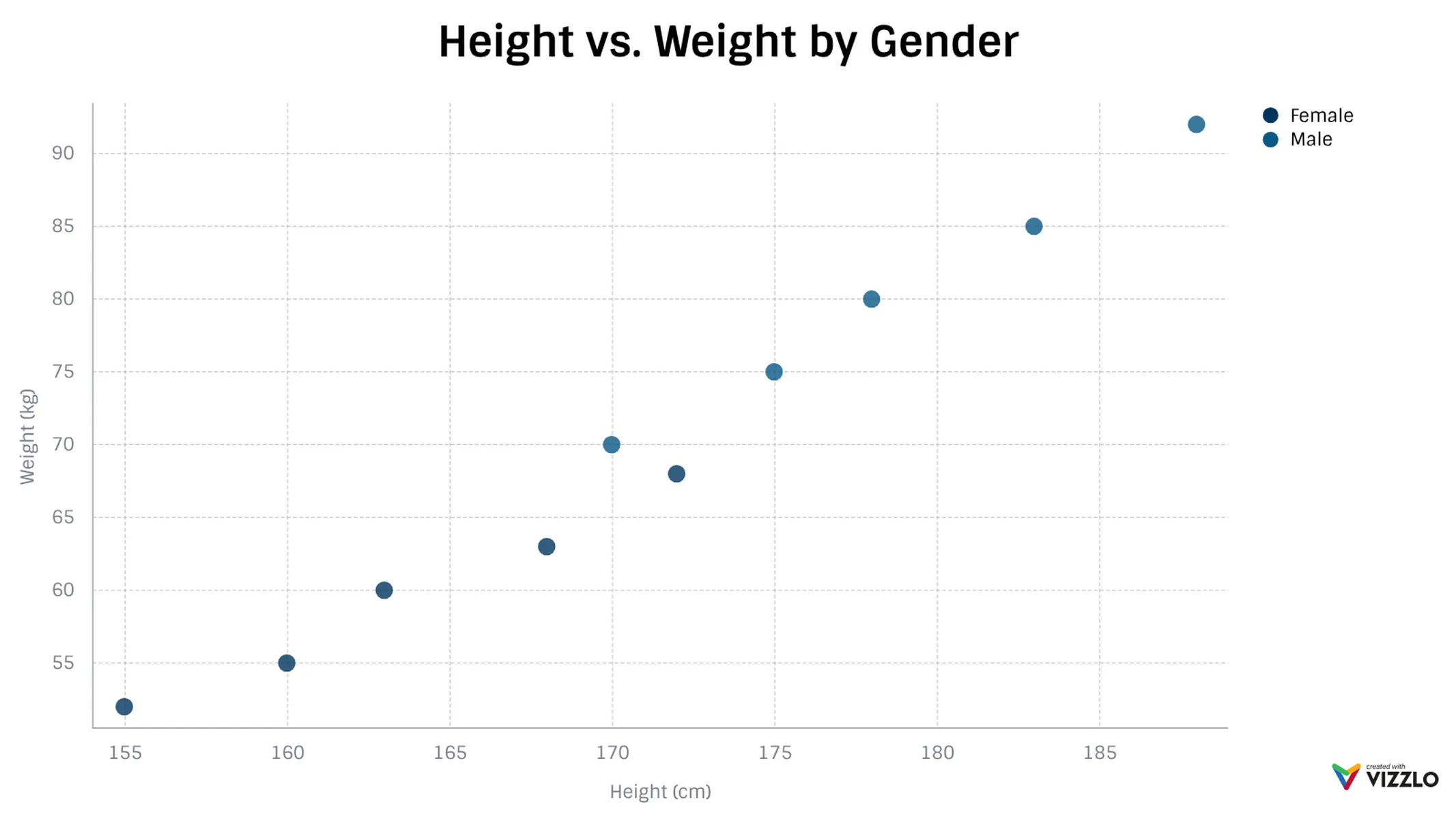
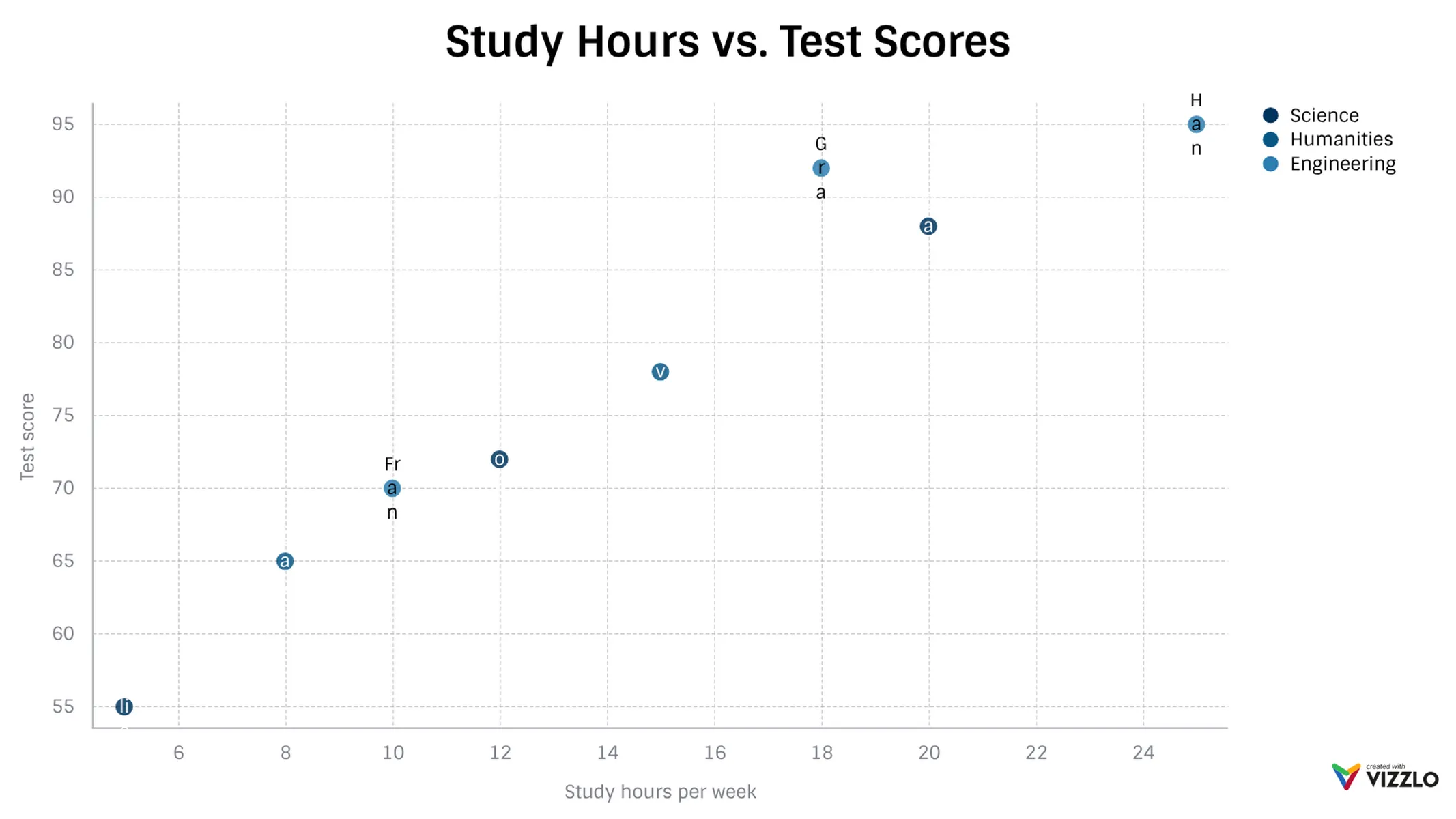
A scatter plot for visualizing correlations and relationships between two variables across multiple groups.
What is a scatter plot?
A scatter plot (or scatter chart) displays the relationship between two quantitative variables by placing data points on a two-dimensional grid. Each point represents an observation, with its position determined by the values of the two variables. Scatter plots are one of the most effective ways to reveal correlations, clusters, and outliers in your data.
How to make a scatter plot with Vizzlo?
Create a professional scatter plot to visualize your data:
- Use the spreadsheet to enter your X and Y values for each data point. Read our help center article on how to get your data into Vizzlo.
- Assign each data point to a group using the “Category” column to color-code your observations.
- Explore the customization options in the sidebar to adjust axes, labels, and colors.
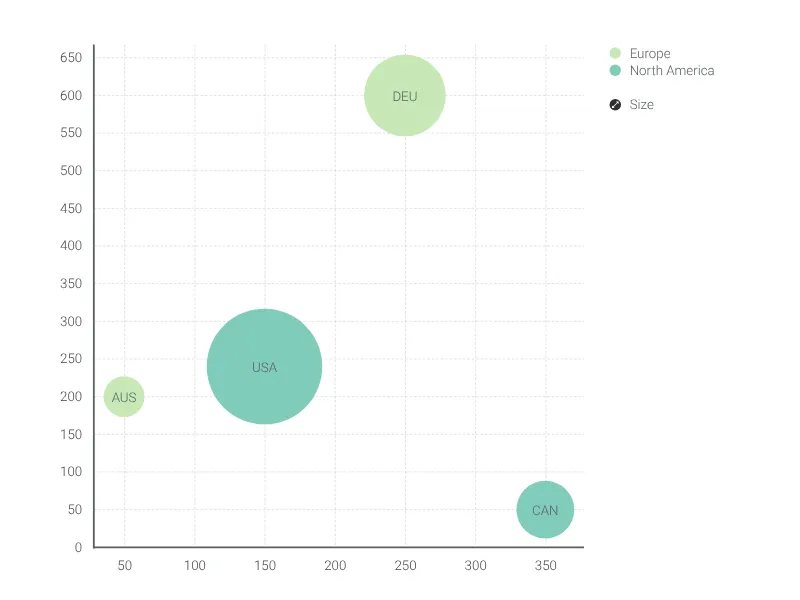
- Need variable-sized dots? Switch to the Bubble Chart for an additional data dimension.
Scatter plot maker: key features
- Plot two quantitative variables against each other
- Color-code data points by category or group
- Switch between linear and logarithmic scales
- Show or hide axis and grid lines
- Adjustable minimum and maximum values for X and Y axes
- Custom number formats and colors
- Optional legend for categories/groups
- Add labels to individual data points
Best uses for scatter plots
- Explore the correlation between two variables
- Identify clusters and outliers in your data
- Compare multiple groups within the same coordinate space
- Visualize distributions of paired measurements
Scatter Plot: What's new?
Visualize correlations, patterns and trends with the new scatter plot chart type!
Scatter Plot Alternatives
Enhance your productivity
Create a Scatter Plot directly in the tools you love

Create a Scatter Plot in PowerPoint with
Vizzlo's add-in

Loved by professionals around the world


Visualizations your audience won’t forget
Convey abstract concepts and data with professionally designed
charts and graphics you can easily edit and customize.