Chart Vizzard
Vizzlo's AI-based chart generatorSemantic Differential Scale
Easily visualize the connotative meaning of products and services.
What is a semantic differential scale?
The semantic differential scale measures individual perceptions, including feelings and ideas towards the research topic.
This scale was developed by the American psychologist Charles E. Osgood in the 1940s and ‘50s to grasp or rather determine the affective/connotative meaning connected with words, objects, and even people. Osgood’s framework to measure connotative meaning established bipolar adjectives scales to rate and systematize these perceptions within three dimensions, commonly referred to as EPA:
- Evaluation (e.g., good–bad, safe–dangerous)
- Potency (high–low, strong–weak)
- Activity (fast–slow, active–passive)
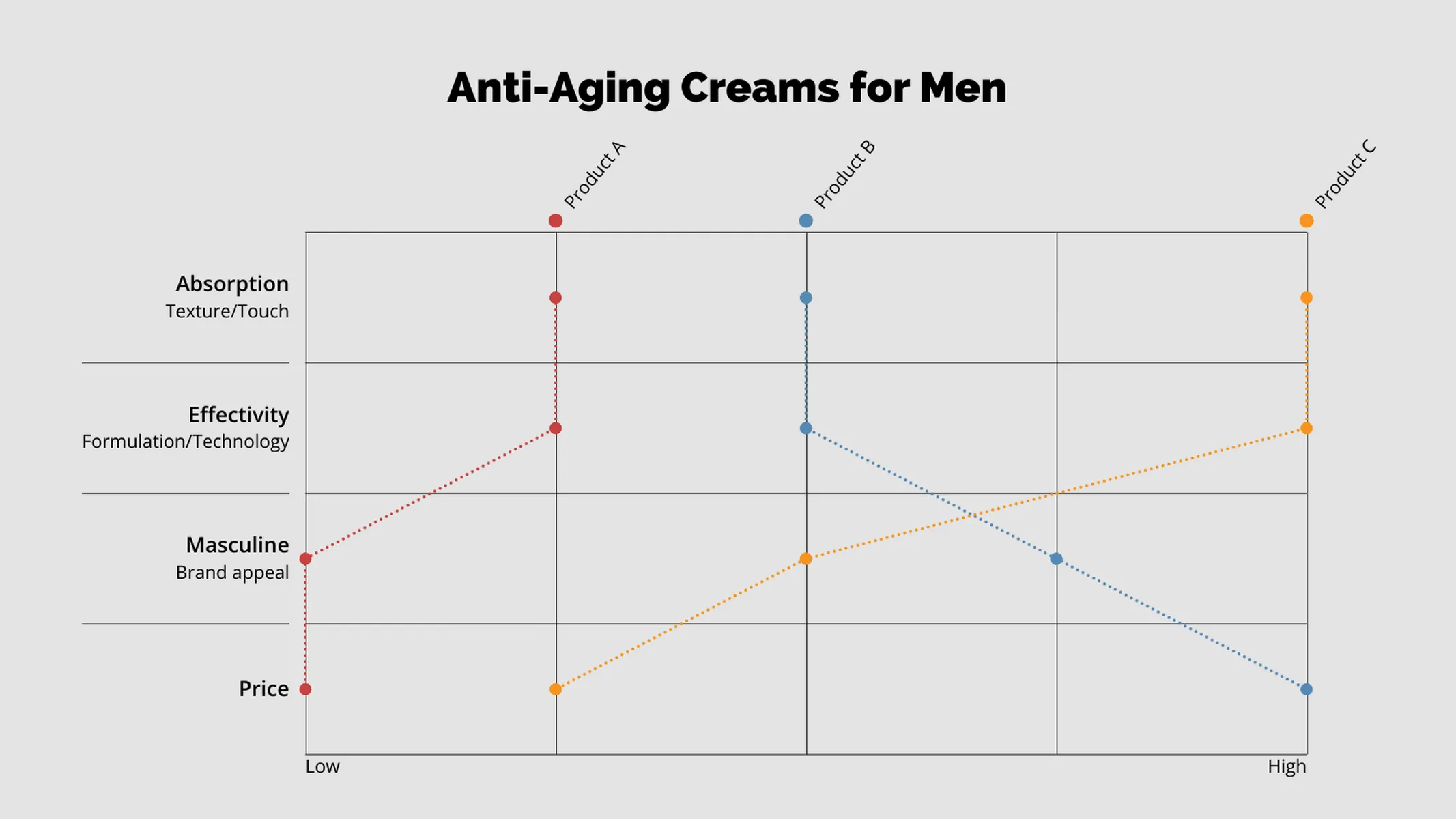
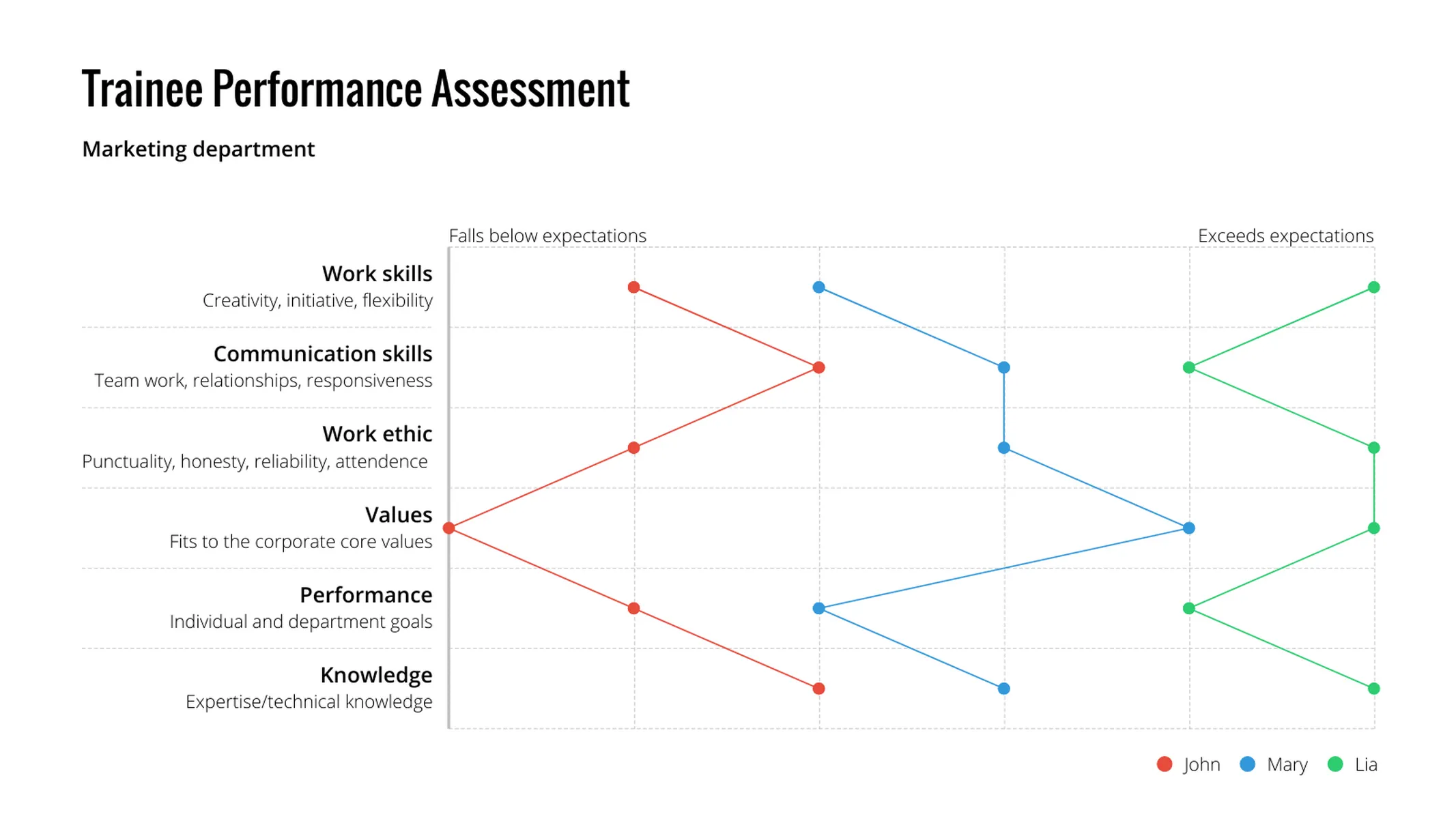
Refer to the first example in the gallery (Anti-Aging Creams for Men), this qualitative method is very common in marketing and customer satisfaction research, consumer behavior, branding, and design assessments; as well as in different kinds of opinion surveys and other questionnaires.
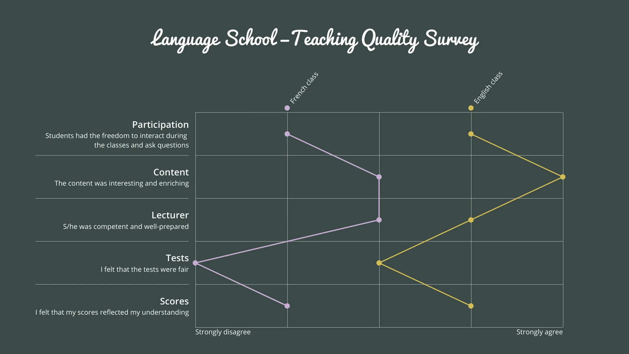
The Likert scale (named after psychologist Rensis Likert) is often used for similar purposes. It’s also a bipolar scale, usually applied with five or seven scores. In the Likert scale, survey participants are asked how far they agree or disagree with a given statement.
The semantic differential scale chart is the graphic representation of the rating scorings within the bipolar scales. Different visualization types, like tables and stacked bars, are useful to analyze data with concrete numbers–known as discrete values–but some values (like feelings) cannot be accurately given numerical values as the distance between them is impossible to know. These are known as ordinal values.
This is where the semantic differential scale chart comes in! Its plots reflect the meaning attributed to your product or service by the reviewer, unveiling predominant attitudes towards it while highlighting strengths and weaknesses.
Best uses for the semantic differential scale
- Market research
- Aggregating psychological evaluations
- Visualizing the overall positivity/negativity of written data, e.g. film reviews
- Consumer feedback
- Sales and marketing
- Academic research
How to make a semantic differential scale with Vizzlo?
Regardless if you’re working with the semantic differential scale or with the Likert scale, results of both rating scales can be plotted using this highly versatile vizzard.
Follow these easy steps:
- Click on any element to start editing it
- Quickly enter your data using Vizzlo’s spreadsheet (tab “DATA”) or click on the axis’ categories and fill the data using their active cards.
- Click on the series to edit their styles
- Drag and drop categories and the series plots
- Customize your chart using the options of the “APPEARANCE” tab: customize your theme by selecting colors and fonts, choose to show and hide the grid, position the axis poles above or below the grid, opt to snap the plots to the raster and much more
Semantic differential scale: pro tips
- Clarify your scale with an additional “Antonym column” in the “APPEARANCE” tab
- Maximise your use of space with the “Integrated legend” function
Semantic differential scale maker: key features
- Axis categories with titles and descriptions
- Custom series styles
- Custom position of the axis poles
- Optional separators
- Optional snapping to raster
Resources
- For a full run-through of the scientific and mathematical possibilities of the semantic differential scale chart, see this resource from Science Direct
Semantic Differential Scale: What's new?
All the charts that support symbols now have the same settings and styles available.
Semantic Differential Scale Alternatives
Enhance your productivity
Create a Semantic Differential Scale directly in the tools you love
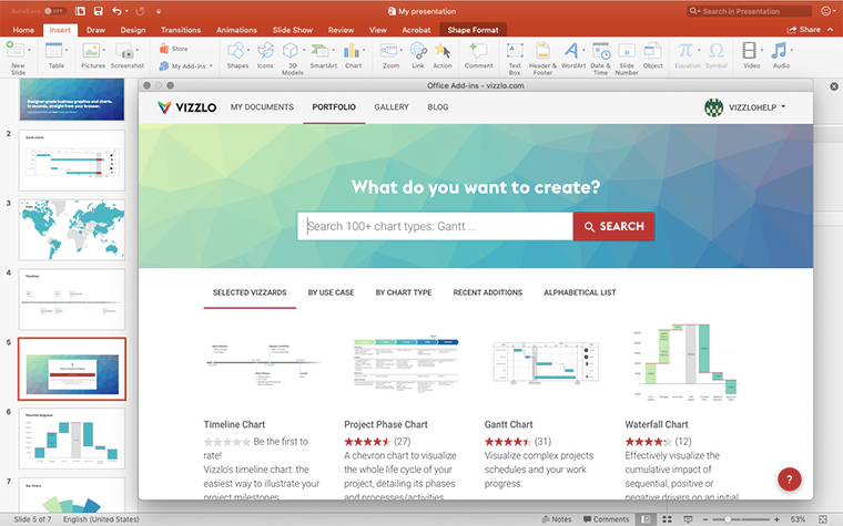
Create a Semantic Differential Scale in PowerPoint with
Vizzlo's add-in
Loved by professionals around the world


Visualizations your audience won’t forget
Convey abstract concepts and data with professionally designed
charts and graphics you can easily edit and customize.
