Chart Vizzard
Vizzlo's AI-based chart generatorStacked Bar Chart
Highlight the part-to-whole relationships of categories and compare various groups with this stacked bar graph.
What is a stacked bar chart?
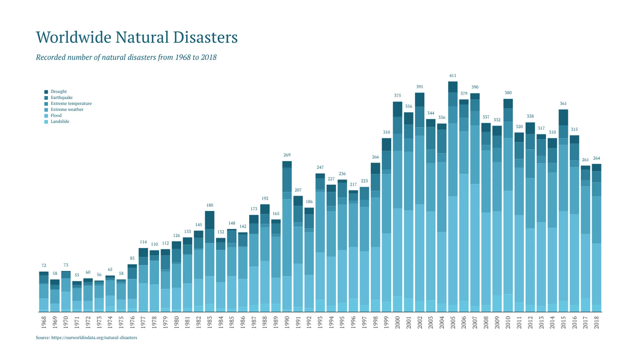
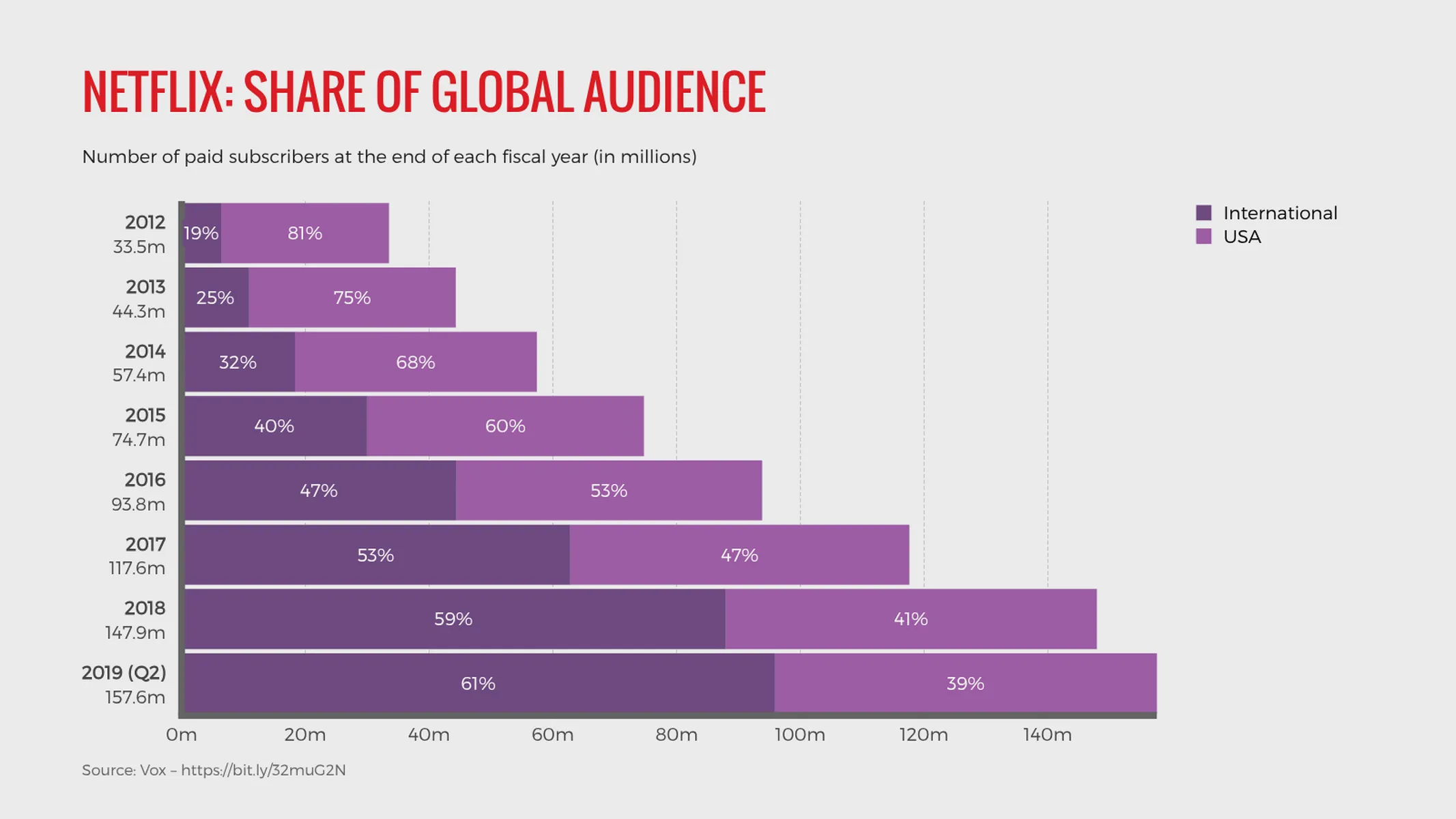
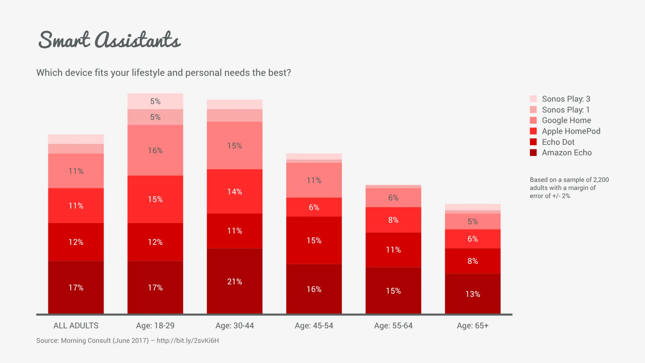
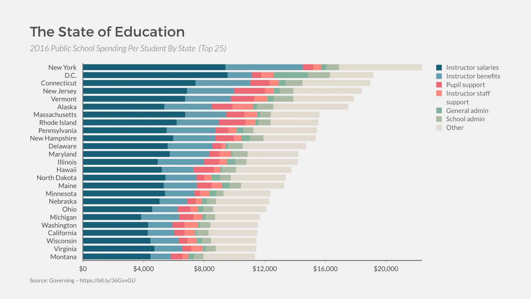
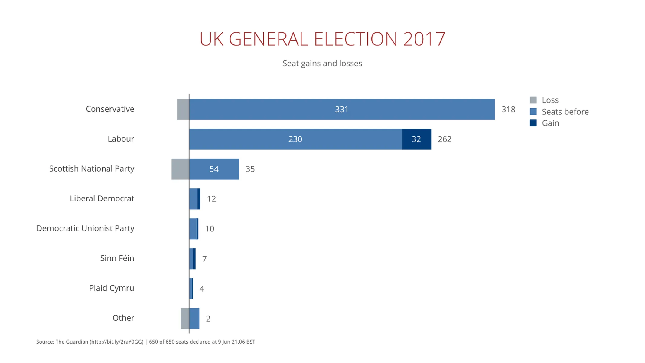
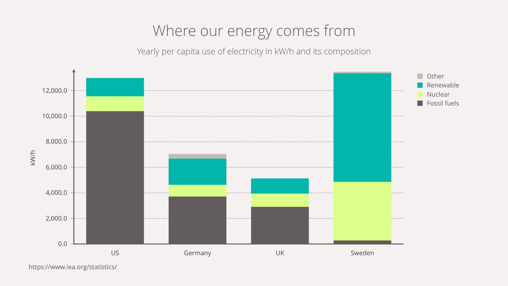
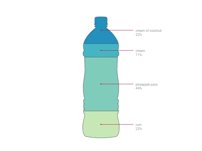
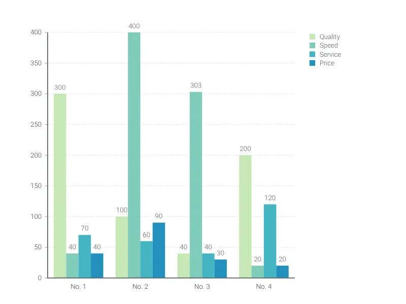
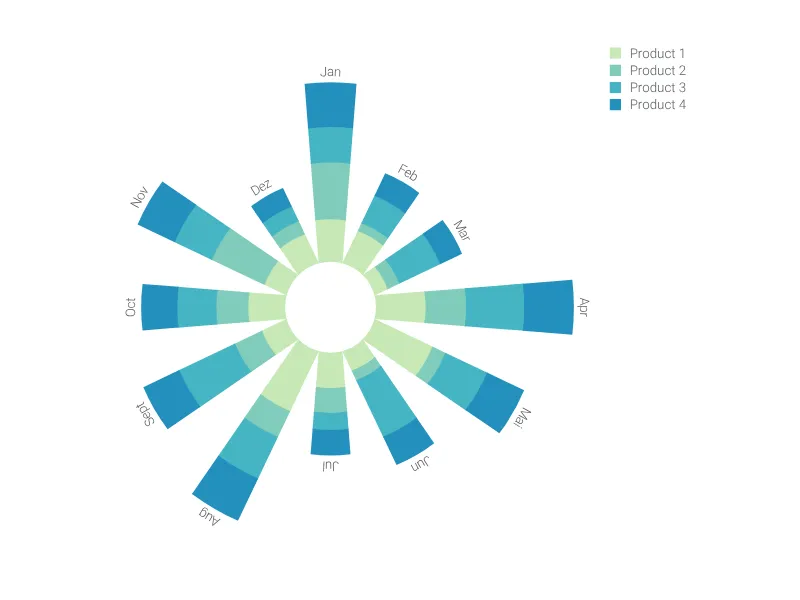
A stacked bar chart displays a part-to-whole relationship among categories within various groups. The columns representing the groups are divided into smaller segments, making the proportions and relationship of the categories to each group explicit.
Because the bars visually aggregate all categories, this graph is ideal for highlighting sharp differences of composition, and is particularly useful to compare the total values across groups of data.
The stacked bar chart is widely used in financial reports and other corporate settings to show proportions as well as absolute values, this can be particularly interesting if you want to compare different departments, or visualize growth and its different factors.
Best uses for the stacked bar chart
- Exploring the key factors that contributed to an overall result
- Breaking down total sales figures into component parts (it is much easier to read the sum value of a stacked bar chart series than a grouped bar chart group)
- Large data sets that would be overloaded and cluttered as a grouped bar chart or line series
How to make a stacked bar chart with Vizzlo?
Make a sophisticated stacked bar chart with ease:
- On the “DATA” tab of the sidebar, click on the “CATEGORIES” button to name your series and define their colors
- Then select a column to edit it using the active cards on the sidebar; or use the spreadsheet to quickly enter your data
- Finally, explore the customization options of the “APPEARANCE” tab to choose your display preferences
Stacked bar chart: pro tips
- For long category names, consider switching the layout to a Horizontal chart (you can select this quickly in the “APPEARANCE” tab)
- If you have one value that is much larger than the rest, try using the “Scale break” function (under the “Y-axis” menu) to give the smaller values more visibility–but remember that this distorts the information, so use it wisely!
- Add or subtract “Sum values” (the total value of each category), “Individual values” (the value of each segment within the category), or “Minor values” (tiny segments in comparison to the rest) to illustrate your point–the general rule for pro charts is ‘less is more’, so only add what is necessary to communicate your point
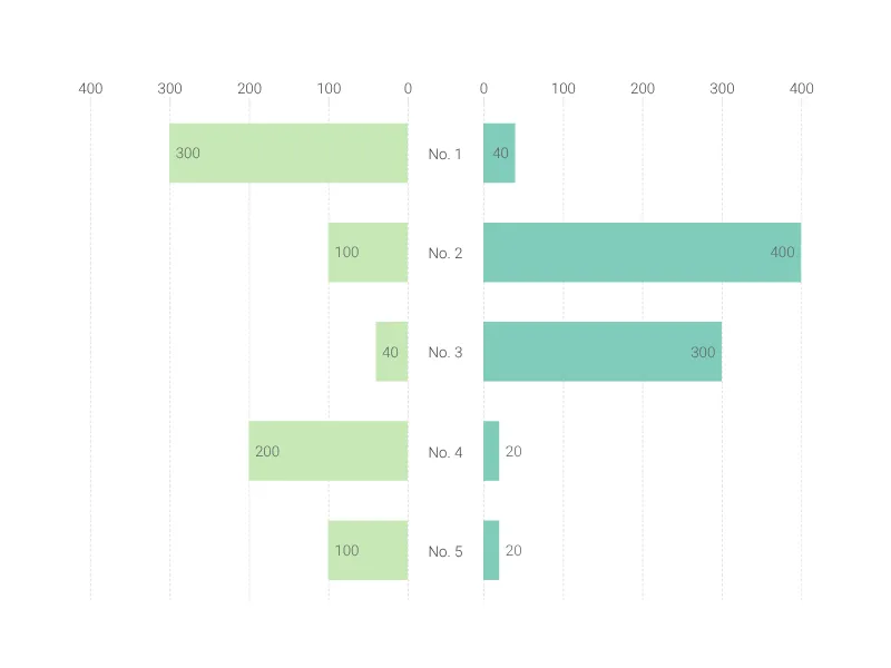
- If there is no part-to-the whole relationship or if you want to emphasize the comparison of the individual categories, consider creating a grouped bar chart
Stacked bar chart maker: key features
- Multiple series
- Vertical and horizontal views
- Custom number formats and colors
- Custom axes and grid
- Optional labeling of individual and sum values
- Adjustable min/max values for y-axis
- Scale break
Resources
- Data Viz Guide: What is a bar chart?
- Wikipedia: Bar chart, Section “Grouped or stacked”
- Data Visualisation Catalogue: Stacked Bar Graph
Stacked Bar Chart: What's new?
It is now possible to seamlessly switch between grouped and stacked series—no need to convert into a different chart type anymore.
Projections are now available.
Position rendering for top arrows now works properly again.
Sum value label positioning is now responsive to individual value labels.
Toggling off the legend now works properly again.
Editing values & the sidebar inputs for side labels now work properly again.
Stacked Bar Chart Alternatives
Use Cases
Bar & Column chartsEnhance your productivity
Create a Stacked Bar Chart directly in the tools you love

Create a Stacked Bar Chart in PowerPoint with
Vizzlo's add-in

Loved by professionals around the world


Visualizations your audience won’t forget
Convey abstract concepts and data with professionally designed
charts and graphics you can easily edit and customize.