Chart Vizzard
Vizzlo's AI-based chart generatorHow to Create a Bar Chart in Excel for Office 365
There are many tools available to create bar charts, one of which is Vizzlo. For many, however, Excel is the bar chart maker of choice. In this step-by-step bar chart tutorial we will show you how to create a bar chart in Excel for Office 365. Before start making a bar chart, let us see what a bar chart actually is.
What is a bar chart?
Typical applications are the sales figures of a product over the years, medal table at the Olympic Games for participating countries, or the growth rate of GDP per quarter and so on. In each of these examples, it is a matter of visualizing a figure for different categories (i.e. years, countries, quarters), which is often done using bars. The length of the bars is proportional to the numerical values associated with each category. The bars can be placed either vertically or horizontally. This type of chart is also known as a bar chart, bar plot, or column chart.
How to make a bar chart in Excel
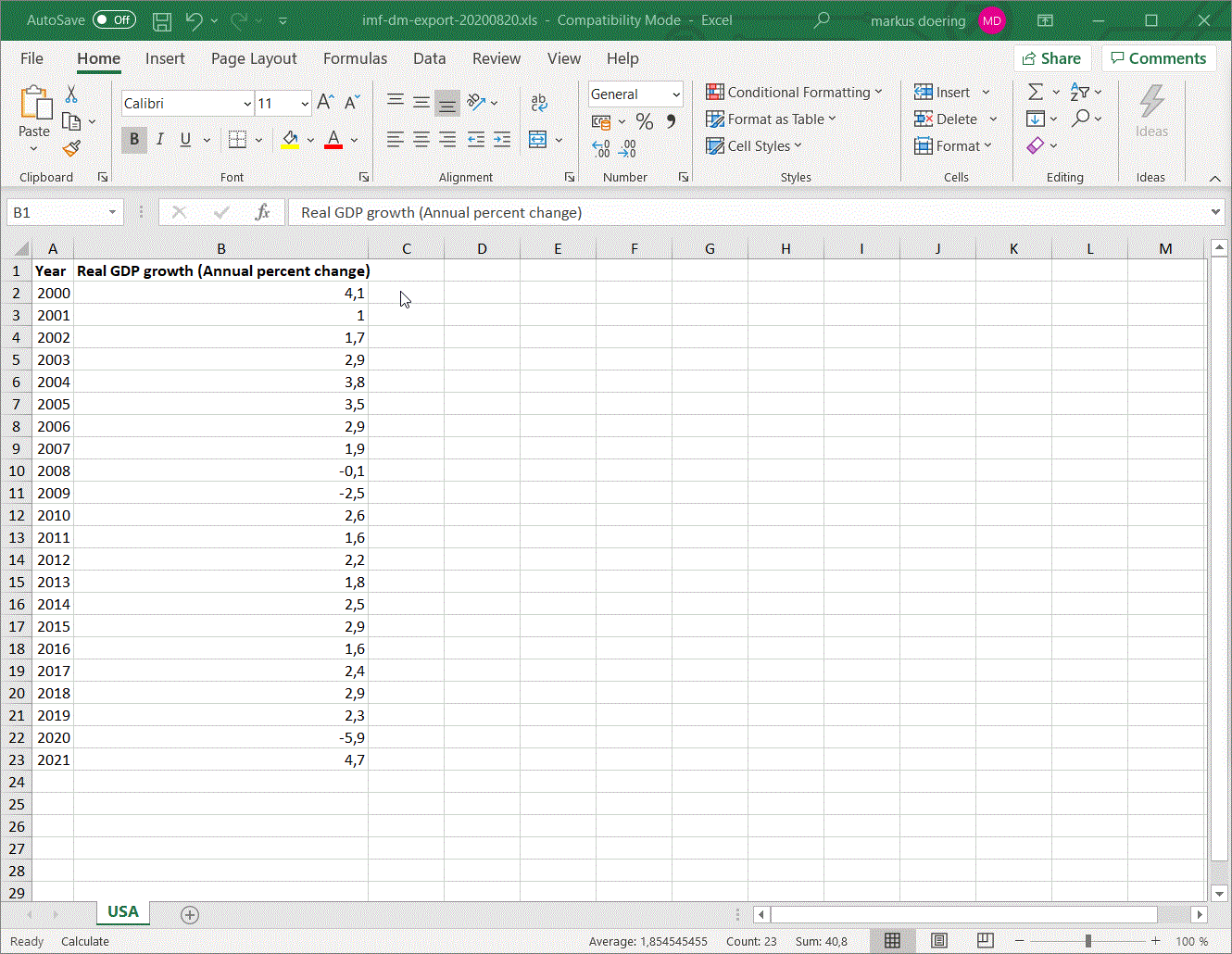
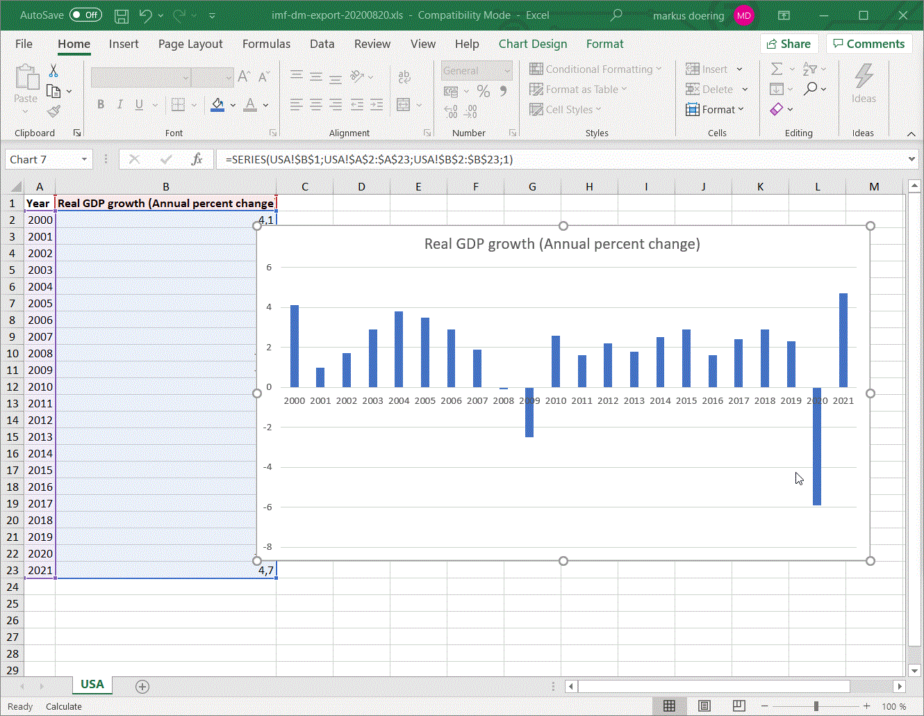
To start creating your bar chart, begin with a blank worksheet in Excel and enter the data you want to visualize. In this example we are looking at the annual percent change of the real GDP in the US. The data source is the IMF. For a bar chart you need a single column only that contains the values you want to plot. The year column in then used to label the x-axis of your chart.
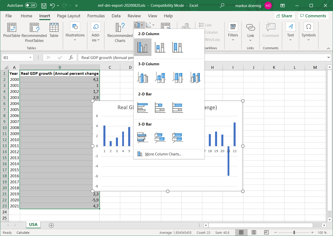
To create a bar chart in Excel you need to
- Insert your data into a worksheet
- Select your data
- Click on the
Inserttab - Select 2D bar chart from the various chart options
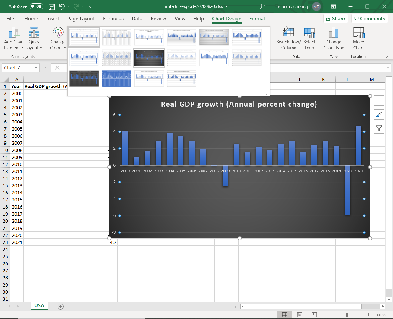
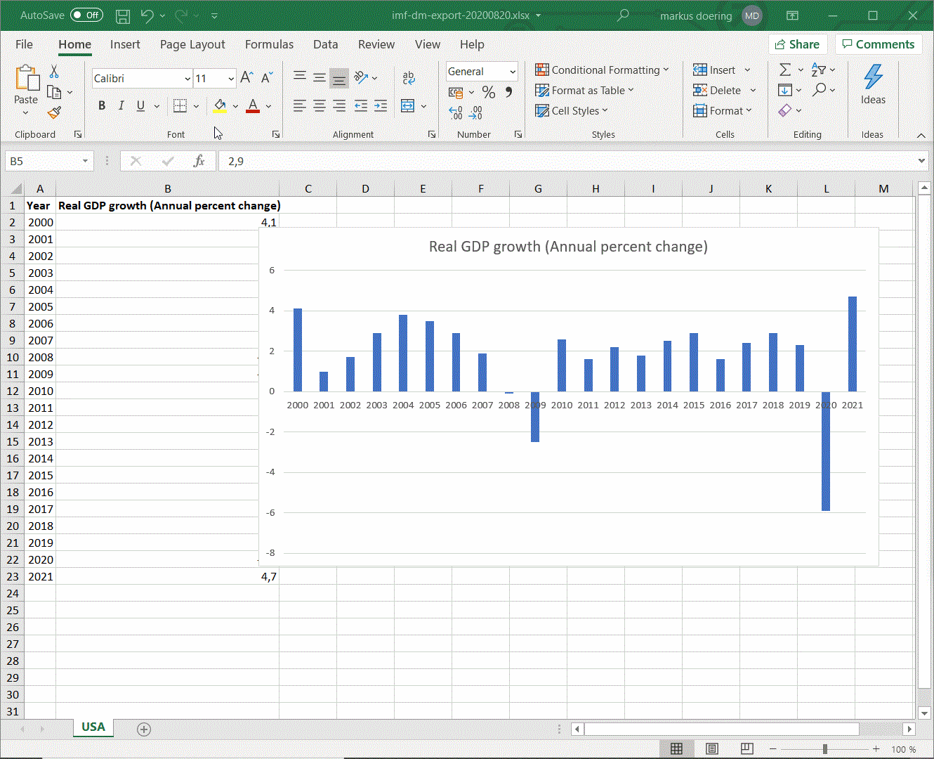
The chart will appear on the same worksheet as the data ready for further styling and adjustment.
If you have to edit any of your data, there is no need to create a new chart, you can just change the data and your chart will update automatically. If your chart is implemented in other Office documents or linked to a PowerPoint presentation, it will update there as well.
Different Kinds of Bar Charts
A bar chart shows for each category a single numerical value. If you Excel provides variations of Bar and Column charts. Here’s a quick summary of each:
-
Grouped: A chart that displays a group of dependent variables side-by-side for each category.
-
Stacked: A chart that shows the dependent variables stacked on top of each other. This chart is also called segmented bar chart.
If you want to learn more about bar charts, read our guide on What is a bar chart.
What is a bar chart used for?
Like any data visualization, a bar chart can serve many purposes when done right. The chart is easy to interpret which makes it useful to inform, to compare, and to persuade. In the not so old discipline of data visualization a bar chart has been one of the first applications. The bar chart was first used at the end of the 18th century by William Playfair, an engineer and economist from Scotland. Playfair published the bar chart in a chart of imports and exports between Scotland and other countries. Playfair is also credited with the creation of the pie chart.
Excel Chart Formatting Options
After you have created your bar chart, you can edit the design of the graph either by selecting pre-made designs that Excel offers you in the Design tab. Alternatively, you can use your color schemes by right-clicking on the bar chart and selecting Format data series. Then, select colors, gradients, opacity, and other elements like glow, 3D effects, and shading. We will go through this step-by-step.
Change the chart style
A chart style affects the background color, bar fill color and much more. You can change the chart style after you left-clicked on your chart and select any of the options in the Chart style tab.
Note: when you work with an Excel file that is saved in the old 97-2003 format .XLS the option to change the chart style will be grayed out. To change that, save the workbook as an Excel workbook with an .XLSX extension. In compatibility mode you will only be able to use features that are compatible with the earlier version.
To change the theme, click the Page layout tab, then browse the themes. There you can also change fonts and color palettes.
Change the colors of your bars
Once you created a bar chart, you can change the default color of a single bar or of all bars all together. For the latter, left-click on any bar, then right click to open a dialog in which you have to change the Fill color.
Edit Chart Background
If you need to edit the background, right-click the chart area, and select Format plot area. In this menu, you have the options to change borders, fill and size of the whole chart and format design options like a glow or 3D effects.

Labels & Title
When you select a single numeric column to create a bar chart, Excel will add axis labels for you starting from 1 to the number of observations in your data. To edit these axis labels:
- right click on the chart area
- select the option
Select Data Source - under ‘Horizontal (Category) Axis Labels click
Edit - Select the values in a column you want as axis tick labels
If you need to edit size and color, select the “Format” tab on your home bar and in the drop down list, select the one you want to edit (e.g. vertical axis). Labels can be repositioned by drag and drop to the desired position.
Right-click on the chart title, will open a menu in which you can select the option ‘Format Chart Title’.
Adjusting Axis & Gridlines
To adjust the different axis in your graph, you can either right click the desired axis or grid lines and select “format axis” / “format grid lines” or, in the format tab of your home bar, use the dropdown list on the left-hand side.
Move Chart
A chart can be re-positioned within a sheet by drag and drop. All you need to do is to click and drag it to the desired position. In case you want to move the chart to another sheet, right-click the chart and select “Move Chart.” You can then either choose an existing sheet or create a new sheet to move it to.