Chart Vizzard
Vizzlo's AI-based chart generatorHow to Create a (More Impressive) Bar Chart
Start With the Data, Not the Design
Before we jump straight into the bar graph maker guide, let’s spend some time considering all the options, what you need to relate and if the bar graph template is the right one for your needs.
I hate to break the bad news, but the best format for your data visualization does not always equal the one you think looks slick. Reports, data analysis, chart or graph visualizations, presentations and sales decks all need to do one thing above all others: to tell the right story.
There is good news as well though! Bar graphs are so widely used because they are incredibly flexible graphs—comparing almost anything to almost anything else. We naturally read information from top down and left to right, so the bar chart is incredibly intuitive to decipher. Minute differences in data are much more difficult to see immediately in more complexly shaped chart formats as our brains have to process more—but the bar chart’s simplicity really shines in these cases.
If we take the two examples below, we can see that while significant differences may be obvious in both graph types, the more incremental variations are far more obvious in the bar chart.
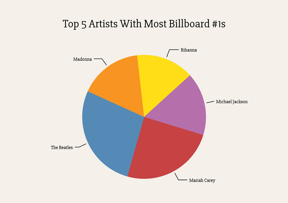
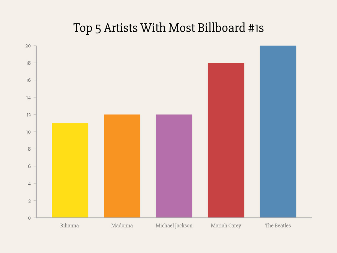
Without the data labels, Mariah Carey and The Beatles seem to have around the same number of #1s in the pie chart, and it’s almost impossible to see that Rihanna has less #1s than Madonna or Michael Jackson; in the bar graph, these discrepancies leap out at you.
Tip! Create a Bar Chart in seconds with Vizzlo —it has its very own Vizzard here!
Whilst we heavily, borderline aggressively, encourage you to thoroughly research before selecting your data viz type (after all, we do have an entire data viz guide for that), if in doubt a bar chart will probably work out just fine.
Start designing your own charts and business graphics.
Try Vizzlo for freeUse Cases: Better Results, Bar None
If you have relative data categories that need comparing, then a bar chart is often the best option. It’s familiar, easy to create and easy to interpret—and if there’s one thing data viz should never do, it’s to make the information more complicated to understand. Below are some bar graph example ideas, of the kinds of information bar charts are best used to represent and why:
Bar Charts for Presentations: (Motivation) To Persuade*
- The bottom line: show that you are bringing in better sales rates than your competitors, and show projections for the future
- Categories showing the current + projected costs to your client without your service, and then bars showing the savings you can make them immediately and in the future, will be much more persuasive when illustrated
*Show investors, clients and budget-gatekeepers exactly what ROI’s to expect—here’s where analysis tools really come into their own
Bar Charts for Reports: (Motivation) To Illustrate*
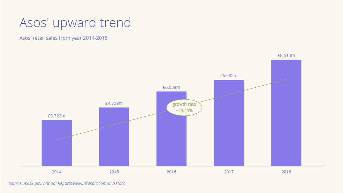
- Emphasise your achievements! Month-on-month growth is most noticeable in a bar chart format
- Add a Growth Rate line (available in the analysis tools) to really drive home exactly what you’ve already accomplished
*Frankly, no-one reading a report cares about anything as much as the bottom line, so using the most easily interpreted chart to describe hard figures will save everyone time
Bar Charts for Discovery: (Motivation) To Learn*
- Are you missing some areas of concern? Bar charts highlight even incremental differences, which when tackled simultaneously can make a big difference to your GP
- Don’t be afraid to play around with analysis tools like projections and benchmarks—re-aligning your future goals can show you exactly what you need to be achieving day by day, and if those steps are unrealistic you’ll know better what you need to change to move forward
*To repeat (yet again): even the best statisticians miss learnings if they don’t use visualizations
Bar Charts for Decision Makers: (Motivation) To Compare*
- Reference lines here can help to compare performances, so you can make the right call and get on with your day
- Spot the difference! It’s made easier than ever with the bar chart to understand even small increments, making your decision much more representative of detail
*The most literal application of the bar chart—its raison d’etre is to compare and thus decide
Data Viz in Practice: Bar Graph Creator
Just a reminder! We have a really concise video tutorial of this on the bar chart Vizzard.
Now that you’re really, really 100% sure that a bar chart is the data viz for you, we can take a more practical approach to how to make a bar graph. If you want to start from a blank page and do all the fiddly bits yourself you absolutely can, but Vizzlo’s bar graph templates and examples make it easier than ever to get your bar chart tasks completed in seconds.
First input your data categories and values associated. What do they have in common? That’s your title.
Then ensure the category labels are easy to read—try switching to a horizontal style if needed.
Will grids, value labels and axis labels make the information easier to understand, or create a confusing cluttered look? Less is more when it comes to data viz, but make sure all the information required is included.
Do you want to sort the bars in descending/ascending order? This makes it really simple to quickly locate the top, bottom and median values—but be careful if there’s a fixed parameter involved (like time on a histogram) as communicating this takes priority.
Design isn’t just a pretty picture—the style you use helps communicate more about the data. Use Vizzlo’s presets or customize your own.
If you’re using Vizzlo, all formatting and customization is intuitive—you can easily select anything to edit it.
After inputting our data and formatting our chart, we are ready to share our work. We have the option to download it in different formats, or we can decide to share it with viewing or editing rights, and of course every chart you make on Vizzlo is printable.
If you need any pointers on looks, color schemes or the like, check out our gallery for different Venn diagram examples with all kinds of color schemes and styles.
And that’s all it takes to create a beautiful, quick and professional-looking bar chart!
A far more impressive bar chart data visualization awaits you and your colleagues!
Ready to create your own bar chart?
Try Vizzlo for free