Chart Vizzard
Vizzlo's AI-based chart generatorThe Definitive Guide to Professional Looking Bar Charts
A bar chart is a way to visualize a data set graphically using rectangular bars of proportional length to the values displayed. This form of visualization is omnipresent in reports or PowerPoint or Google Slides presentations. The typical use case for a bar chart is for displaying amounts, whereby you can display absolute or relative amounts.
What is the difference between a bar chart and a column chart?
Both bar and column charts display discrete categorical data and compare quantities of a variable at different points in time or to compare different values for categorical variables at the same time. The bars can be aligned vertically and horizontally, in the latter case one also speaks of a column chart or a horizontal bar chart.
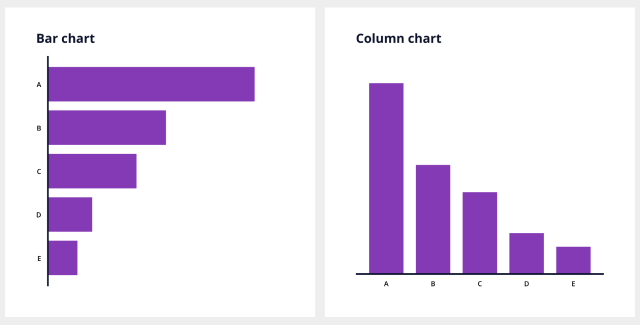
Column chart
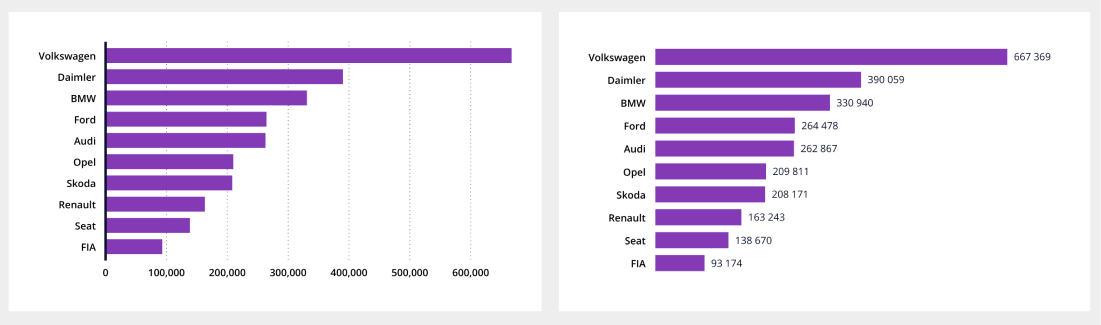
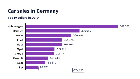
Let’s look at some real world data. Below plot tells us about car sales in Germany in 2019. We see Volkswagen sold the most cars, followed by Daimler, BMW and so forth.
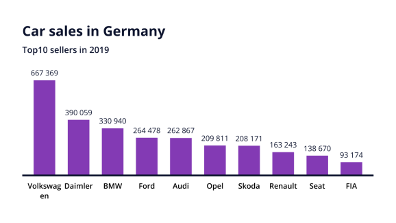
One problem with this chart is that the axis labels take up a lot of space. To save horizontal space, we could rotate the axis labels by 45° or even 90°
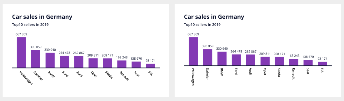
Not sure if the result is easier to read in both cases. If the labels do not fit because they are too long, it is best flip the chart.
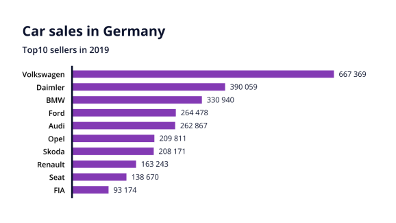
Bar chart
So column charts or horizontal bar charts have advantages over vertical bar charts when axis labels are too long. Not only labels are easier to read, but also the whole chart is easier to format for presentations, particularly when there are a lot of bars.
In the following explanations we will use the term bar chart throughout, unless otherwise indicated.
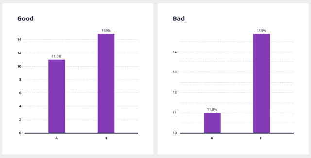
Bar charts must start at zero baseline
Do not truncate bars. Regardless of whether you plot bars horizontally or vertically, a bar chart that does not start at a zero baseline is misleading. Recall that the idea of the chart is to shows rectangular bars of proportional length to the values displayed.
Take a look at the simplified example below to see the consequences. Both graphs show the same data, but the impression you get about the difference between A and B is very different.
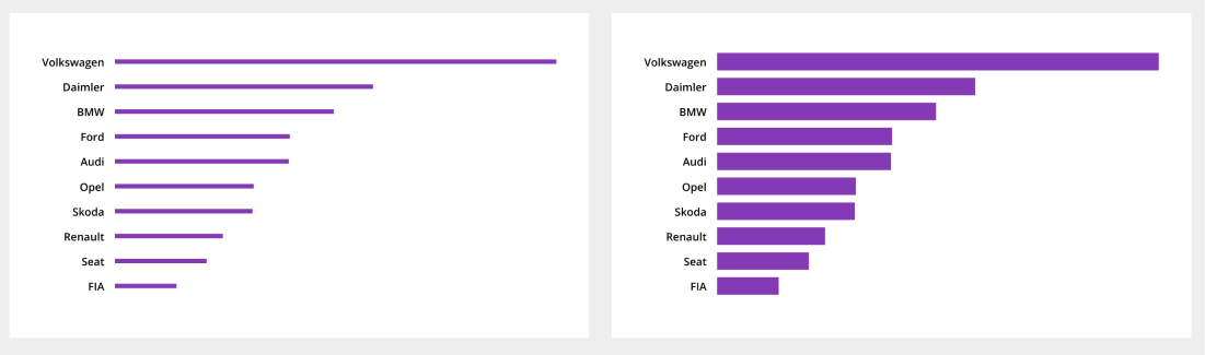
Pay attention to the order of the bars
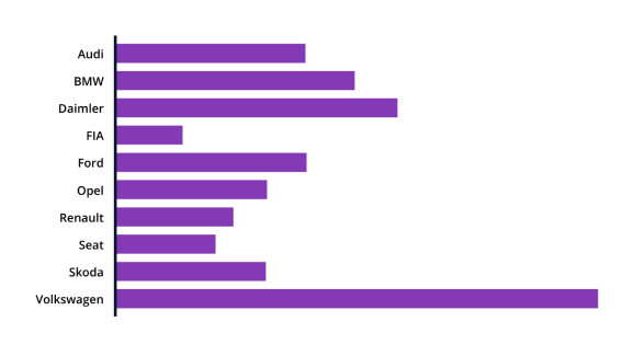
When you visualize data, you should make it as simple as possible for the reader to understand the message your plot communicates. Pay attention to the order in which the bars are arranged. If your data does not contain a natural order, e.g. time, you should order the bars by ascending or descending data values, not arbitrarily, e.g. by alphabetical order. Take a look at the chart about car sales in Germany, this time sorted alphabetically. This chart is harder to understand and might be confusing too. Who sold more cars, Opel or Skoda? Audi or Ford?
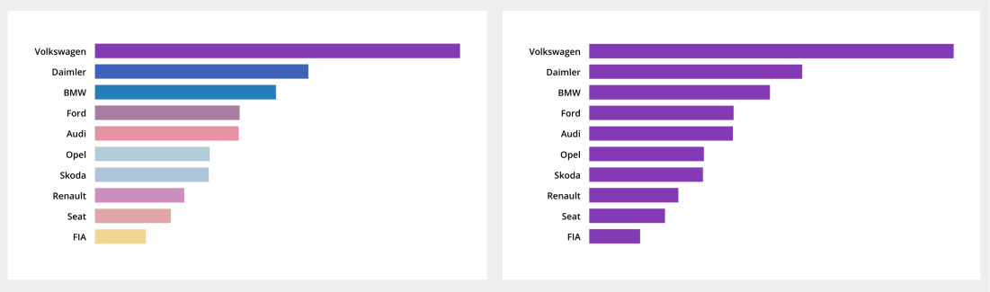
Label bars directly
Bars are directly labeled and grid axes have been removed to optimize legibility. In general, it is good practice to remove elements from the chart that do not contribute to the message of the chart. That is, remove visual clutter. When possible, label bars directly, remove grid lines and axes. That will enhance the visibility of the data.
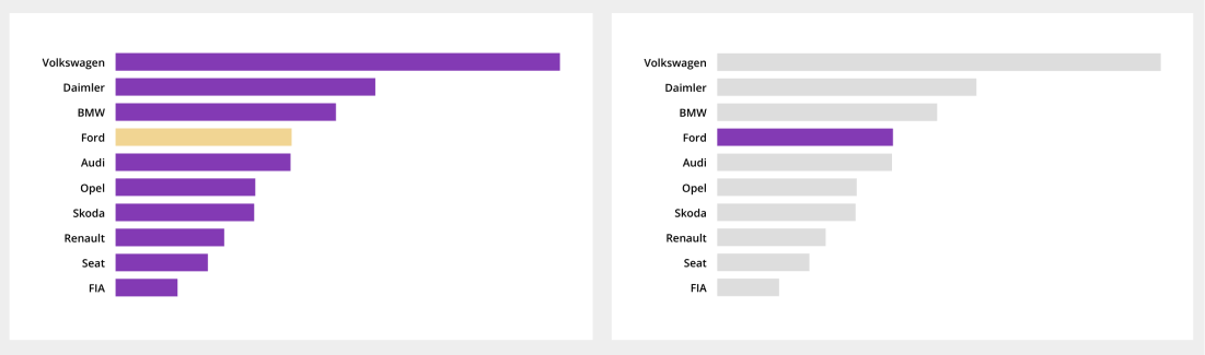
Colors of bars
Just like with the direct labels, arrangement of the bars, using different colors for the bars will distract the reader from the data unnecessarily. Keep bars the same color if there are no noticeable differences between the categories.
Colors are a powerful tool, use it, for example, when you want to highlight single data points. To make a single bar stand out even more, consider to make gray your friend.
Size and spacing of bars
The spaces between each bar should not be bigger than the width of each bar.
Add text that explains the message
We have shown how to use colors effectively to put the focus on a data point. We can also use annotations to illustrate the difference between two (or more) values. We can ask ourselves what is the difference between two values or the growth rate? Use Level Difference Arrows for this, which serve this purpose.
Vizzlo’s is a chart maker that brings over 100 ready-made business graphic and chart templates, diagrams, and maps directly to PowerPoint and Google Slides. Microsoft PowerPoint is one of the most frequently used tools to present analyses, reports to an audience. So is Google Slides. Vizzlo’s PowerPoint add-in and Google Slides add-on are designed to save you time.