Chart Vizzard
Vizzlo's AI-based chart generatorDoes working less truly make you happier?

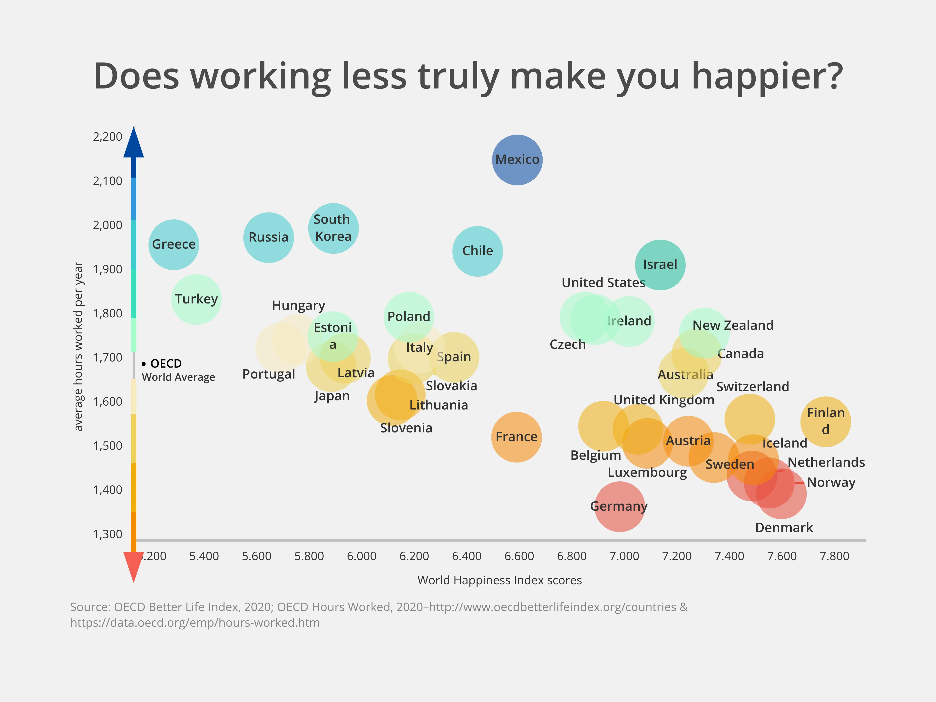
Generally, there’s a fairly strong correlation between fewer hours worked per year and OECD Happiness Rating.
You can see that countries like Denmark, Norway and Finland–the happiest countries in the world–work hundreds of hours less per year than the OECD Global Average of 1,734.
Comparatively, countries with some of the lowest happiness ratings like Greece, Russia, Turkey and South Korea also clock in some of the highest working hours per year. Greece, in fact, averages 564 more hours than Denmark–over 14 additional working weeks extra!
However, there are a few outliers. Mexico hit the top of the list with the highest number of hours worked per year, but also comes in bang on average on the Life Happiness scale. And though Germany takes a more relaxed attitude to work than any other country listed with 400 hours less completed per year than the global average, it only edges ahead of Mexico in terms of happiness with a score difference of less than 0.4.

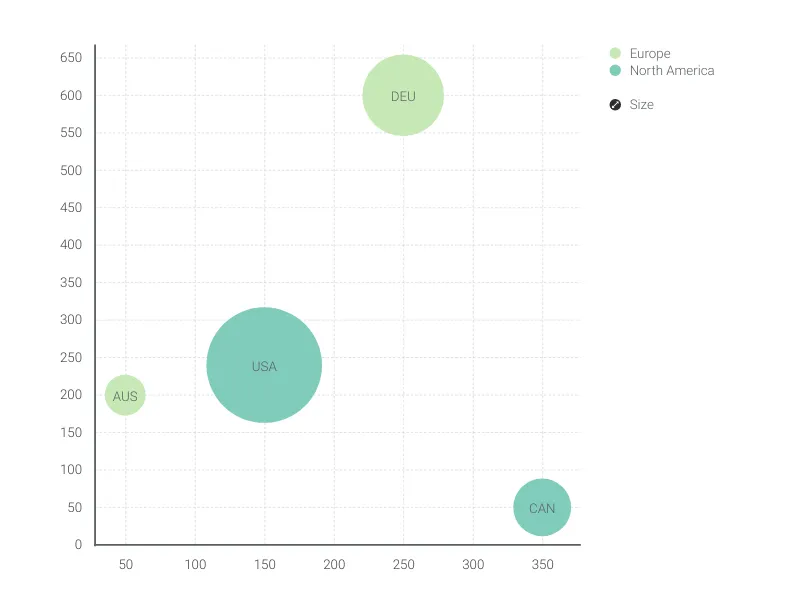
This is an example of Vizzlo's “Bubble Chart”
A multivariable graph for visualizing and comparing up to four dimension of your data.
Finance & Economics Sales & Marketing Scatter plots & Bubble charts