Chart Vizzard
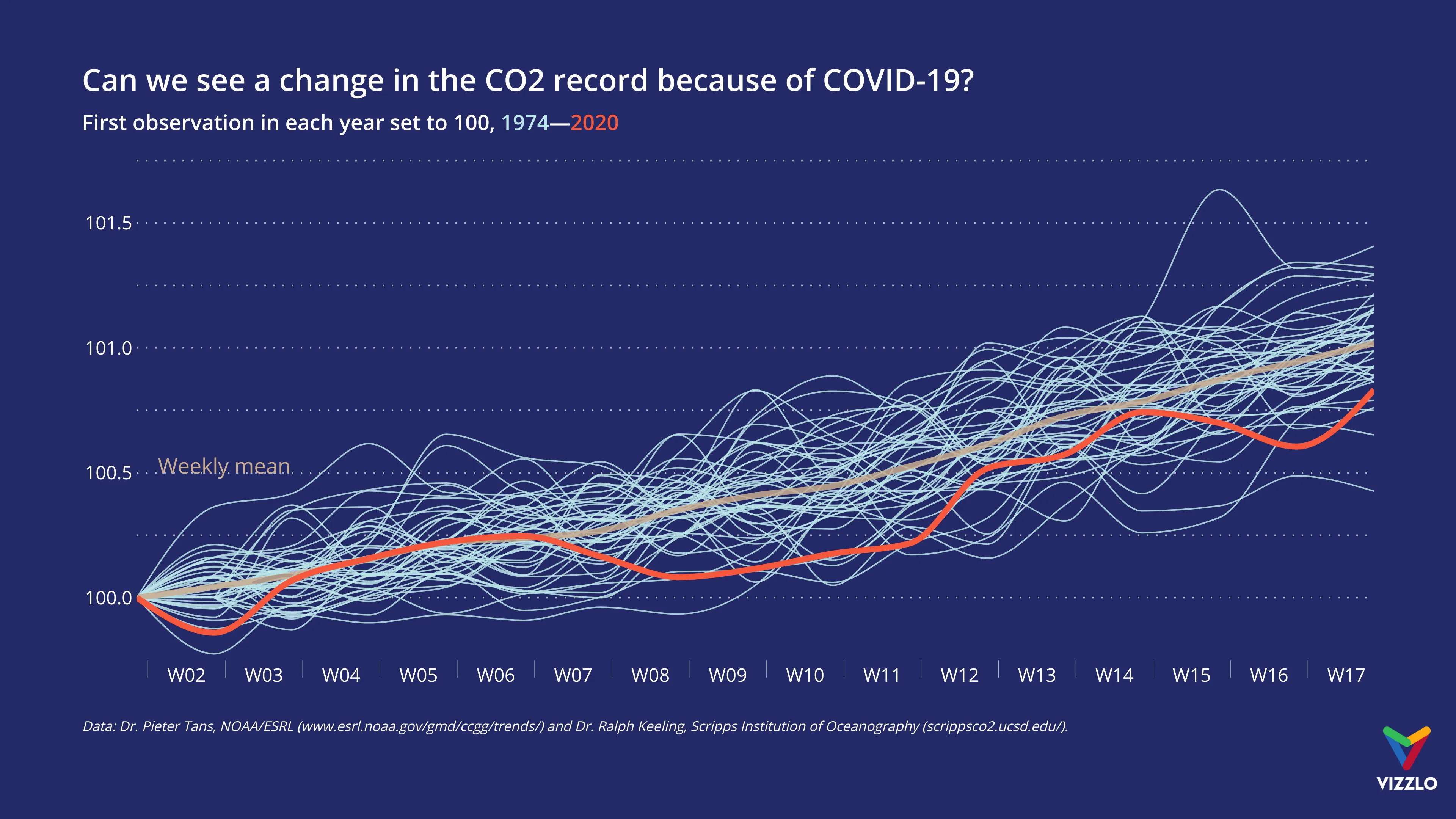
Vizzlo's AI-based chart generatorCan we see a change in the CO2 record because of COVID-19?

In times of COVID-19, it is easy to forget that climate change is one of the world’s most pressing challenges. The Global Monitoring Laboratory of the National Oceanic and Atmospheric Administration (NOAA) publishes weekly data about trends in atmospheric CO2 emissions, that dates back to 1974.
To compare the 2020 data to previous years, for each year, we filtered the data for the first 17 weeks. We chose to display the observations as an index chart. We cannot tell anything about absolute numbers, but about the change since the first measurement of each year.
So, can we see a change in the CO2 record? Maybe. The question was asked before by the experts at NOAA. Go to their website to read the detailed interpretation: https://www.esrl.noaa.gov/gmd/ccgg/index.html#co2change

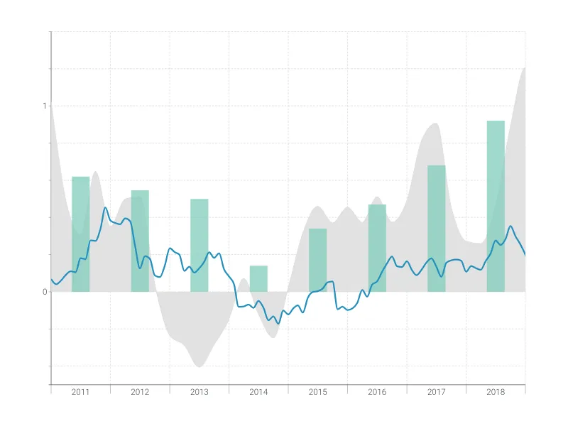
This is an example of Vizzlo's “Time Series Graph”
Complex time series graph to visualize detailed financial data.
Finance & Economics Bar & Column charts Line & Area charts Time-based charts