Chart Vizzard
Vizzlo's AI-based chart generatorA Decade of GitHub Reliability: Post-Acquisition Drift
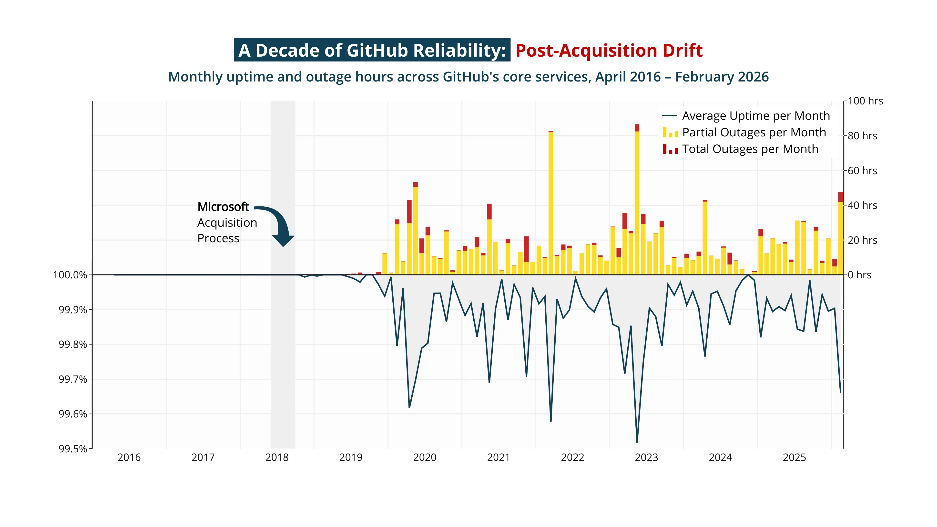
Microsoft closed its $7.5B acquisition of GitHub in October 2018, and in the years since, the platform has quietly become noisier. This chart traces nearly ten years of reliability across eight core services — API Requests, Actions, Git Operations, Issues, Packages, Pages, Pull Requests, and Webhooks — drawn straight from GitHub’s own public status page.
The trajectory is hard to ignore. Partial outages now average close to 19 hours per month across 2025, up from the calmer rhythm of the late-2010s. February 2026 alone logged 42 hours of degraded service and over five hours of full-blown major incidents. As GitHub has piled new products onto the same foundations — Actions, Packages, Codespaces, Copilot — the blast radius of every incident has grown with it, and the recent media drumbeat about the platform’s reliability is showing up clearly in the numbers.
A caveat worth naming: GitHub’s status page tracked far less granularity in its earlier years, so the older end of the chart looks artificially clean. The interesting story is the post-2018 trend — and the sharper turn it has taken lately.
Source: GitHub Status, via Nelson Schramm’s github-historical-uptime project.
This is an example of Vizzlo's “Time Series Graph”
Complex time series graph to visualize detailed financial data.
Finance & Economics Bar & Column charts Line & Area charts Time-based charts