Chart Vizzard
Vizzlo's AI-based chart generatorBottle Chart
Visualize different values or fill levels using a selection of water, beer, or wine bottles.
What is a bottle chart?
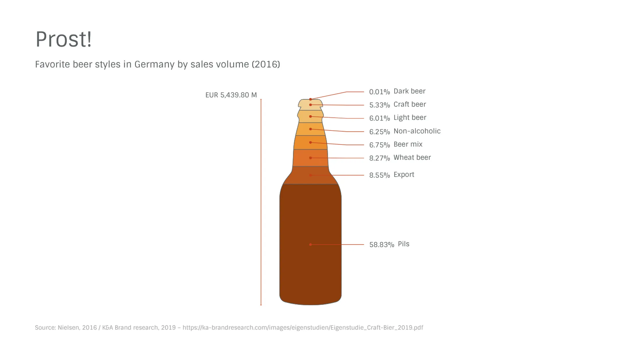
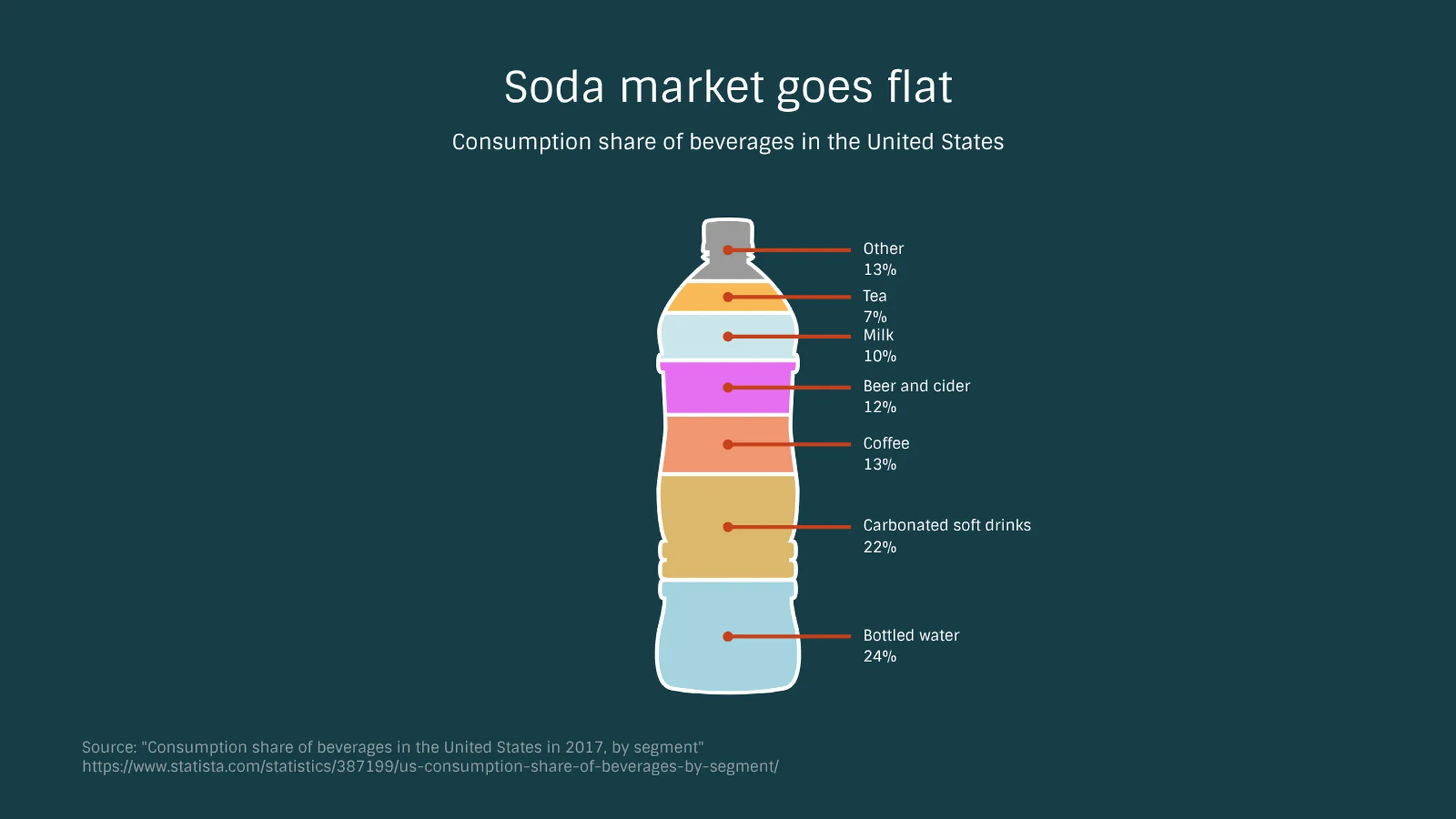
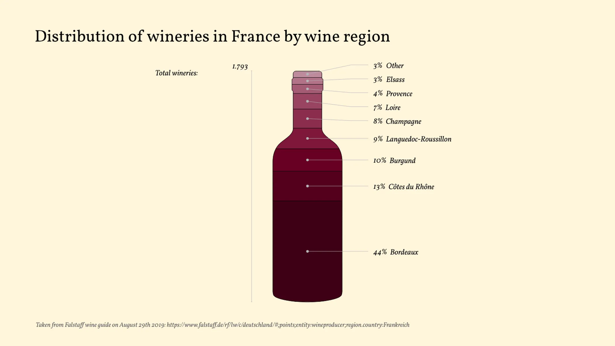
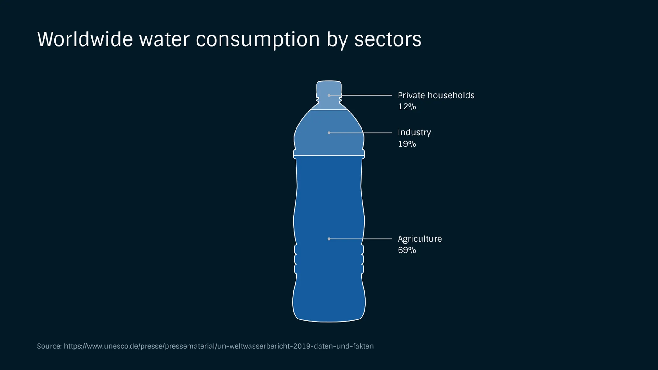
What are you drinking? What better way to demonstrate than by visualizing the composition of your beverage with a 100% stacked pictogram chart? Use Vizzlo’s bottle chart to put the ingredients or chemical composition of your favorite drink (or any liquid, for that matter) on display—the perfect slide for your presentation.
How to make a bottle chart with Vizzlo?
- Click on the elements or on the “DATA” tab to add, remove, and edit the ingredients.
- Drag the elements to adjust the position of the sections.
- Select the bottle type—water, beer, and wine—under “APPEARANCE.”
Bottle chart maker: key features
- Multiple pictogram types
- Custom number formats and colors
- Optional fill level
- Optional sorting by value
Bottle Chart: What's new?
When you display data labels as percentages we made sure setting applies to the sum label too.
Bottle Chart Alternatives
Use Cases
Pictorial chartsEnhance your productivity
Create a Bottle Chart directly in the tools you love

Create a Bottle Chart in PowerPoint with
Vizzlo's add-in

Loved by professionals around the world


Visualizations your audience won’t forget
Convey abstract concepts and data with professionally designed
charts and graphics you can easily edit and customize.