Chart Vizzard
Vizzlo's AI-based chart generatorGrowth Bar Chart
A bar chart that highlights the change from one record to the next using hand drawn arrows.
Features
- Custom number formats and colors
- Custom axes and grid
- Optional labeling of individual values
- Optional sorting by value
- Adjustable min/max values for y-axis
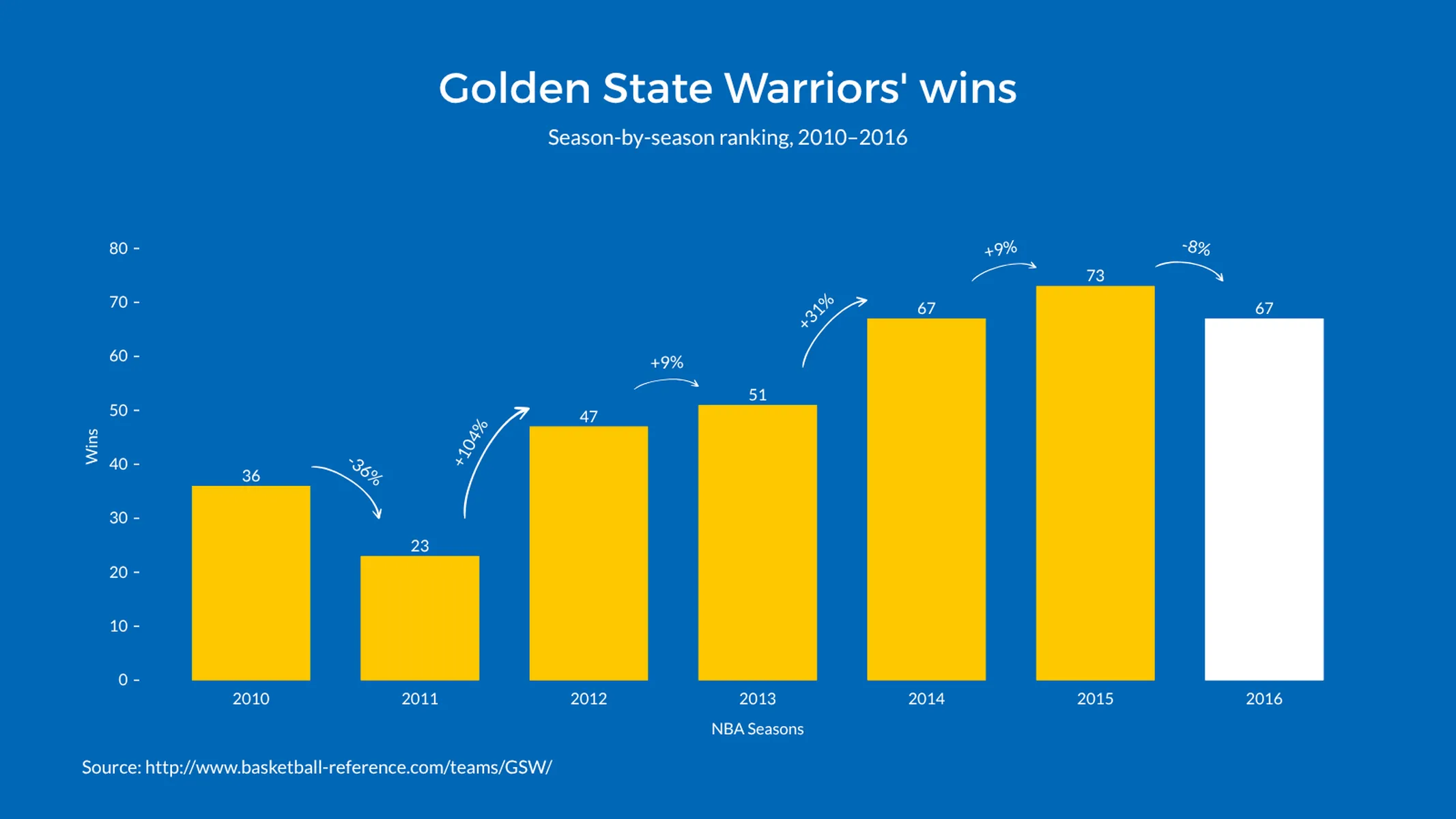
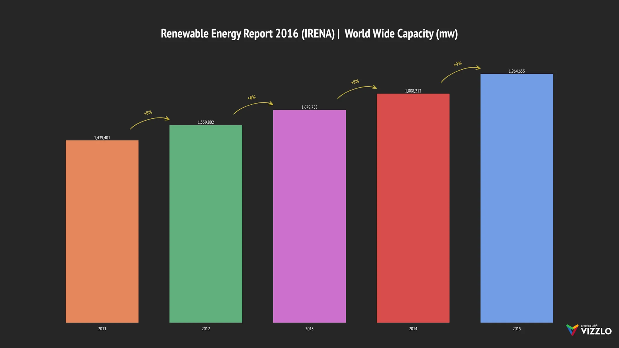
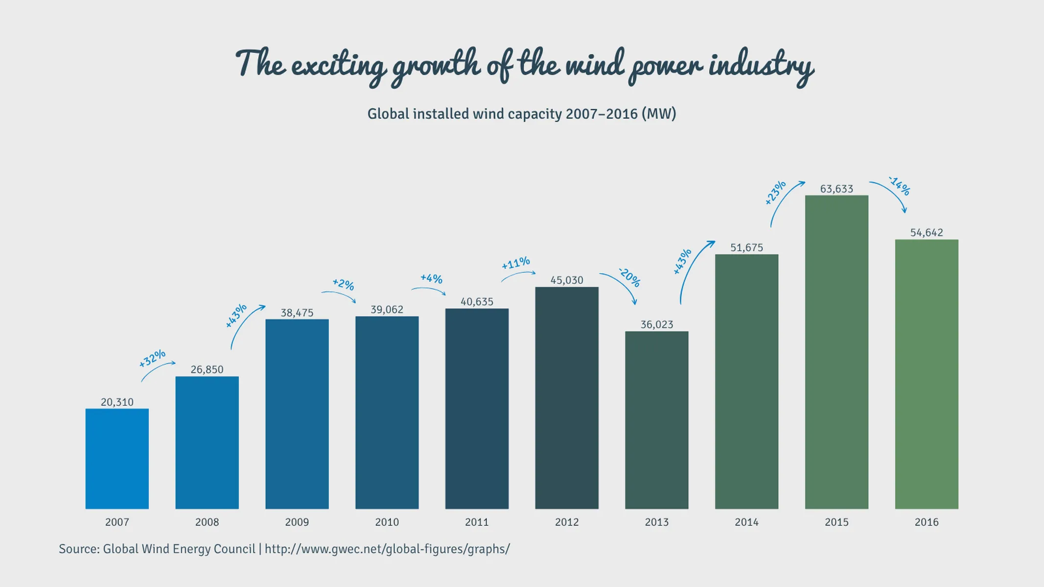
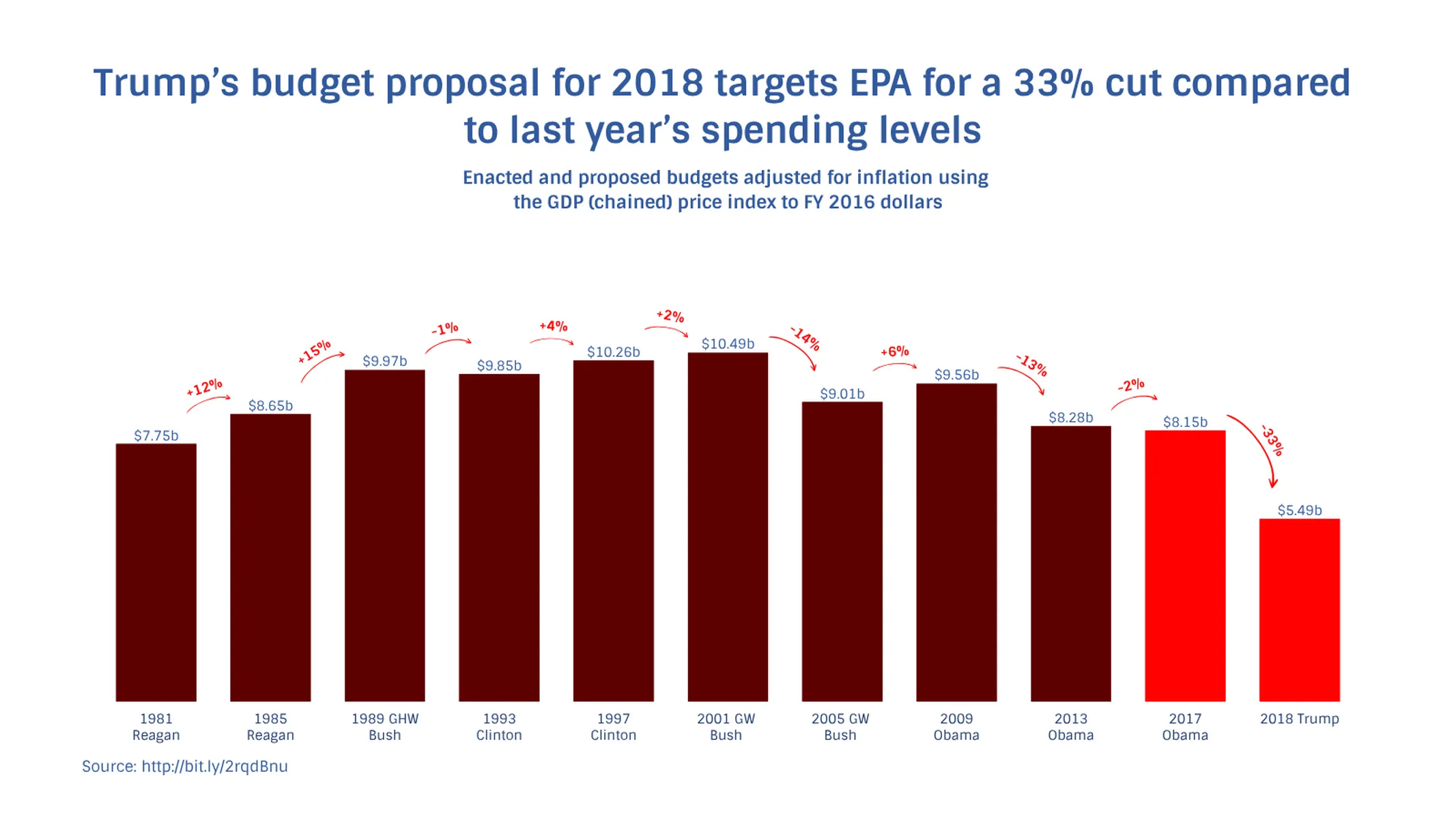
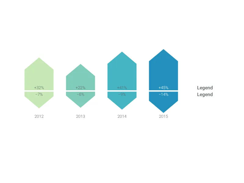
What is a growth bar chart?
This bar graph is perfect to compare/visualize changes of one single category over time. Like in a regular bar/column chart, the bars’ lengths are proportional to the values they represent, making changes visible. Moreover, the hand drawn arrows are highlighted in an accent color, letting positive and negative variations of growth more evident to your audience.
How to make a growth bar chart with Vizzlo?
Make your growth bar chart in seconds:
- Click on any bar to start editing the graph.
- Use its respective card in the sidebar to enter your values and pick a color.
- For even quicker results, choose to enter your data using the spreadsheet. Click on the button “EDIT DATA IN SPREADSHEET” in the tab “DATA” of the sidebar. Then copy and paste your data.
- Try the customization options of the tab “APPEARANCE” to refine the look of your chart.
- The growth rates are calculated automatically for you!
Pro tip: Before, pasting your data into Vizzlo’s spreadsheet, make sure the number format matches your data source. Click on the “wheel” icon of the spreadsheet column to set it.
Growth Bar Chart: What's new?
These chart types now all support adding custom formatting to individual value labels.
Added support for reference lines!
We added an option to hide axis labels.
You can now hide vertical and horizontal axis lines.
Growth Bar Chart Alternatives
Enhance your productivity
Create a Growth Bar Chart directly in the tools you love

Create a Growth Bar Chart in PowerPoint with
Vizzlo's add-in

Loved by professionals around the world


Visualizations your audience won’t forget
Convey abstract concepts and data with professionally designed
charts and graphics you can easily edit and customize.