Chart Vizzard
Vizzlo's AI-based chart generatorBlow-Up Chart
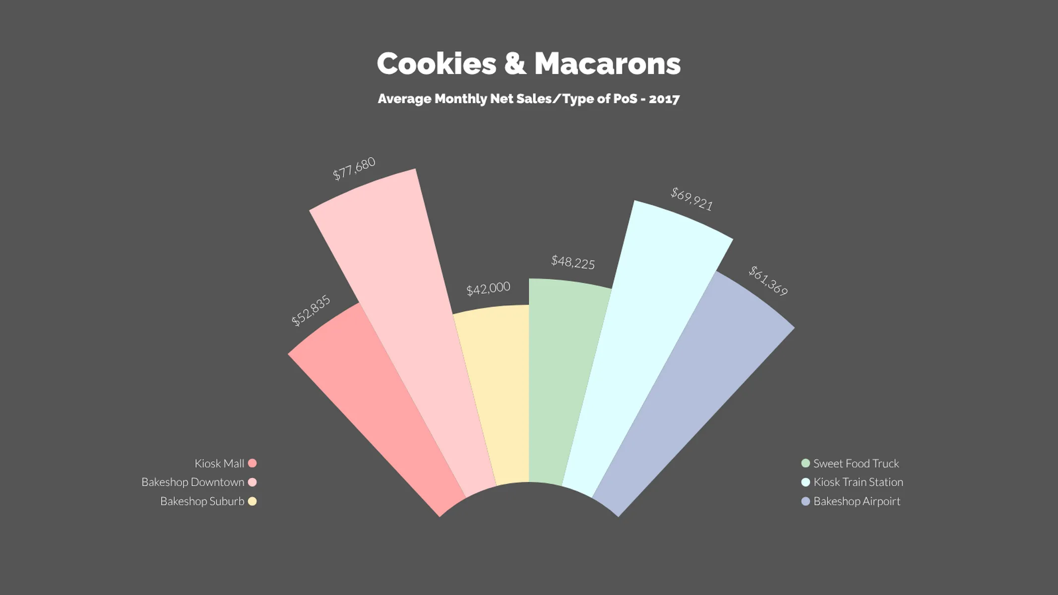
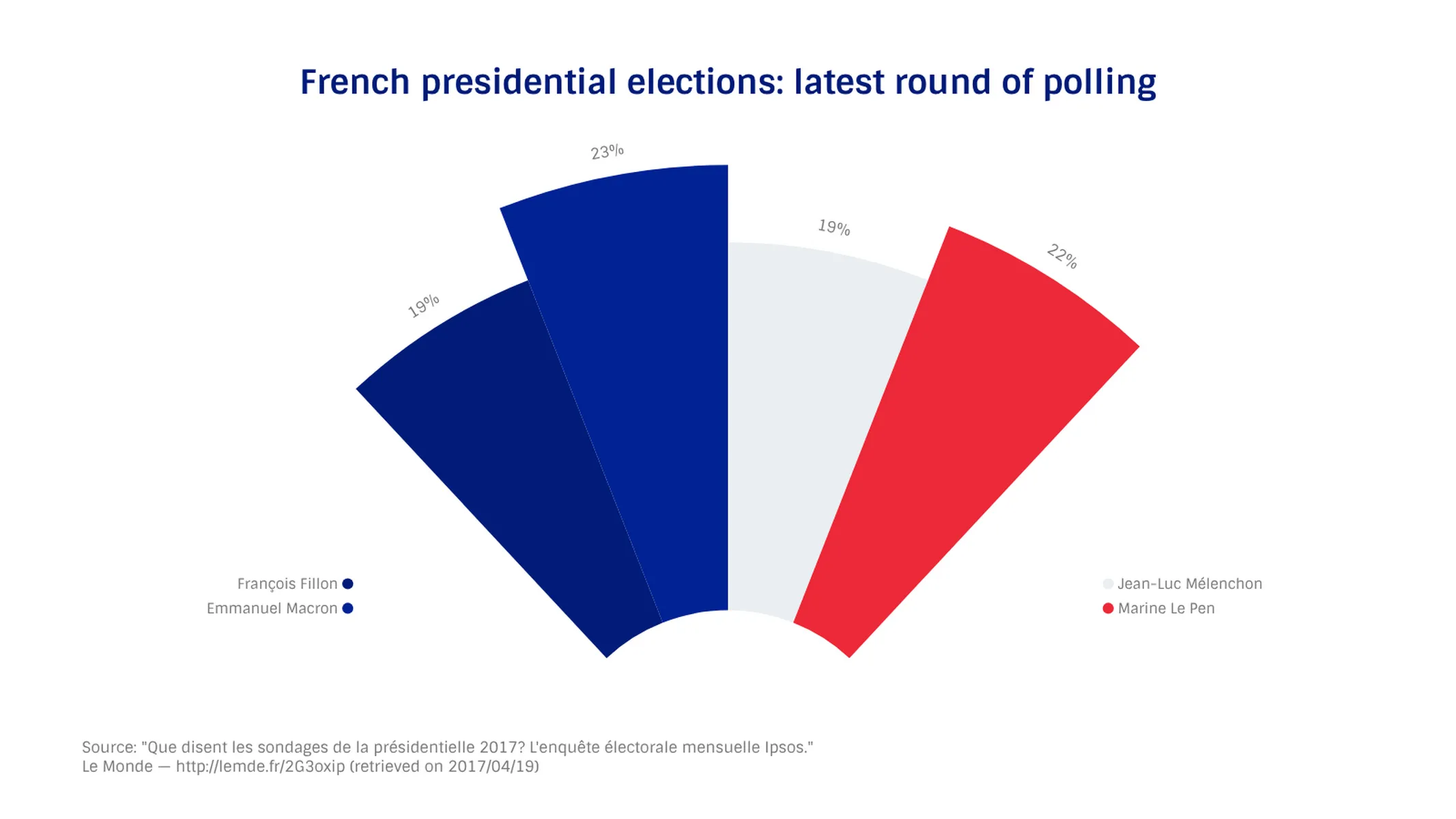
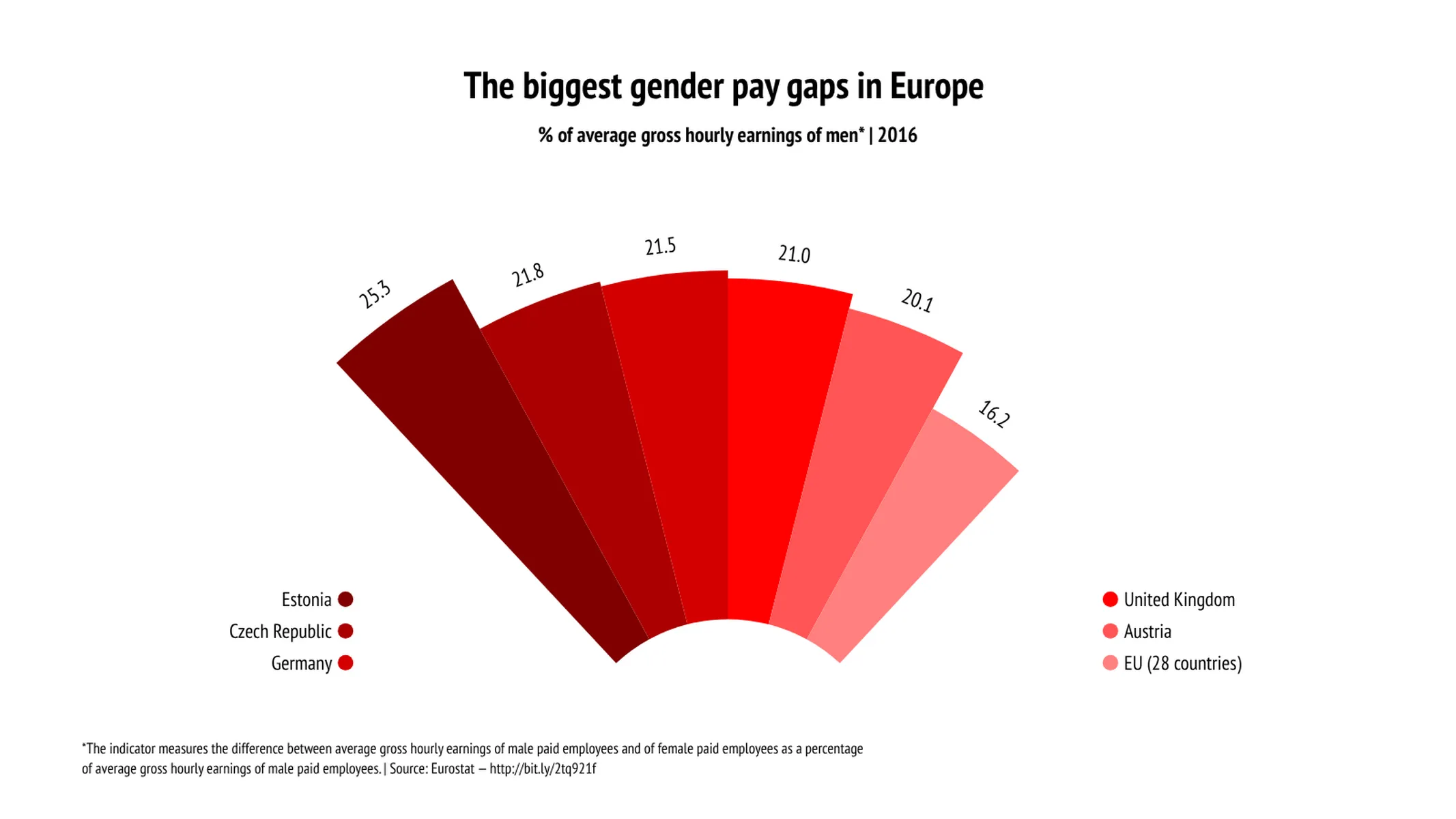
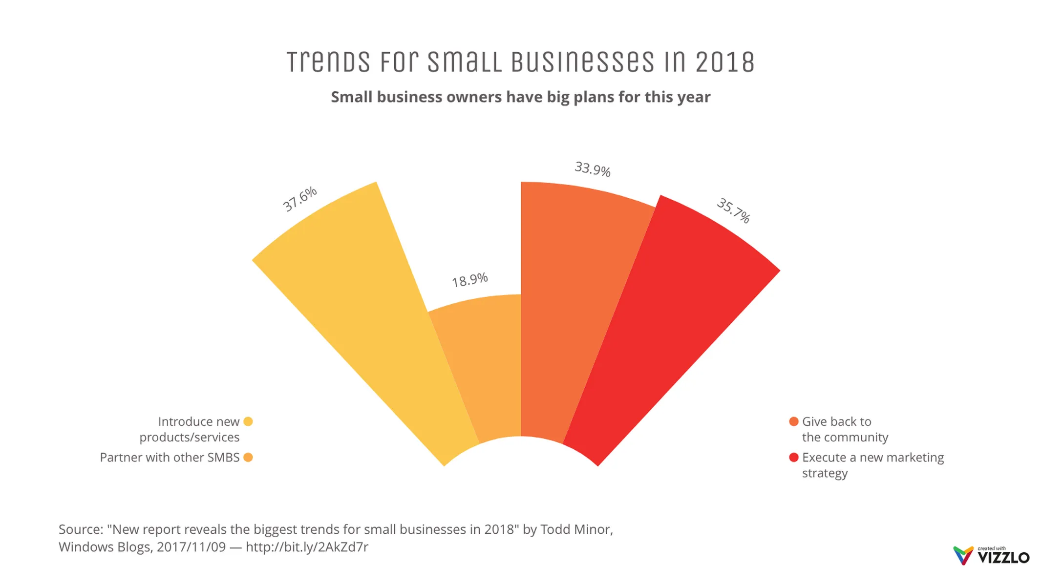
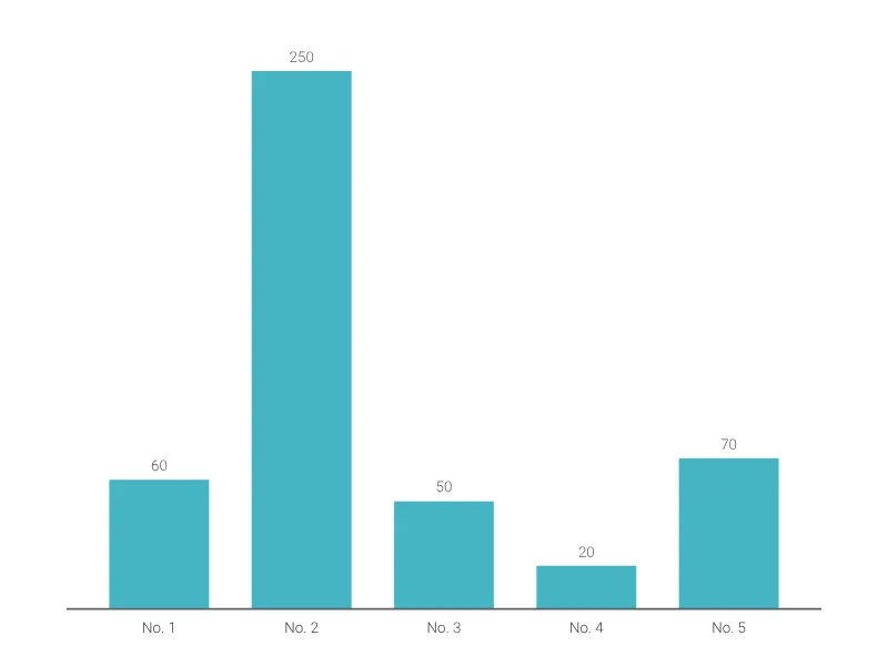
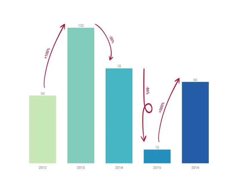
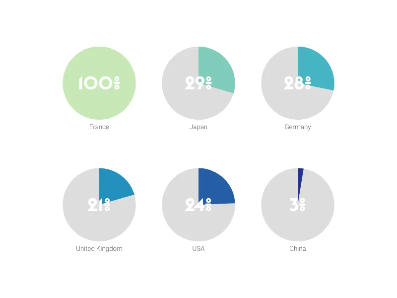
Compare up to six different categories with this charming diagram.
What is a blow-up chart?
The blow-up chart is a dynamic alternative to a conventional [column chart] (/create/bar-chart). You can use it to compare different categories. Because of its outbursting shapes, it’s perfect to communicate growth!
How to create a blow-up chart with Vizzlo?
Bring some energy into your presentations with this chart! Follow these easy steps to create your blow-up chart in seconds:
- Click on any element to edit it.
- Use the active cards in the sidebar to define custom colors and number format with ease.
- Alternatively, use Vizzlo’s spreadsheet to copy and paste your data quickly.
- Explore the Vizzlo themes to choose your favorite one.
Blow-up chart maker: key features:
- Custom number formats and colors
- Up to six categories
Blow-Up Chart: What's new?
These chart types now all support adding custom formatting to individual value labels.
Blow-Up Chart Alternatives

Use Cases
Bar & Column chartsEnhance your productivity
Create a Blow-Up Chart directly in the tools you love

Create a Blow-Up Chart in PowerPoint with
Vizzlo's add-in

Loved by professionals around the world


Visualizations your audience won’t forget
Convey abstract concepts and data with professionally designed
charts and graphics you can easily edit and customize.