Chart Vizzard
Vizzlo's AI-based chart generatorCreate your Triangle Bar Chart in seconds
Capture you audience's attention with this nice bar chart alternative.
Create your chart in 3 simple steps
- Create new Triangle Bar Chart
- Add your data
- Export or share
Why Vizzlo?
- Create professional charts in seconds
- Fully customizable, no design skills needed
- Create directly in PowerPoint & Google Slides
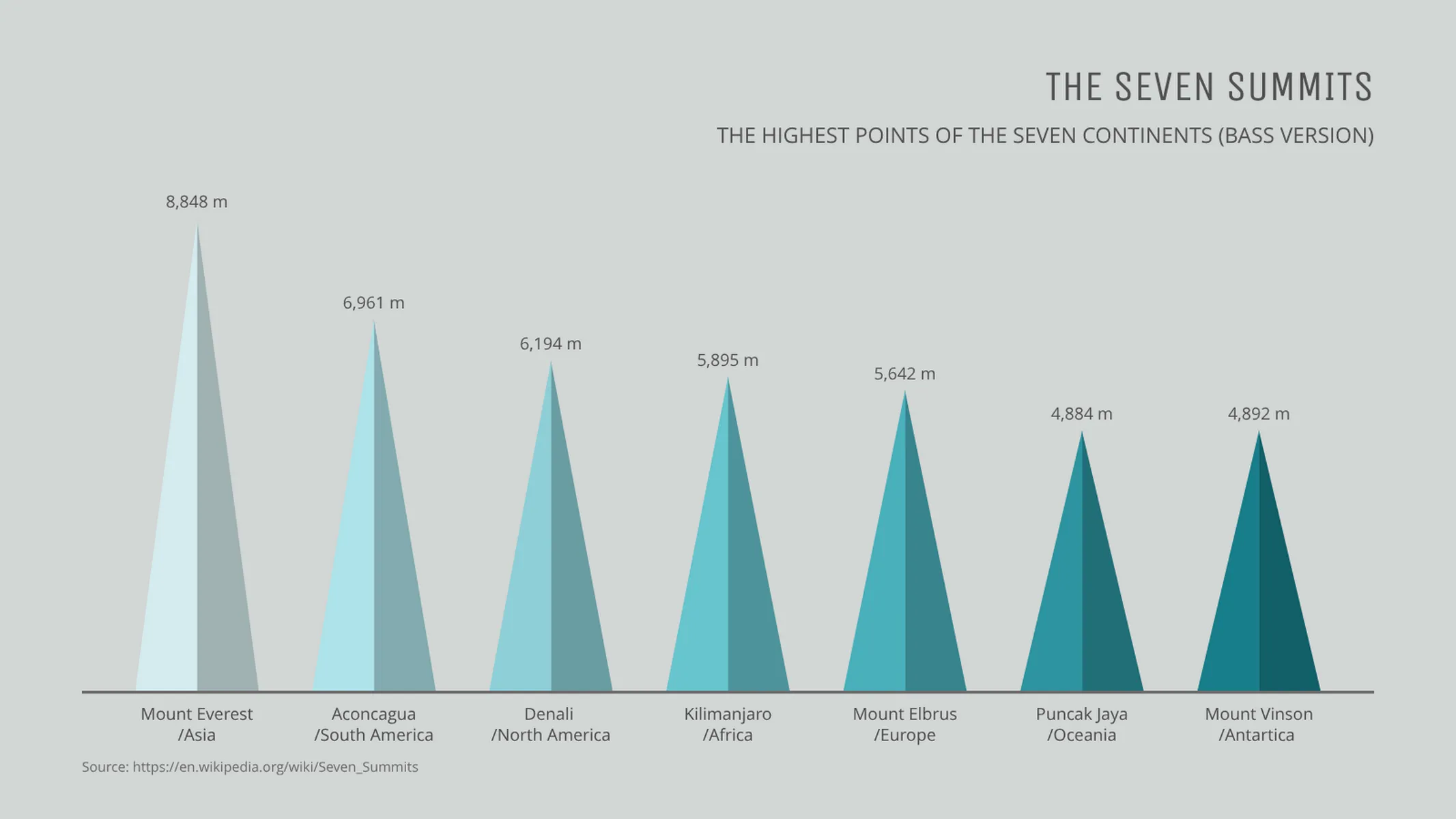
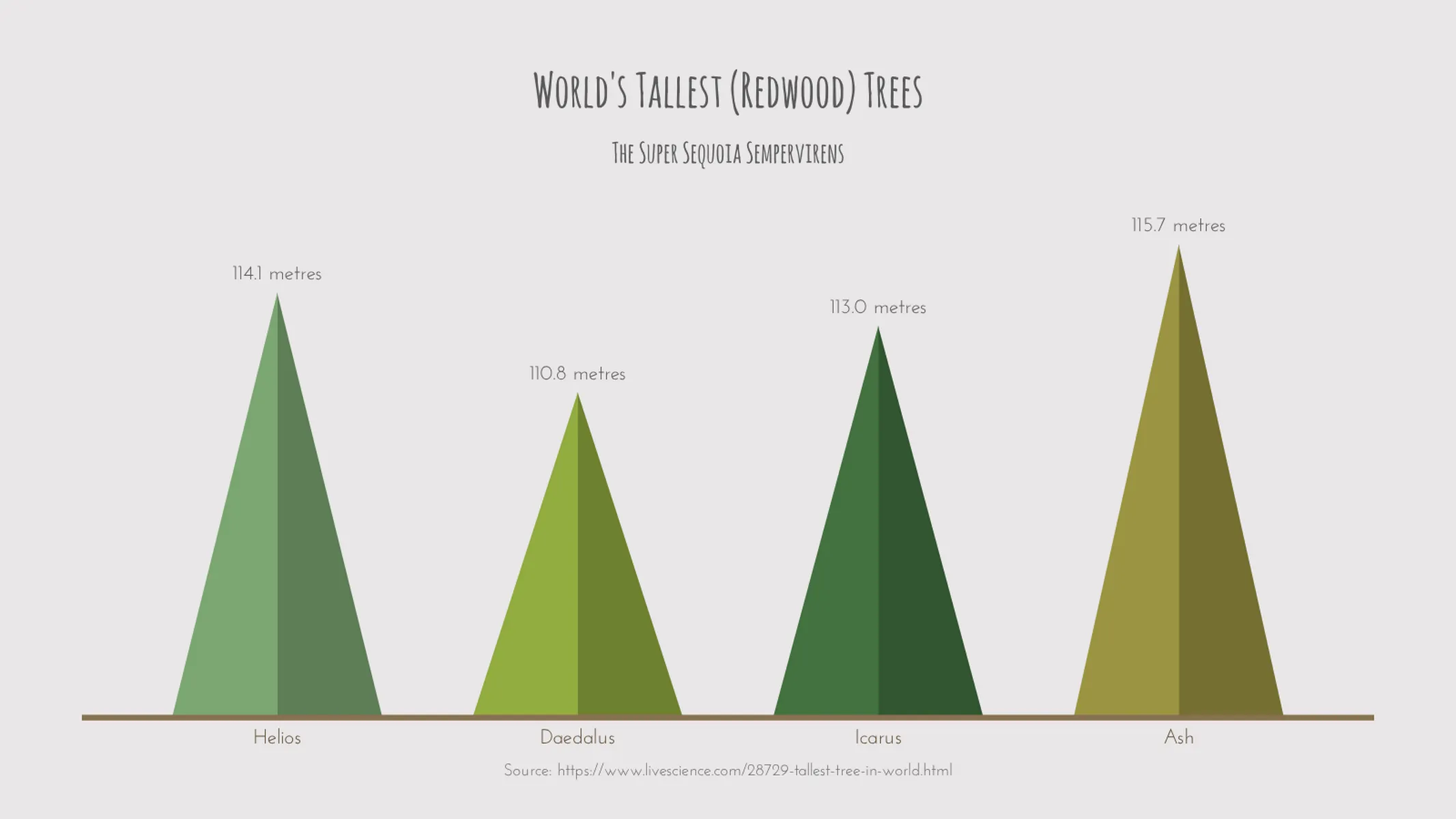
What is a triangle bar chart?
Highlight the peak performance of your team/or business with the triangle chart. Everything you love about the traditional bar chart, now with three sides and 180 degrees. Embrace the elegant angles of the triangle and compare various categories over one variable. The length of the triangles is proportional to the values of the categories they represent.
How to make a triangle bar chart with Vizzlo?
Create a great-looking triangle bar chart in seconds. Follow these easy steps:
- Click on the triangles to start editing them. For that, you can pull their sizes, edit the labels or use the active cards in the sidebar.
- Alternatively, click on the button “EDIT DATA IN SPREADSHEET” on the tab “DATA” of the sidebar. Import or paste your data from any spreadsheet (e.g., import Excel files or CSV files).
- Explore the options of the tab “APPEARANCE” to customize your theme, choose display preferences, sort the triangles, and refine the look of the chart.
Pro tip: Before importing or pasting your data into Vizzlo’s spreadsheet, make sure the number formats match your data source. Click on the “wheel” icons in the spreadsheet columns to see the number formatting options.
Triangle bar chart maker: key features
- Custom number formats and colors
- Custom triangle width
- Custom axes and grid
- Optional sorting by value
- Optional labeling of individual values
- Analysis lines: growth rates (CAGR), reference lines, trendlines, and benchmarks
- Adjustable min/max values for y-axis
Triangle Bar Chart: What's new?
The styling of individual numerical value labels can now be modified—much in the same way you’ve been able to format the text labels before.
Axis titles can now be disabled.
You can now hide vertical and horizontal axis lines.
Triangle Bar Chart Alternatives

Use Cases
Bar & Column chartsEnhance your productivity
Create a Triangle Bar Chart directly in the tools you love

Create a Triangle Bar Chart in PowerPoint with
Vizzlo's add-in

Loved by professionals around the world


Visualizations your audience won’t forget
Convey abstract concepts and data with professionally designed
charts and graphics you can easily edit and customize.