Chart Vizzard
Vizzlo's AI-based chart generatorCreate your Color Coded Bar Chart in seconds
Visualize and compare numerical data of categories from groups with the color coded bar graph.
Create your chart in 3 simple steps
- Create new Color Coded Bar Chart
- Add your data
- Export or share
Why Vizzlo?
- Create professional charts in seconds
- Fully customizable, no design skills needed
- Create directly in PowerPoint & Google Slides
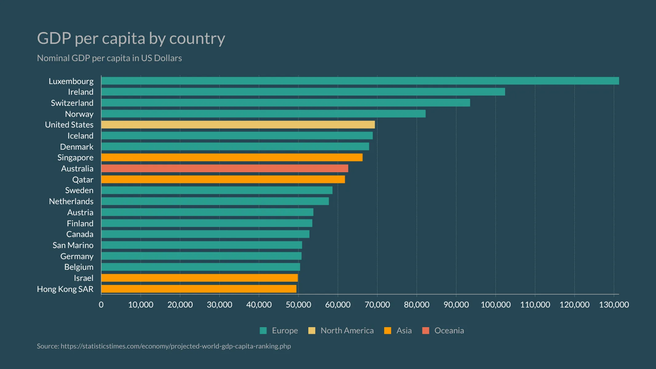
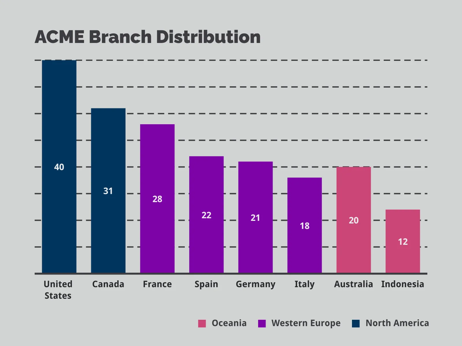
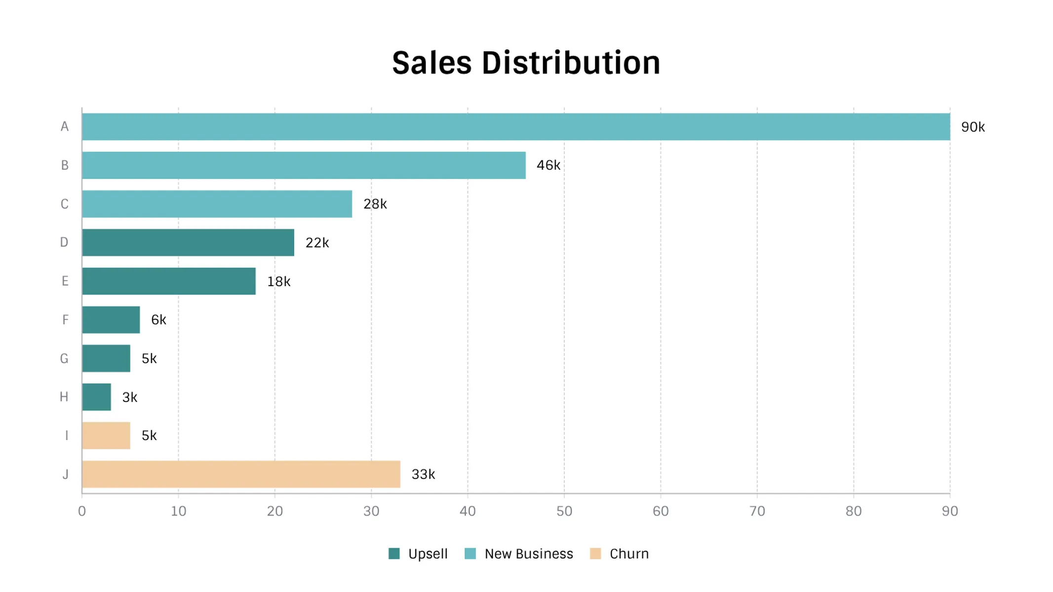
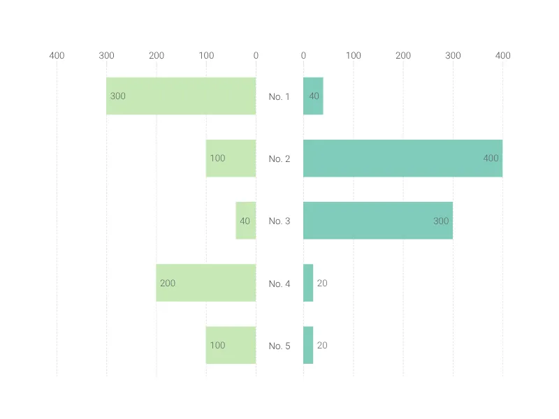
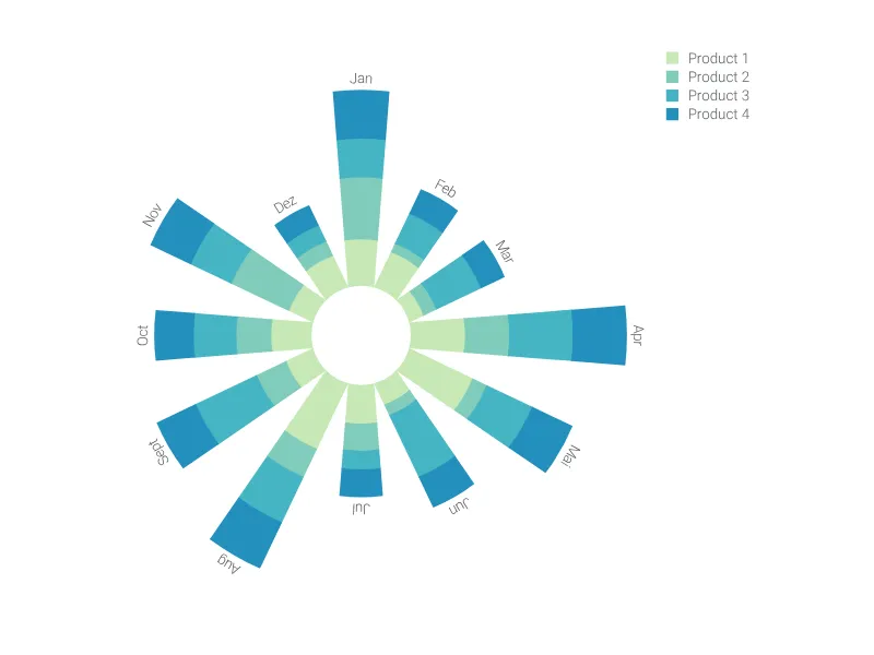
What is a color coded bar chart?
A color coded bar chart is basically a bar chart with a legend that utilizes color to visualize different category groups. The bars represent a set of numerical data points. The length of the bars is proportional to the numerical values associated with each category. The bars can be placed either vertically or horizontally.
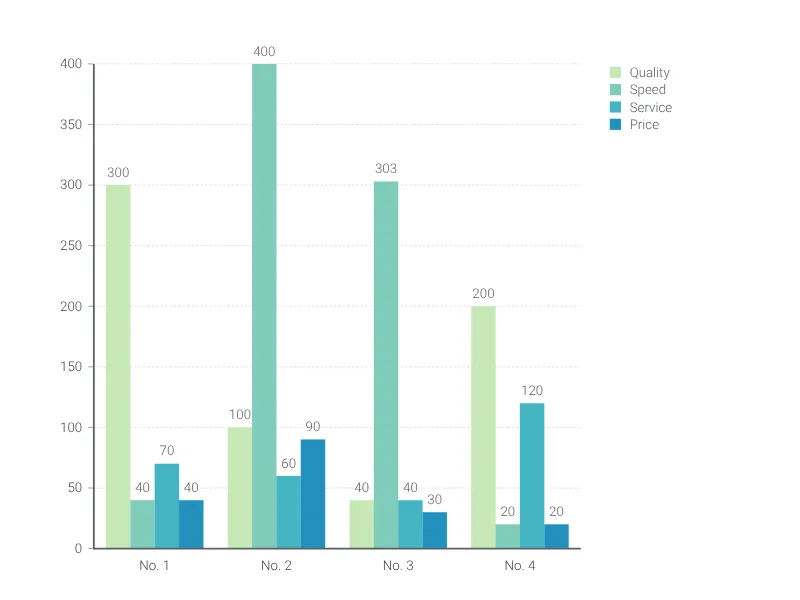
Technically, the color coded bar chart is a stacked bar chart where for each category only one of the series is visually represented. The transformation to a stacked bar chart is therefore seamlessly possible at any point.
Best uses for a color coded bar chart
- Comparing the key factors that contributed to a group
- Breaking down total sales figures into component parts
- Grouping smaller data sets of specific categories
How to make a color coded bar chart with Vizzlo?
- Enter your data either open the “Spreadsheet” in the menu bar and copy & paste your data into the corresponding fields or upload as XSLX or CSV file
- Change the data of the default entries - just click on any bar and use the input elements in the sidebar
- Add additional bars by clicking the “plus” buttons on each side of a bar. Alternatively, click on “+ Add bar” in the menu bar
- Create new groups by clicking the “plus” button in the legend
- Explore additional customization options the sidebar
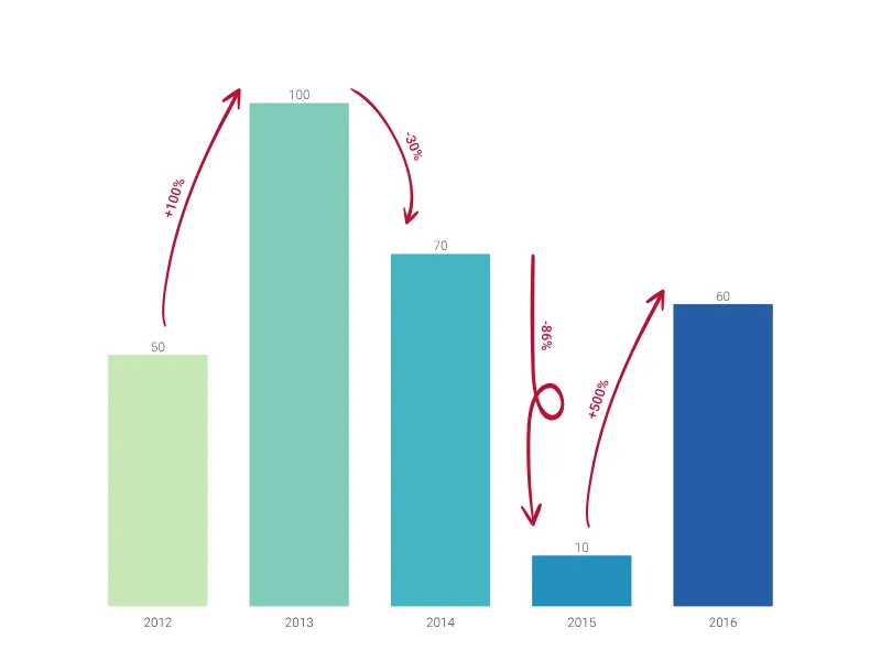
- Click on Analysis or use the toolbar to add a level difference arrow or reference line
Color coded bar chart: pro tips
- Transform your color coded bar chart into a stacked bar chart using the sidebar
- If the labels to identify the bars take up too much horizontal space, swap between vertical or horizontal mode
- Always sort your bars to form a group via drag and drop
Color coded bar chart maker: key features
- Vertical and horizontal views
- Sorting bars ascending or descending
- Change group colors
- Customize axes lines and grid lines
- Adjustable minimum and maximum range for y-axis
Color Coded Bar Chart: What's new?
The new Color Coded Bar Chart is available!
 .
.
Color Coded Bar Chart Alternatives
Enhance your productivity
Create a Color Coded Bar Chart directly in the tools you love

Create a Color Coded Bar Chart in PowerPoint with
Vizzlo's add-in

Loved by professionals around the world


Visualizations your audience won’t forget
Convey abstract concepts and data with professionally designed
charts and graphics you can easily edit and customize.