Chart Vizzard
Vizzlo's AI-based chart generatorCreate your Expenses Waterfall Chart in seconds


Variation of the standard waterfall chart which inverts sign logic to display expenses, following standard accounting notation.
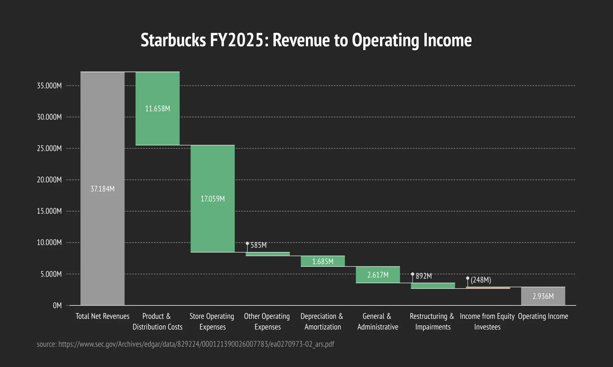
Create your chart in 3 simple steps
- Create new Expenses Waterfall Chart
- Add your data
- Export or share
Why Vizzlo?
- Create professional charts in seconds
- Fully customizable, no design skills needed
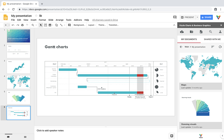
- Create directly in PowerPoint & Google Slides
What is an expenses waterfall chart?
The expenses waterfall chart is a variation of the standard waterfall chart, purpose-built for cost breakdowns, budget reporting, and expense tracking. Instead of using standard budget-style sign conventions, it follows accounting and cost-reporting norms: costs, outflows, and expenses are displayed with a minus sign, while negative or zero values are shown without a minus sign. This makes it easier for financial teams to present expense data in the format stakeholders expect, without the visual noise of negative signs on figures that represent spending, not deficits.
At its core, the waterfall chart is a stacked bar chart with a visible and an invisible series of bars. The invisible series acts as a placeholder that hides the previous amount, to help the viewer understand changes in the distribution. Incremental bars add up, decremental bars subtract from the previous value. Commonly the initial and the final values are represented by whole columns starting at a zero baseline. Intermediate values are shown as floating columns that begin based on the value of the previous column. Connecting lines help the viewer to see the increments. These strokes avoid distracting or adding clutter to the chart. Vizzlo’s waterfall chart is the easiest and most beautiful alternative to the Excel waterfall chart.
Waterfall charts are widely adopted in accounting and sales, as well as in management. It is regularly used by strategic consulting firms to analyze cash flows. It is used as an instrument to estimate the value of a company to address key questions that can come up from stakeholders.
A typical use-case of an expenses waterfall chart is breaking down operating costs, departmental budgets, or project expenditures — showing where money was spent without the distraction of negative signs on every cost line. It’s also well suited to variance reports, where actual spend is compared against budgeted spend, and to cost-of-goods breakdowns where every component is, by nature, an outflow.
Environmental agencies use waterfall charts too, e.g. to visualize the annual change of CO2 emissions by breaking down the main drivers of that development.
Fun fact: This chart is also referred to as flying bricks chart or Mario chart due to its floating bars—their look closely resembles the way bricks are laid out in 2D Jump ‘n’ Run games like the classic “Mario Bros.” arcade of the early 1980s.
How to create an expenses waterfall chart with Vizzlo?
- Set the Calculation mode to “Expenses” to apply cost-reporting sign conventions.
- Switch to horizontal mode by one click.
- Set colors for positive and negative values.
- Click on any bar to change its value or properties like color.
- Import your data from your Microsoft Excel file or CSV file, or paste it into Vizzlo’s spreadsheet.
- Add a subtotal column by clicking on the “Σ” handles on the right side of any selected bar.
- Add Top arrows to compare values across bars.
- Choose a sign style — including parentheses — for flow bar labels in the sidebar settings.
- Explore the layout settings to show or hide the connectors, and choose how to display the labels.
Expenses waterfall chart maker: key features
- Dedicated Calculation mode control to switch between Budget and Expenses labelling conventions.
- Expense-style sign display: costs shown without a leading minus sign, in line with standard accounting conventions.
- Consistent sign convention applied to both flow bar labels and value labels inside bar annotation arrows.
- Optional parentheses notation for flow bar labels, selectable in the sidebar settings.
- Adjust the width of the bars.
- Change colors of bars and lines.
- Show axes and grid lines.
- Show multiple subtotal columns.
- Show individual values.
- Optional labeling of bars.
- Compare values across bars by their sum, difference, growth rate, or ratio.
- Add a shade to highlight parts of the chart.
- Show sum values above the bars.
- Adjust the number format, add prefix or suffix.
- Set minimum and maximum values for the y-axis.
- Add a scale break to the y-axis.
- Show multiple series per category.
Resources
Expenses Waterfall Chart: What's new?
The waterfall chart now offers an expenses mode: a variation that inverts the sign logic to display expenses following standard accounting notation. Turn it on as a simple setting in the regular waterfall chart, or pick it as its own chart type.
Expenses Waterfall Chart Alternatives
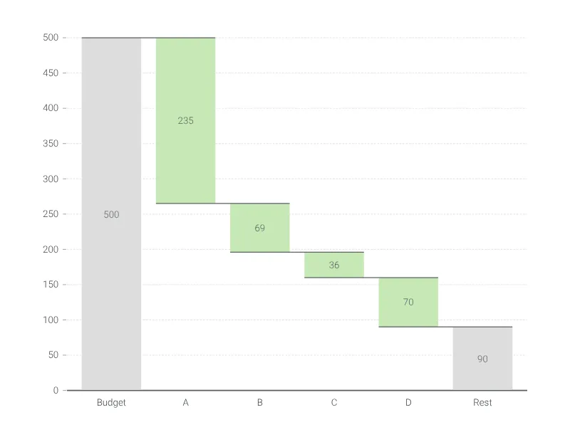
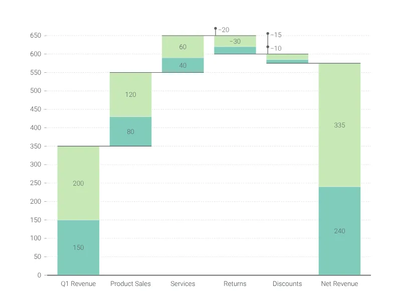
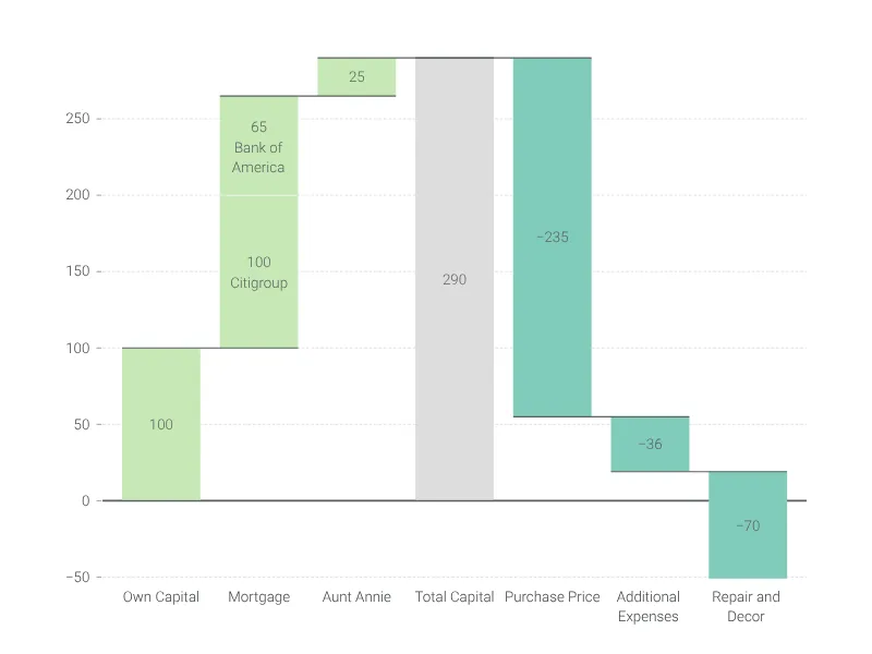
Enhance your productivity
Create a Expenses Waterfall Chart directly in the tools you love
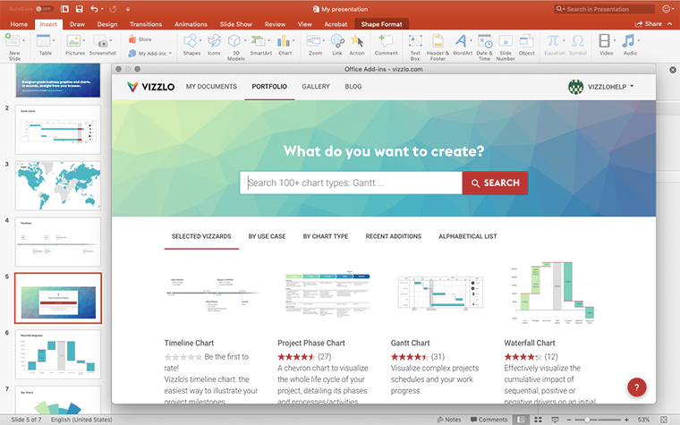
Create a Expenses Waterfall Chart in PowerPoint with
Vizzlo's add-in
Loved by professionals around the world







Visualizations your audience won’t forget
Convey abstract concepts and data with professionally designed
charts and graphics you can easily edit and customize.