Chart Vizzard
Vizzlo's AI-based chart generatorStacked Waterfall Chart
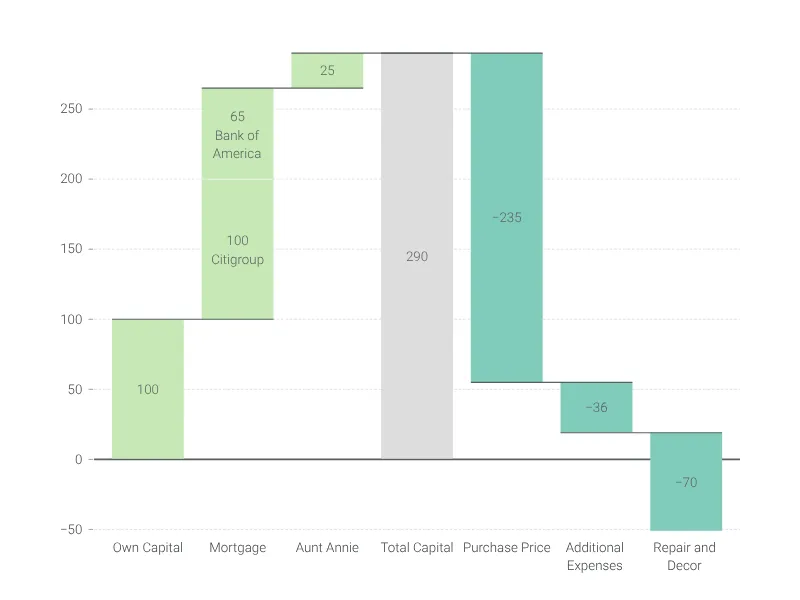
Waterfall chart with multiple data series stacked per category, ideal for visualizing the cumulative effect of several contributing factors at each step.
What is a stacked waterfall chart?
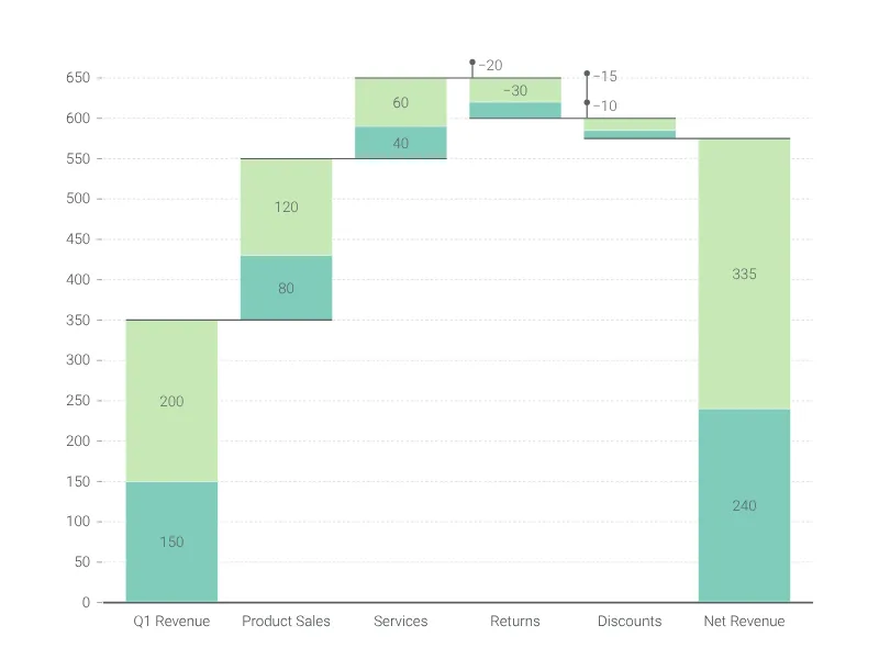
A stacked waterfall chart extends the standard waterfall chart by allowing multiple data series per category. Each bar in the waterfall is subdivided into stacked segments, making it easy to see how different contributing factors combine at each step. This is particularly useful when you need to break down incremental changes into their individual components.
For example, in a revenue bridge analysis, a stacked waterfall chart can show how product sales and service revenue each contribute to the total change at every stage — from starting balance through individual adjustments to the final result.
When to use a stacked waterfall chart
- Multi-factor analysis: When each step in your waterfall is driven by more than one factor, stacking reveals the breakdown within each bar.
- Comparative breakdowns: Compare how different business units, regions, or product lines contribute to cumulative changes.
- EBITDA bridges with detail: Show not just the total movement between periods, but the composition of each movement.
- Budget variance analysis: Break down budget variances by department, cost center, or project at each stage.
How to create a stacked waterfall chart with Vizzlo
- Add multiple series in the chart settings to enable stacking.
- Enter your data in the spreadsheet — each series gets its own column.
- Click on any bar segment to change its value, color, or label.
- Import data from Microsoft Excel or CSV, or paste directly into Vizzlo’s spreadsheet.
- Add subtotal columns by clicking the “Σ” handles.
- Switch to horizontal mode with one click.
- Use the legend to identify each series.
Stacked waterfall chart maker: key features
- Multiple data series per category with automatic stacking.
- Customizable colors for each series, as well as for positive and negative values.
- Adjustable bar width and connector lines.
- Horizontal and vertical orientation.
- Subtotal columns at any position.
- Individual value labels on each segment.
- Sum values above the bars.
- Compare values across bars by sum, difference, growth rate, or ratio.
- Add shading to highlight parts of the chart.
- Full number formatting with prefix and suffix support.
- Scale breaks and custom axis ranges.
Stacked Waterfall Chart: What's new?
Added a stacked waterfall chart template chart type to the portfolio.
Stacked Waterfall Chart Alternatives
Enhance your productivity
Create a Stacked Waterfall Chart directly in the tools you love

Create a Stacked Waterfall Chart in PowerPoint with
Vizzlo's add-in

Loved by professionals around the world


Visualizations your audience won’t forget
Convey abstract concepts and data with professionally designed
charts and graphics you can easily edit and customize.