Chart Vizzard
Vizzlo's AI-based chart generatorInbound Sankey Arrow
Visualize the flow from several sources to a whole with a beautiful Sankey-like diagram.
Features
- Custom colors and number formats
- Optional sorting by value
- Optional labeling of individual and total values
What is an inbound Sankey diagram?
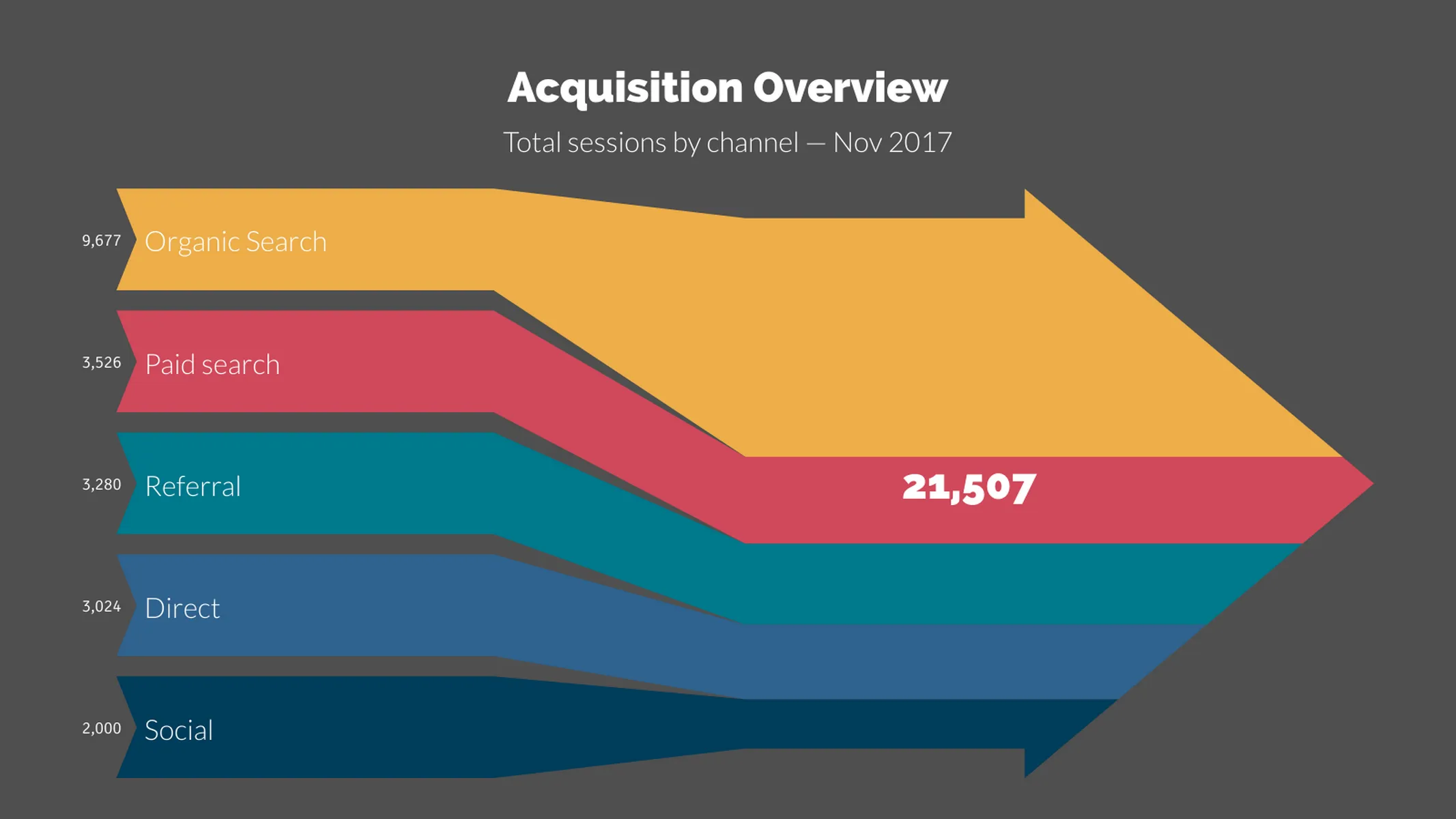
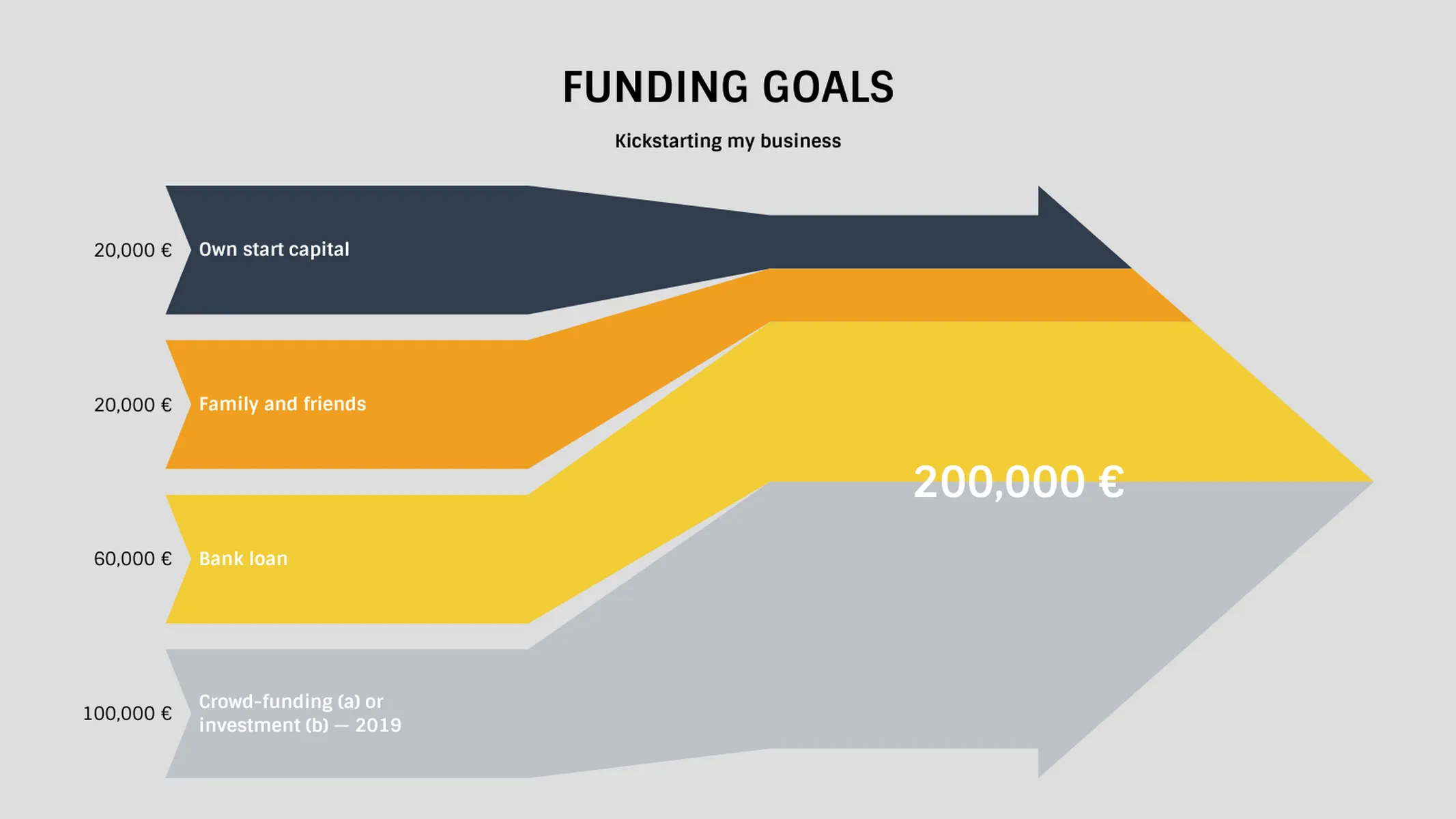
A Sankey diagram is a part-to-whole flowchart, in which the width of each arrow corresponds to the size of the flow (i.e., its magnitude). An inbound Sankey arrow is not different. However, it focuses just on the many sources flowing inwards to build up your results.
Translating it into real-world cases, you could use this chart to represent: your social media channels and how they generate traffic to your website; or your cash inflow/the composition of your sales results, i.e., how each of your sales channels contributes to your business turnover. Check the examples to get inspired!
How to make an inbound Sankey diagram with Vizzlo?
Vizzlo’s inbound Sankey diagram is a dynamic and colorful option to visualize how a particular result is produced. Follow these easy steps to create yours in seconds:
- Click on the arrows and text elements to start editing them.
- Use the cards in the sidebar or the spreadsheet to enter your data with ease.
- If needed, drag and drop the arrows to reorder and reposition them.
- In the tab “APPEARANCE” of the sidebar, set your preferred number format, choose to show single and total values, and pick your favorite color theme.
Inbound Sankey Arrow: What's new?
We updated the default data.
Inbound Sankey Arrow Alternatives
Enhance your productivity
Create a Inbound Sankey Arrow directly in the tools you love
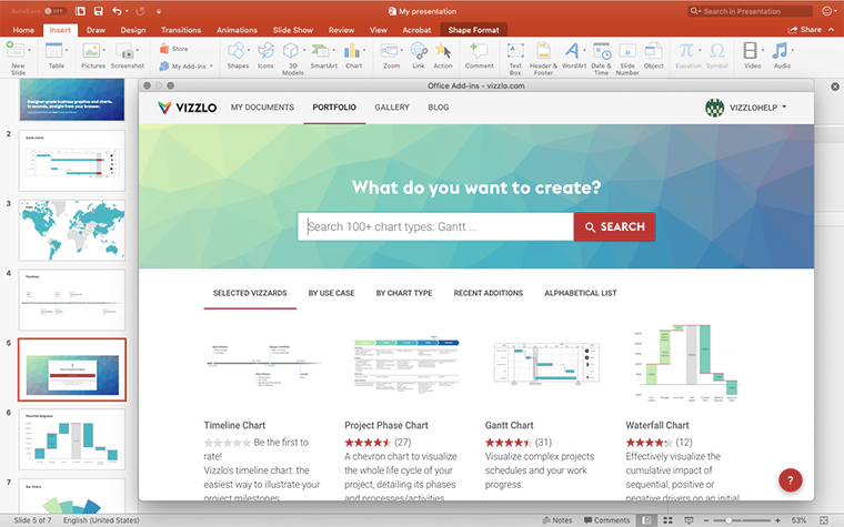
Create a Inbound Sankey Arrow in PowerPoint with
Vizzlo's add-in
Loved by professionals around the world


Visualizations your audience won’t forget
Convey abstract concepts and data with professionally designed
charts and graphics you can easily edit and customize.
