Chart Vizzard
Vizzlo's AI-based chart generatorRange Plot
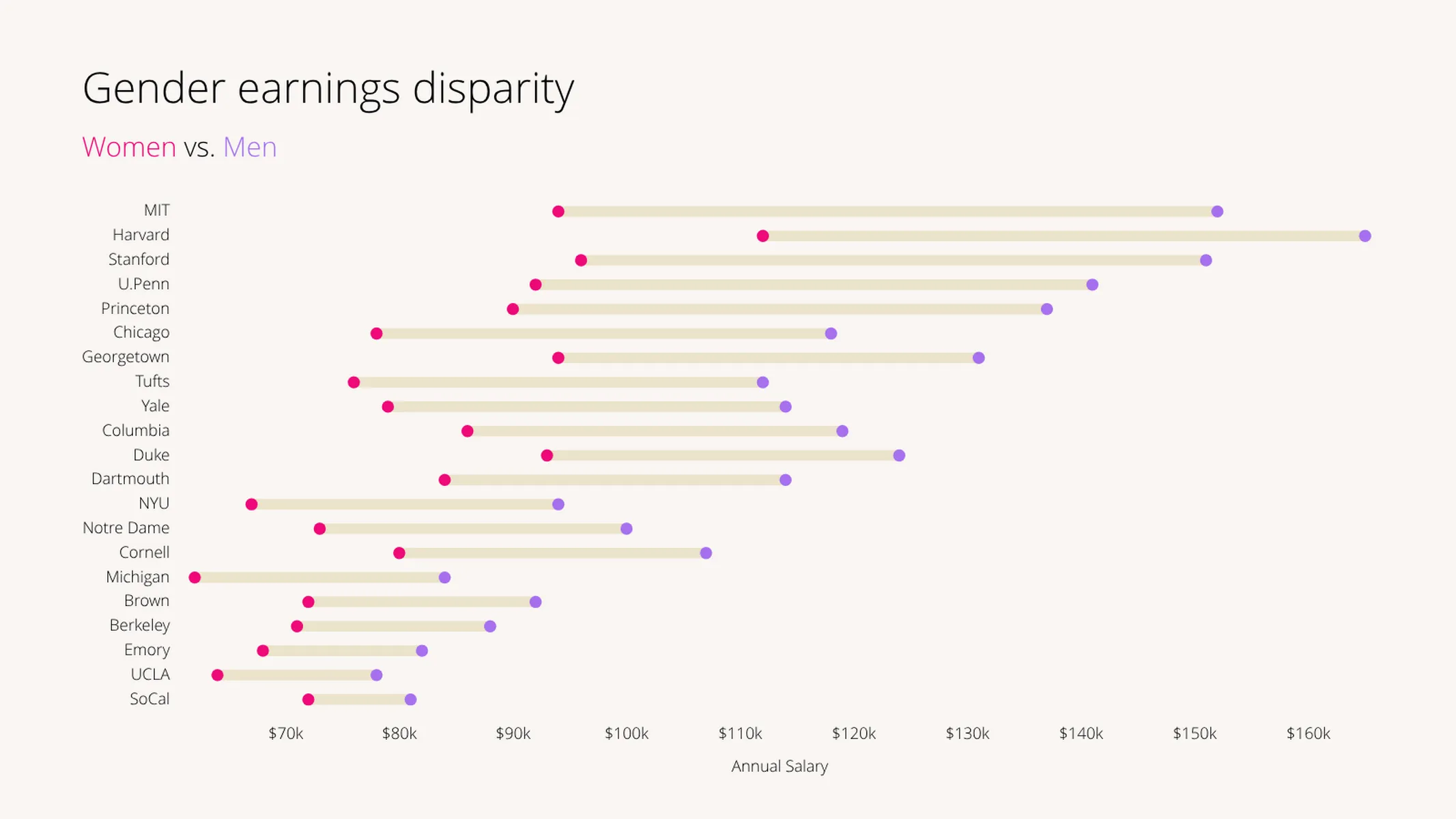
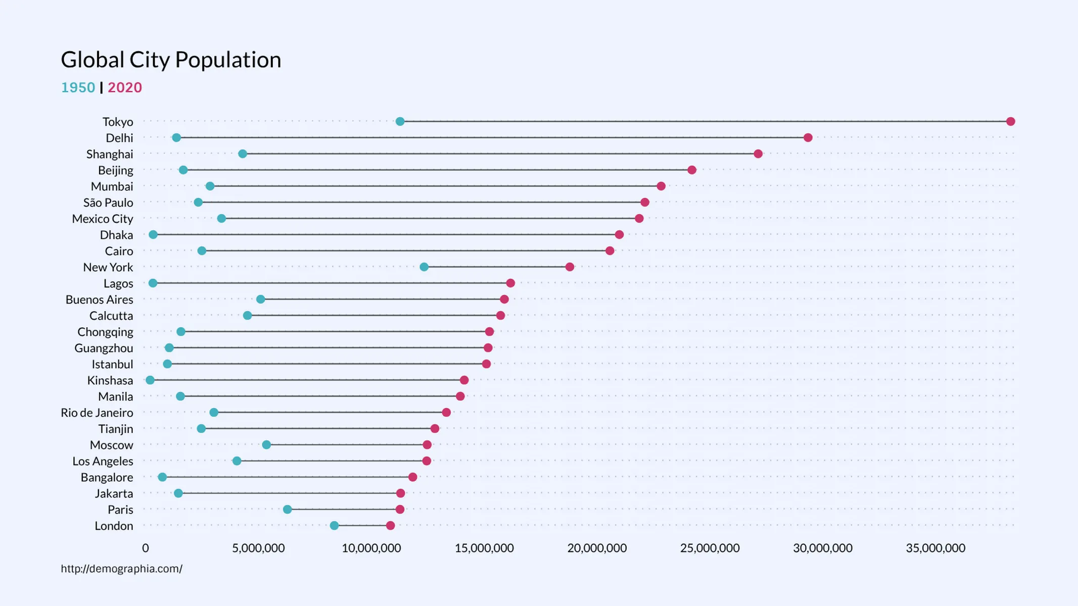
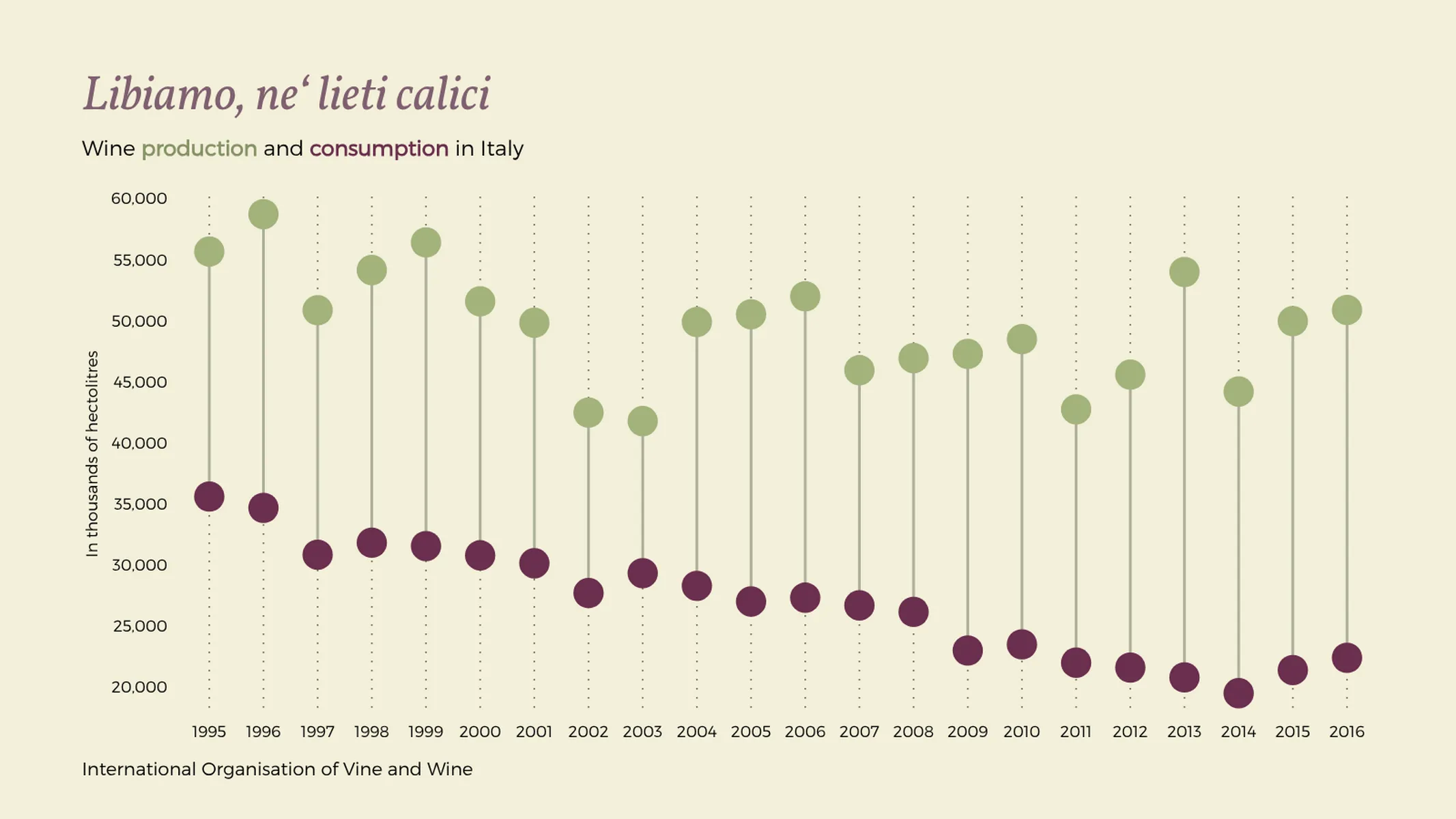
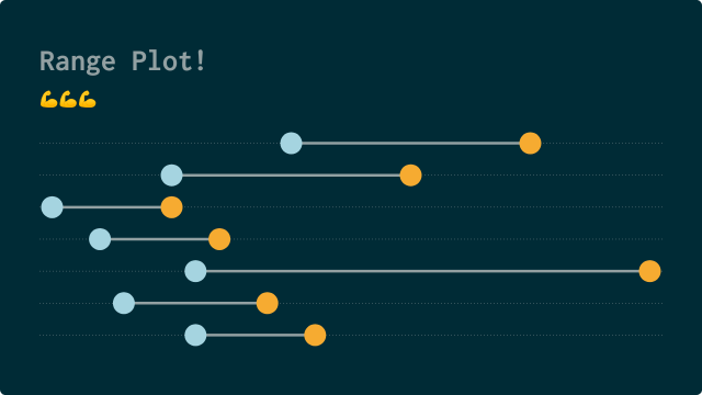
A range plot is a great choice if you want to highlight the difference between two values rather than the values itself.
What is a range plot
A range plot displays two or more quantitative values for different categorical items. Typically, the chart displays exactly two values connected by a segment for each category. The chart therefore focuses on the difference, i.e. gap between the values which is represented by the size of the segment.
Color attributes are used to highlight the different categorical grouping. The chart is also know as dumbbell chart, connected dot plot chart, or barbell chart.
How to make a range plot with Vizzlo?
- Use the spreadsheet to insert your data
- Change the position of categories using drag and drop
- Explore additional customization options in the sidebar or in the theme settings
Range plot maker: key features
- Display multiple categories and values
- Switch between a horizontal and vertical mode
- Custom number formats and colors
- Custom axes and grid
- Adjustable min/max values for y-axis
Resources
Range Plot: What's new?
We fixed a bug for all Safari users. Solid connector lines are displayed as such when you edit your chart.
Most of our data visualisations now support SI prefixes, advanced number format options for axes and shown data labels.

There is a new chart waiting for you in our portfolio! Use it to display the difference between two values.
You can adjust the size of the dots, switch between a horizontal and vertical chart and more. We added a more a sophisticated example to our gallery.
Range Plot Alternatives
Enhance your productivity
Create a Range Plot directly in the tools you love

Create a Range Plot in PowerPoint with
Vizzlo's add-in

Loved by professionals around the world


Visualizations your audience won’t forget
Convey abstract concepts and data with professionally designed
charts and graphics you can easily edit and customize.