Chart Vizzard
Vizzlo's AI-based chart generatorBar Chart Definition
We are often interested in a representation of the order of magnitude of a series of numbers. For example, we could imagine the number of countries per continent, or the total number of goals scored by football clubs in a season, or the average age of US Americans compared to the average age within all other OECD countries over time.
In all these cases we have a number of categories (e.g. continents, football clubs or states) and a quantitative value for each category. Typically, a bar chart is the first thing that comes to mind when we want to visualize such orders of magnitude. That is, a bar chart is the most common visual when you want to show numerical values for some set of categories. Take the life expectancy example mentioned above and shown below:
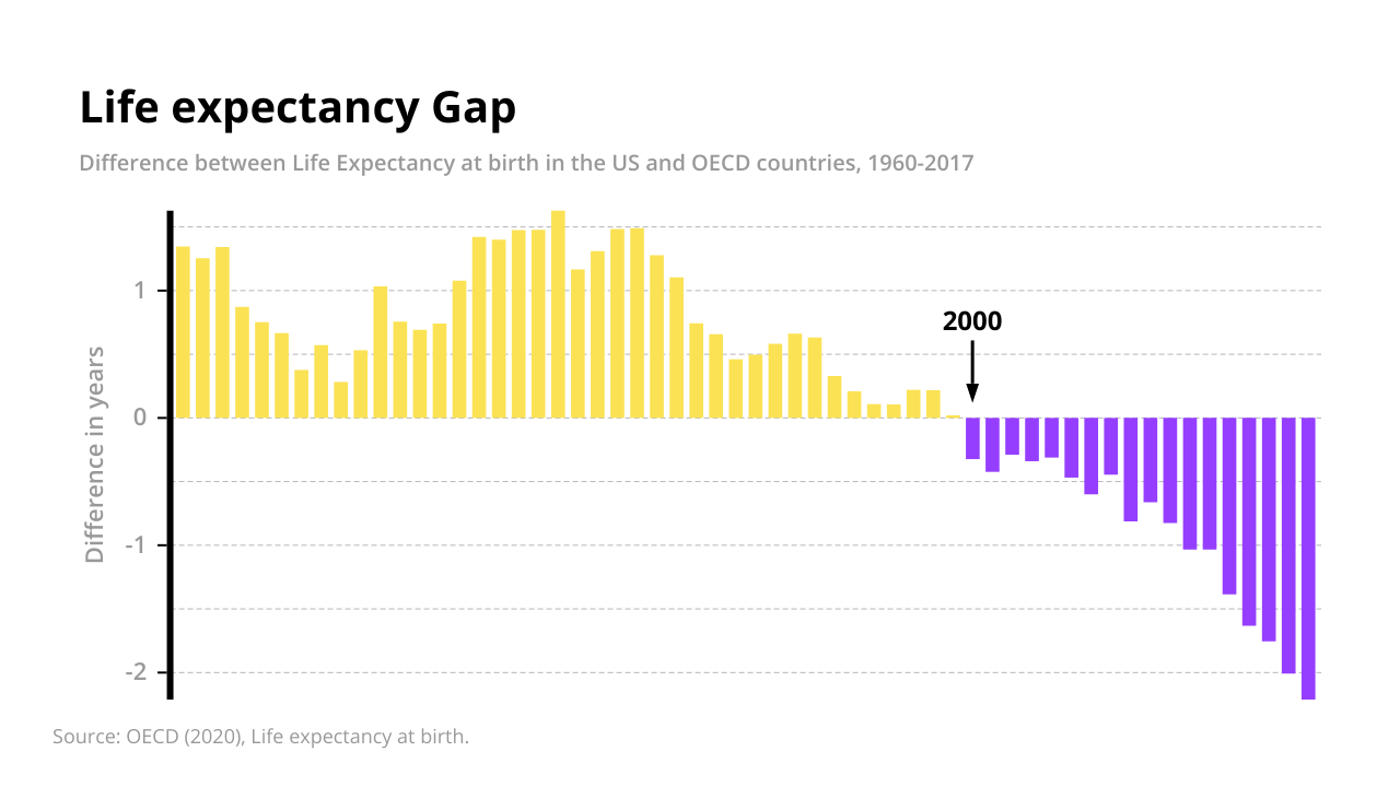
This is a clever and effective visualization because it contains information from three variables:
- The life expectancy of US citizens
- The life expectancy of OECD citizens
- Time
For the years between 1960 and 2017, the chart shows the difference in average life expectancy between US and OECD citizens. Strikingly, the shift in ratios is illustrated. While US Americans lived longer on average until the year 2000, the situation has reversed since then. In 2017, US citizens lived on average two years less than people in other OECD countries.
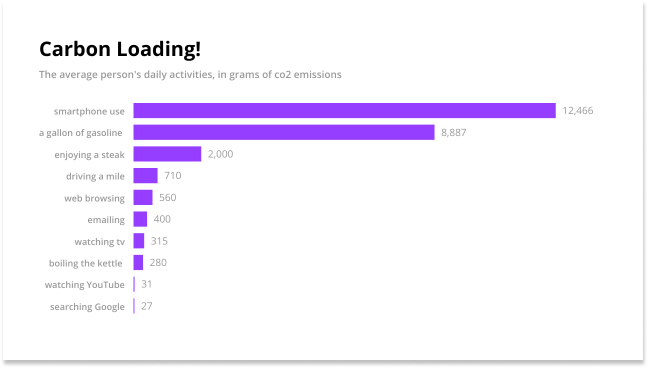
One problem we commonly encounter with vertical bars is that the labels identifying each bar take up a lot of space. Longer labels are harder to fit into the bar width when you are comparing a larger number of categories. There are 4 ways that this problem can be approached
- Use acronyms, abbreviations or to shorten the terms
- Rotate the axis labels
- Flip the chart vertically
- Hide the axis completely (and use an annotation)
We have used the fourth approach in the example on life expectancy because the columns are ordered by time anyway and the value for a particular year is of less interest. Rather, it is interesting for the viewer to know the year in which the conditions have reversed, and we have used an annotation for this.
Let us consider another example taken from our gallery.
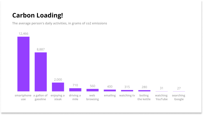
Using a shorter, abbreviated label doesn’t make much sense in the example above. The best way usually to overcome this problem is to flip the x- and y-axis to make the bars run horizontally. Horizontal labels make the information presented far more accessible.
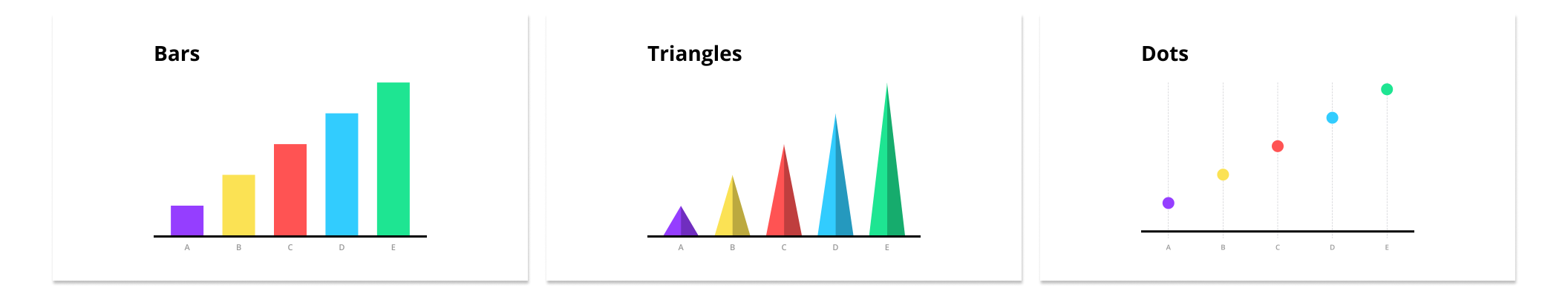
There are many types of bar chart, e.g. grouped, stacked which can be arranged either vertically or horizontally. Typically, numerical values are displayed as bar, i.e. rectangles, but instead of using bars, we can also place dots at the location where the corresponding bar would end or use triangles.
Radial Bar Chart
A Radial Bar chart or Circular Bar Chart is simply a Bar Chart plotted on polar coordinates. It is best used for aesthetic reasons because the bars cannot be compared by their lengths. This is because each bar has to be at different radial points, so each bar is judged by its angle. A bar on the outside will be longer by construction than one on the inside, even with an equal value, see example below.
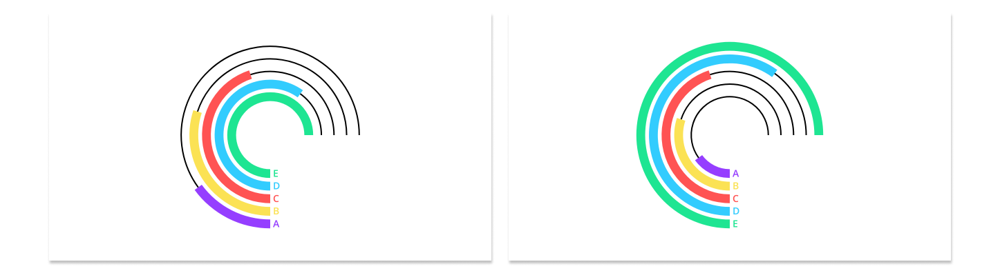
Humans are better at interpreting straight lines rather than angles, so the Cartesian bar chart is a better choice for comparing values.
Development and History of the Bar Chart
Unusually for such a simple and universally popular diagram, the bar chart did not develop organically over time, with many vague and mysterious sources, but was conceived by a single man (William Playfair) in 1781.
William Playfair, the Scottish engineer, political economist, and scoundrel, was inspired by Joseph Priestley’s creation of the timeline chart in 1765 as a way of visualizing and comparing information. The major difference between previous data visualizations and Playfair’s invention was that his bar charts measured data by a set (any set) of comparative values, whereas all that had come before was measured either by time (as with Priestly’s timelines) or space (such as coordinates).
Grouped and stacked bar charts
All examples so far showed how a value varied with respect to one categorical variable. If there are multiple values for each category you want to show, you can use a grouped bar chart or stack the bars or even a butterfly chart.
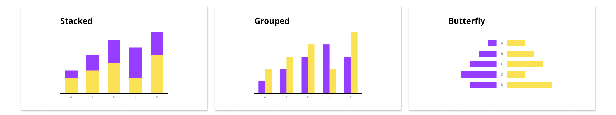
Grouped Bar Chart
Grouped bar charts are useful to compares a group of values different values for each category along the x-axis. They can also be referred to as clustered bar graphs, multi-set bar charts, or grouped column charts.
Stacked Bar Chart
Use a stacked bar chart when the sum of the amounts represented by the individual stacked bars adds additional information to the chart. Stacking bars instead of grouping them is also appropriate when the individual bars represent counts. Take the example below, which you can fork from our gallery too. The diagram essentially clarifies two things. Firstly, people in the US are spending more and more time on social media every day, and more and more on their phones.
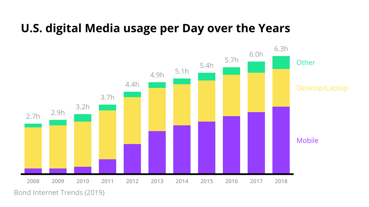
It is a good idea to display only a small number of different values and then add the actual numbers to the chart. This considerably increases the amount of information conveyed by the chart, keeping the chart clear and eliminating the need for an explicit y-axis.
Segmented Bar Chart
Segmented bar charts (also known as “100% stacked bar charts”) show each bar with the same, unified length and a complete value of 100%. The focus here is on the breakdown of each comparative category and their relative sizes rather than their absolute, cumulative values. When there are only two bars in each stack, the resulting visualization can be quite clear. Consider the example about the share of women and men in different job roles:
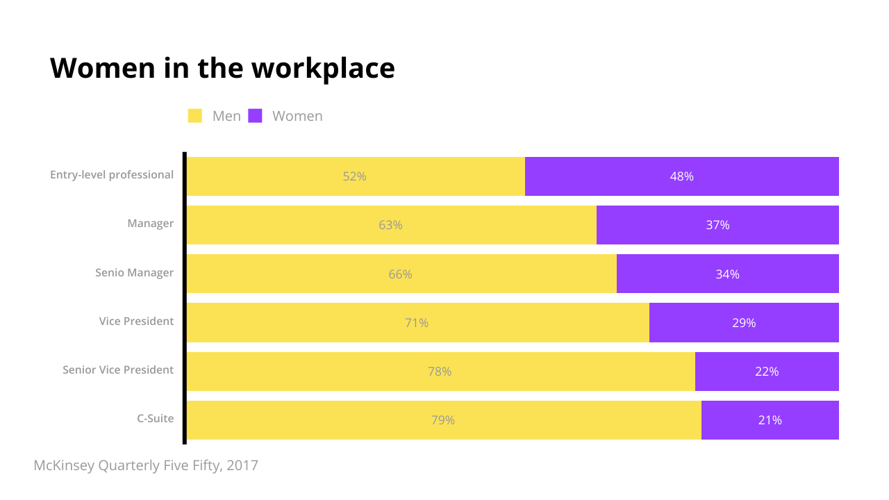
This figure provides an immediate visual representation of the proportions for different job positions. We don’t focus on how many managers or vice-presidents there are in total; to show the comparatively smaller number of C-suite officers than entry-level professionals may give a skewed perspective on the respective importance or power held by these positions. The proportion of those roles that are held by either men or women is the point of interest here.
What is not a Bar chart: Histograms
Although a bar chart and a histogram share an almost identical appearance they should not be confused with each other. A histogram shows the distribution of a continuous variable while a bar chart displays a quantitative value for a set of categories.