Chart Vizzard
Vizzlo's AI-based chart generatorHow to Create a Gantt Chart in PowerPoint With Vizzlo Templates
In this step-by-step tutorial we will explain how to make Gantt charts in PowerPoint.
What is a Gantt chart?
One thing that all projects have in common is advance planning. Working with careful planning can significantly improve the achievement of your task, no matter how small or large your task is. Project management saves managers and teams a lot of time and effort.
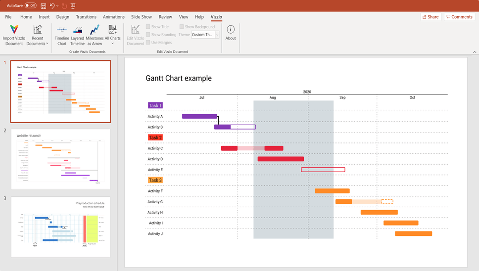
Vizzlo’s Gantt chart is easy to use and looks beautiful. The chart is completely interactive, that is you can click on any element to select and then edit it.
Why Vizzlo’s PowerPoint add-in?
Vizzlo is a tool that helps you to create beautiful business graphics easily. Besides our online chart maker, Vizzlo offers a PowerPoint add-in that ships with our free desktop app. Vizzlo’s desktop app is the charting tool that you can take with you wherever you go. With hundreds of business charts and graphs, unlimited features, and seamless integration, Vizzlo helps you create visualizations with ease. Whether you work online or offline, you can create charts with confidence. Vizzlo makes charting easy.
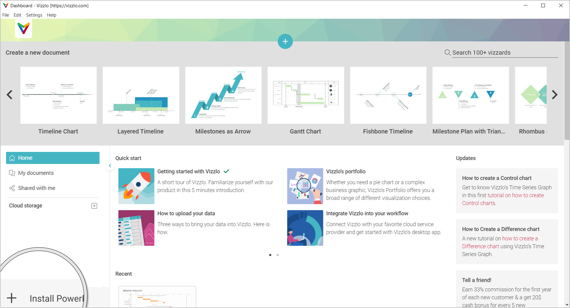
You can download our FREE PowerPoint add-in from the Microsoft Store. Download the app, create a Vizzlo account, install the PowerPoint add-in and you are ready to go.
How to install Vizzlo’s PowerPoint add-in?
Once you downloaded Vizzlo Desktop app from the Windows store you need to open it, then click the + Install PowerPoint add-in button at the bottom left and you are ready to start. The installation of the PowerPoint add-in should not take more than a few seconds.
How to Create Gantt charts in PowerPoint?
Open PowerPoint and click on Vizzlo tab. You will see the options to import a Vizzlo file (.vzl), insert a new chart and more options that are enabled once a chart was added to your presentation.
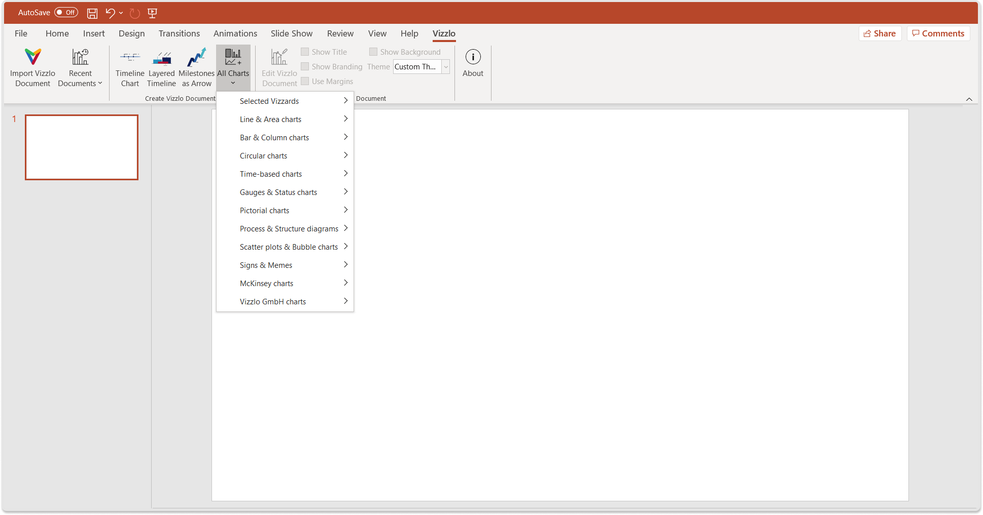
A Gantt chart is time-based so hover on the respective option add select Gantt Chart. You will be able to insert the chart via drag and drop. Once the chart was insert, double-click on it to start editing.
When you opened the document editor, you will see all the options to
— edit default data and title
— change font properties
— add new activities to your Gantt chart
— add a segment and a milestone
— edit a theme and layout
— change the date style
— export your work
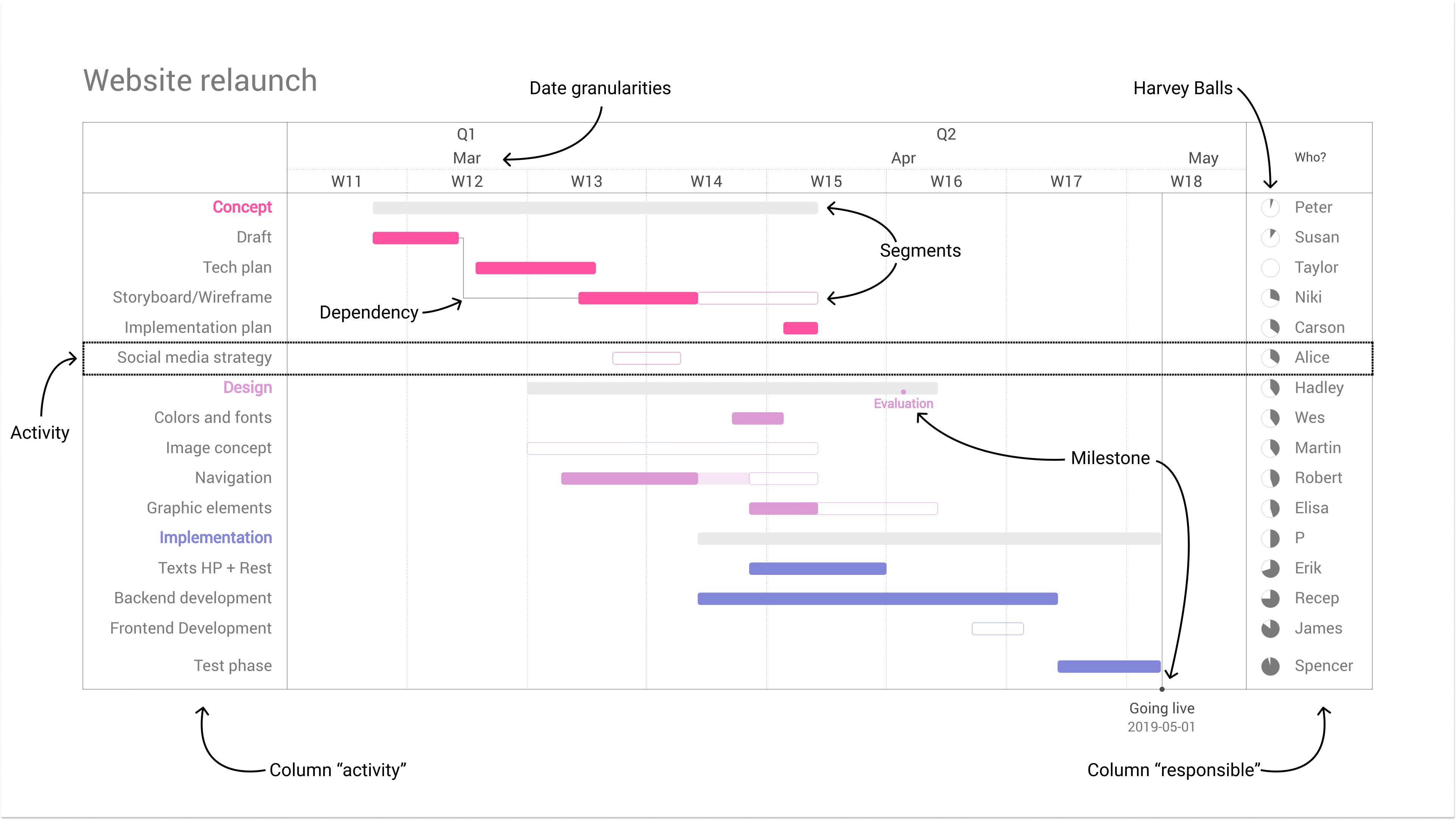
If you don’t know what an activity, a segment or a milestone is, the next image will explain that to you.
At the end of this tutorial you will have created your first Gantt chart, a tool widely used among perfect for knowledge workers, marketers, IT professionals, and project managers.
Gantt chart step by step
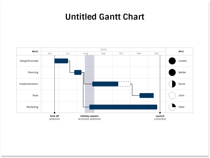
The chart comes with sample data. When you create a new document this looks as below. There might be differences regarding fonts, colors and aspect ratio of the document, depending on your default theme:
Adding data
There are multiple ways to add, delete or edit data of a Vizzlo chart. You can either
— click on one of the elements and change the data in the sidebar, or
— edit it in the Spreadsheet. Open the Spreadsheet then click on Import data to browse your local files, or simply drag a Microsoft Excel file or CSV file into the spreadsheet. Columns of your data must match the pattern, we take care of parsing your dates correctly and numbers for you
— After a right click, adding Activities, Segments or Milestones is also possible.
The sample data used for this tutorial can be downloaded here.
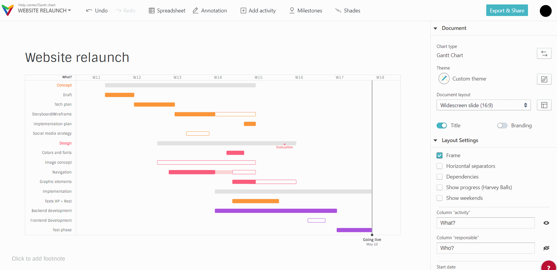
When you have imported the data, your Gantt chart should look like this:

The sidebar
Vizzlo’s Gantt chart is completely interactive. Click on the document title for example and start changing it.
In the sidebar you can change a document’s
— theme
— layout dimensions
— properties of any elements of your chart
— start end end date of the horizontal time axis
— label and value formatting and many more.
For example, under Layout settings uncheck the options Dependencies, Show progress (Harvey Balls), or click on the eye next to the text input called Column “responsible” to hide the respective elements from your Gantt chart. You can set the option Axis granularites to Week and now we only need to tweak the document’s theme for the final styling.
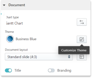
Theme editor
The overall look of a document can be edited by the settings in the theme editor, i.e. fonts, colors, line width etc. Click on the Customize theme button
Tip: Read our help center article ‘Customize a theme’ for more information.
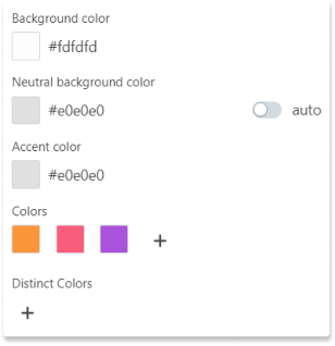
We create a theme with three colors to distinguish the segments:
— #FA9639
— #FA5D7C
— #AA52DE.
As background color we use #FDFDFD, Neutral background color and Accent color are set to #E0E0E0.
Editing elements
Editing an element is straightforward - select it with a mouse click and start editing. Change the properties of an element in the sidebar. However, you can drag segments vertically, activities can be dragged horizontally too.
If you are new to Vizzlo we added the final chart to your dashboard. But it can also be downloaded here.
Ready to create a Gantt chart?
All you need to o is sign-up for an account.
Vizzlo’s is a comprehensive add-in that brings over 100 ready-made business graphic and chart templates, diagrams, and maps directly to PowerPoint. Among the list are powerful business charts such as Waterfall chart, Gantt chart, Venn Diagram. Microsoft PowerPoint is one of the most frequently used tools to present analyses, reports to an audience. In Microsoft PowerPoint there is no integrated Gantt chart function. However, with Vizzlo’s PowerPoint add-in, a Gantt chart is only one click away from your presentations. Vizzlo’s PowerPoint add-in is designed to save you time.