Chart Vizzard
Vizzlo's AI-based chart generatorThe Definitive Guide to Pie Charts
A pie chart is the archetypal visualization to how a part-to-whole relationship. Pie charts are omnipresent in any business presentation, or analysis report. Despite being maligned among data scientists, we should not ignore this visualization, but rather talk about how to use it right. In this guide you will learn everything about Pie charts to make the best out of it and avoid common pitfalls.
What is a Pie Chart
A pie chart is a circular representation of proportions that together make up 100%. That is, a pie chart breaks a circle into slices. Each slice’s area is proportional to the fraction of the total it represents.
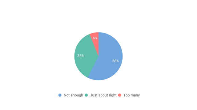
The pie chart above depicts the distribution of attention online daters say they received in the past five years. We see that 6 out 100 men received too many messages, represented by the red slice, while 36/100 received about the right amount of messaged (green slice) and 58/100 did not get enough attention (blue slice). The annotations give us a these precise numbers of the proportions, the pie chart tells the overarching story quite well.
Why are Pie charts bad?
Data visualization should serve the purpose of being able to draw correct conclusions about the data from a graphical display in order to interpret it quickly and more importantly, correctly. However, humans are not very good at decoding information represented as angles and area. But this is precisely what a pie chart does. That is the main reasons why pie charts don’t enjoy the best reputation.
When should you use a Pie Chart?
It is a common task to show how a group is divided into individual pieces that each represent a proportion of the whole. Common examples are the shares of Democrats and Republicans voting for the different political parties in an election or the market shares of companies. There are various ways of showing shares, which we will discuss in more detail at the end of this paper. As so often, many roads lead to Rome and there is no single ideal visualization that always works. You always want to pick the visualization that best highlights the key features you want to show. We’ll give you some advice to avoid common mistakes.
How do you put data into a pie chart?
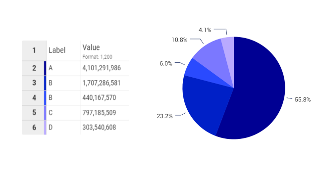
The data used for a Pie chart usually comes in a table with two columns. The first column contains at least two categories, these will determine the labels of the pie chart. The second the values associated with each category. Values can represent proportions, frequencies, or amounts.
Remember that a pie chart represents 100%. That is, a pie chart cannot be more than 100%. Data that allows multiple answers will lead to a misleading pie chart.
Once you have prepared your data, create a new pie chart in Vizzlo, it will do the aggregation for you. That is, there is no reason for you to calculate the sum of the value column, it will be done for you. The un-aggregated data as shown in the image is enough. (You find the percentage of a pie chart if you divide the values by the sum of all values.)
Your data can be uploaded by copy & paste, or upload it as an Excel file, a .CSV file or connect the pie chart to a Google Spreadsheet.
Pie Chart: Best practices
As with other diagrams, there are some things to consider before you draw them. The most important aspect is the answer to the question: Does a pie chart reflect the data as clearly as possible so that a viewer can understand the main result?
Pie chart work best with only a few categories
As it was stated before
Pie chart work best with only a few categories
This is especially true if the differences between the shares are small.
Pie chart display proportions. This is not always an easy task. Pie charts should not be used when there are many categories, or when you want to show changes in proportions over time or across conditions.
Pie Chart Examples: What are the Different Kinds of Pies?
Simple 2-D Pie Chart
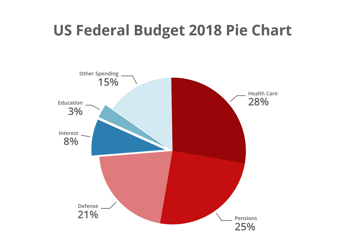
Because Excel and other tools offer the possibility to create 3-D pie charts, the simple flat pies are sometimes also referred to as 2-D pies. Depicting pie charts in 3-D has fallen out of good data viz practice, as the extra dimension can visually distort the information and does not add anything to analysis. However, the simple 2-D pie chart can explain information in a very easy-to-grasp way. Difficult subjects like the percentages of GDP that go towards different areas of government spending become easy to visualize with a pie chart. If you’ve ever asked yourself “where do my taxes go?!”, a pie chart will help you to understand this much faster than reading the raw data.
The “US Federal Budget 2018” pie chart below can also be described as an exploded pie chart, as two sections are separated to give them extra emphasis. It shows the relatively small percentage of spending that goes into one of the top concerns of Americans (Education) in comparison to other areas. Exploded pie charts are very common when depicting multiple variables that are available in minor percentages.
Tip! You can create a pie chart in seconds with Vizzlo—it has its very own Vizzard !
Donut Chart
A donut chart is basically a pie chart with a hollow opening in the center. This opening can either contain information or be left blank. A donut chart does the same thing that any pie chart does, it depicts composition and proportional data, but it does so better than a pie chart especially when a large number of variables or proportions are to be depicted. The name comes from the shape of the chart with the hollow in the center.
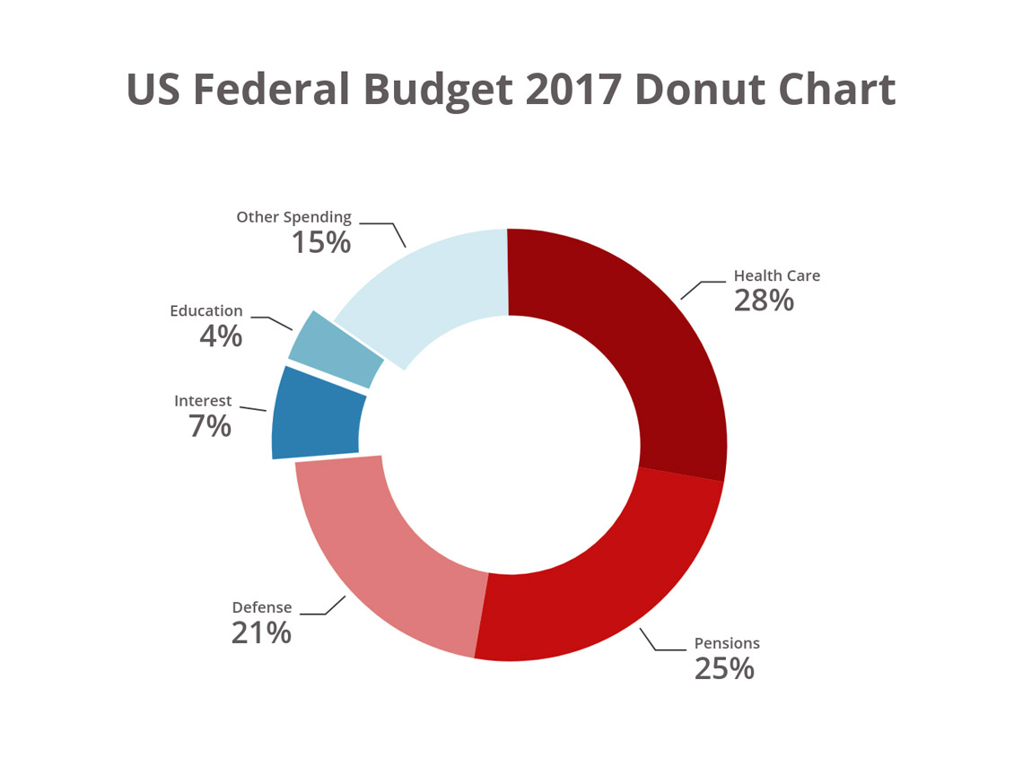
We can see that in 2017 there was extra budget for Education, again an exploded section, as government debt Interest was lower than in 2018. One percent of the US budget pie chart may not seem like a huge difference by year, but when you consider that the total federal budget in 2017 was $3,981.6bn, that’s an extra $39.8bn for education. We could even create an additional chart to show the absolute values of budgetary changes rather than the percentages—in this case, a bar chart would be a better data viz choice.
Create your donut chart with the dedicated Vizzard .
Half Pie Chart
A half pie chart still represents 100% or the total volume of the data set. The difference is merely a design decision — the chart takes up much less space on the page, and can be positioned in-line with other kinds of charts that have straight axes. As you can see from the federal spending half-pie chart example below, the smaller surface area can make complex data sets with small percentages difficult to visualize, so it’s recommended to use half pie charts with around three categories for maximum impact.
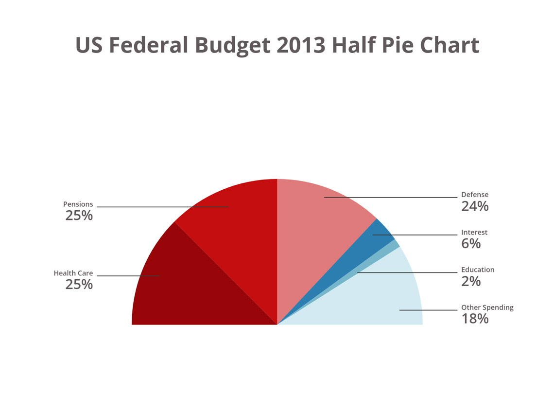
The US budget half-pie chart depicts some interesting government spending choices. Health Care, Pensions and Defense each represent almost an exact quarter of the budget each—much more evenly weighted than in the latter years we have depicted. For instance, if you compare the percentage of the budget being spent on Health Care from 2013 to 2018, you’ll see that this cost rose by 3% (equal to $284bn) in five years, which is as much as the entire budget for Education!
There’s always room for a little Half Pie Chart—why not create your own slice over on our Vizzard page ?
Multiple Pies Chart
Rather than focusing on the proportions of within a data set, multiple pies charts are used to compare and contrast percentages across different data sets, as with the example below:
Ready to create your own multiple pies chart? Here’s a little shortcut to the Vizzard page just for you
A Brief History of the Pie Chart
The history of pie charts dates back to the early 19th century in the works of Scottish engineer and political economist William Playfair.
Since their creation in the early 19th century, pie charts became widespread and accessible for everybody especially through tools such as Excel, PowerPoint or Google Slides.