Chart Vizzard
Vizzlo's AI-based chart generator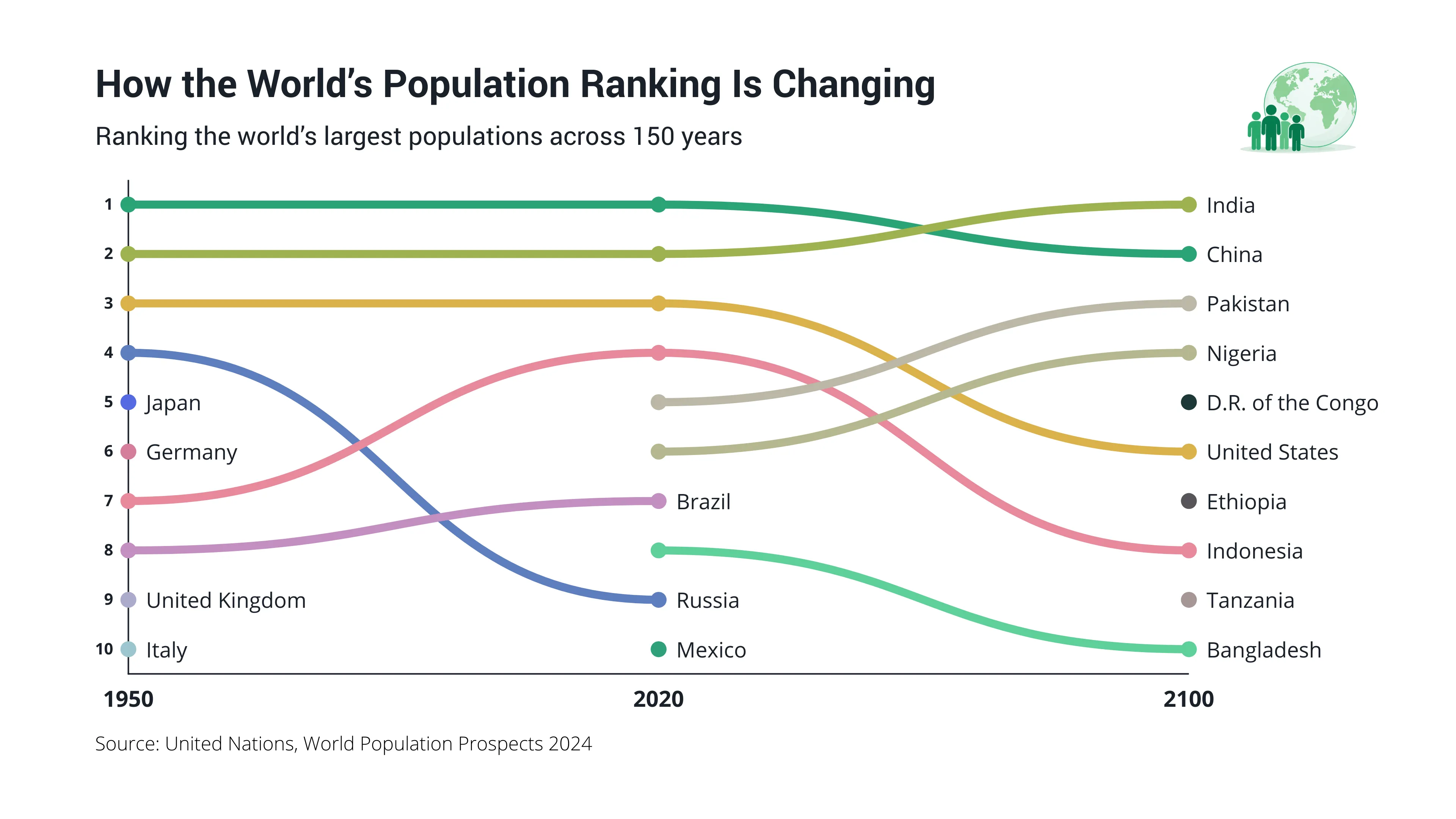
How the World’s Population Ranking Is Changing
How the World’s Population Ranking Is Changing is a bump chart that visualizes how the ranking of the world’s ten most populous countries changed between 1950 and 2020, alongside United Nations projections for 2100. The chart highlights major shifts in global population, including India overtaking China as the world’s most populous country and the growing presence of African countries among the global top ten.
The visualization shows how the geographic distribution of the world’s largest populations is changing. While European countries such as Germany, Italy, and the United Kingdom were among the ten most populous countries in 1950, none are projected to remain in the top ten by 2100. At the same time, Nigeria, the Democratic Republic of the Congo, Ethiopia, and Tanzania are projected to rise into the ranking.
By connecting each country’s position across the three reference years, the bump chart makes it easy to see changes in rank, countries entering or leaving the top ten, and broader demographic shifts over time. Bump charts are particularly useful for visualizing changes in rankings, competitive positions, market leadership, and other data where relative position is the main focus.
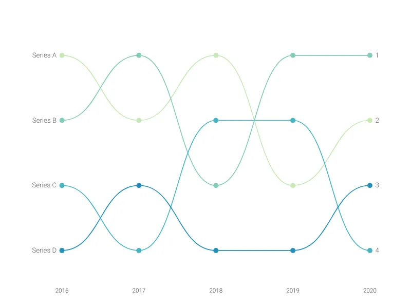
This is an example of Vizzlo's “Bump Chart”
Visualize how items change rank across a series of categories with smooth, connected lines.