Chart Vizzard
Vizzlo's AI-based chart generator100% Stacked Time Series Graph
Create a 100% Stacked Time Series graph to visualize proportional trends over time.
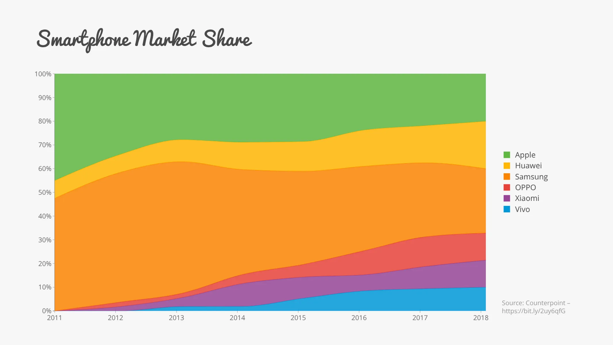
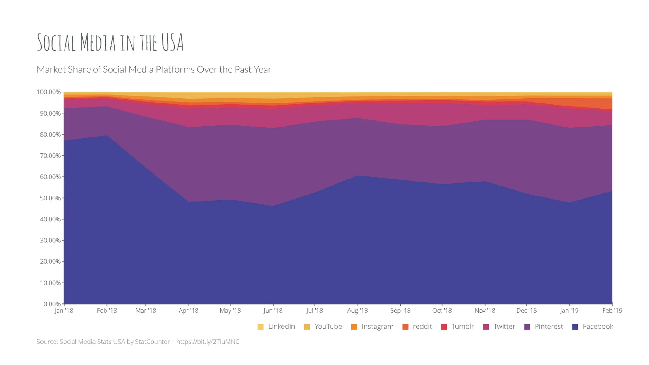
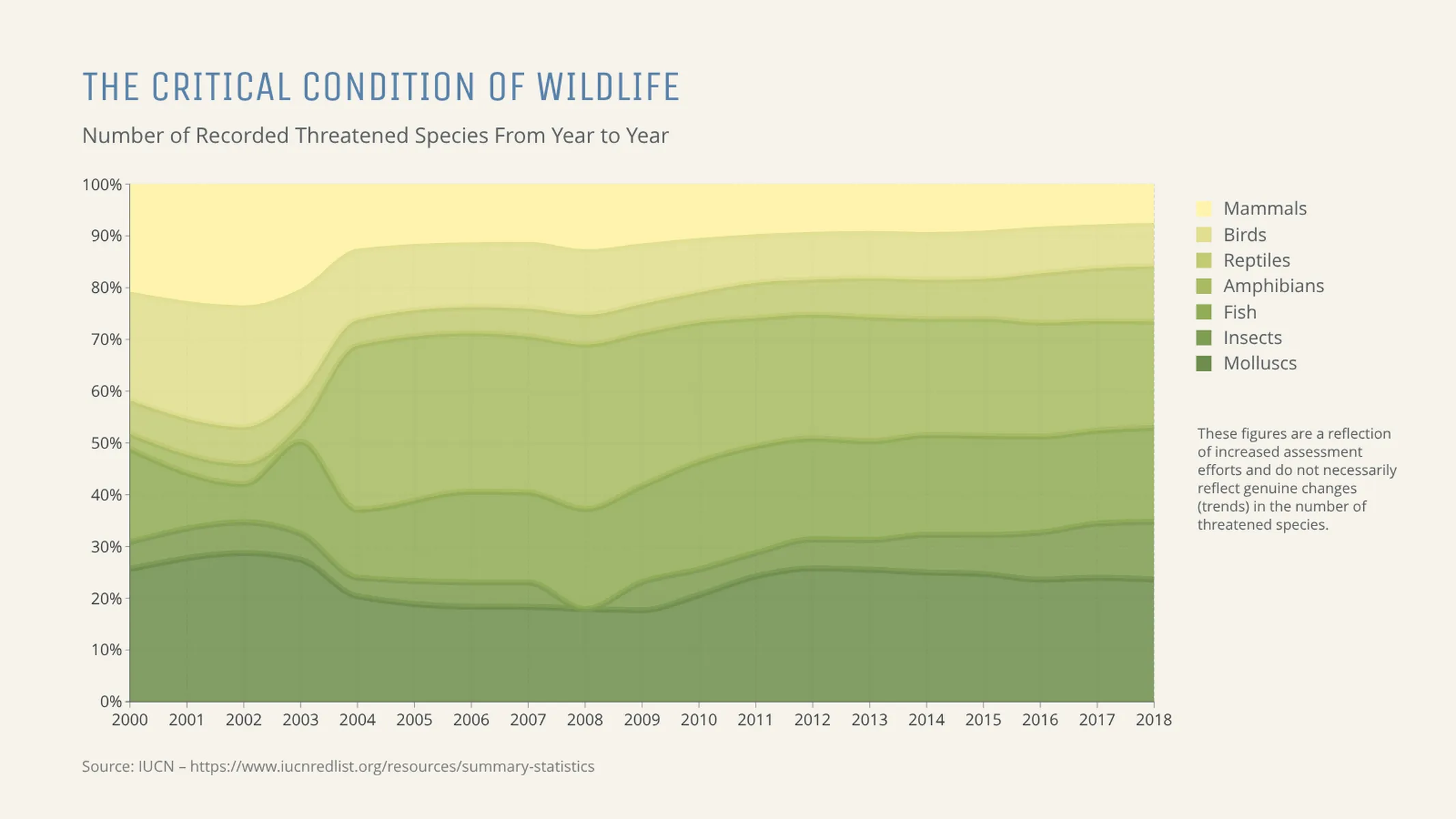
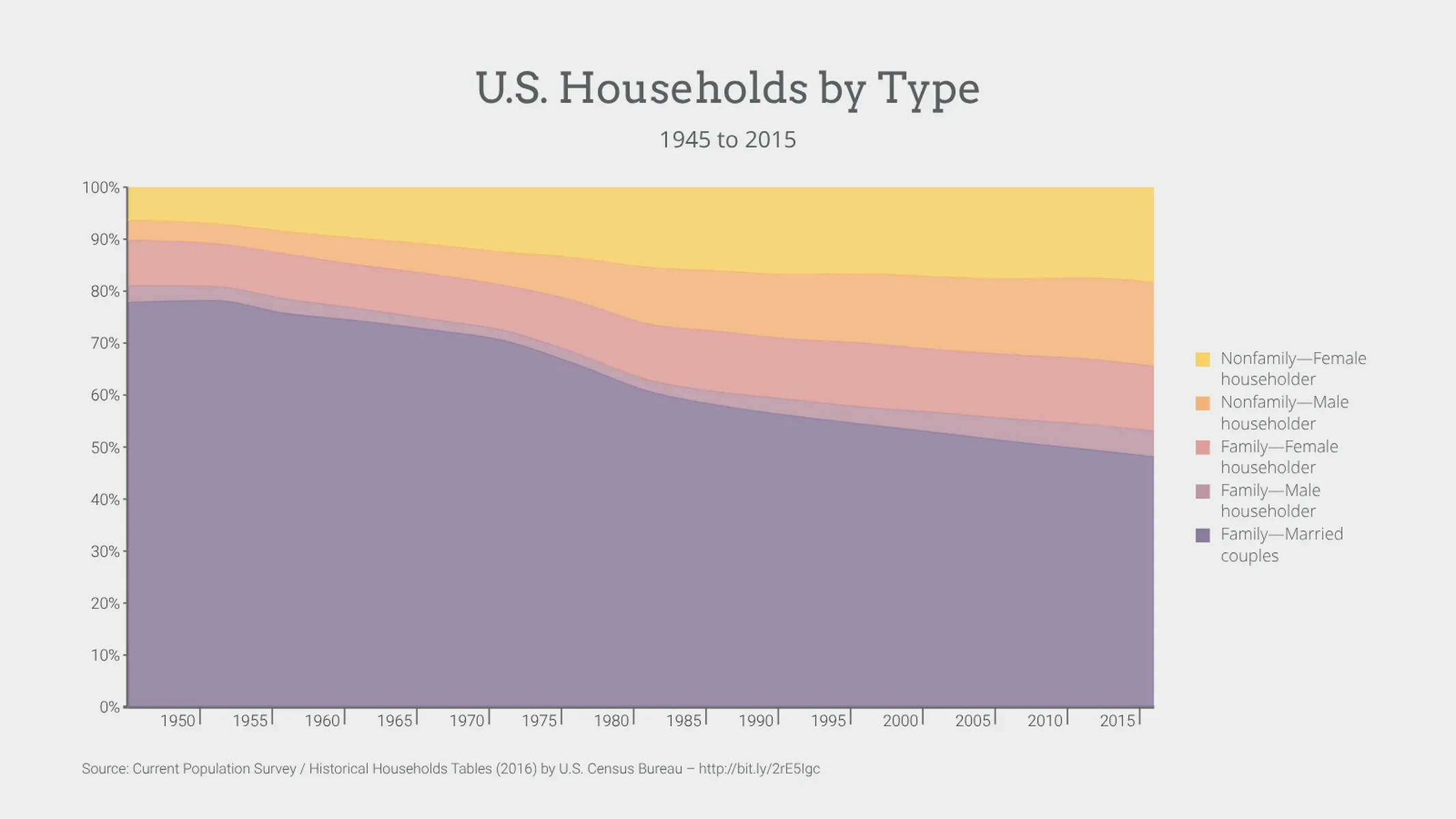
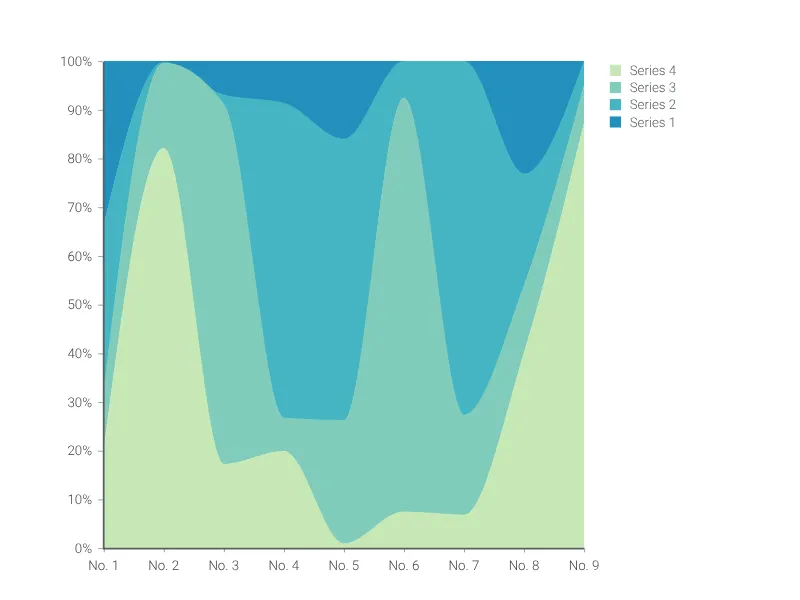
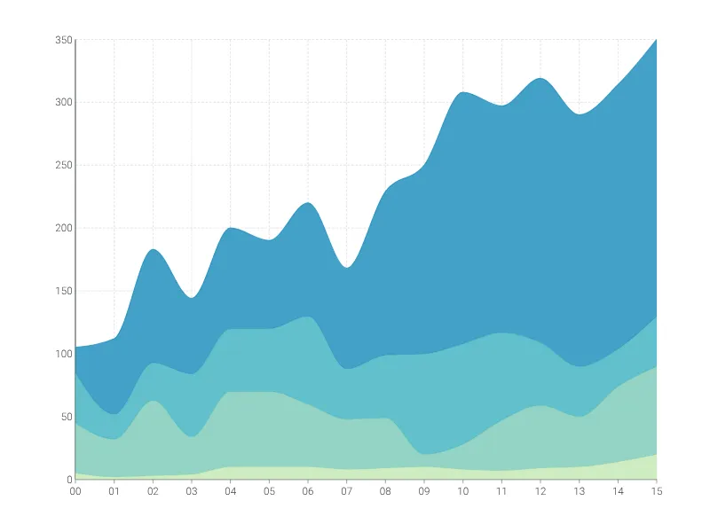
What is a 100% stacked time series graph?
The 100% stacked time series graph is a variant of the time series graph. Like the name suggests, the total area of the chart corresponds to 100%, with each data point representing a proportion of the total value. Data is plotted over a chronological axis, and is best suited for when you want to observe your categories as part of a whole or to see proportional trends over time.
Confused as to what the difference is between a line chart, area chart, and time series graph? Check out our blog post.
How to make a 100% stacked time series graph with Vizzlo?
Create a highly customizable stacked time series graph by following these steps:
- On the tab “DATA” of the sidebar, click on the button “SERIES” to name your time series. If necessary, add new rows.
- Use the spreadsheet to enter your data quickly. Ensure that the date and number formats match your data source. Click on the “wheel” icons of the columns to set the number formatting.
- Play with additional customization settings on the “APPEARANCE” tab. Click on the x-axis and y-axis options to set the intervals, define the scale and choose how to display tick marks and labels.
- Click on “EDIT SINGLE GRIDLINES” to determine which y-axis labels and gridlines you want to display.
Area chart maker: key features
- Multiple series
- Custom styles: lines, filled areas and bars
- Straight line segments or smoothly interpolated curves
- Adjustable axes and ranges
- Linear and logarithmic scales
- Optional right y-axis
- Custom gridlines
- Custom labels and tick marks
- Custom date and number formats
- Optional labeling of closing/end values
- Custom colors and fonts
- Analysis lines: growth rates, reference lines, trendlines, and benchmarks
100% Stacked Time Series Graph: What's new?
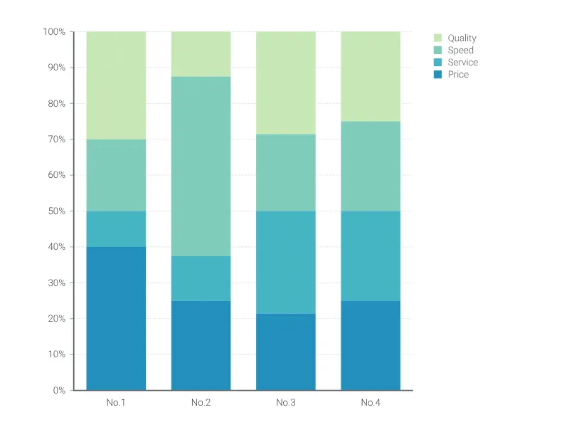
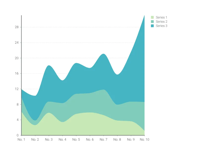
100% Stacked Time Series Graph Alternatives
Use Cases
Line & Area chartsEnhance your productivity
Create a 100% Stacked Time Series Graph directly in the tools you love

Create a 100% Stacked Time Series Graph in PowerPoint with
Vizzlo's add-in

Loved by professionals around the world


Visualizations your audience won’t forget
Convey abstract concepts and data with professionally designed
charts and graphics you can easily edit and customize.