Chart Vizzard
Vizzlo's AI-based chart generatorMultiple Radial Bars Chart
Compare your data across up to six different radial bars chart on a single page.
Features
- Custom colors and numbers
- Optional sorting by value
- Add up to six pies
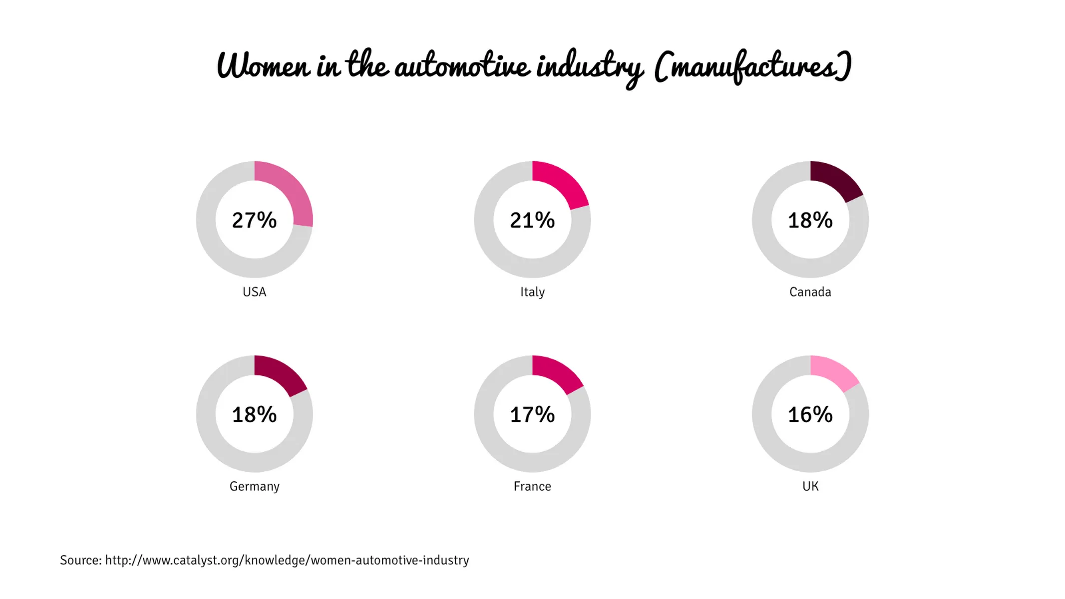
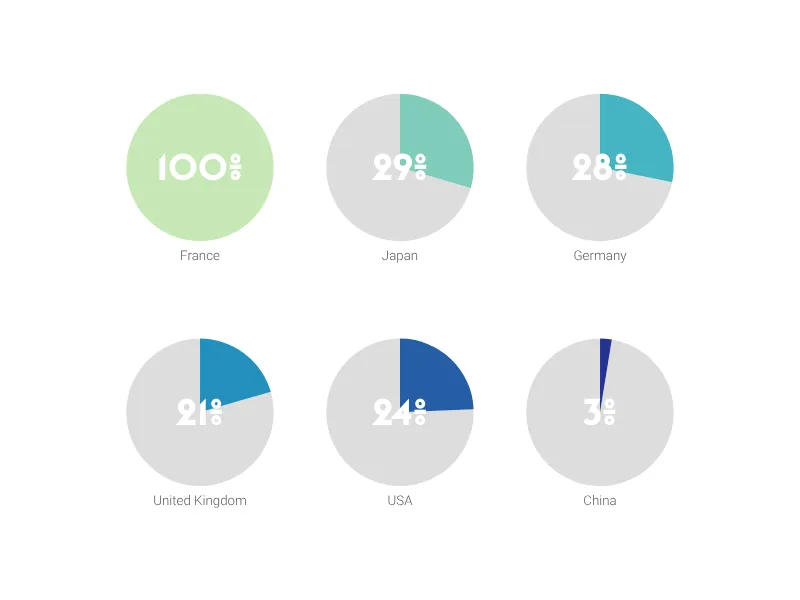
What is the multiple radial bars chart?
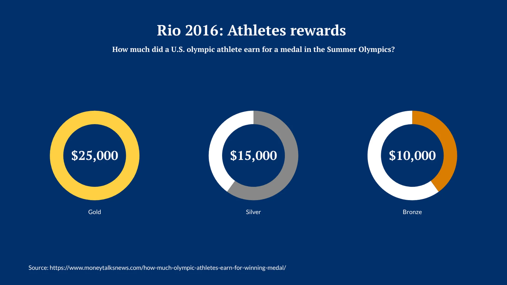
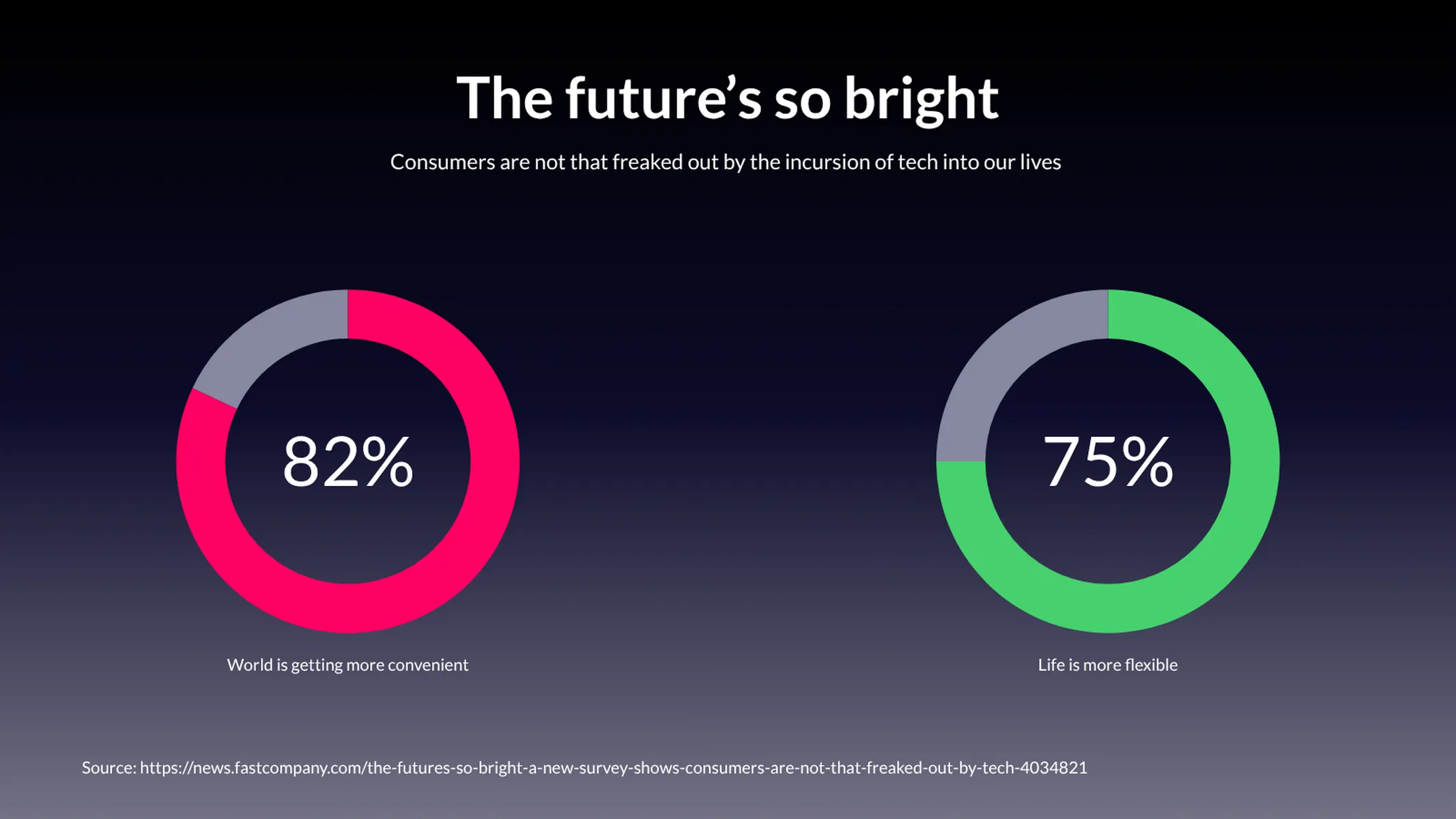
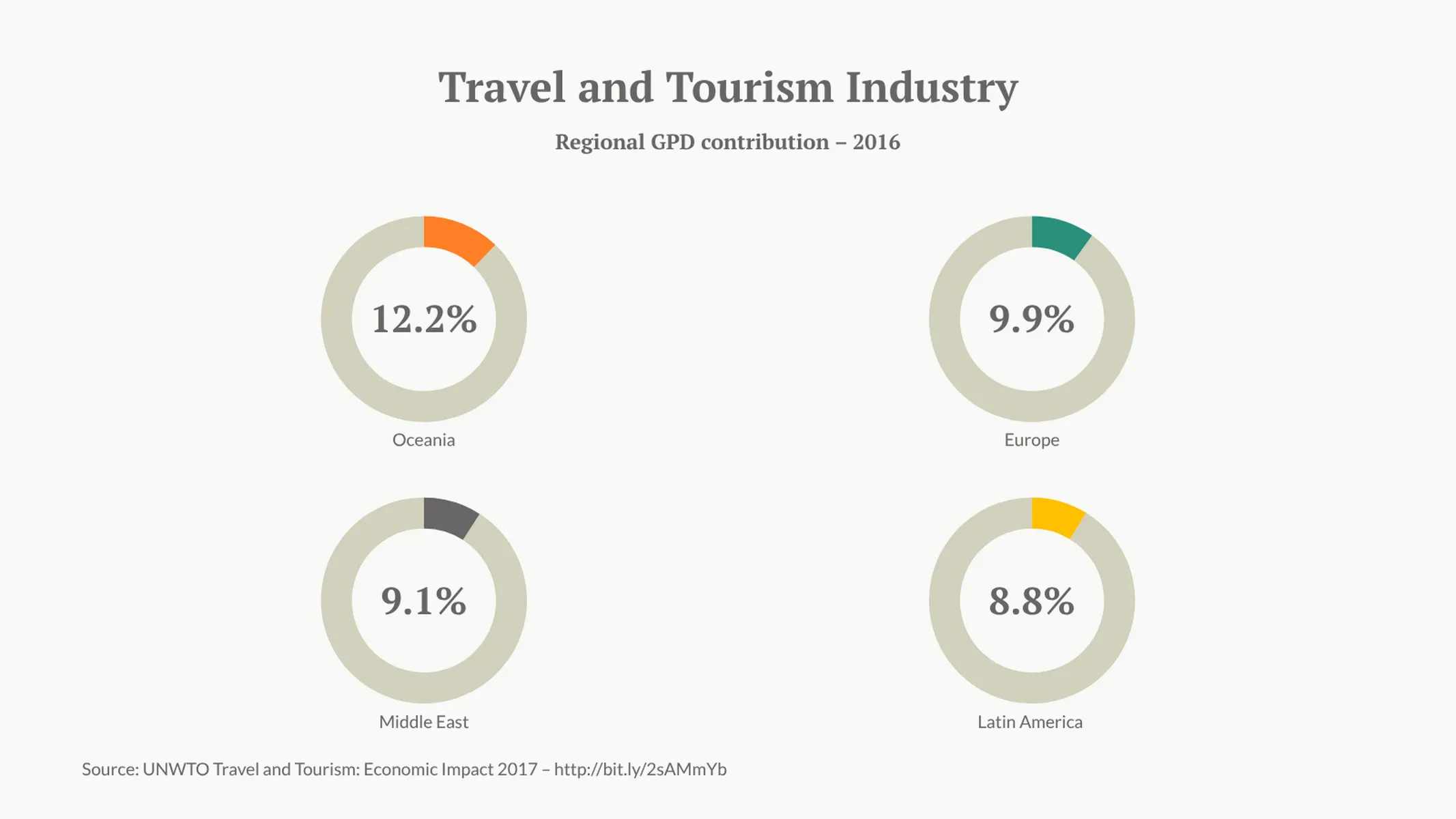
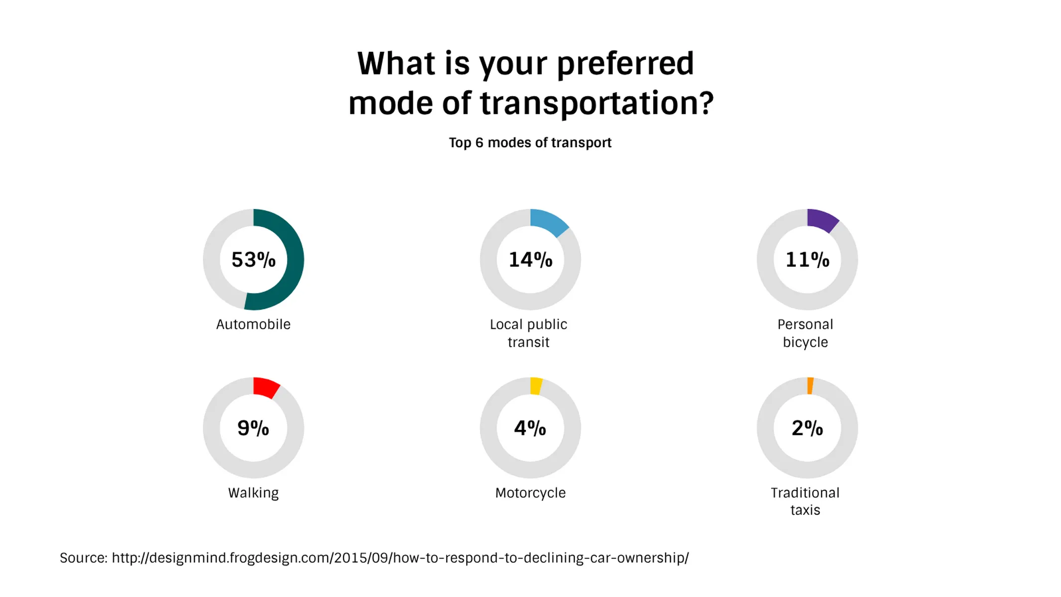
The multiple radial bars chart is a kind of visualization in which various radial bars are plotted side-by-side. Each of them corresponds to 100%, and their arch/bar length is proportional to the value of the category it represents.
Very similar to the multiple pies chart, you can use this visualization either to compare data from a category across different groups, to illustrate the breakdown of a single group, i.e., to highlight the difference between categories adding together up to 100%, or to present key-facts about a subject.
How to make a multiple radial bars chart with Vizzlo?
Plot up to six radial bars side by side in seconds. Follow these easy steps :
- Click on the elements to select and directly edit them.
- Alternatively, use the active cards or the spreadsheet to enter your data.
- Use the “x” or ”+” buttons on the chart to delete or add a new radial bar.
- Explore the options of the tab “APPEARANCE” to customize your charts: you can sort them by size, custom the number format, hide percentage labels, and choose to use just one color for all of them.
Pro tip: Radial bars are often used to illustrate progress. Use this chart to track your project, and visualize and compare the progress of different tasks compellingly.
Multiple Radial Bars Chart: What's new?
The styling of individual numerical value labels can now be modified—much in the same way you’ve been able to format the text labels before.
Multiple Radial Bars Chart Alternatives
Enhance your productivity
Create a Multiple Radial Bars Chart directly in the tools you love

Create a Multiple Radial Bars Chart in PowerPoint with
Vizzlo's add-in

Loved by professionals around the world


Visualizations your audience won’t forget
Convey abstract concepts and data with professionally designed
charts and graphics you can easily edit and customize.