Chart Vizzard
Vizzlo's AI-based chart generatorPopulation Pyramid
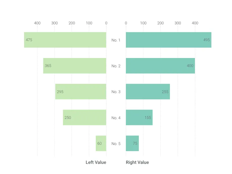
Break down demographics with this population pyramid.
What is a population pyramid?
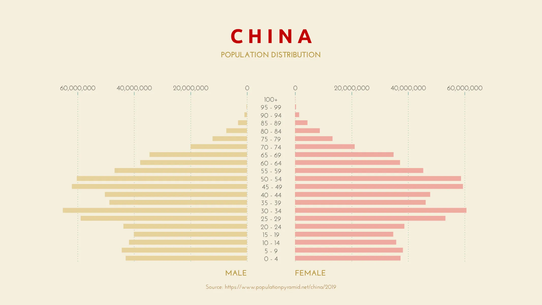
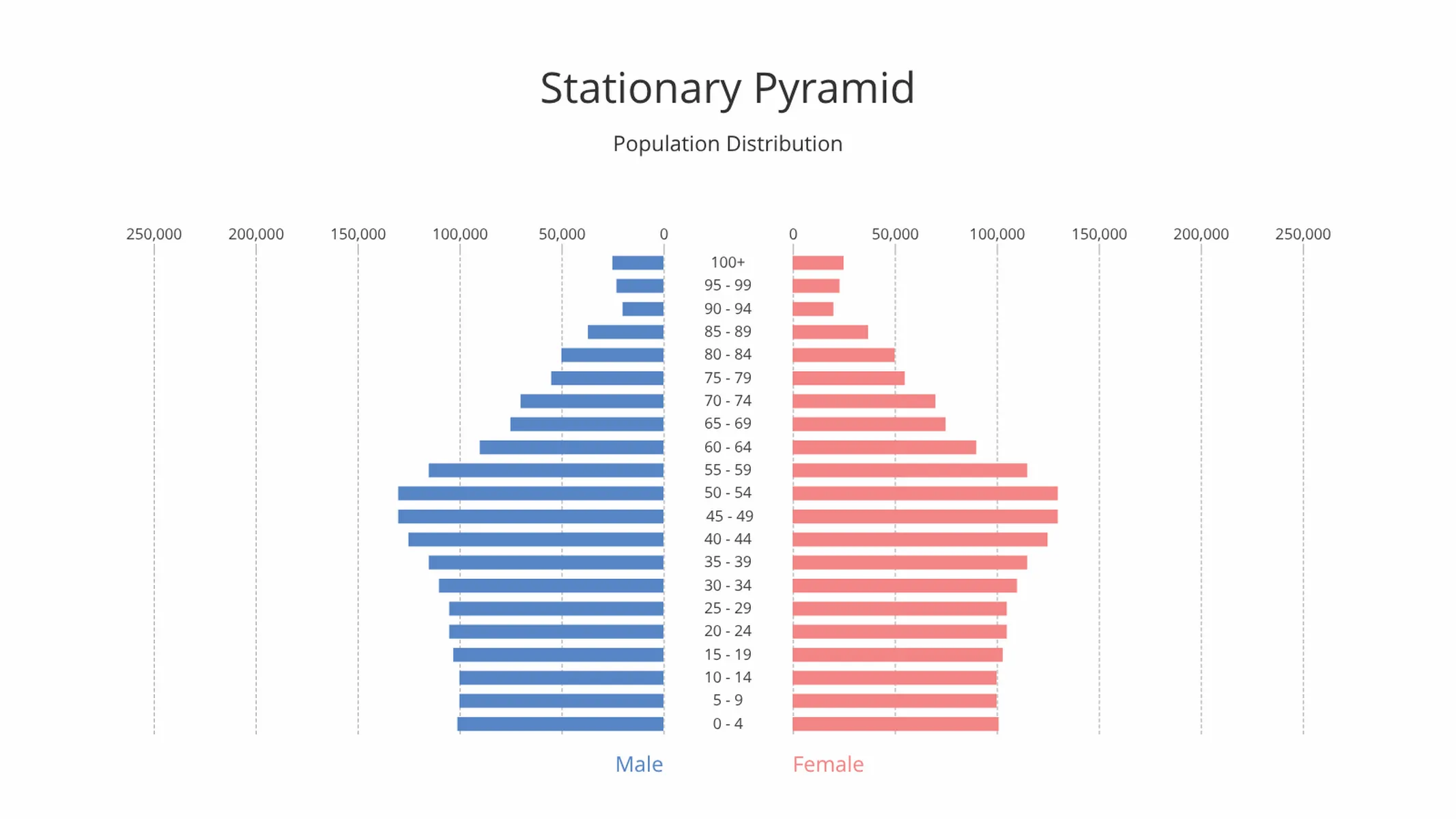
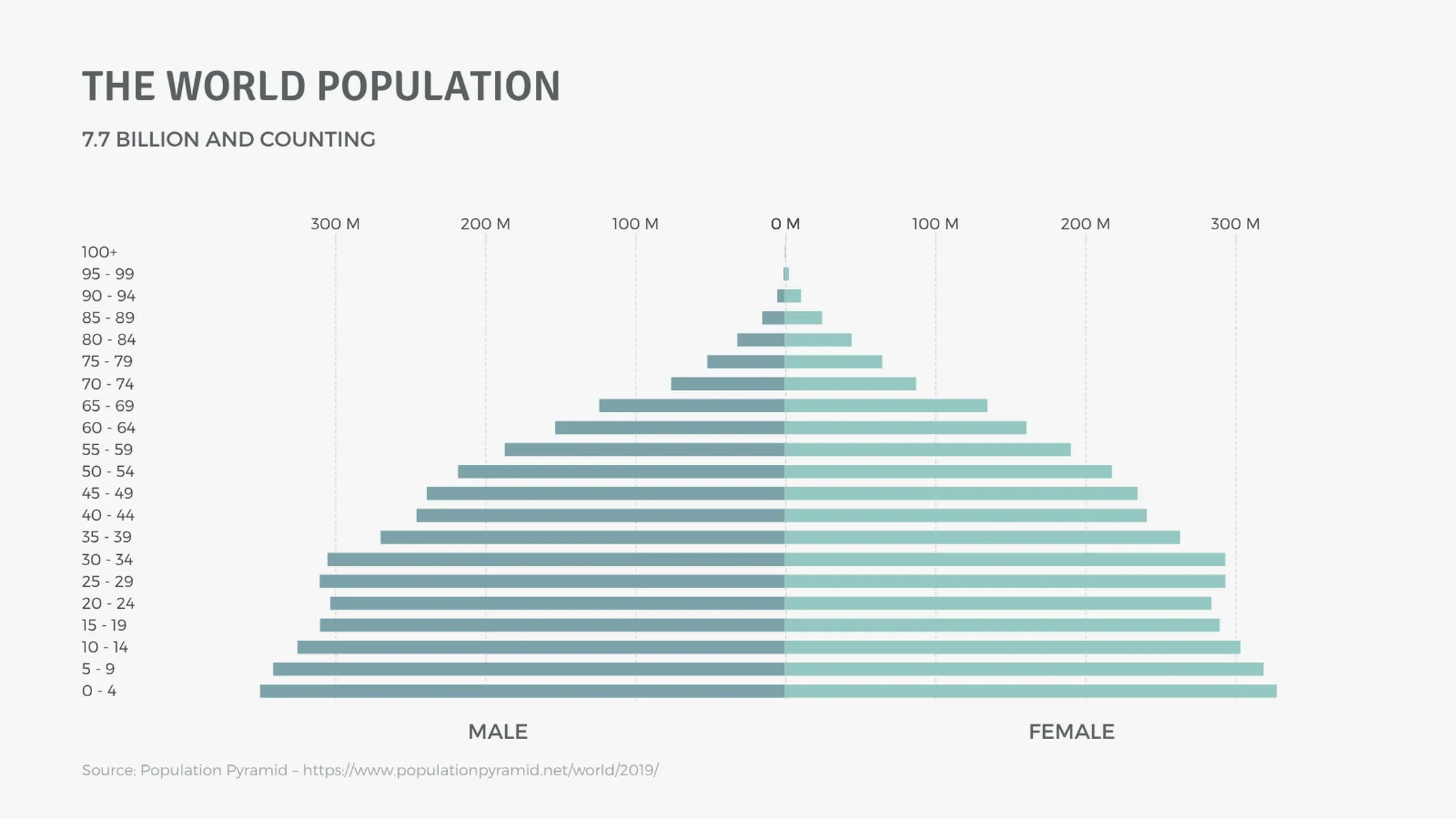
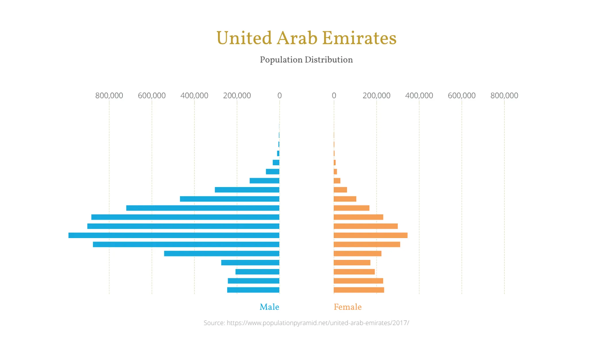
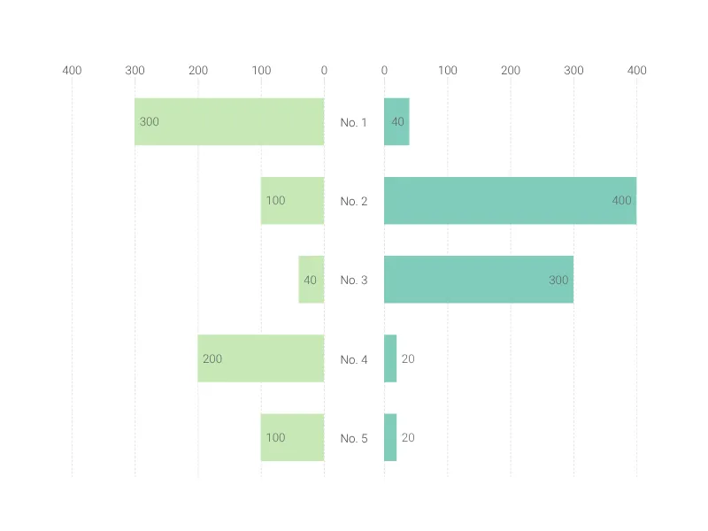
A population pyramid (or age-sex pyramid) is a visual representation of the distribution of age and sex within a given population.
It’s essentially a stacked, horizontal bar chart used to interpret the stage of demographic transition or visualize the current/future state of a given population (most often that of a country, continent or region of the world).
For instance, a pyramid with a wide top half and a narrow base is indicative of an aging population with lower fertility rates.
Because population pyramids are impactful and easy to interpret, they are viewed as the most effective way to demonstrate a population’s age and gender distribution.
Best uses for the population pyramid
- Measuring the distribution of a population by age groups and gender
- Visualizing a country or region’s projected growth
- Exploring factors that determine a population’s economic outlook by its working-age distribution
How to make a population pyramid with Vizzlo?
Create a stunning population pyramid in a matter of seconds by following these simple steps:
- Click on a bar and drag the handles left or right to increase each side accordingly
- Add additional bars by clicking the “plus” buttons on each bar–alternatively, go to the “DATA” tab and click on “+ ADD BAR”
- Want to quickly enter a larger quantity of data? No problem, open up the spreadsheet (tab “DATA” and copy and paste your data into the corresponding fields)
- Explore additional customization options on the “APPEARANCE” tab to add your finishing touches
Population pyramid: pro tips
- Remember that the data can’t be entirely accurate, so focus on the averages of the populations
- Most of the time, it’s best to organise population data by age range–but for a different spin on the same information (and to highlight the biggest groups in the range) try switching to Tornado chart on the “APPEARANCE” tab, which sorts the bars by descending value
- Make sure your age groups cover a consistent number of years–a chart grouping population age by 0-4, then 5-25, would distort the data and mislead your audience
Population pyramid maker: key features
- Custom number formats and colors
- Options for different label layouts
- Percentage mode
- Adjustable max value for x-axis
- Sort by value for a Tornado chart
- Add separator grid lines for easy reference
Resources
- This Ted-Ed video takes a look at the population pyramid in a really fun and educational format!
Population Pyramid: What's new?
Population Pyramid Alternatives
Enhance your productivity
Create a Population Pyramid directly in the tools you love

Create a Population Pyramid in PowerPoint with
Vizzlo's add-in

Loved by professionals around the world


Visualizations your audience won’t forget
Convey abstract concepts and data with professionally designed
charts and graphics you can easily edit and customize.