Chart Vizzard
Vizzlo's AI-based chart generatorTornado Chart
Create a tornado chart to analyze and evaluate decisions.
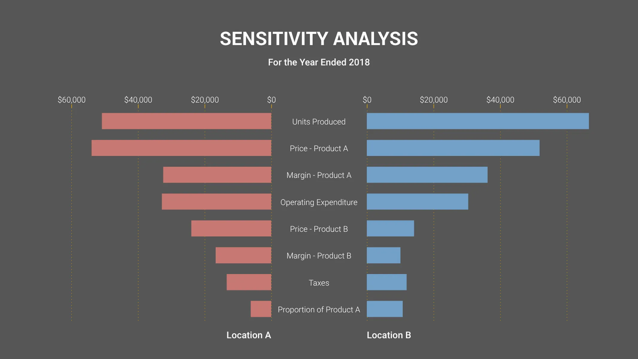
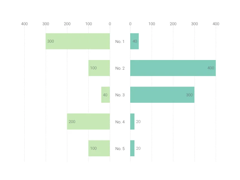
What is a tornado chart?
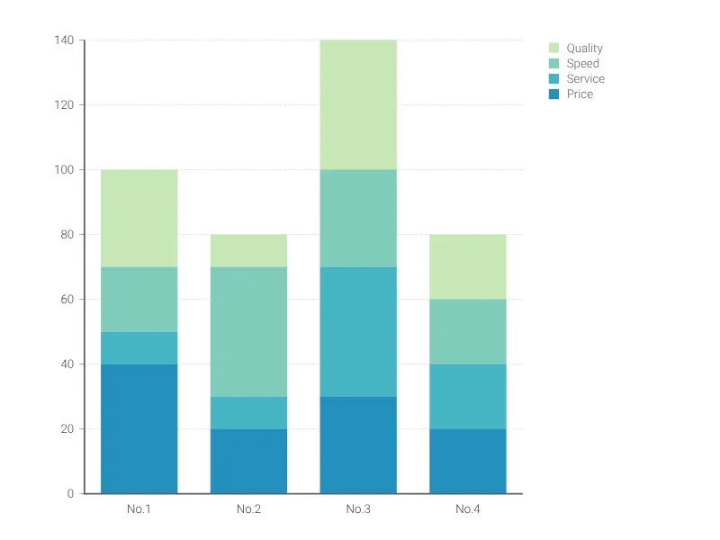
A tornado chart (also tornado diagram) is a variation of the butterfly chart, in which the bars are organized in descending order—the shape is similar to that of a tornado, hence the name.
A tornado chart is a graphical representation of a sensitivity analysis that demonstrates the correlation between values and a given output. By determining which variables have the largest impact on the outcome, one can assess the risk and make a decision.
How to make a tornado chart with Vizzlo?
Ready to blow the uncertainty away with a tornado chart? Follow these simple steps to get started:
- Click on a bar to start editing. Adjust the size of each bar using the handles, or use the respective cards in the sidebar.
- Alternatively, paste or import your data directly into Vizzlo’s spreadsheet.
- Adjust the look and feel of your chart on the “APPEARANCE” tab.
- Explore the preset Vizzlo themes, or customize your own in order to make adjustments to colors and fonts.
Tornado chart maker: key features
- Custom number formats
- Custom lines, grid, and colors
- Optional labeling of individual values
- Left-aligned or centered layout
Tornado Chart: What's new?
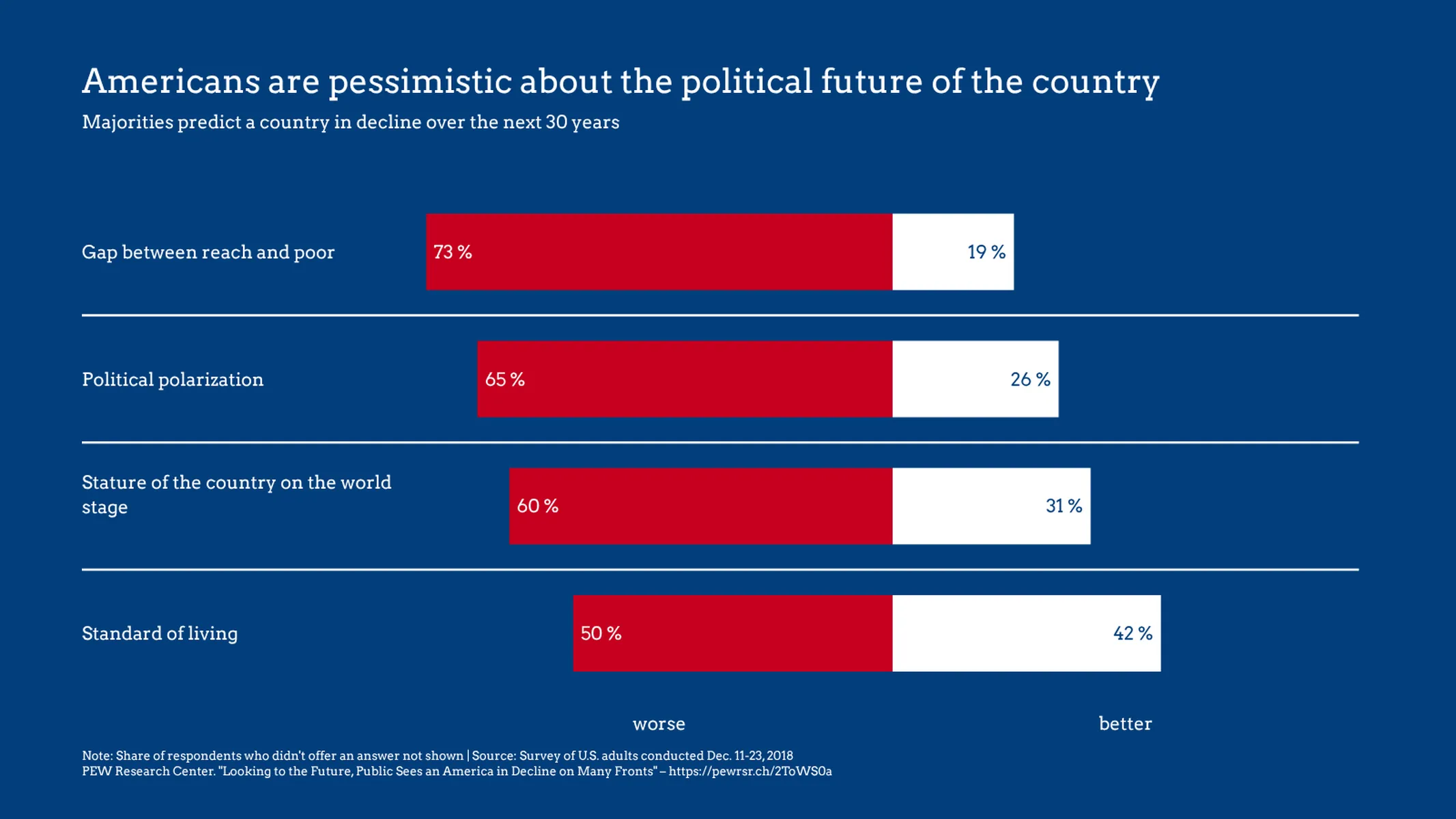
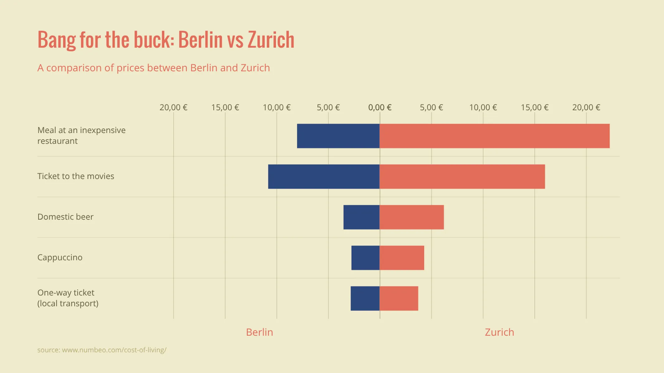
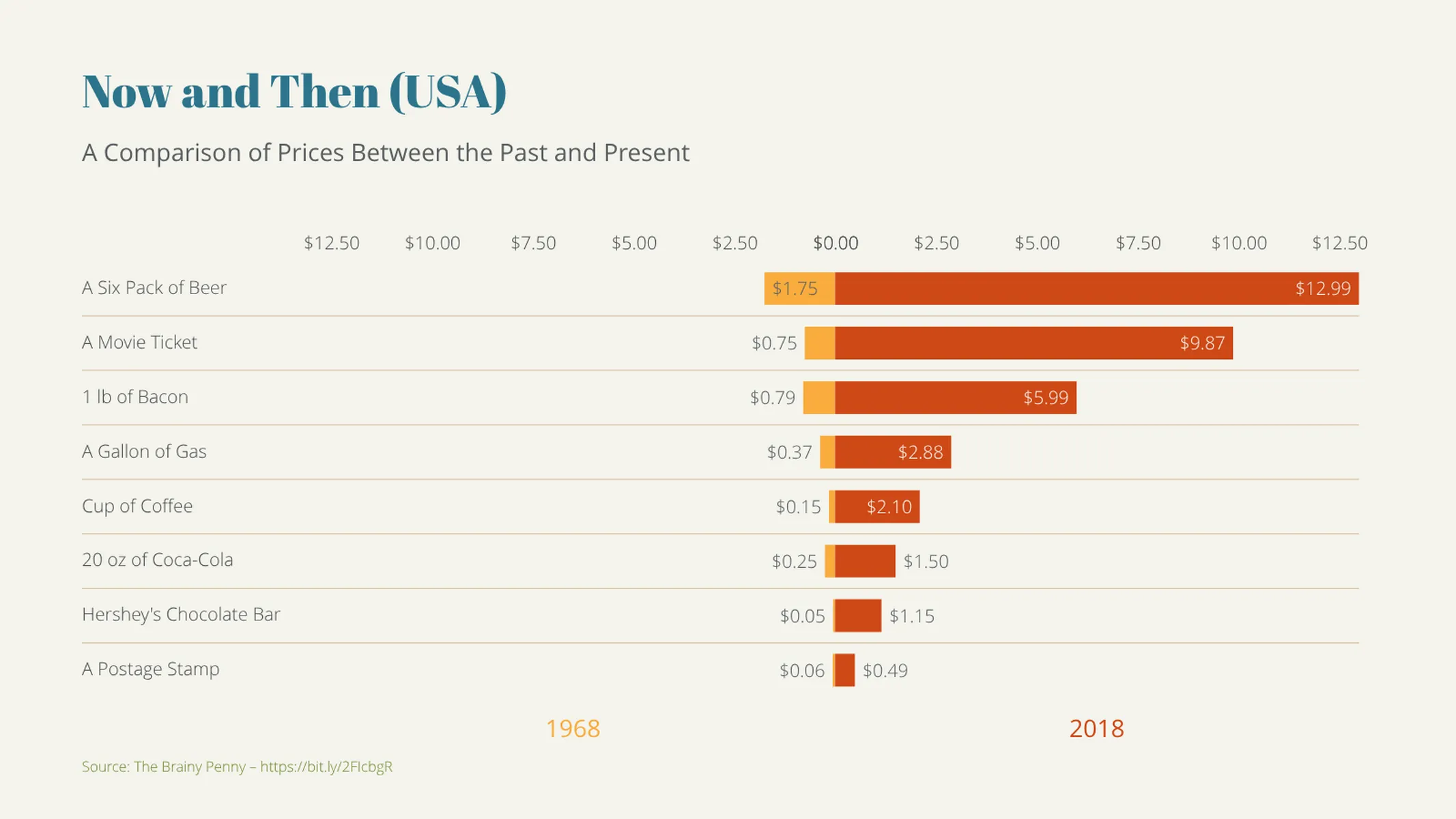
Tornado Chart Alternatives
Enhance your productivity
Create a Tornado Chart directly in the tools you love

Create a Tornado Chart in PowerPoint with
Vizzlo's add-in

Loved by professionals around the world


Visualizations your audience won’t forget
Convey abstract concepts and data with professionally designed
charts and graphics you can easily edit and customize.