Chart Vizzard
Vizzlo's AI-based chart generatorRetention Chart
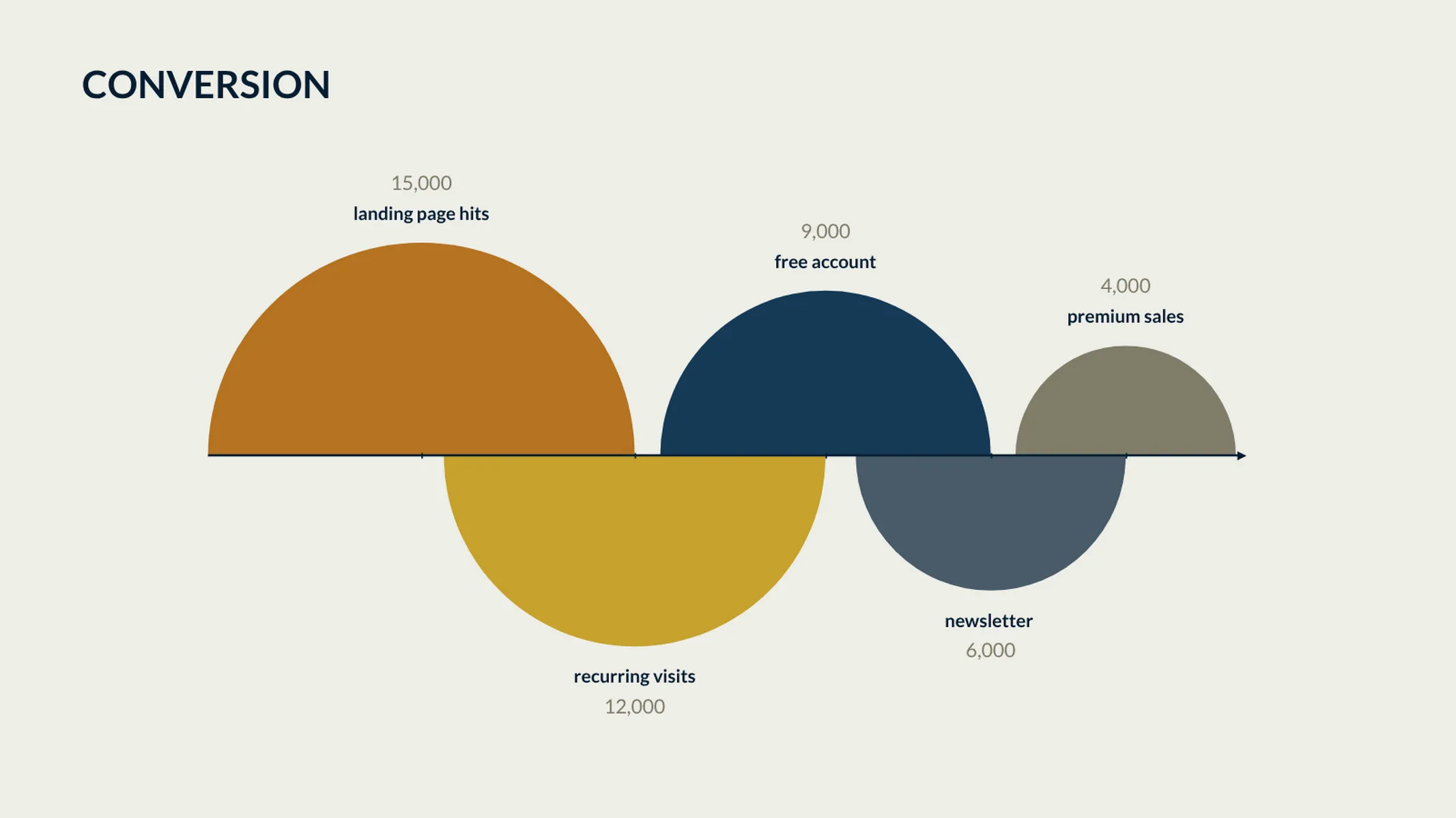
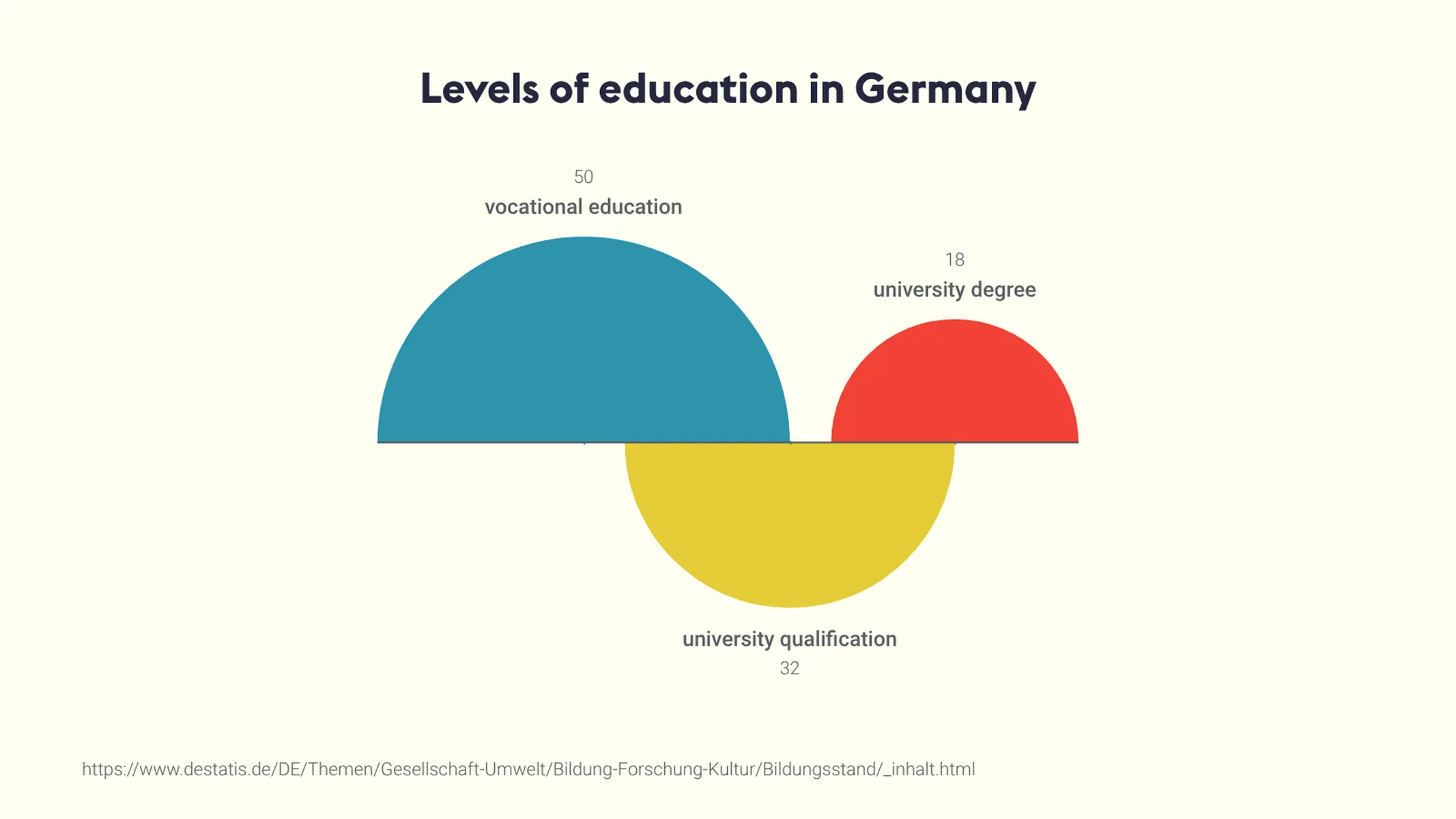
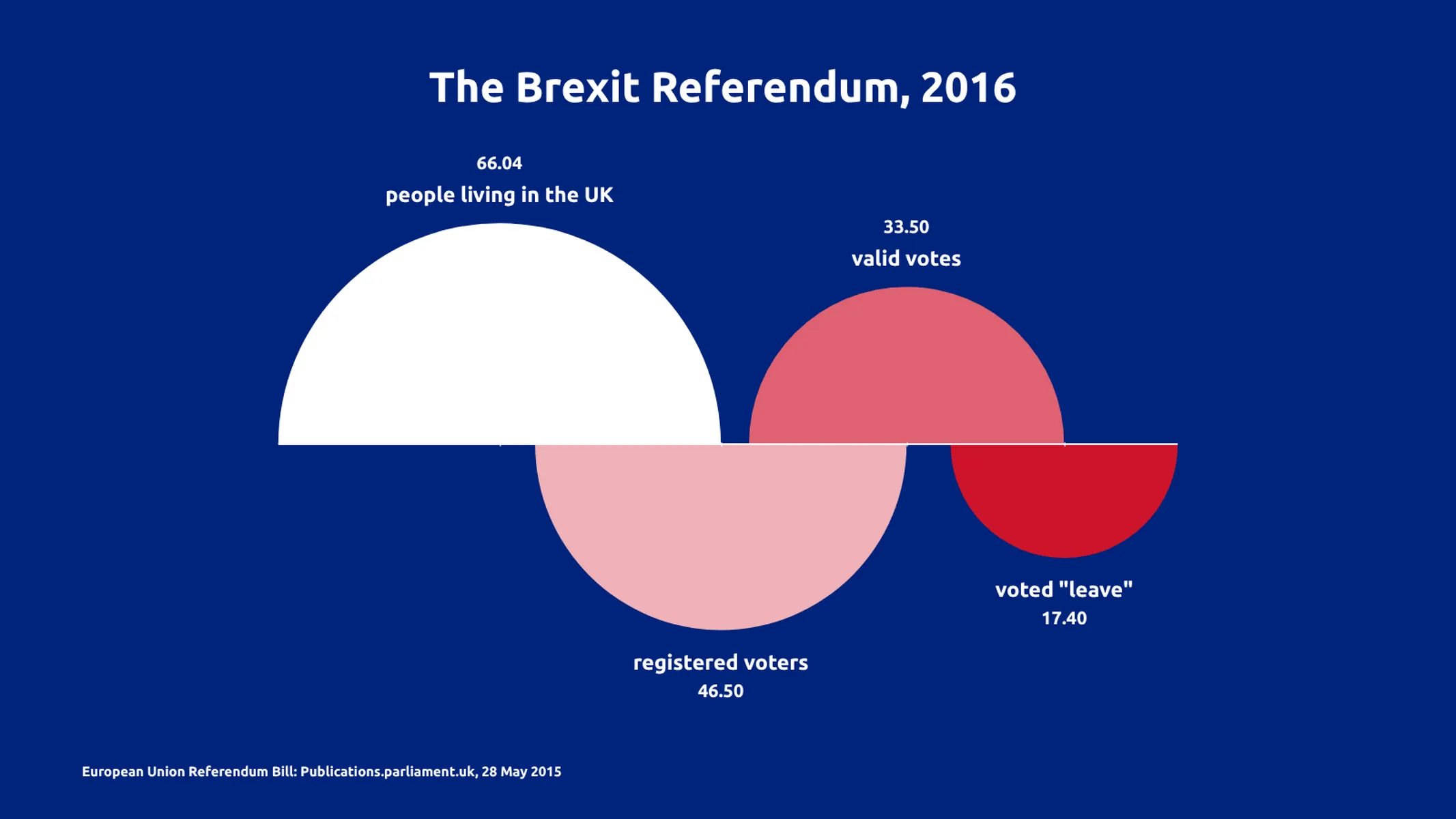
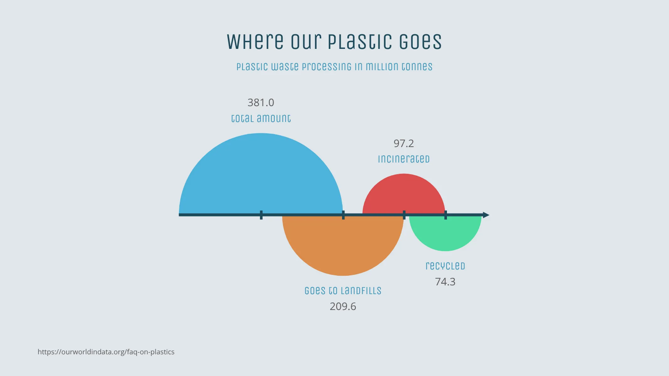
Visualize your user retention or any other simple data series using a set of sequential half circles.
What is a retention chart?
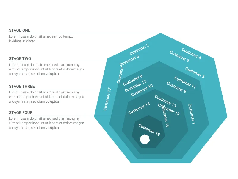
A retention chart is a series of sequential half circles arranged along the same axis. It is used to visualize the retention of a value over different steps or phases of a process. Every half circle is proportional to the kept amount in the phase it represents.
The retention chart is used in business for cohort analysis to visualize retention rates or processes, that lead to narrowing down or sharpening input elements (e.g., leads in a sales or marketing, customer journeys and customer retention, as well as employee retention—in other words, processes that might also involve drop-outs or filters).
How to make a retention chart with Vizzlo?
This plugin is an intuitive online retention chart maker. Check the examples to get inspired and follow these easy steps to make a colorful retention chart in seconds:
- Click on the elements to select and edit them.
- Alternatively, use the active cards in the sidebar or the spreadsheet to enter your data.
- Click on the “+” handles to add new phases.
- Explore the options of the tab “APPEARANCE” to customize the display of labels, colors, and fonts.
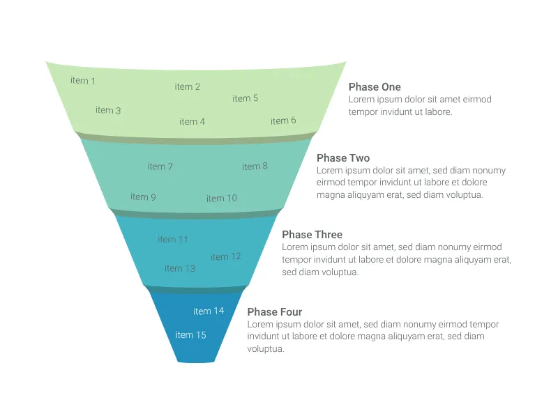
Pro tip: While sharing similarities with a funnel or pyramid chart, Vizzlo’s retention chart is best used to visualize exactly that: retention. If you try to visualize a form of hierarchy, a pyramid chart might better fit your needs. For visualizing a narrowing process, a vertical funnel is well suited.
Retention chart maker: key features
- Custom colors and number formats
- Optional value labels
Retention Chart: What's new?
These chart types now all support adding custom formatting to individual value labels.
Retention Chart Alternatives
Enhance your productivity
Create a Retention Chart directly in the tools you love

Create a Retention Chart in PowerPoint with
Vizzlo's add-in

Loved by professionals around the world


Visualizations your audience won’t forget
Convey abstract concepts and data with professionally designed
charts and graphics you can easily edit and customize.