Chart Vizzard
Vizzlo's AI-based chart generatorCreate your Combo Chart in seconds


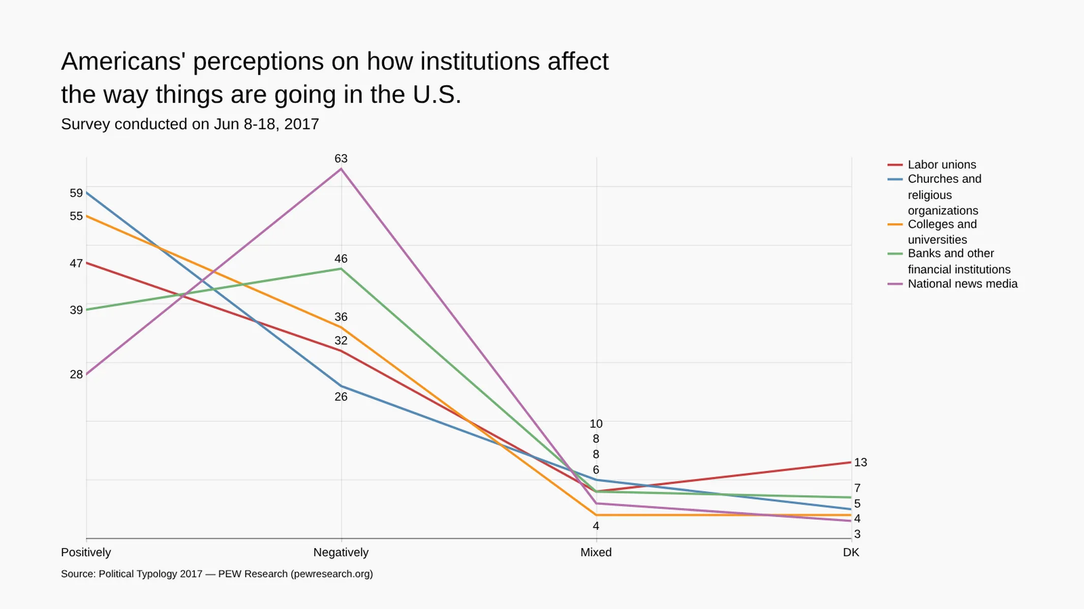
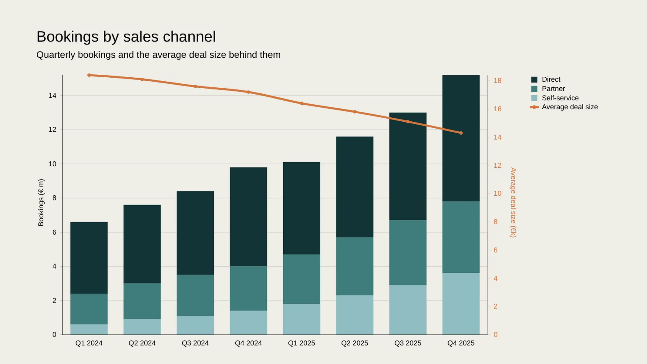
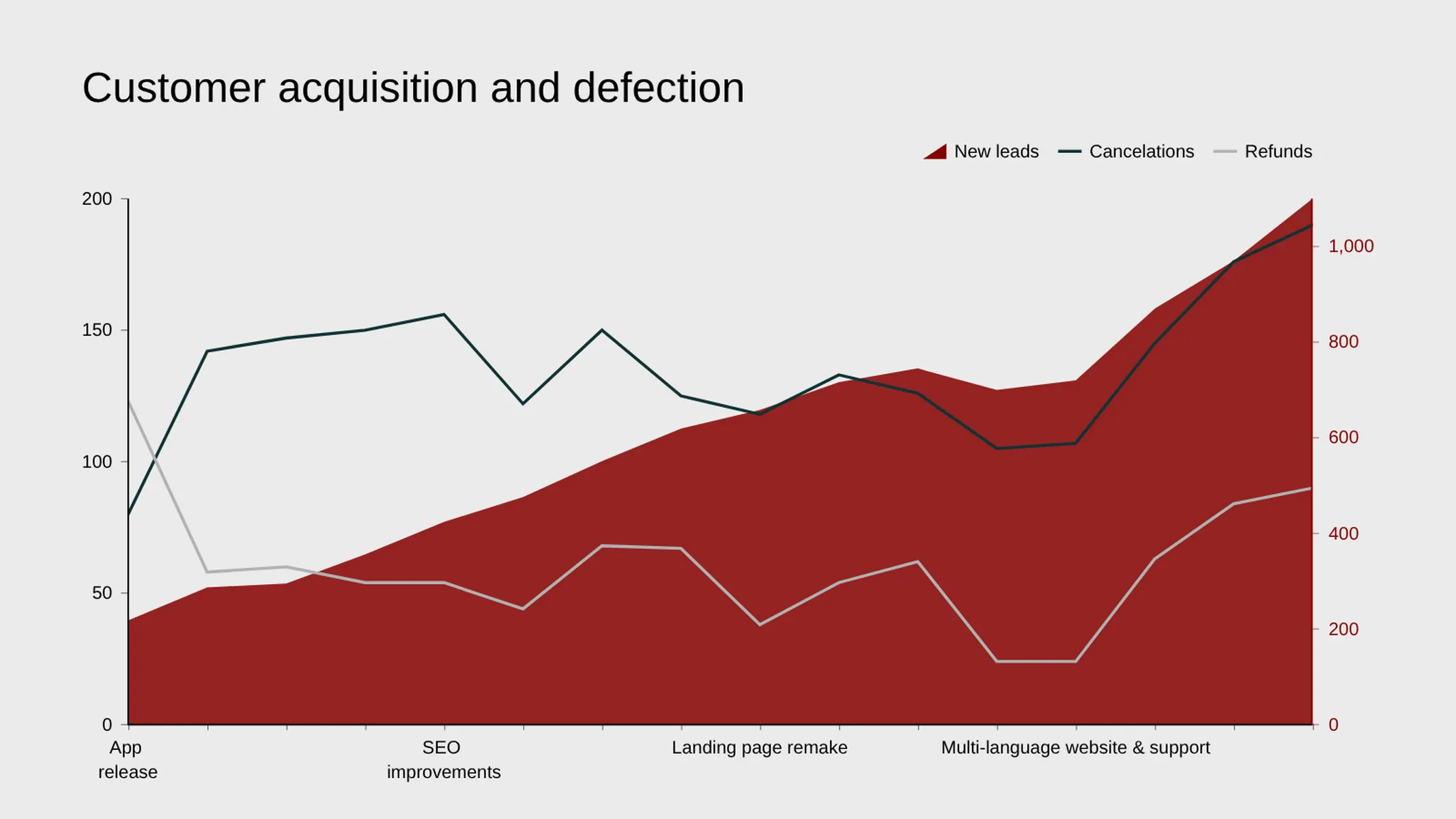
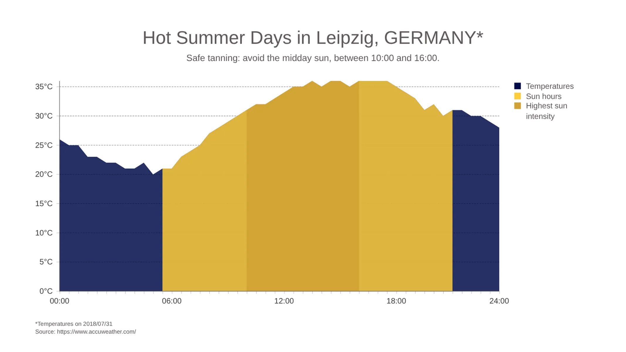
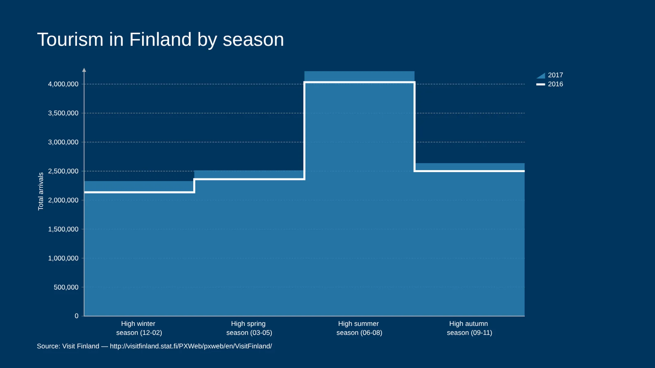
Mix bars, lines, and areas in one chart — with an optional second value axis for a different unit.
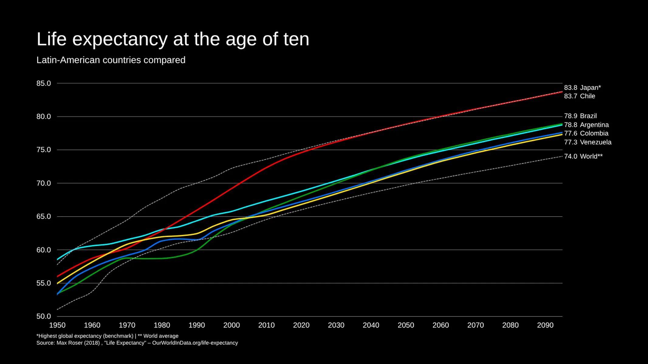
Create your chart in 3 simple steps
- Create new Combo Chart
- Add your data
- Export or share
Why Vizzlo?
- Create professional charts in seconds
- Fully customizable, no design skills needed
- Create directly in PowerPoint & Google Slides
What is a combo chart?
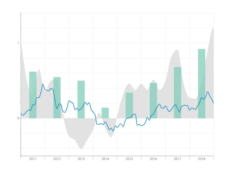
A combo chart, also known as a combination chart, combo graph, or dual-axis chart, plots two or more data series in the same coordinate system but draws each of them in the style that suits it best: bars, lines, or filled areas.
That mix is the whole point. Quantities that are counted — revenue, units sold, headcount — read most naturally as bars. Quantities that flow — a rate, a share, a temperature, a moving average — read most naturally as a line. Putting them side by side in one chart lets your audience see cause and effect in a single glance instead of comparing two charts from memory.
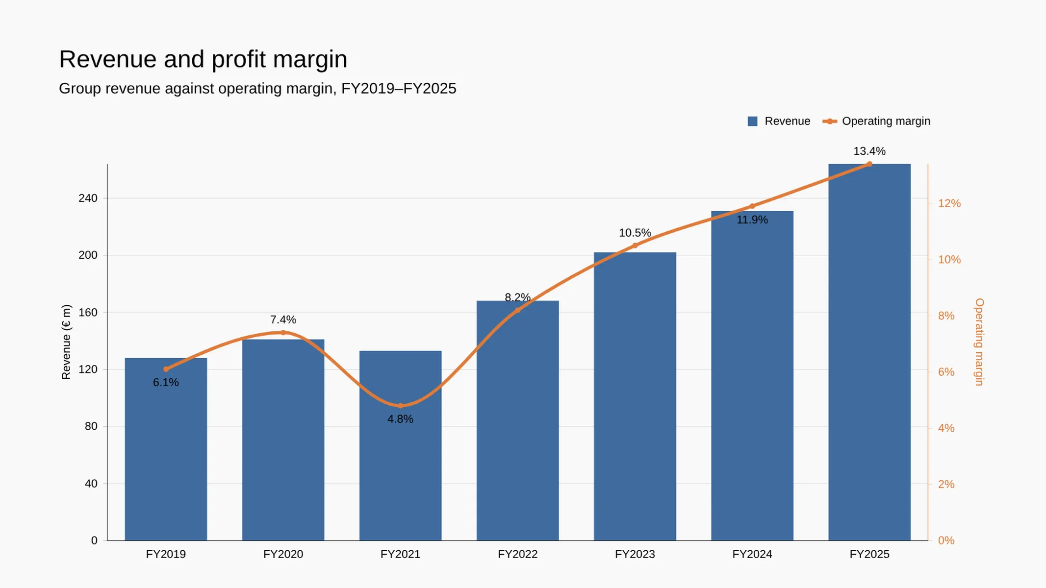
When the series don’t share a unit, a second value axis on the right keeps both of them readable: euros on the left, percent on the right, one shared category axis at the bottom.
Best uses for the combo chart
- Volume against a rate: revenue bars with a profit-margin line, or sales bars with a conversion-rate line
- Actual against target: monthly performance as bars, the plan or benchmark as a line running across them
- A total and its parts: stacked bars for the breakdown, a line for the total, an index, or a year-over-year comparison
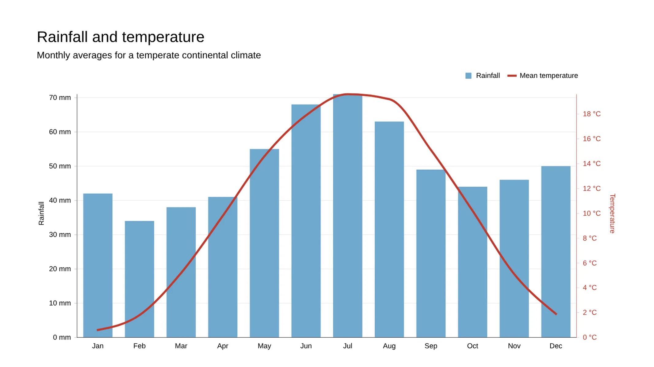
- Climate and weather diagrams: precipitation as bars, temperature as a line — the classic Walter-Lieth pattern
- Signal and noise: raw values as bars, a moving average as a smooth line on top
- Budget reviews: costs and revenue as grouped bars, cumulative cash flow as an area behind them
How to make a combo chart with Vizzlo?
Create a combo chart following these easy steps:
- Enter your figures in Vizzlo’s spreadsheet, or paste them straight from Excel, Google Sheets, or a CSV file. Every column becomes a series
- Click any series in the chart and pick Line, Area, or Bar as its series style
- For bar series, choose whether they are grouped, stacked, or 100% stacked; area series offer the same three layouts
- Switch on Right axis for any series that uses a different unit or a very different range. Vizzlo adds a secondary y-axis and can color each axis to match its series
- Fine-tune the look: line width and style, curve or step interpolation, fill pattern and opacity, point symbols, bar width
- In the sidebar, adjust axes, gridlines, number formats, and the legend, or switch the whole chart to a horizontal layout
Combo chart: pro tips
- Two axes are a promise that both series matter equally. If one of them is only context, consider a lighter treatment — a pale area behind bold bars — instead of a second scale
- Draw the series the reader should compare within a category as bars, and the series they should follow across categories as a line
- A secondary axis can imply a correlation that isn’t there. Pick both ranges deliberately — Vizzlo lines the two axes up at zero for you, so resist the urge to nudge the scales until the curves happen to match
- Bars on top of a line will hide it: put the line on the right axis, or reduce the bars’ opacity so the line stays visible
- Keep it to two units and three or four series. Beyond that, a grouped bar chart or two charts side by side will be easier to read
- If all your series share one unit and one style, the simpler line graph, area chart, or stacked bar chart will get you there faster
- For data indexed by date rather than by category, use the time series graph, which understands date granularity and aggregation
Combo chart maker: key features
- Per-series style: line, area, or bar, freely mixed in one chart
- Grouped, stacked, and 100% stacked layouts for bar and area series
- Optional secondary y-axis, assignable series by series, with automatic axis coloring
- Vertical and horizontal orientation
- Linear, curved, and stepped interpolation; solid, dashed, and dotted lines
- Adjustable line width, fill pattern, opacity, bar width, and point symbols
- Value labels per series, with automatic placement and smart handling of labels that don’t fit
- Analysis toolkit: trendlines (linear, exponential, moving average), projections, growth rates, reference and benchmark lines, difference arrows, and shades
- Callouts to annotate any single data point
- Custom number formats, prefixes, suffixes, and precision for each axis
- Adjustable axis ranges, scale intervals, and scale breaks
- Configurable gridlines, axis titles, slanted category labels, and a fully positionable legend
- Data gap handling for lines and areas: show a break, fill the gap, or bridge it with a shaded fill
- Edge labels for the first and last value of a line or area series
- For a chart that is a single bar series: sort by value, and separate colors for positive and negative bars
Resources
- Line, area and time-series graphs. Choose the best visualization type for your data
- Data Viz Guide: What is a bar chart?
Combo Chart: What's new?
Combo Chart Alternatives
Enhance your productivity
Create a Combo Chart directly in the tools you love
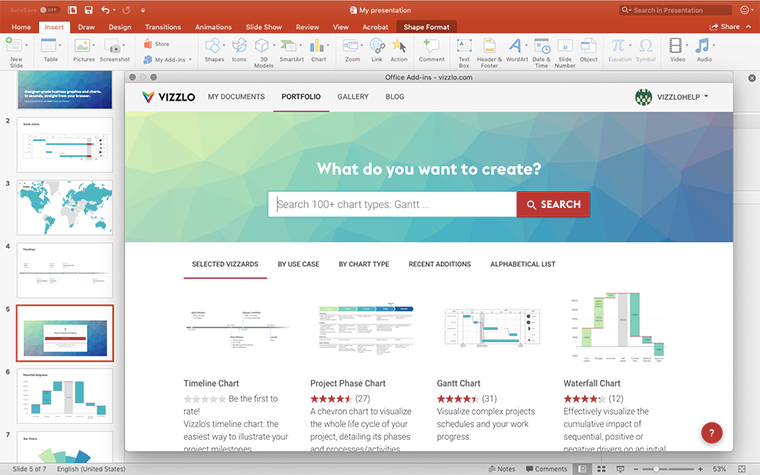
Create a Combo Chart in PowerPoint with
Vizzlo's add-in
Loved by professionals around the world







Visualizations your audience won’t forget
Convey abstract concepts and data with professionally designed
charts and graphics you can easily edit and customize.