Fill out the form, and we'll get in touch as soon as possible.
Visualize project schedules and your progress flow.
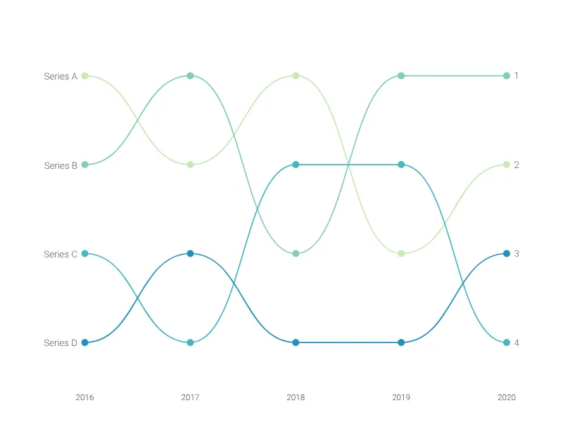
Visualize how items change rank across a series of categories with smooth, connected lines.
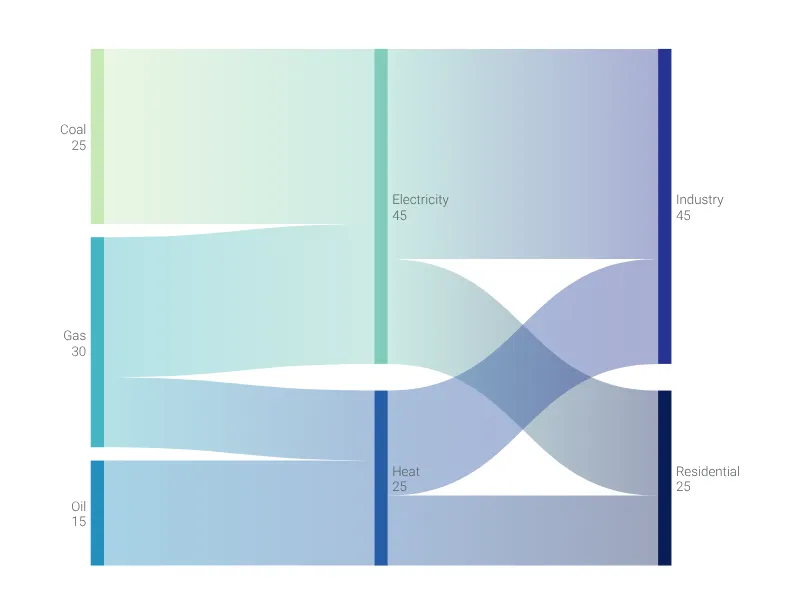
Visualize flows and quantities between nodes using proportional-width bands. Perfect for energy flows, budget allocations, and process analysis.
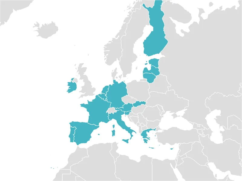
A zoomable map for highlighting any number of countries of the world by clicking on them.
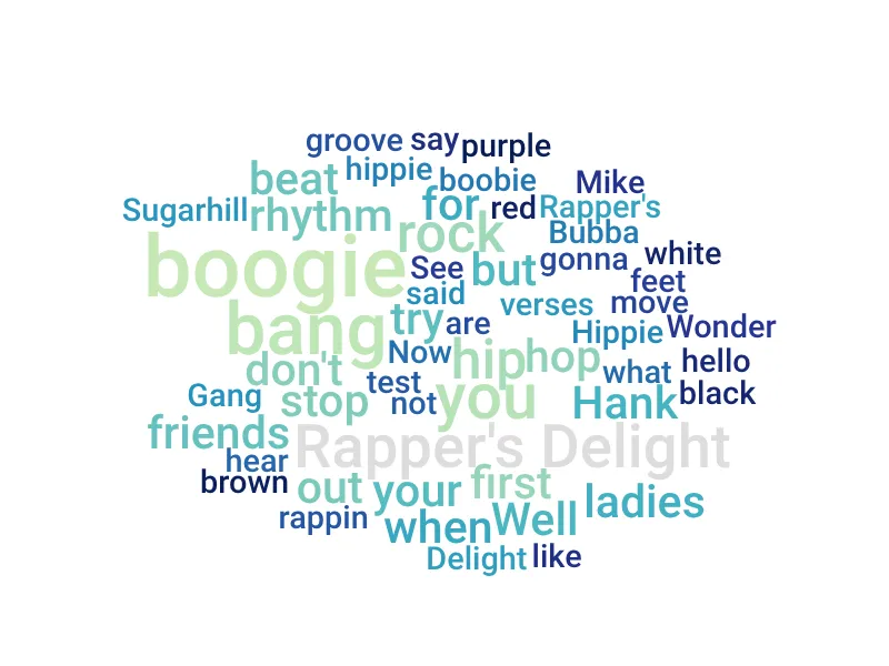
Generate a stunning word cloud (or tag cloud) with ease, just by pasting your text here.
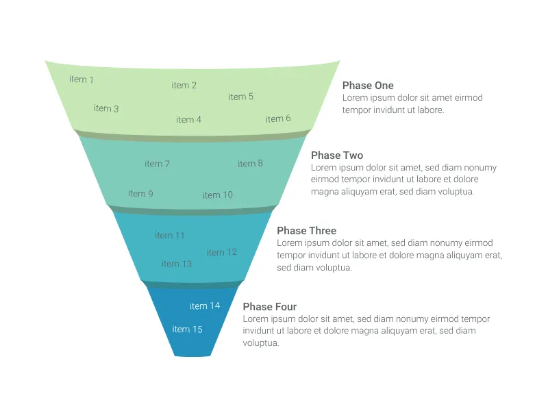
Create a beautiful funnel chart with up to six stages to map out your sales pipeline or any other process.
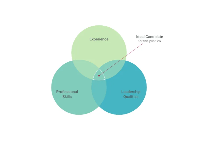
Create a Venn diagram to visualize intersections and differences between groups.
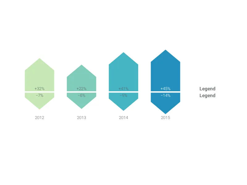
Use a value projection to compare the values of different categories in two different moments.
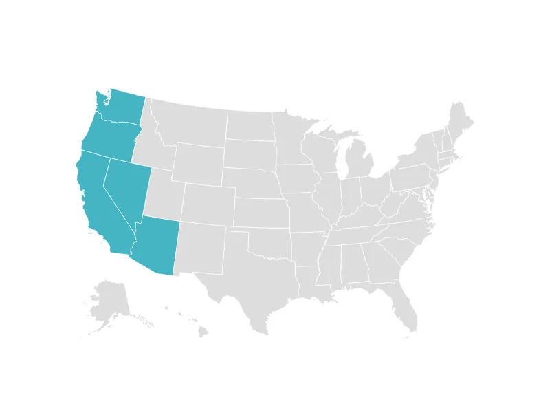
A zoomable map of the United States for highlighting any number of states by clicking on them.
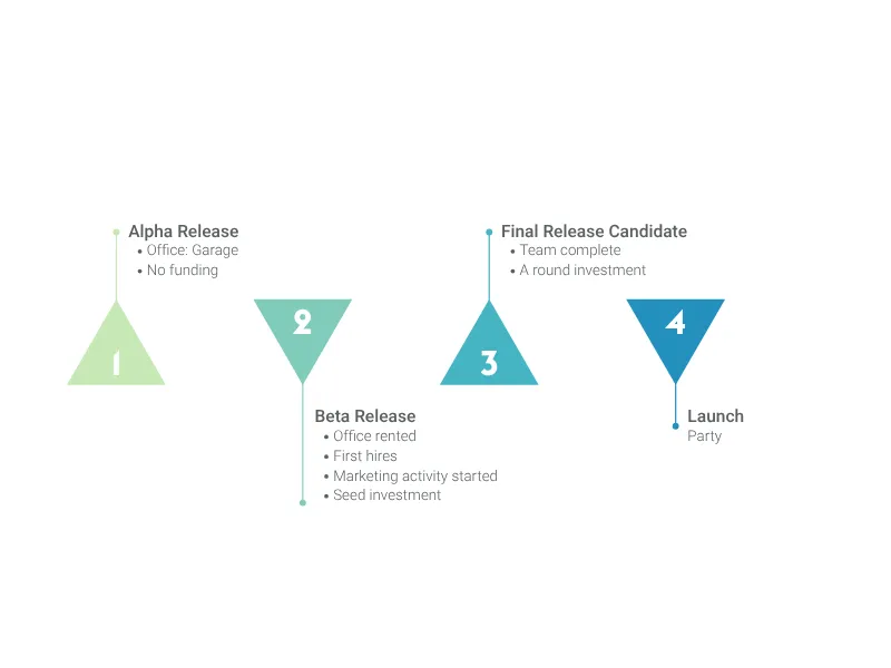
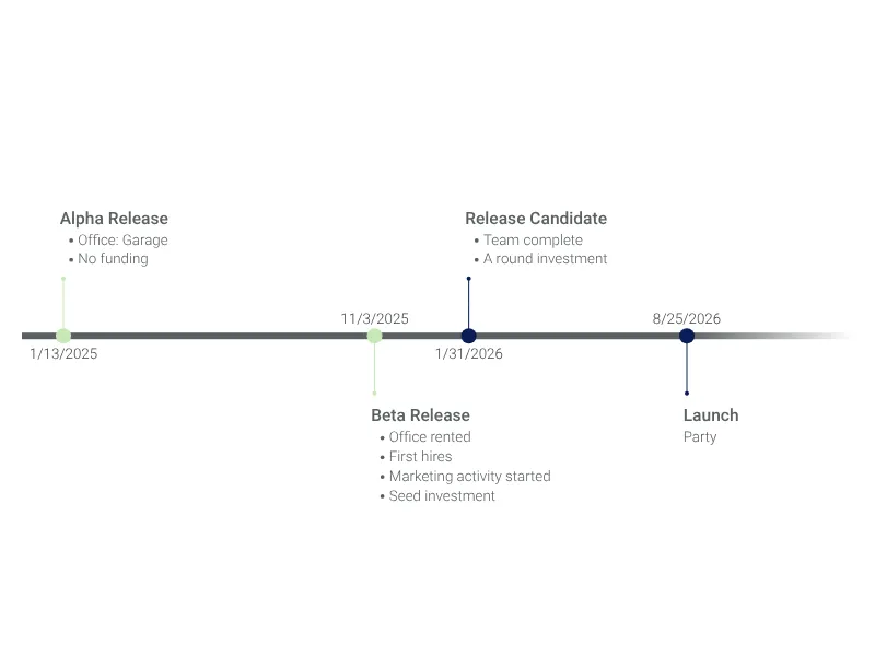
A clean graphic to point out a sequence of milestones along a project.
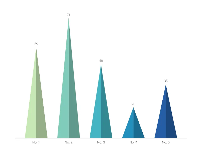
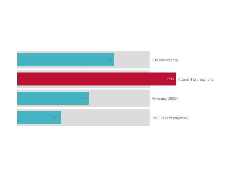
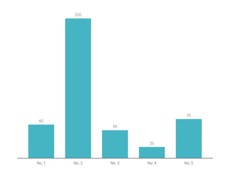
Capture you audience's attention with this nice bar chart alternative.
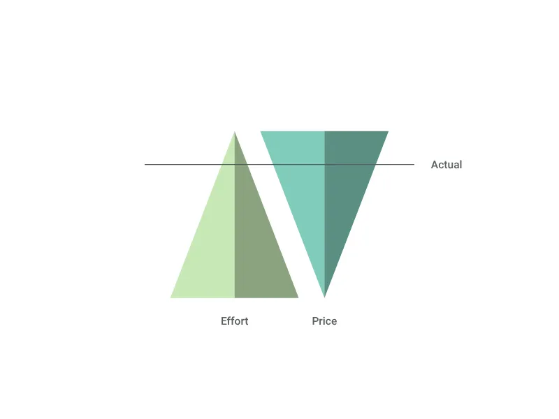
Visualize the trade-off between two different aspects of the same thing.
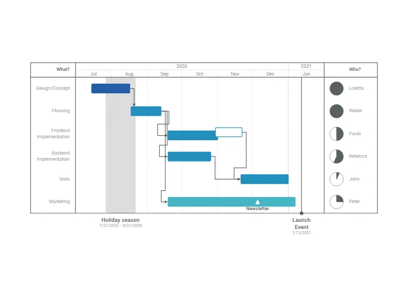
Efficient project planning and scheduling with impressive timelines with just a few clicks.
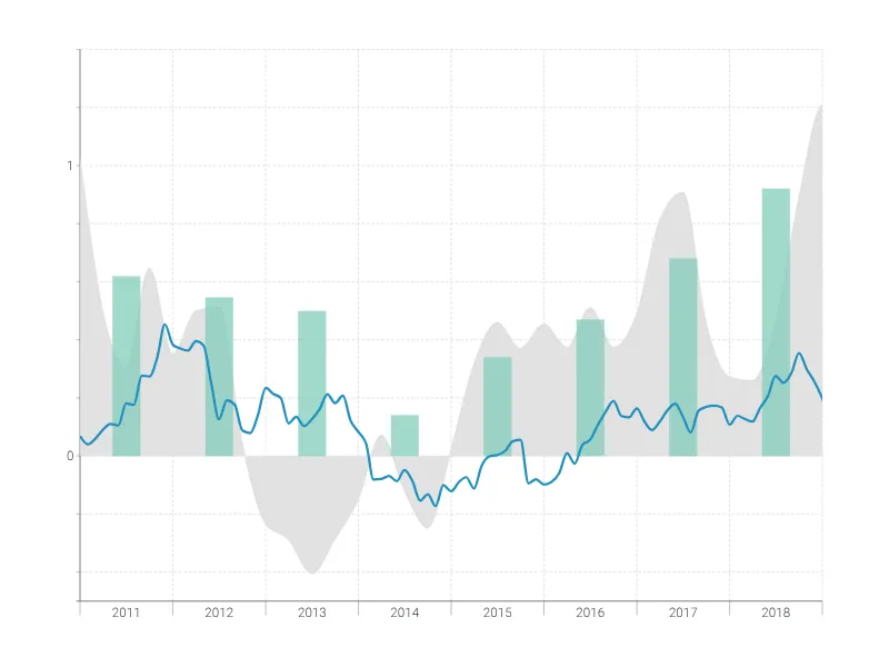
Complex time series graph to visualize detailed financial data.
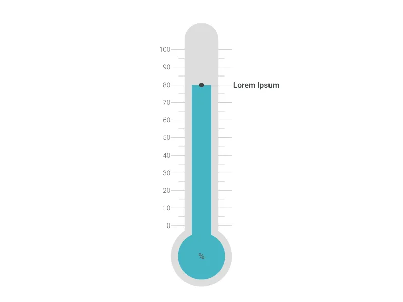
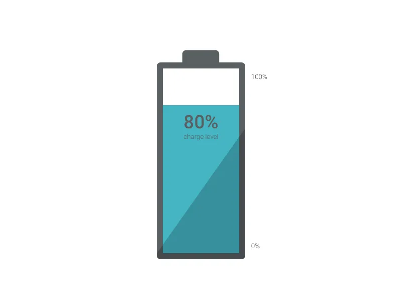
Use an illustrated thermometer to display any kind of single value.
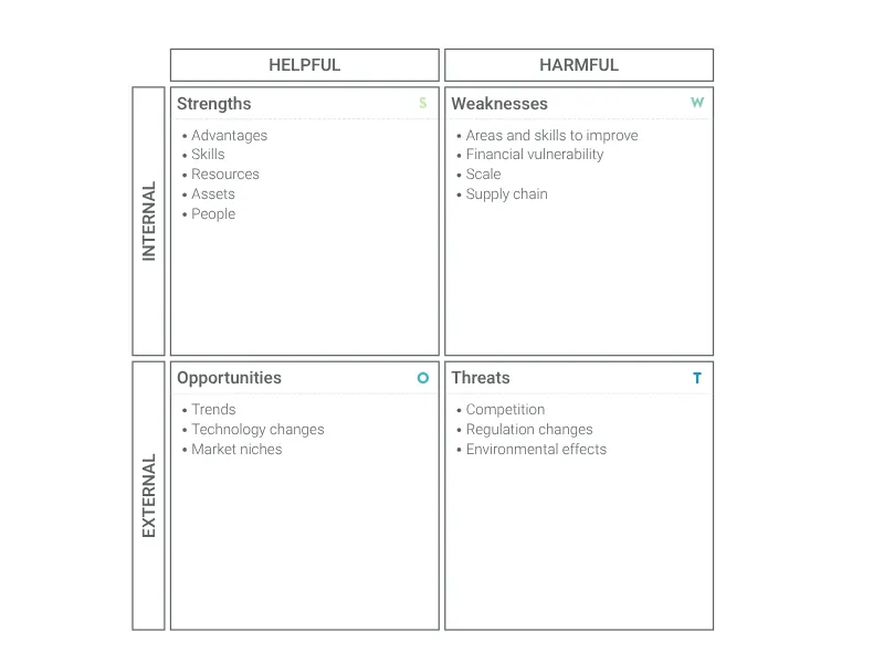
Easily visualize your business strengths and weaknesses, and identify opportunities and threats.
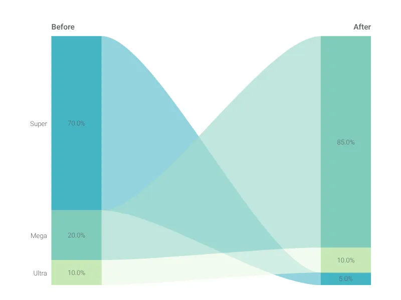
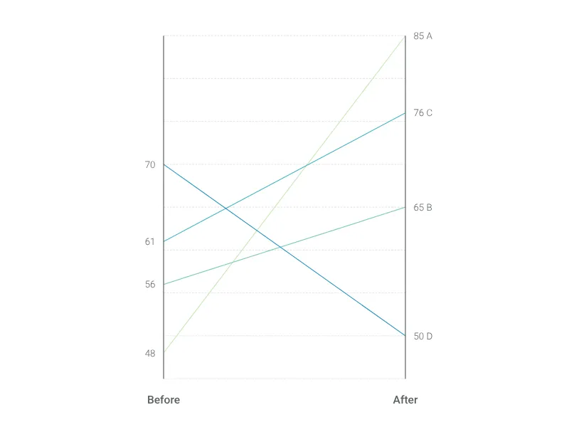
Visualize a before and after story with a focus on slopes.
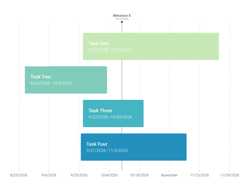
Make impressive and beautiful project management timelines easily with just a few clicks.
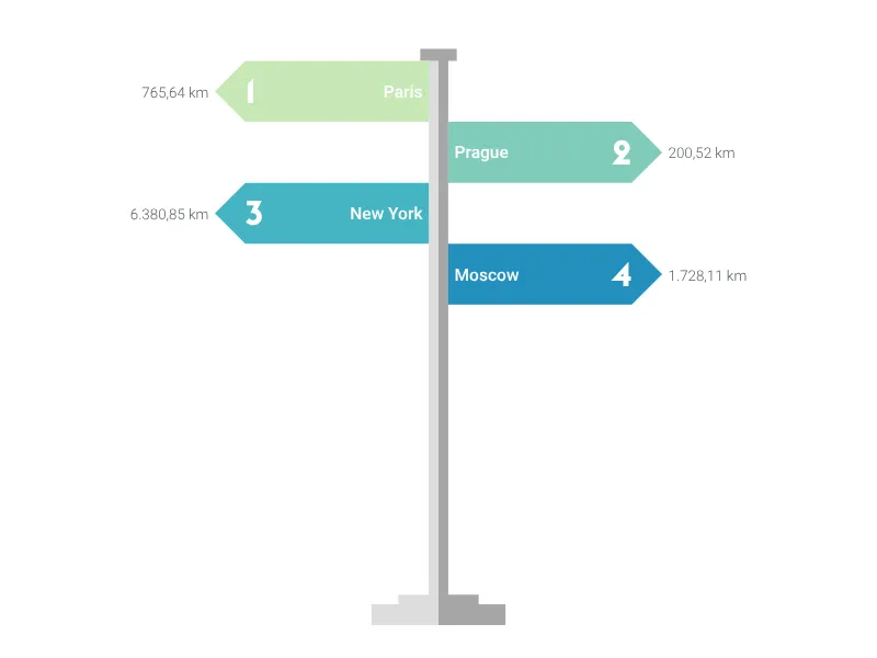
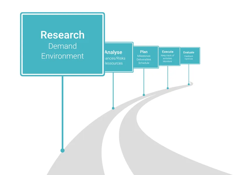
This signpost chart is great to visualize the different directions your project could go from here.
Easily visualize the connotative meaning of products and services.
Where's your product heading? Visualize your next steps using an actual roadmap.
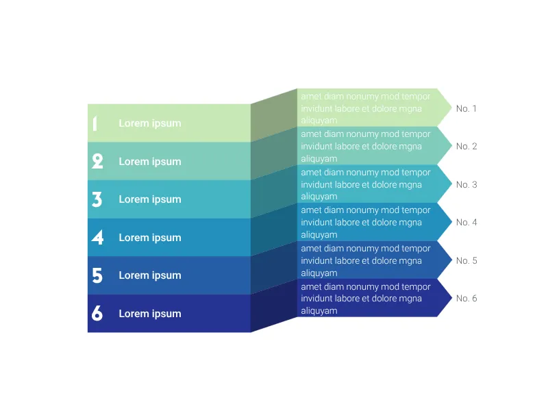
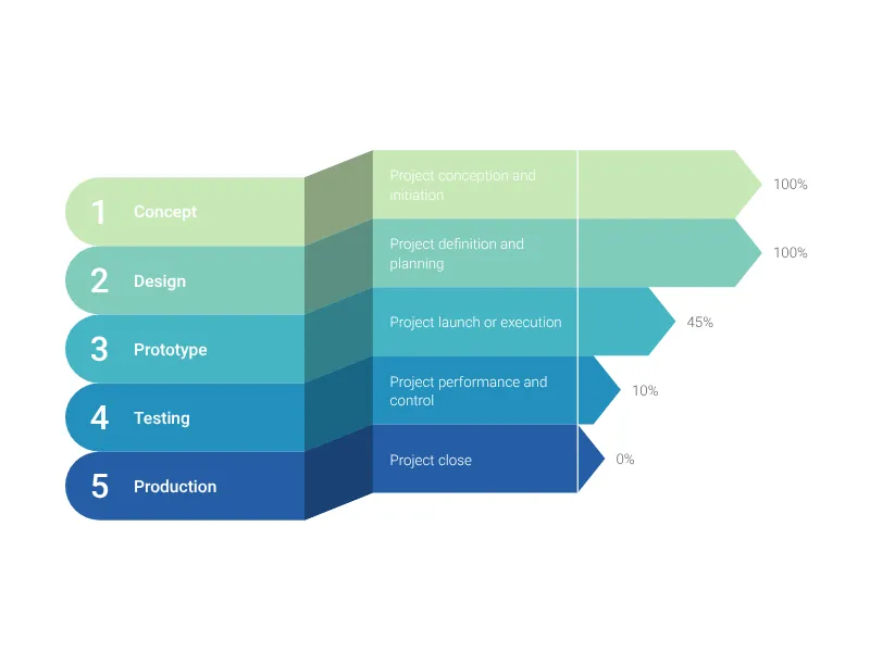
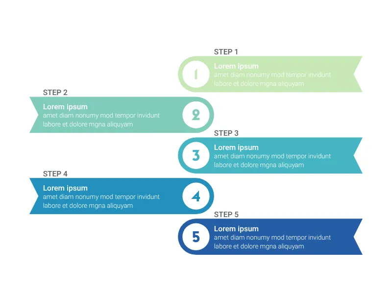
A vertical list of agenda items, bullet points, or milestones visualized as ribbons.
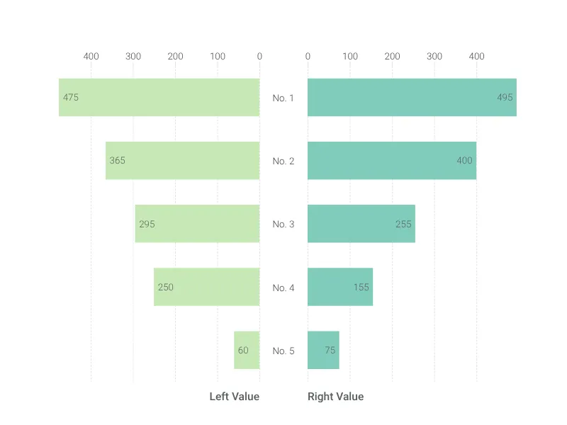
A horizontal bar chart that functions as a vertical list (or the other way round).
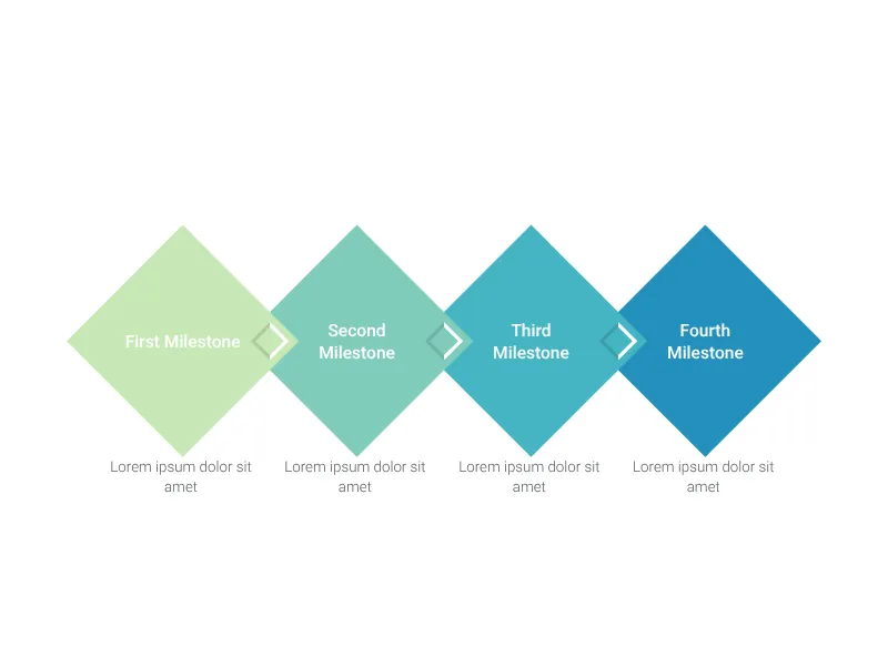
In love with diamonds? Use up to ten rhombi to visualize your milestones.
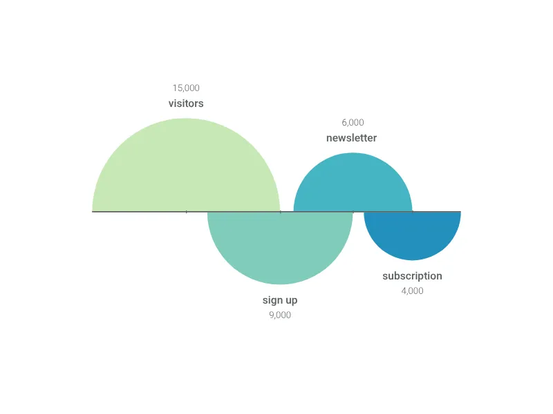
Visualize your user retention or any other simple data series using a set of sequential half circles.
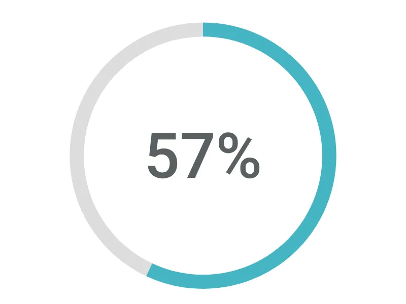
Visualize your progress towards a goal or the share of a whole with this simple but effective chart.
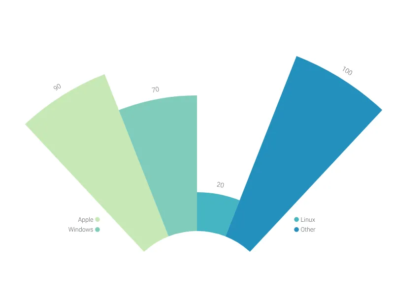
This modified bar chart with its circular shape is as stylish as possible for your next presentation.
Easily compare multiple variables in a compelling graph with several polar axes.
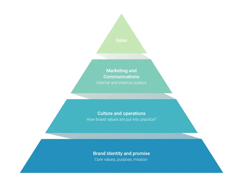
A beautiful and highly customizable pyramid diagram with up to ten levels.
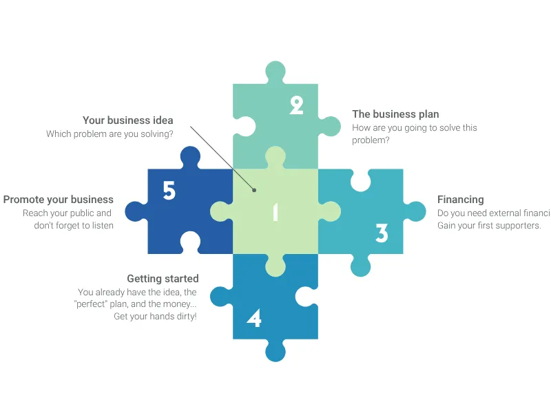
Piece processes or elements of a project together with this puzzle chart.
A chevron chart to visualize the whole life cycle of your project, detailing its phases and processes/activities.
Communicate the completion status of a task list with our progress bar chart.
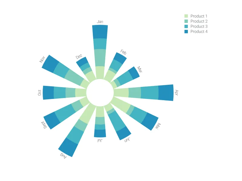
Quickly create a sophisticated polar graph with stacked bars. It's an eye-catching alternative to conventional column charts.
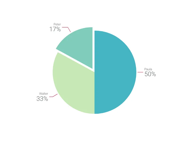
Our free online chart maker helps you create pie charts in no time. Online, in PowerPoint or Google Slides.
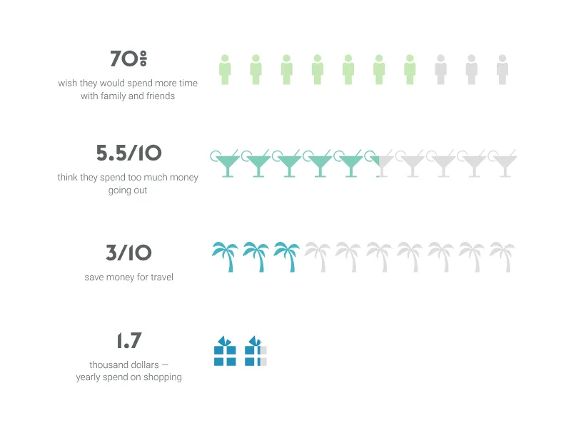
Visualize and compare percentages, fractions or absolute numbers with engaging icons.
Capture photos from your webcam and embed low-resolution grayscale images in your documents
Don't you miss MS Paint, too?
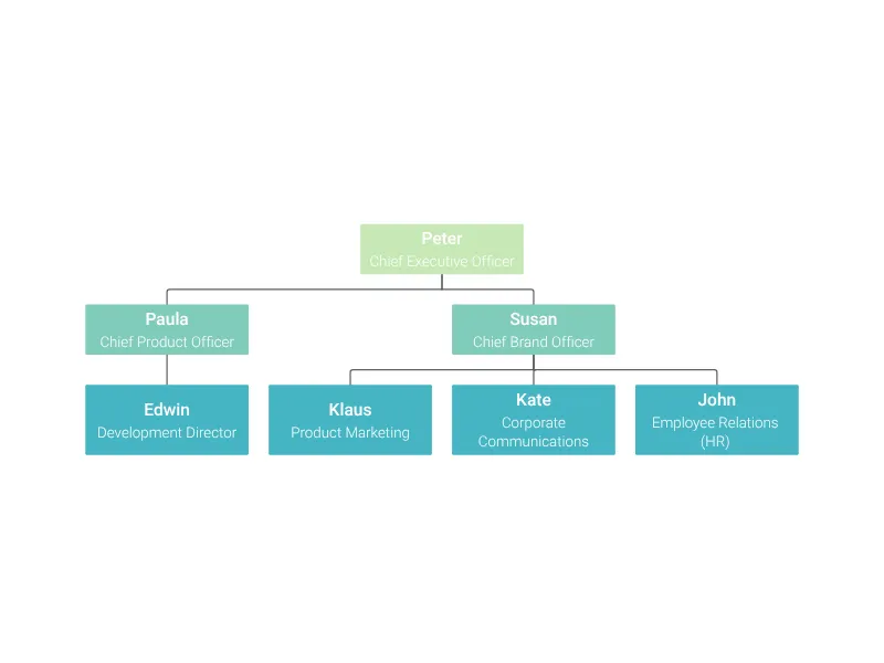
Use an organigram/logic tree to visualize the hierarchy of your company. It is also suitable for building a heritage tree.
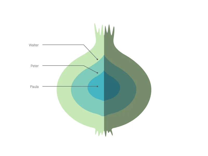
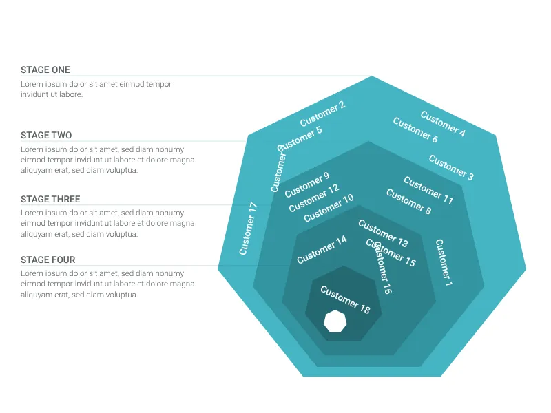
Create your onion diagram with multiple layers of your projects' dependencies.
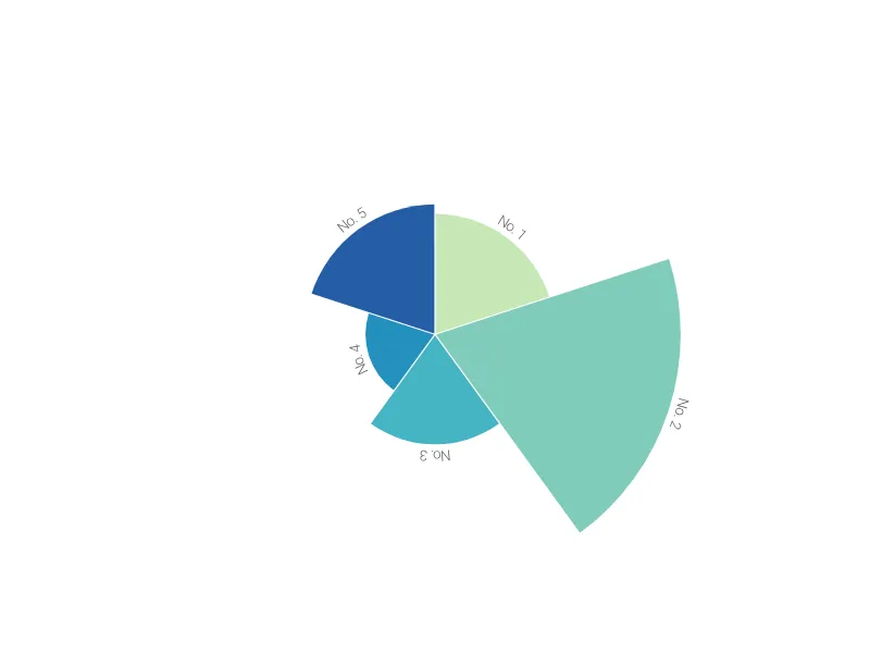
Create a sophisticated Nightingale's Rose chart to compare periodic data or various categories across different groups.
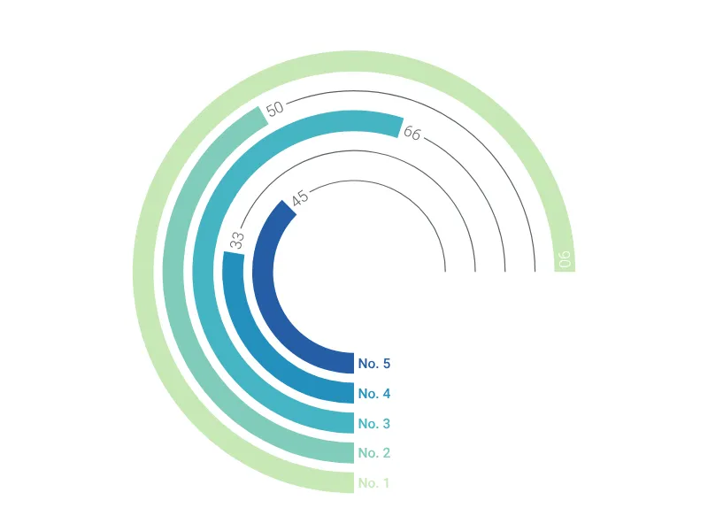
Compare your data across up to six different radial bars chart on a single page.
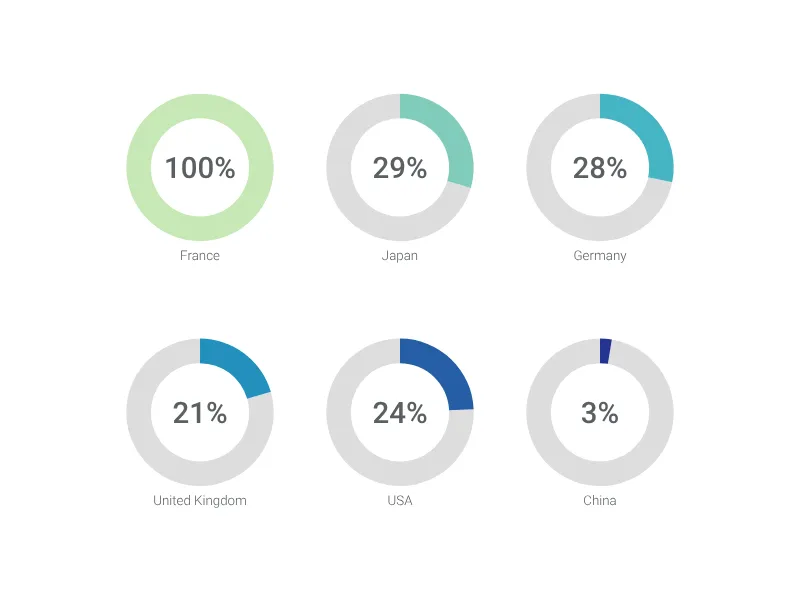
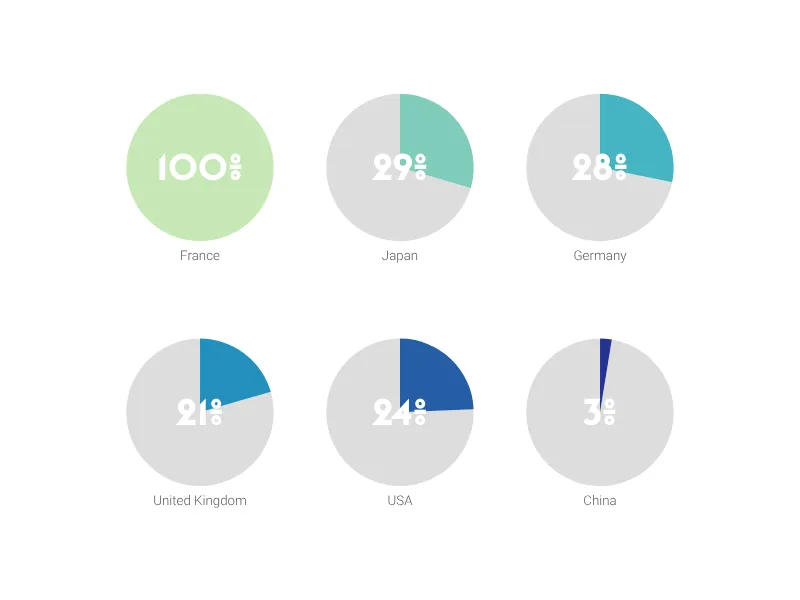
Place up to six pie charts on a single page. A modern alternative to a bar chart.
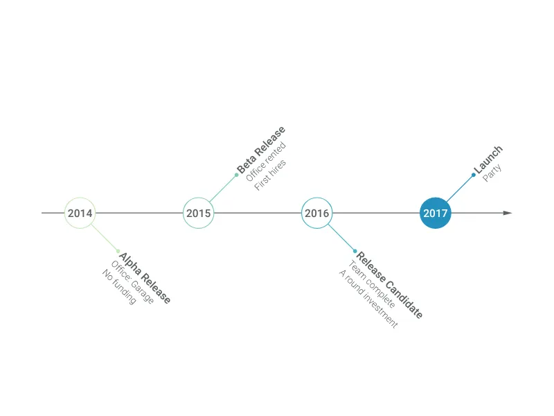
Point out up to ten events along a project development with this milestone plan plotted as an arrow.
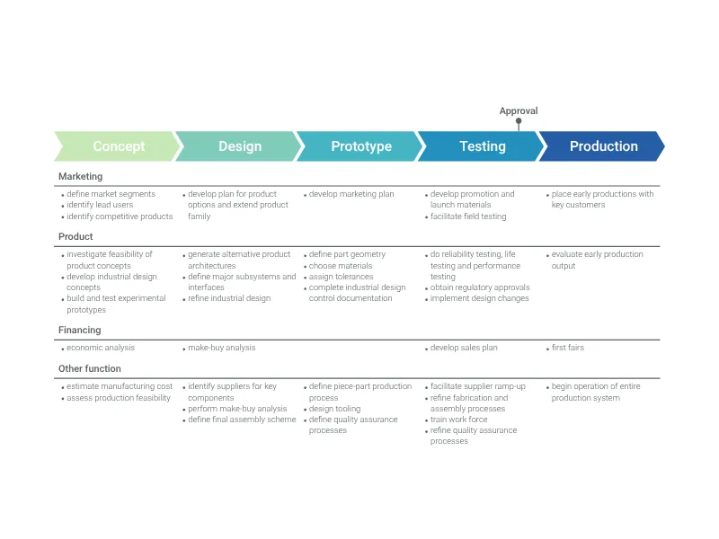
A visually attractive way to explain longer processes of a specific project or your day-to-day operations.
An easy, quick, and super versatile line graph maker.
Present your project milestones in a simple and compelling way with this vertical list.
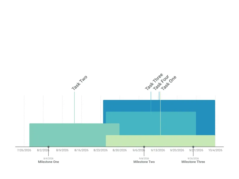
Make an attractive timeline to visualize overlapping and concurrent processes with ease.
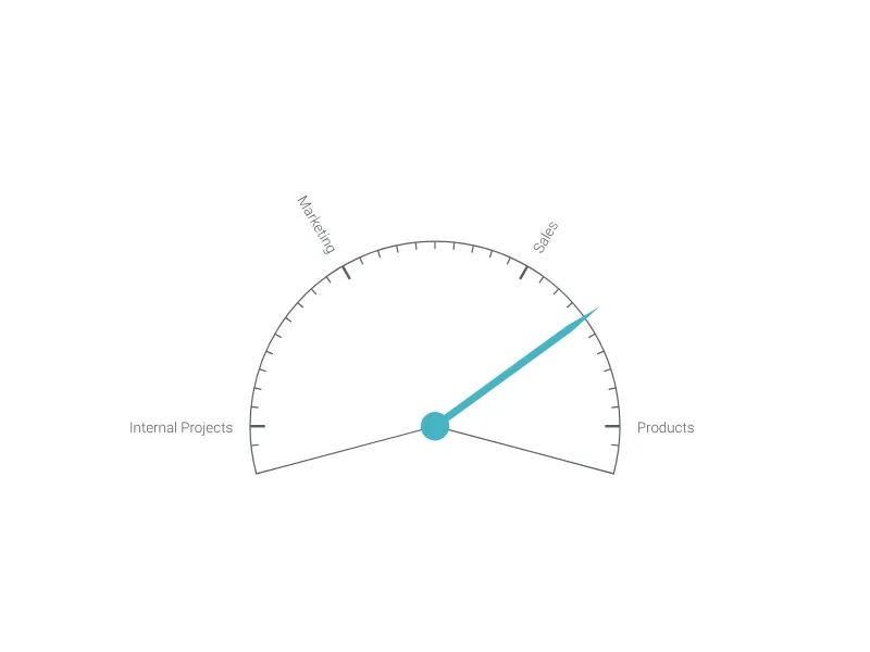
A speedometer-like gauge with arbitrary text labels to present the direction of a project or a specific area of focus.
Visualize the flow from several sources to a whole with a beautiful Sankey-like diagram.
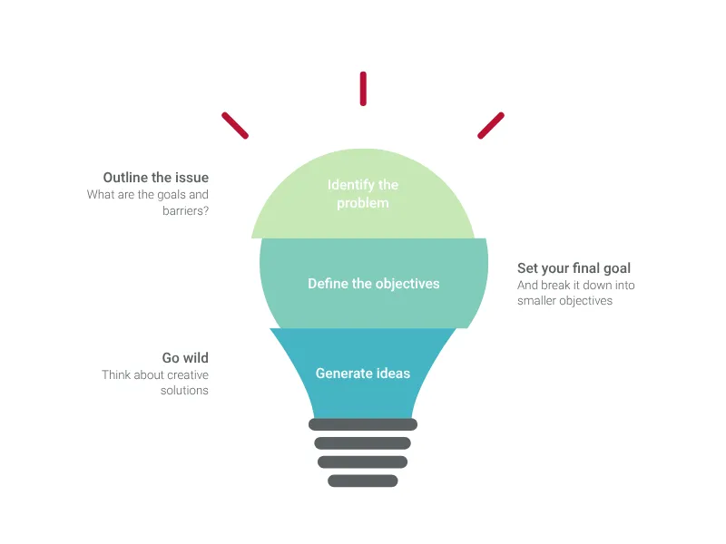
Visualize your ideas and core beliefs with this great staged light bulb graphic.
Create a simple timeline with icons.
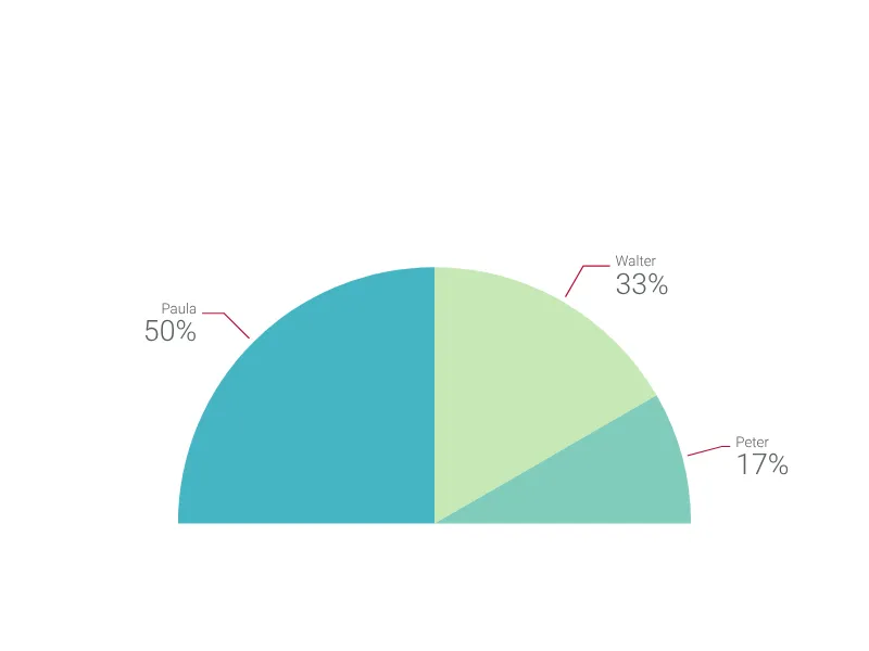
Create a beautiful half-pie chart in seconds (with no tricks or workarounds as in Excel) to present your data.
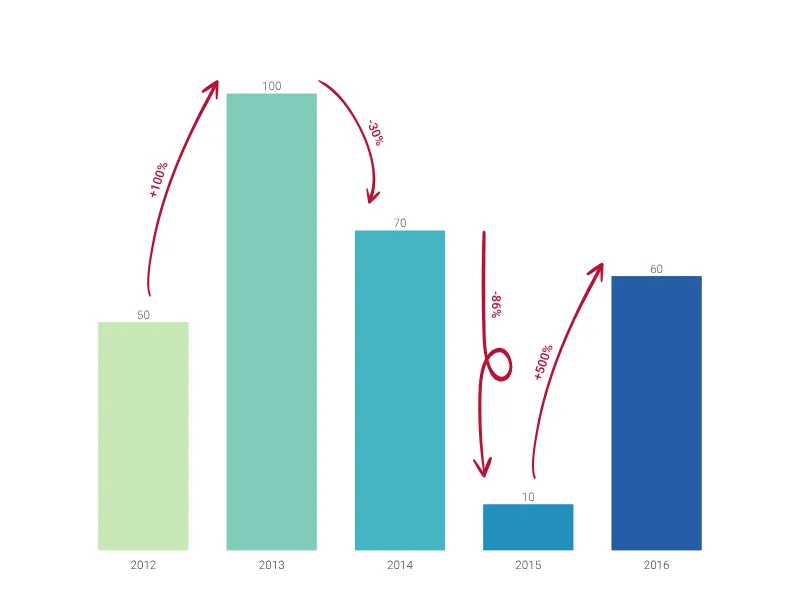
A bar chart that highlights the change from one record to the next using hand drawn arrows.
Communicate your project growth with a visual metaphor of growing leaves on a tree.
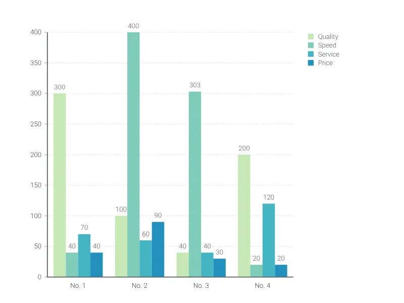
Use a grouped bar chart to compare the same categories within different groups.
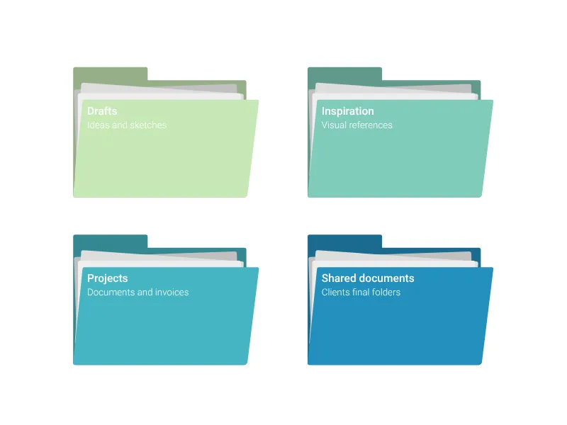
Easily visualize different packages of documents using this folder chart.
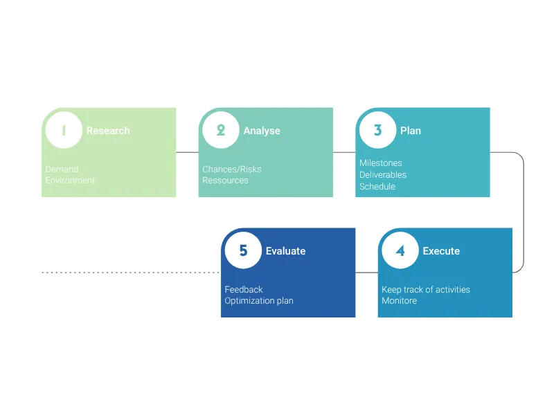
A circular diagram to visualize project and feedback processes.
Easy to create, this timeline chart will make your project presentations and reports more compelling.
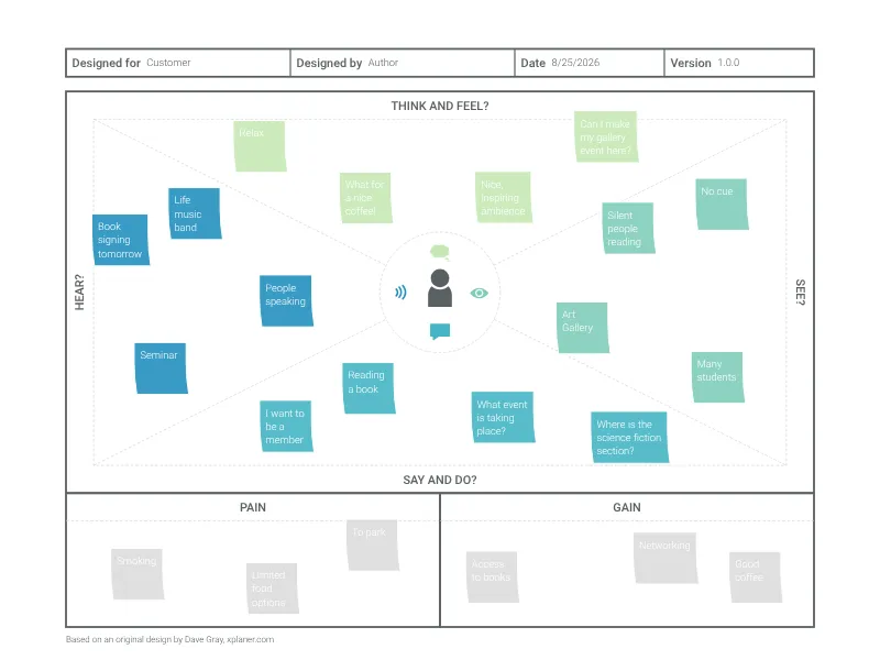
Gain insight into your customers using Vizzlo's Empathy Map.
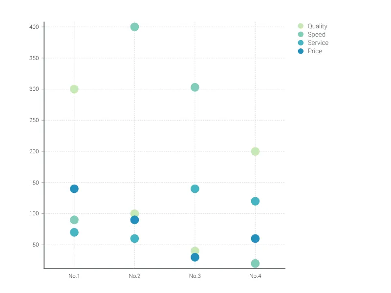
The dot plot chart is a visually appealing alternative to the bar chart for single or multiple categories of data.
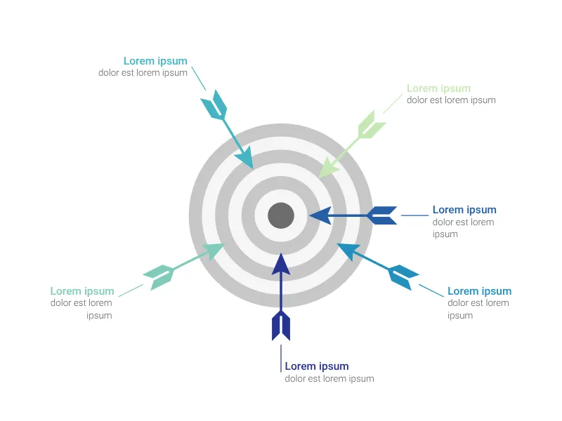
Visualize your competitions' or projects' progress with arrows on a dartboard.
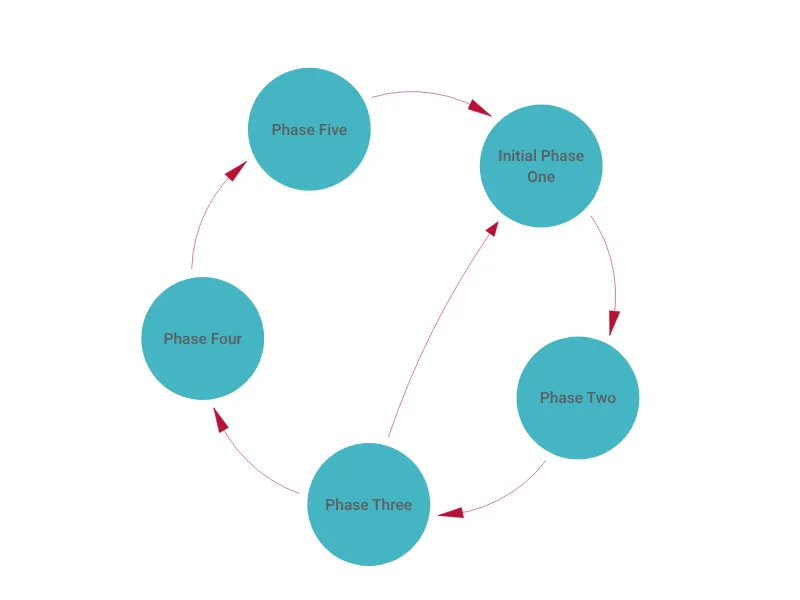
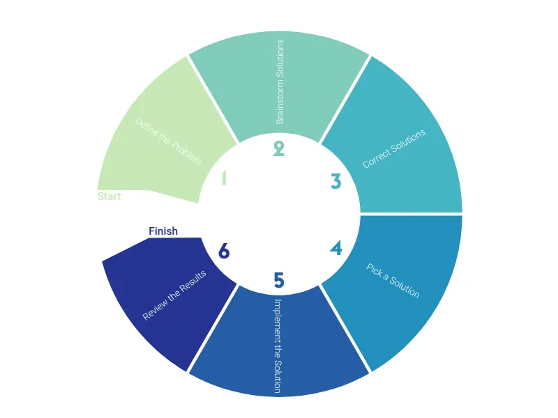
A circular chart for milestones or recurring processes with up to ten stages.
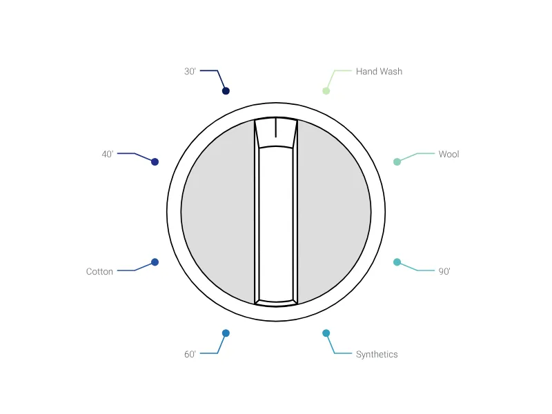
Present the different steps of your project with a flippable adjusting wheel.
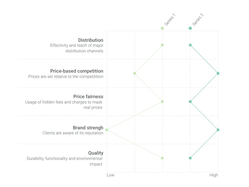
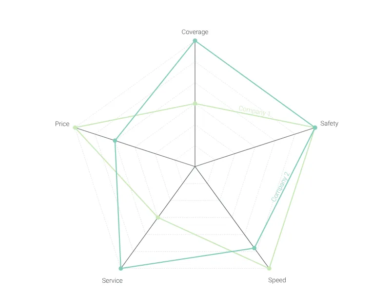
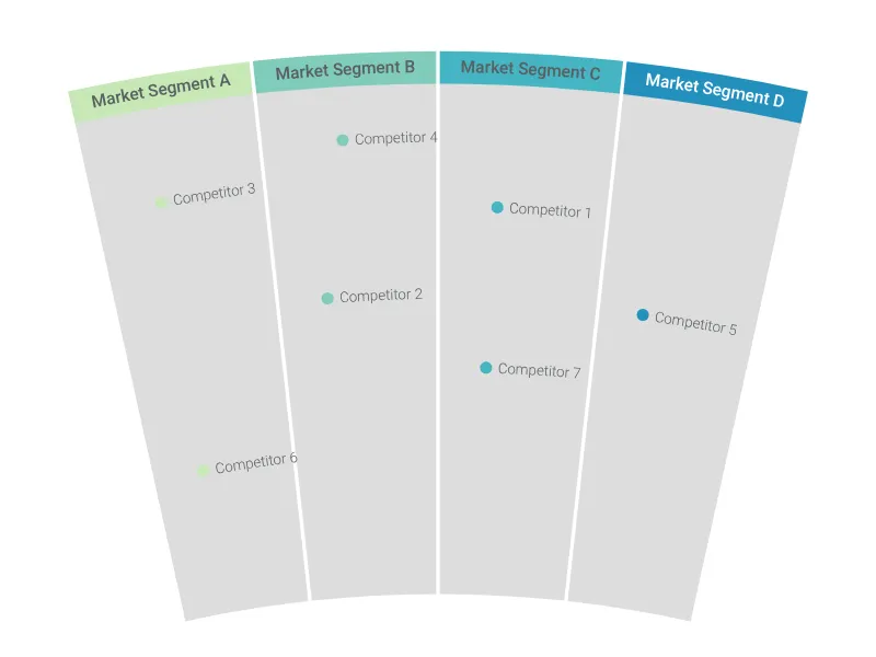
Visualize the positioning of your competition using this radar-like chart.
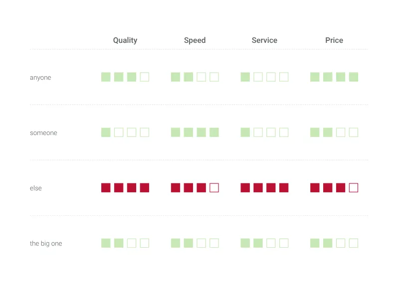
Use this table to compare product features or skills, and tell at a glance which option suits you best.
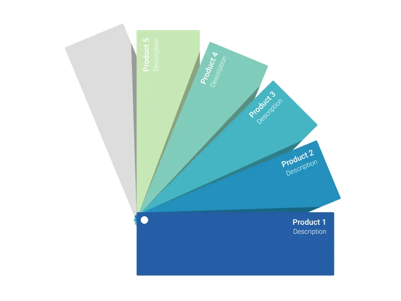
Show your corporate portfolio with this fanned-out color chart.
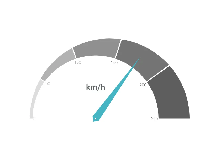
Tachometer-like gauge modeled after a typical car dashboard.
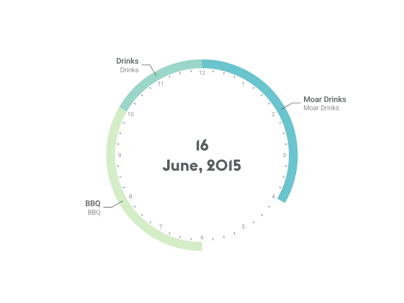
Plan a whole year or a day, or quickly display recurring activities/events with this beautiful agenda chart.
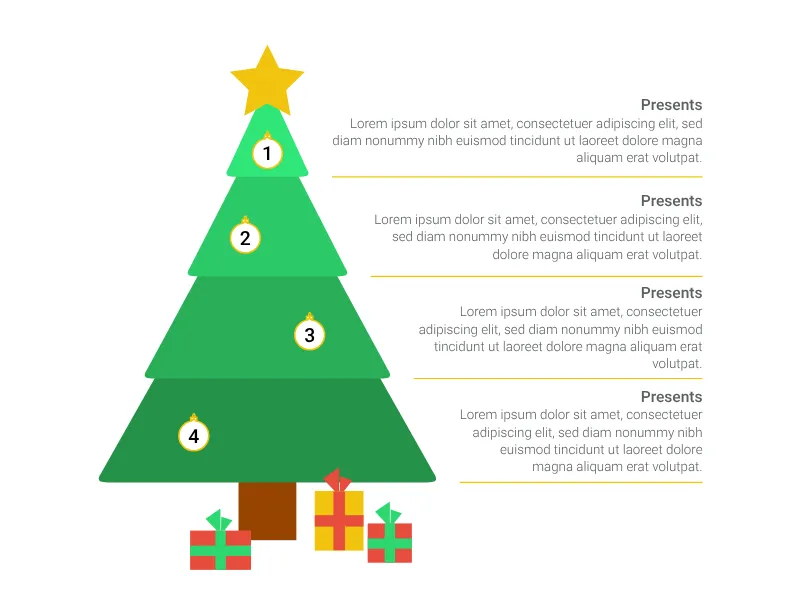
X-MAS SPECIAL! Prioritize your christmas wish list along a christmas tree.
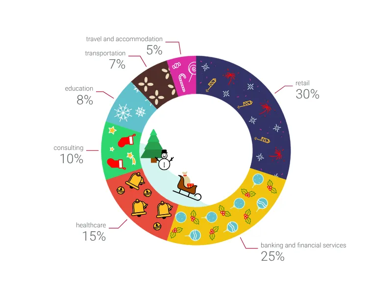
X-MAS SPECIAL! Give your data a holiday twist and season your presentation with this special donut chart.
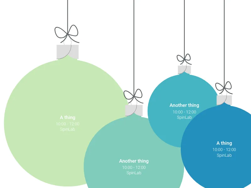
X-MAS SPECIAL! Tell your christmas story with christmas balls.
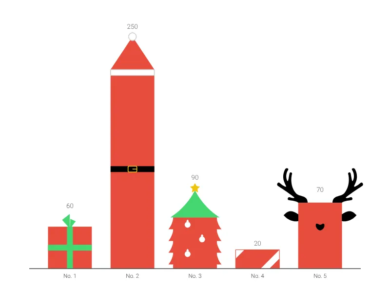
X-MAS SPECIAL! Give your data a holiday theme with this special bar chart.
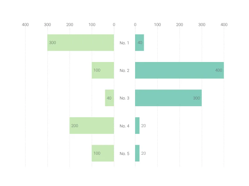
Create a butterfly chart to compare two data sets side by side.
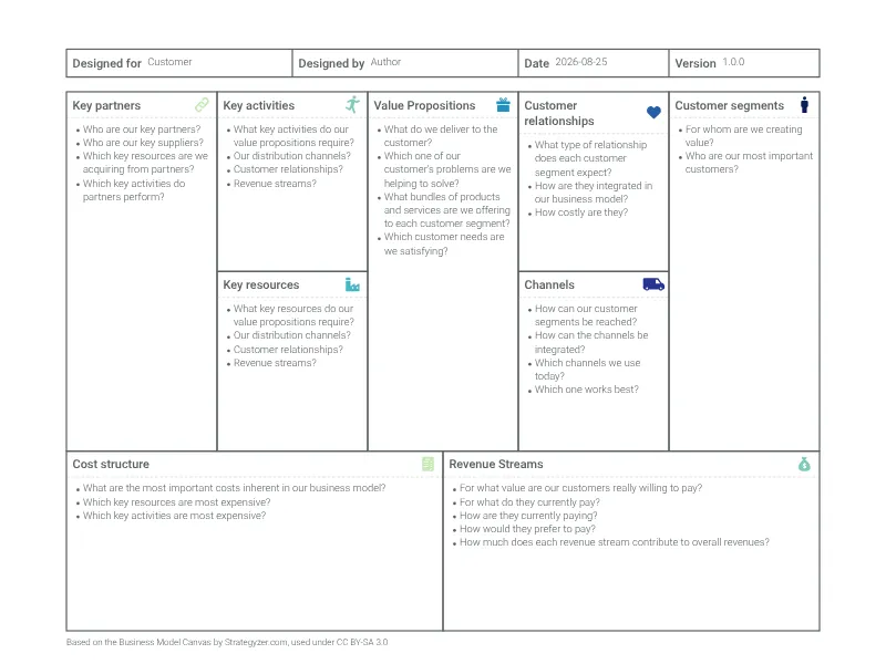
A visual template to develop new or document existing business models.
A multivariable graph for visualizing and comparing up to four dimension of your data.
Highlight and label different areas of the human brain.
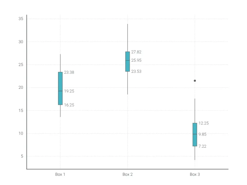
Compactly display the distribution of a continuous variable.
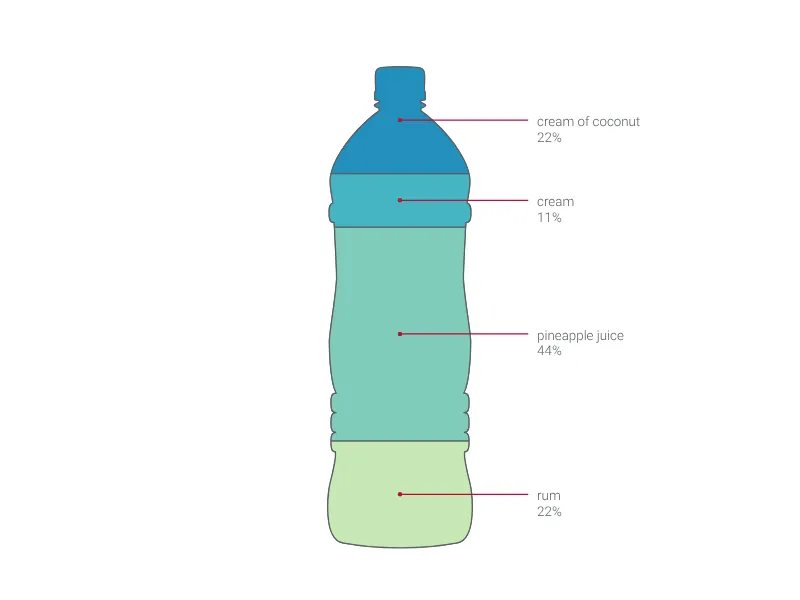
Visualize different values or fill levels using a selection of water, beer, or wine bottles.
Compare up to six different categories with this charming diagram.
This diagram will be the best choice for representing your business processes.
A fantastic representation of a funnel chart from the top of it. Perfect to represent the stages of your sales process!
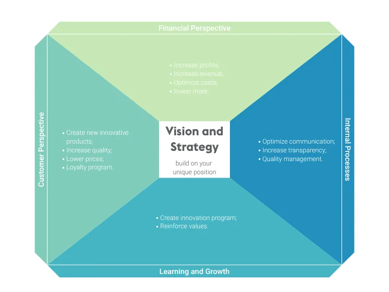
Keep track of your vision and strategy with this well-known performance management tool.
This alarm clock will be ideal to demonstrate the balance time in your presentation.
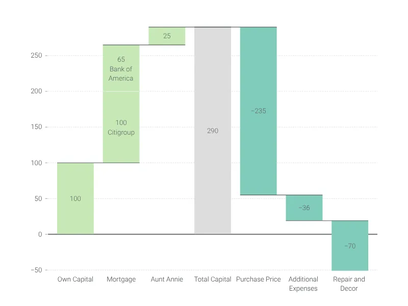
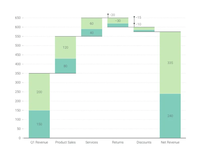
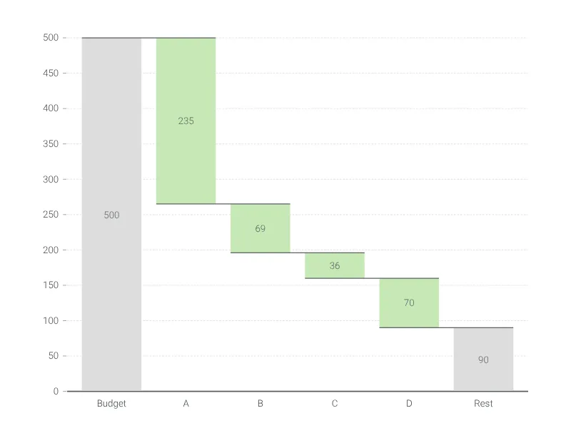
Visualize and understand the cumulative effect of sequentially added positive or negative values.
Classical warning sign. No idea what to write on it? Try 'Sign not in use' or 'Road never ends'.
Compare different the growth and decline of multiple values with up to ten up pairs of arrow bars.
Won a prize or some other trophy in a competition? Show how proud you are.
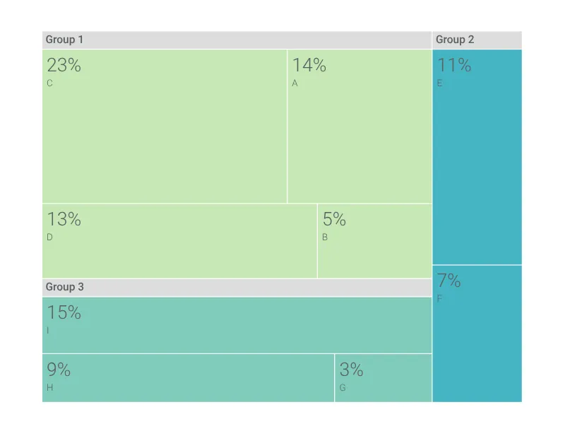
A treemap chart is often a better choice than a pie chart. Create a sophisticated one with ease.
Create a tornado chart to analyze and evaluate decisions.
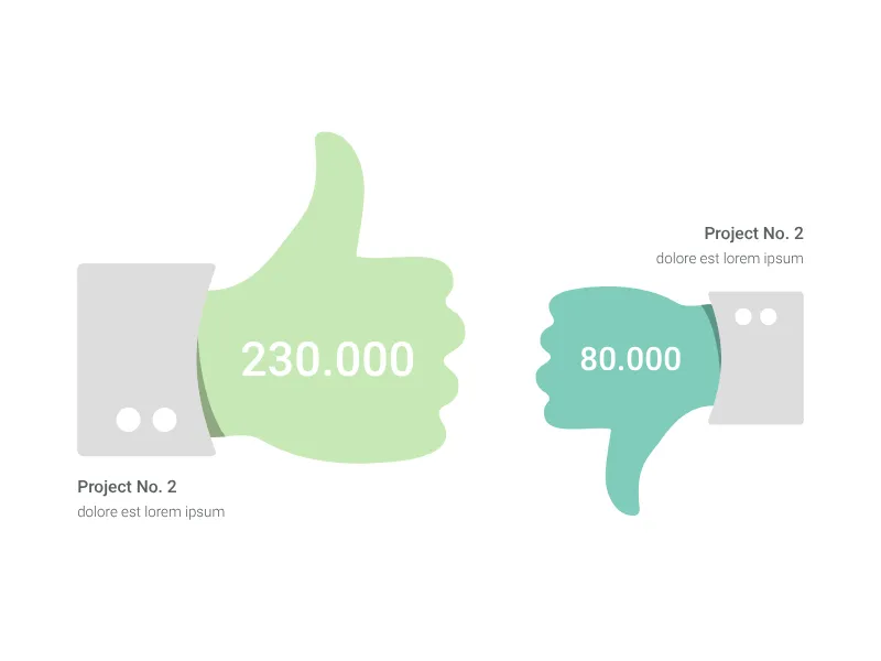
What was good about a project and what was bad? What do you like, what not? Show it using the thumbs signal.
Waterfall chart with multiple data series stacked per category, ideal for visualizing the cumulative effect of several contributing factors at each step.
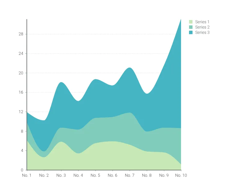
A stacked time series graph to visualize the part-to-whole relationship between your data.
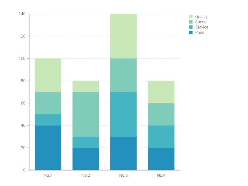
Highlight the part-to-whole relationships of categories and compare various groups with this stacked bar graph.
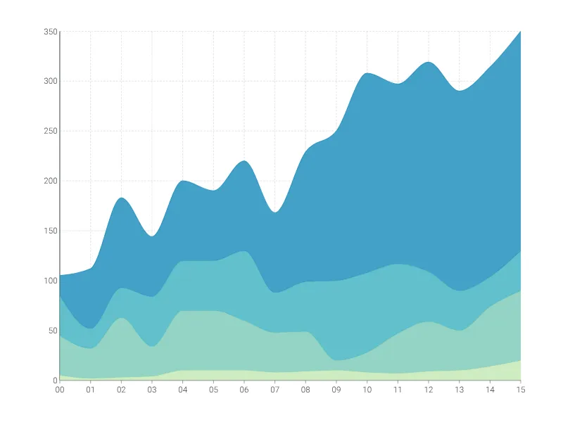
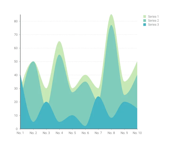
Easily visualize changes of cumulative data series using the stacked area chart.
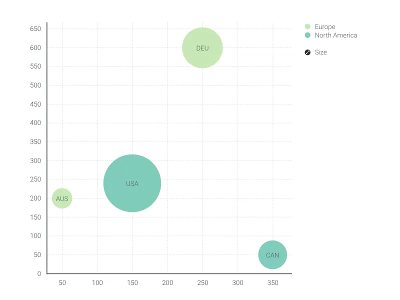
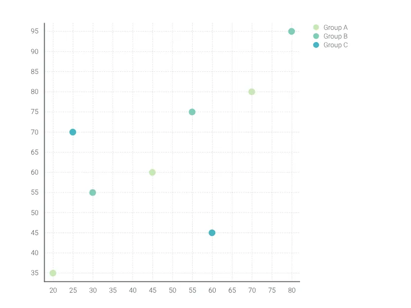
A scatter plot for visualizing correlations and relationships between two variables across multiple groups.
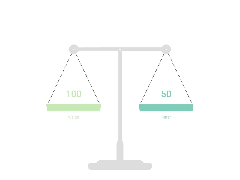
This scale will be ideal for showing your balanced or disbalanced values.
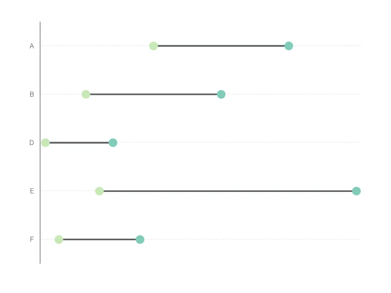
A range plot is a great choice if you want to highlight the difference between two values rather than the values itself.
Generate QR codes from URLs or text for print materials, presentations, and digital displays
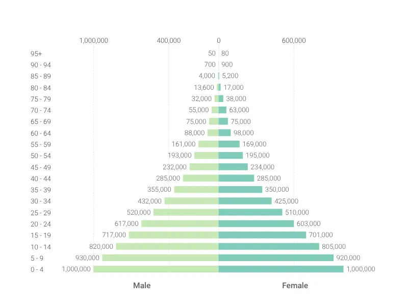
Break down demographics with this population pyramid.
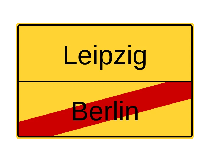
Germany's sign to indicate that you're leaving a city and the next is just around the corner.
Get your message across using a speech balloon, a thought bubble or a simple frame.
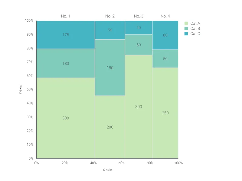
Our free chart creator helps you create beautiful Marimekko charts in no time. Online, in PowerPoint, or Google Slides.
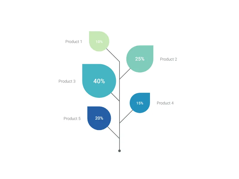
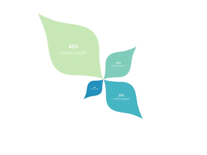
Present your data in a natural way with this beautiful leaf chart.
Customizable version of the famous British propaganda poster from WWII.
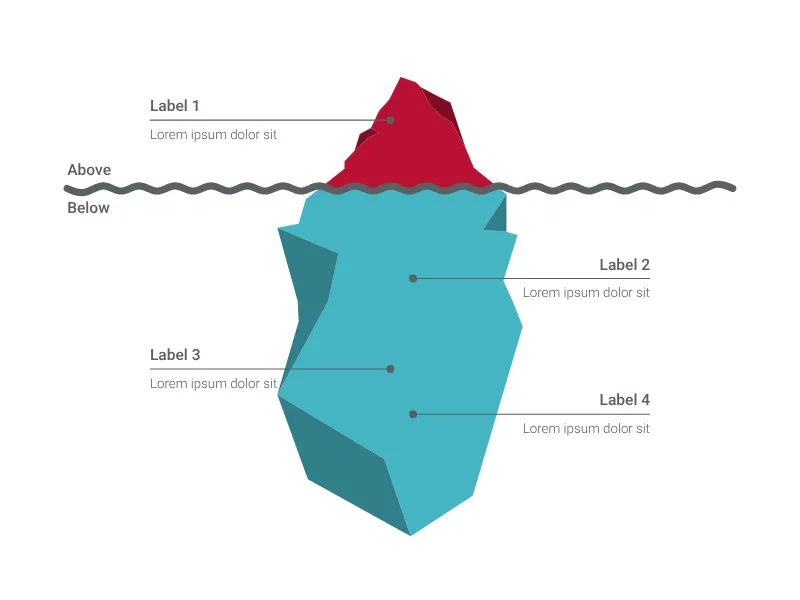
What's hidden below the surface of your project plan? Visualize it with an actual iceberg!
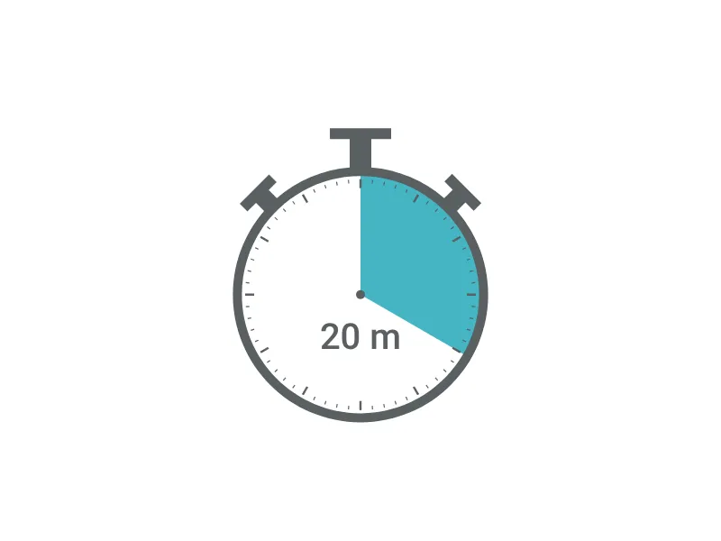
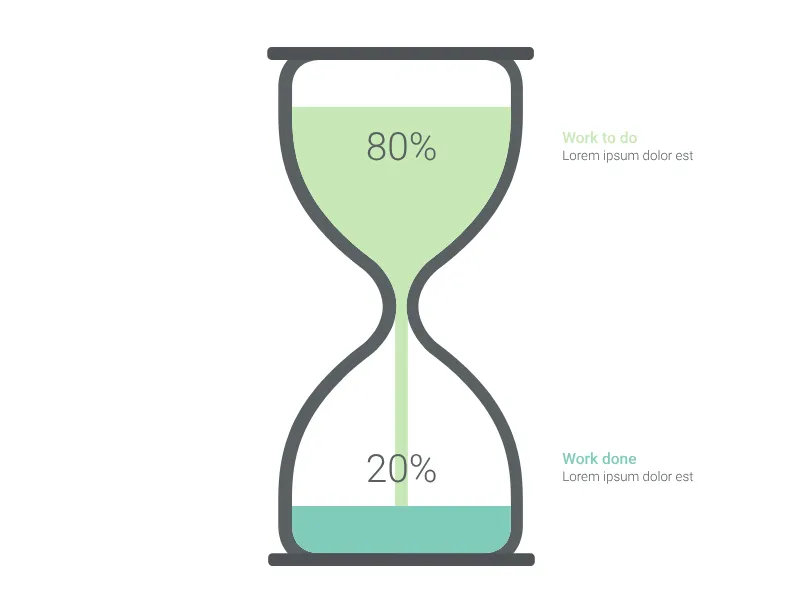
How much time is still left for your project? Visualize it like in the old days.
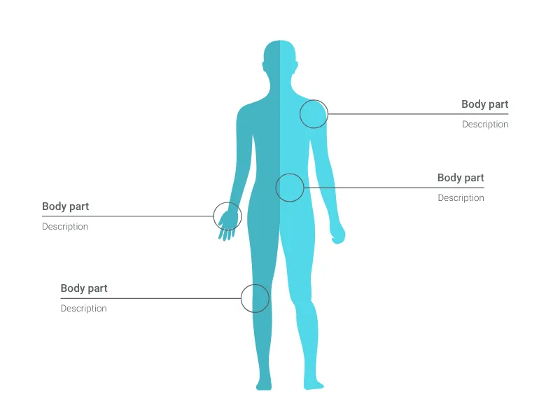
Simplified representation of the human body. Displays a woman, a man, or both.
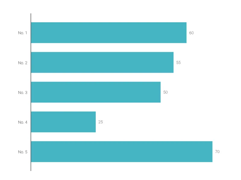
A horizontal variant of the classic column chart.
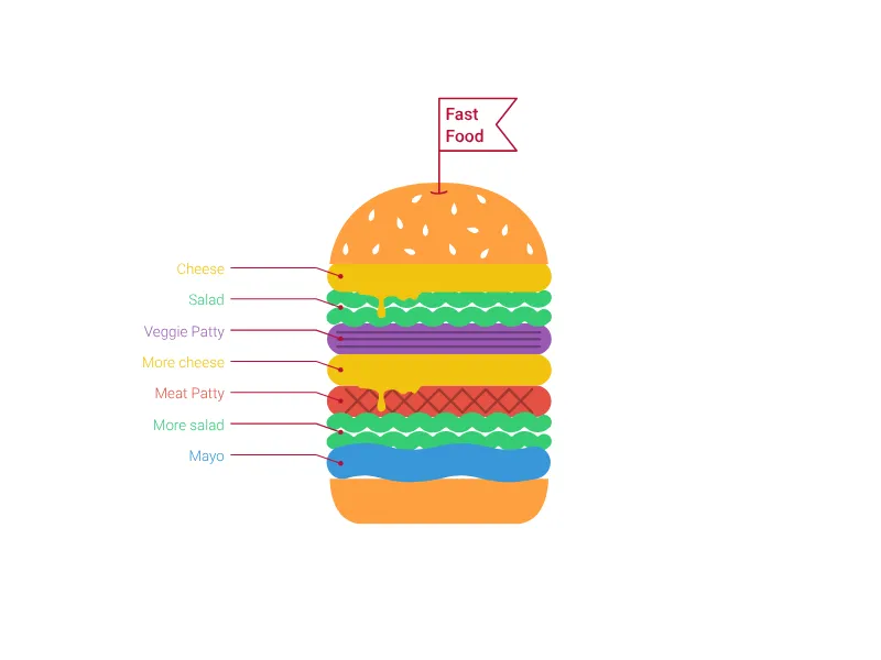
Visualize your technology stack using delicious layers of a hamburger or sandwich.
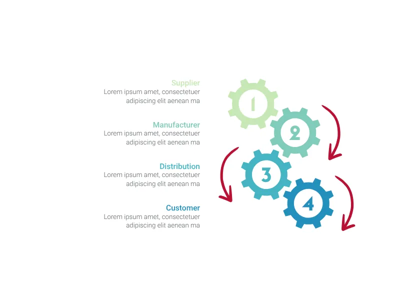
This gearwheel chart perfectly fits your relationships in business processes.
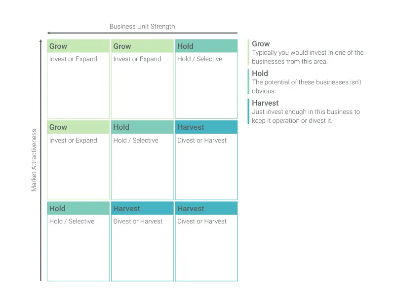
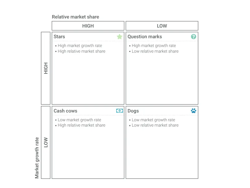
Visualize a portfolio analysis effectively to help you allocate resources efficiently for a successful business strategy.
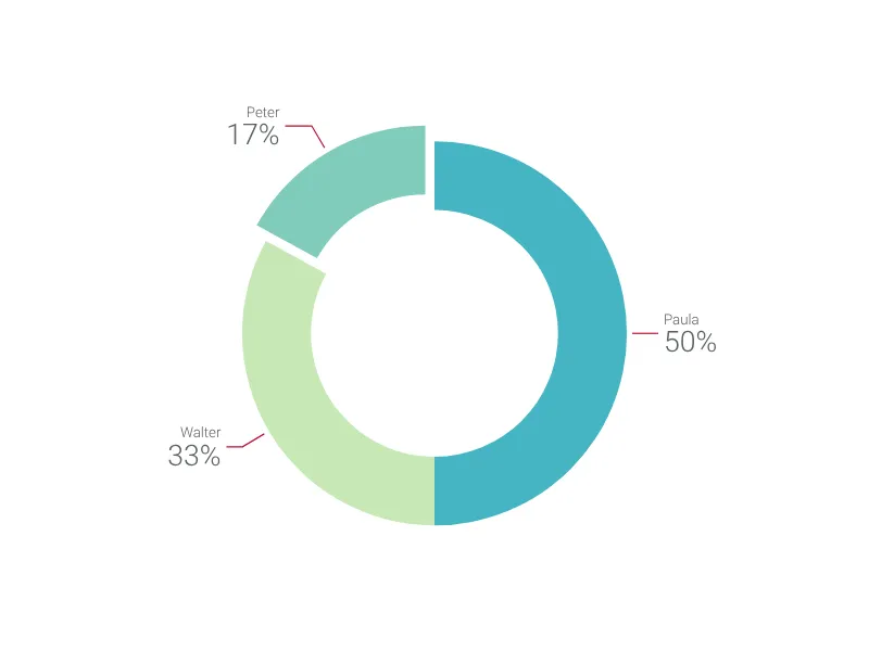
Slenderize your simple pie chart with this donut chart and highlight your favorite pieces.
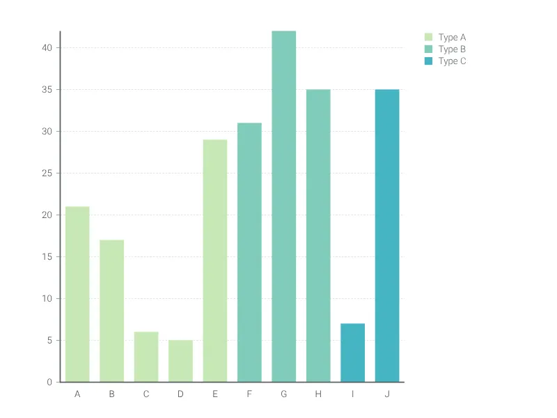
Visualize and compare numerical data of categories from groups with the color coded bar graph.
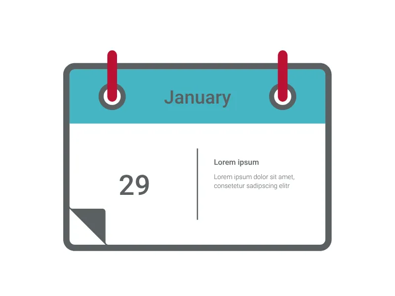
Present your deadline date with this eye-catching calendar chart.
Variation of the standard waterfall chart which adds up items from right to left to a total on the left of the chart.
Carry out a portfolio analysis to help you allocate resources efficiently and devise a successful business strategy.
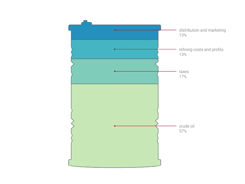
Visualize different values or fill levels using a barrel.
Visualize amounts with respect to one categorical variable
A super versatile area chart maker for colorful, bold visualizations
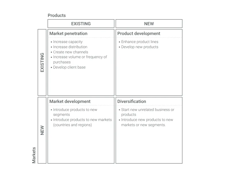
Visualize product- and market-related opportunities to define your growth strategy.
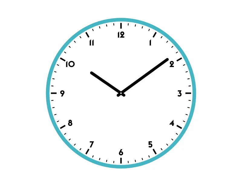
A customizable analog clock that displays a specific time
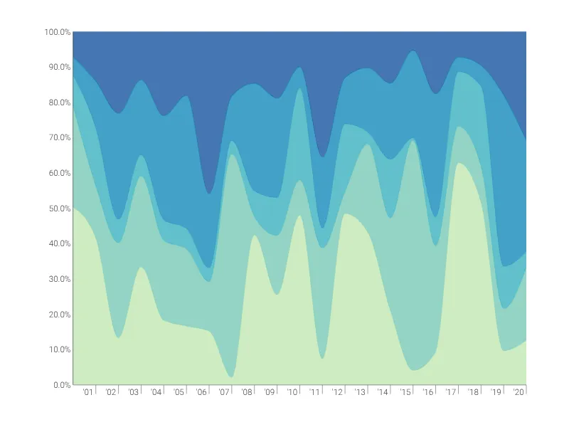
Create a 100% Stacked Time Series graph to visualize proportional trends over time.
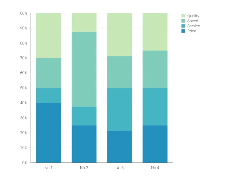
Create a stacked bar chart that adds up to 100%.
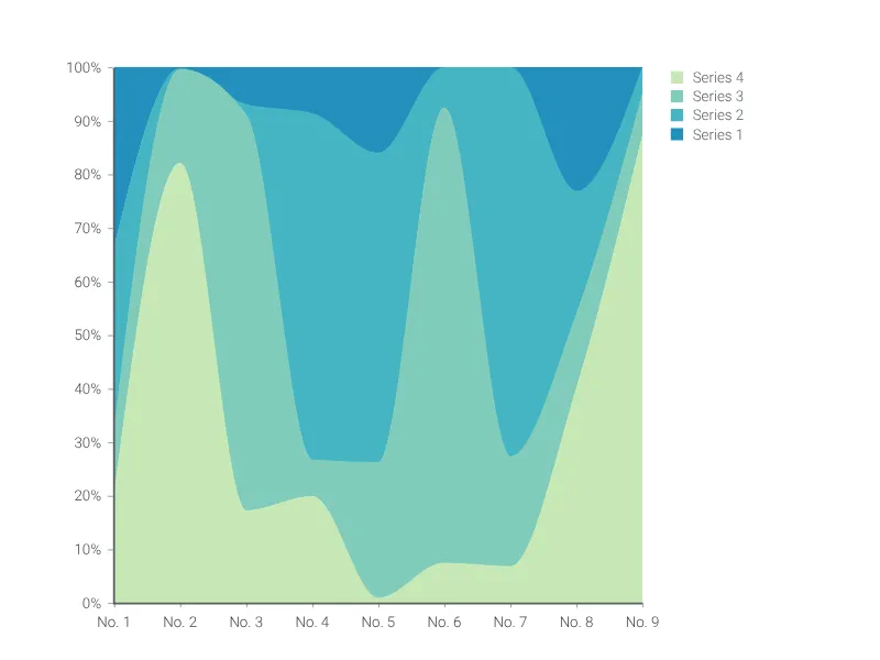
Create a 100% stacked area chart to compare the relative weight of different data series.